Home > Article > Web Front-end > Detailed description of length units in CSS
Previous words
This article is divided into absolute length units and relative length units to introduce the main knowledge of length units in CSS
Absolute length unit
Absolute length unit represents a physical measurement
Pixel px (pixels)
On the web , the pixel px is a typical unit of measurement, and many other length units map directly to pixels. Finally, they are processed in pixels
inches
1cm = 10mm = 96px/2.54 = 37.8px
millimeters
1mm = 0.1cm = 3.78px
1/4mmq(quarter-millimeters) 1q = 1/4mm = 0.945px
1pt = 1/72in = =0.0139in = 1/72*2.54cm = 1/72*96px = 1.33px
PICAS(picas)
1pc = 12pt = 1/6in = 1/6*96px = 16px
Font-related relative length units
em, ex, ch, rem are font-related The relative length unit
em
em represents the calculated value of the font-size attribute of the element. If used for the font-size attribute itself, relative Relative to the font-size of the parent element; if used for other attributes, relative to the font-size of the own element
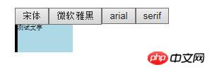
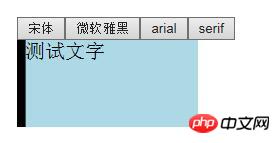
测试文字
##rem

Compatibility: IE8-not supported
测试文字
ex

[Note]ex is often used for fine-tuning in practice
测试文字
ch is similar to ex and is defined as the width of the number 0. When the width of the number 0 cannot be determined, half of the em value is used as the ch value
Compatibility: IE8-not supported[Note]ch is mainly used for Braille typesetting in practice
测试文字
 The viewport-related length value is relative to the size of the initial containing block. When the width and height of the initial containing block change, they will scale accordingly. However, when the root element's overflow value is auto, any scrollbars are assumed not to exist.
Regarding the viewport-related units, there are four units: vh, vw, vmin, and vmax. Compatibility: IE8-not supported, IOS7.1-not supported, android4.3-not supported ( For vmax, all IE browsers do not support it)[Note] BlackBerry incorrectly calculates it relative to the visual viewport; and Safari strangely calculates it relative to the html element, if content is added to the html , these two units will also change
vh1/100 of the layout viewport height
vw 1/100 of the layout viewport width
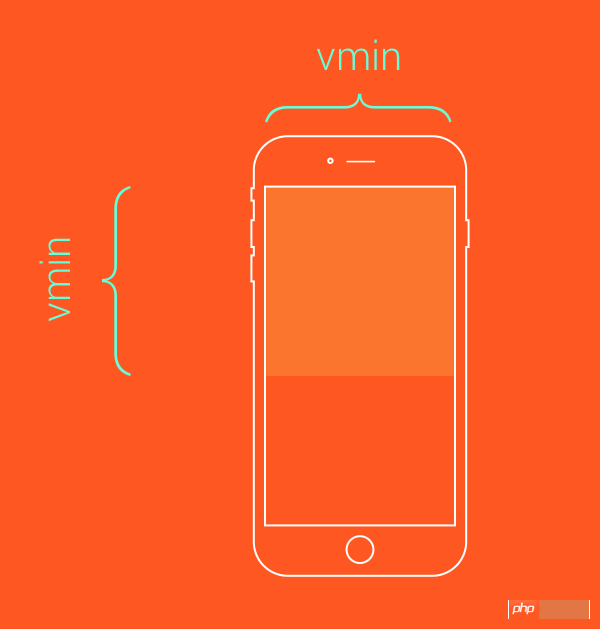
##vmin
1/100 of the minimum value between layout viewport height and width

vmax
1/100 of the maximum value between layout viewport height and width
/*类似于contain效果*/
.box{
    height: 100vmin;
    width: 100vmin;
}
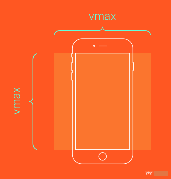
The above is all the clichés about the length unit in CSS brought to you by the editor. I hope everyone will support the PHP Chinese website
The above is the detailed content of Detailed description of length units in CSS. For more information, please follow other related articles on the PHP Chinese website!