

CSS 文本属性(Text)
| 用于 | 属性名 | CSS 版本 | 浏览器支持 | 继承性 | 默认值 |
|---|---|---|---|---|---|
| ① 颜色的前景色 (文本/文本装饰/边框/当前颜色的 颜色) 。 | color | 1 | 都支持。IE 所有版本 不支持属性值“inherit”。 | yes | not specified |
② 文本的书写方向。文本/表列/水平溢出的 方向 (文本方向 可用标签的 dir 属性 替代)。 | direction | 2 | 同上。 | yes | ltr |
| ③ 标点字符 是否位于线框之外。属性: 悬挂标点的 位置和符号 (实验中 属性)。 | hanging-punctuation | 3 | safari 10.1+支持,其他 都不支持。 | yes | none |
| ④ 字符间距 (字符之间的 额外空白/空间)。 | letter-spacing | 1 | 同上。 | yes | normal |
| 行高。设置 行高/行间距 (一行多高,影响 行之间的 距离) 。 | line-height | 1 | 同上。 | yes | normal |
| ⑤ 标点字符 修剪。 | punctuation-trim | 3 | 都不支持。 | yes | none |
| ⑥ 文本 水平对齐 方式。 | text-align | 1 | 都支持。IE 所有版本 | yes | 如果 direction 属性是 ltr,则默认值是 left;如果 direction 是 rtl,则为 right。 不支持属性值“inherit”。 |
⑦ 文本最后一行 水平对齐方式 (搭配 direction,text-align 属性)。 | text-align-last | 3 | IE11+,edge14+部分支持,FF52+ chrome49+ opera45+支持,safari不支持。 | yes | auto |
| ⑧ 文本 装饰(线)。 | text-decoration | 1 | 同上,且IE、Chrome 或 Safari 不支持 “blink” 属性值。 | no | none.(块元素 首行) 文本的 缩进量 (空白长度)。 |
| ⑨ 添加 文本强调符号(形状,颜色,位置) 。 | text-emphasis | 3 | IE,Edge 不支持,FF52+ safari10.1+ 支持,chrome49+部分支持。 | no | none |
⑩ 文本两端对齐的 空间分隔方式 (搭配text-align属性)。 | text-justify | 3 | IE11+,edge14+部分支持,FF55+支持,其他不支持。 | yes | auto |
⑪ 文本的阴影 (影响 装饰线 text-decoration)。 | text-shadow | 2 | 都支持。IE 10及以上才支持。 | yes | none |
| 文本 大小写转换。 | text-transform | 1 | 都支持。IE 所有版本 不支持属性值“inherit”。 | yes | none |
| ⑫ 文本的轮廓。 | text-outline | 3 | 都不支持。 | yes | none |
⑬ 隐藏文本溢出时 的显示 (搭配 overflow,white-space,display 属性)。 | text-overflow | 3 | 都支持,不需要前缀。 | no | clip |
| ⑭ 文本添加阴影。 | text-shadow | 3 | 都支持,IE10+支持 | yes | none |
| ⑮ 文本的换行规则。 | text-wrap | 3 | 都不支持。 | yes | normal |
⑯ 双向文本的 重写/覆盖 (搭配 direction属性)。 | unicode-bidi | 2 | yes | ||
| ⑰ 空白和换行的 处理。 | white-space | 1 | 都支持。IE 所有版本 不支持属性值“inherit”。 | yes | normal |
| ⑱ 单词 换行/断行 位置 (能否 词内断行)。 | word-break | 3 | 都支持。IE6+支持。 | yes | normal |
| ⑲ 对长的不可分割的单词 进行分割并换行到下一行。单词 断行时的 断行位置 (断句/断行 方式)。 | word-wrap | 3 | 都支持,IE6+ | yes | normal |
| ⑳ 单词/字 之间的 距离。 | word-spacing | 1 | 同上 | yes | normal |
1. color 属性: 颜色的前景色 (文本/文本装饰/边框/当前颜色的 颜色)
- ⑴ 文本 和 边框 的 颜色
- 设置 该元素的 文本和边框的颜色。【推荐学习:css视频教程】
color属性- 文本/边框 颜色 属性
- 元素的 前景色:
color设置 元素的 ❶ 文本 和 ❷ 文本装饰 (text-decoration) 的 前景颜色值- 并设置 当前颜色 ❸
currentcolor的值。- 间接值:
currentcolor可以用作 其他属性的 间接值,并且是 其他颜色属性(如 ❹ 边框颜色border-color)的 默认值。
- 间接值:
- 颜色
color属性设置了 一个 元素的前景色- = 文本的颜色: 在 HTML 中,显示的 就是元素 文本的颜色 和 颜色边框的颜色.
color:green,会 把边框和文字的颜色,同时设置为 绿色.- 边框的颜色 : 可以用
border-color覆盖/ 重新设置. 
- 设置 该元素的 文本和边框的颜色。【推荐学习:css视频教程】

- ⑵ 光栅图像
- 不受 前景色
color影响 - 光栅图
- = 位图(
.jpg)、点阵图、像素图,简单的说, - = 像素构成的图: 最小单位 由像素构成的 图
- 缩放失真: 只有 点的信息,缩放时 会失真
- 每个像素 有自己的颜色,类似 电脑里的图片 都是像素图
- 色块: 把图 放很大就会看到 点变成 小色块了
- = 位图(
- 不受 前景色
- ⑶ 前景色 和 背景色
- ① 背景色
- 就是你要做的 图片的底色
- 默认白色
- ② 前景色
- 当前 构图,线条、填充等 颜色。
- 背景色就是 纸张的颜色,前景色就是 画笔画出的颜色。
- ① 背景色
- ⑷ 前景色属性的 语法
color:color_name|hex_number|rgb_number|inherit;
/* 关键字值 Keyword values */
color: currentcolor;

/* 颜色名称 <named-color> values */
color: red;
color: orange;
color: tan;
color: rebeccapurple;

/* 十六进制颜色 <hex-color> values */
color: #090;
color: #009900;
color: #090a;
color: #009900aa;

/* <rgb()> values ,逗号 可以换成空格,但是目前 最好别这么做,兼容性还没那么好*/
color: rgb(34, 12, 64);

/*rgb()中带不透明度值,浏览器支持度不好,用rgba()*/
color: rgb(34, 12, 64, 0.6);
color: rgba(34, 12, 64, 0.6);

color: rgb(34 12 64 / 0.6);
color: rgba(34 12 64 / 0.3);
color: rgb(34.0 12 64 / 60%);
color: rgba(34.6 12 64 / 30%);

/* <hsl()> values ,逗号 可以换成空格,但是目前 最好别这么做,兼容性还没那么好*/
color: hsl(30, 100%, 50%);
/*hsl()中带 不透明度值,浏览器支持度不好,用 hsla()*/
color: hsl(30, 100%, 50%, 0.6);
color: hsla(30, 100%, 50%, 0.6);

color: hsl(30 100% 50% / 0.6);
color: hsla(30 100% 50% / 0.6);
color: hsl(30.0 100% 50% / 60%);
color: hsla(30.2 100% 50% / 60%);

/* Global values */
color: inherit;
color: initial;
color: unset;
- ⑸ 前景色
color的 属性值- 关键点:颜色名称 十六进制 rgb代码 继承
- ① 关键字(颜色名称):
color_name,currentColor,transparent- 颜色值 为 颜色名称的颜色
- (比如
red)。
- ② 十六进制:
hex_number- 颜色值 为十六进制值的 颜色
- (比如
#ff0000)
- ③ rgb 代码:
rgb(),rgba()- 颜色值为 rgb 代码的颜色
color: rgb(34, 12, 64);color: rgba(34, 12, 64, 0.6);
- 颜色值为 rgb 代码的颜色
- ④ hsl 代码:
hsl(),hsla()color: hsl(30, 100%, 50%);color: hsla(30, 100%, 50%, 0.6);
- ⑤ 继承:
inherit- 从父元素 继承颜色。
- 注意: 值必须是 统一的颜色
color。 - 它 不能是 一个渐变色的值
<gradient>,渐变色 实际上是一种 图像了,而不是一种颜色.。
- ① 关键字(颜色名称):
- 关键点:颜色名称 十六进制 rgb代码 继承
- ⑹ 文本颜色的 默认值
- 取决于 浏览器
- ⑺ 文本颜色 默认继承性
- 被继承
yes


- 示例1: 把一段文字 设置成红色的 方法
color {
    width: 600px;
    border: 10px dashed;
    padding: 10px;
    /*把一段文字 设置成红色的 方法*/
    color: red;
    color: #f00;
    color: #ff0000;
    color: rgb(255,0,0);
    color: rgb(100%,0%,0%);
    color: hsl(0,100%,50%);

    /*设置 半透明的红色 = 不透明值 等于一半的 红色*/
    color: #ff000080;
    color: rgba(255,0,0,0.5);
    color: hsla(0,100%,50%,0.5);
}| 红色 | 半透明的红色 |
|---|---|
 |  |
2. direction 属性: 文本/表列/水平溢出的 方向 (文本方向 可用标签的 dir 属性 替代)
- ⑴ 文本/表列/水平溢出的 方向
direction属性 设置 文本、表列(table columns) 和 水平溢出 (horizontal overflow)的 方向。- 文本流向: 该属性设置 块级元素的基本 文本方向
- (从左 流向右边,还是从右 流向左边,不改变 相邻文字之间的先后顺序,句号除外.)
- 嵌入方向: 由 unicode-bidi 属性 创建的 嵌入方向。
- 文本/块元素 默认对齐: 设置 文本/块级元素 的默认对齐方式
- 单元格 流动方向: 单元格(表列) 在表行中 流动的方向。
- 文本流向: 该属性设置 块级元素的基本 文本方向
- ⑵ 方向属性的 语法
direction:ltr|rtl|inherit;
/* 关键字值 Keyword values */
direction: ltr;
direction: rtl;

/* 全局通用的属性值 Global values */
direction: inherit;
direction: initial;
direction: unset;
- ⑶
direction方向的 属性值- 文本方向 关键点:从左到右流动 从右到左 继承
- ① 从左到右(默认值):
ltr- 内容 从左向右流动
- 用于 从左到右书写的语言 (英语,汉语 和 大多数的其他语言)。
- 文字先后顺序 不变:
- 注意,改变的是 文本的流向,文字之间的前后顺序,是不会变化的.
- ② 从右到左:
rtl- 内容 从右向左流动。
- 用于 从右向左 书写的语言(如 希伯来语(
Hebrew) 或 阿拉伯语(Arabic) 等)- 不是 所有国家的文字,都是 从左到右的写的,就跟 中国的古文,从上往下写的一样,有的国家的文字方向,是从右到左写的)
- ③ 继承父亲:
inherit- 从父元素 继承
direction属性的值。 - 内容流动 从父元素继承。
- 从父元素 继承
- ⑷ CSS 的
direction属性 和 html 标签的属性dir(标签中)- ① 文本方向 用标签的
dir属性 :- 通常是在 文档中定义的 (例如,使用 HTML 标签的
dir属性),而不是 直接使用direction属性。
- 通常是在 文档中定义的 (例如,使用 HTML 标签的
- ② 单元格 不从表列 继承
direction属性:- 与 HTML中 的
dir属性 不同,direction属性 不是从表列 继承到表单元格的,因为CSS 继承遵循 文档树,而 表单元格 位于行中,而 不是列中。
- 与 HTML中 的
- ③ 搭配使用:
- 要使
direction属性 对 行内元素 有影响,必须unicode-bidi属性的值 设置为embed,override.
- 要使
- ④ 不受
all属性影响:direction和unicode-bidi属性: 是唯独的两个 不受all属性 影响的属性。
- ① 文本方向 用标签的
⑸
direction的 浏览器支持

- 示例1: 把一段汉字,设置成相反的 从右到左的 方向.
.color {
    width: 450px;
    border: 10px dashed;
    padding: 10px;

    /*设置文本的方向*/
    direction: rtl;
}| 默认的文本方向: ltr 从左到右 | 设置成 从右到左 direction: rtl; |
|---|---|
 |  |
- 从最后一行的 句号
。的位置,可以看出- ① 文本的流向: 变成了 从左到右,变成了 从右到左排列
- ② 文字之间的 前后顺序: 并没有改变
- (因为那些 文字从右到左排列的语言,文字之间的顺序,也是不会变的,只是汉语 默认是左到右 书写顺序,所以反流向后 看上去 有点怪)
direction: rtl;=<p dir="rtl"> </p>: 两个效果 是一样的,dir: direction 的简写.
- 示例2: 改变 表格中 列的排列顺序
- css
.dirTest {
    border: 1px solid;
    width: 300px;
    direction: rtl;
    background-color: #d0d0d0;
}
.dirTest td, th {
    border: 1px solid;
}- html
    	<table class="dirTest">
    	    <tr>
    	        <th>①姓名</th>
    	        <th>②爱吃的水果名</th>
    	        <th>③爱好</th>
    	    </tr>
    	    <tr>
    	        <td>

    	            小明
    	        </td>
    	        <td>
    	            葡萄

    	        </td>
    	        <td>乒乓球</td>
    	    </tr>
    	    <tr>
    	        <td>
    	            莉莉
    	        </td>
    	        <td>
    	            苹果
    	        </td>
    	        <td>动漫</td>
    	    </tr>
</table>| 默认方向: 从左到右 | 设置 从右到左 |
|---|---|
 |  |
- 列的顺序 完全相反: 1,2,3 列,变成了 3,2,1 列
- 等同值:
direction:rtl=<table class="dirTest" dir="rtl"> </table>- 可在标签的
dir属性中设置.
- 可在标签的
3. CSS3 hanging-punctuation 属性: 悬挂标点的 位置和符号 (实验中 属性)
- ⑴ 悬挂标点的 位置和符号:
hanging-punctuation属性,美 /ˌpʌŋktʃuˈeɪʃn/- 指定 标点符号 应挂在 一行文本的开头 还是结尾。
- 悬挂的标点符号 可以放在 行框外。
- 实验中属性:
- 这是一项实验技术
- 在生产中使用之前,请仔细检查 浏览器兼容性表。
- 指定 标点符号 应挂在 一行文本的开头 还是结尾。
- ⑵ 悬挂标点的 语法
hanging-punctuation: none|first|last|allow-end|force-end;
/* 关键字值 Keyword values */
hanging-punctuation: none;
hanging-punctuation: first;
hanging-punctuation: last;
hanging-punctuation: force-end;
hanging-punctuation: allow-end;

/* 两个值 Two keywords */
hanging-punctuation: first force-end;
hanging-punctuation: first allow-end;
hanging-punctuation: first last;
hanging-punctuation: last force-end;
hanging-punctuation: last allow-end;

/* 三个值 Three keywords */
hanging-punctuation: first force-end last;
hanging-punctuation: first allow-end last;

/* 全局值 Global values */
hanging-punctuation: inherit;
hanging-punctuation: initial;
hanging-punctuation: unset;
- ⑶ 悬挂标点的 属性值
- ① 不悬挂标点:
none- 不在 文本首行的开头 或结尾的 行框之外 放置标点符号。
- ② 首行开始 行框外:
first- 元素的 第一个格式化行 开始处的 左括号或左引号 挂起。
- 标点附着在 首行开始边缘之外。
- ③ 末行结尾 行框外:
last- 元素 最后一个格式化行 末尾的 右括号或右引号 挂起。
- 标点附着在 末行结尾边缘之外。
- ④ 对齐不合适 挂起:
allow-end- 如果 行尾的 句号或逗号 在对齐之前 不合适,则挂起。
- ⑤ 行尾的 句号逗号 挂起:
force-end- 行尾的 句号或逗号 挂起。
- ① 不悬挂标点:
- ⑷ 多值
hanging-punctuation属性 可被指定 多个值,可以是 一个值,两个值,或者 三个值。- 1个值: 使用 上面属性值中的 任何一个 关键字值。
- 2 个值: 使用下列其中一项:
first搭配last,allow-end,force-end中的一个last搭配first,allow-end,force-end中的一个
- 3 个值: 使用下列其中一项:
first,allow-end,lastfirst,force-end,last

4. letter-spacing 属性 : 字符间距 (字符之间的 额外空白/空间)
- ⑴ 字符间距/ 字符间的空白
- 定义了在 文本字符框 之间 插入多少空间
- 属性设置 文本字符之间 的间距行为
- 增加或减少 字符间的空白(字符间距)。
letter-spacing属性- 字符间距 属性
- 增加或减少 字符间的空白(字符间距)。
- ⑵ 字符和字符框
- 由于 字符字形 通常比其 字符框 要窄
- 指定长度值时 ,会调整 字母之间 通常的间隔。
- ⑶ 字符间距的 语法
letter-spacing:normal|length|inherit;
/* 关键字值 Keyword value */
letter-spacing: normal;

/* 长度值 <length> values */
letter-spacing: 0.3em;
letter-spacing: 3px;
letter-spacing: .3px;

/* 全局值 Global values */
letter-spacing: inherit;
letter-spacing: initial;
letter-spacing: unset;
- ⑷ 字符间距的 属性值
- 字符间距关键点:标准 长度值 继承
- ① 标准/正常 间距 (默认):
normal- 字符间 没有额外的空间
- 当前字体的 正常字母间距。
normal≠0,需要时,浏览器可调整 字符间距:- 与值
0不同,此关键字 允许用户代理 更改字符之间的 空格,以 调整/对齐 文本。
- 与值
- ② 指定 字符额外间距:
length- 字符间的 固定空间
- 指定(除了 字符之间的 默认间距之外的) 额外字符间的 空间。
- 负值: 允许使用 负值,这会让 字符之间 挤得更紧。
- 值可能是负数,但可能存在 特定于实现的限制。
- 用户代理 不会为了 调整文本/对齐文字,而进一步 增加或减少 字符间的空间 (因为间距 设定成固定值了)。
- 值可能是负数,但可能存在 特定于实现的限制。
- ③ 继承父亲:
inherit- 从父元素继承
letter-spacing属性的值。
- 从父元素继承
- ⑸ 字符间距的 默认继承性
- 会被继承
yes
- ⑹ 字符间距 和 可访问性问题
- ① 间距太大/小时, 变得不可读: 较大的 正或负字符间距值 将使单词样式 变得不可读。
- 对于具有 非常大的 正值的 文本
- 字母之间的距离 会非常远,以至于 单词看起来就像 一系列单独的、不连接的字母。
- 对于具有 非常大的 负值的文本
- 字母之间 会重叠到 无法识别单词的程度。
- 对于具有 非常大的 正值的 文本
- ② 根据字体 调整 字符间距:
- 清晰的字母间距 必须根据具体情况 来确定,因为不同的字体 有不同的字符宽度。
- 没有一个值 可以确保 所有字体 自动保持其易读性。
- ① 间距太大/小时, 变得不可读: 较大的 正或负字符间距值 将使单词样式 变得不可读。
⑺ 字符间距
letter-spacing的 浏览器支持

- 示例1: 设置一段文字的 字符之间的间距值
- html
    	<p class="textTest">
    	    业精于勤是一个汉语成语,拼音是 yè jīng yú qín,意思是指 学业的精进 在于勤奋。出处唐·韩愈《进学解》:“业精于勤,荒于嬉;行成于思,毁于随。
</p>- css
.textTest {
    width: 450px;
    border: 10px dashed;
    padding: 10px;
    /*字符之间的间距*/
    letter-spacing: normal;
}| 正常间距 (默认值) normal | 增加 0.2em的额外间距 letter-spacing: 0.2em; |
|---|---|
 |  |
| 减少 0.2em的额外间距 letter-spacing: -0.2em; | 字符间距 不正常的字体(太大/太小) 2em, -0.9em |
 |   |
5. line-height 属性: 设置 行高/行间距 (一行多高,影响 行之间的 距离)
- ⑴ 行高/行间距:
line-height属性- ① 属性设置 行框的 高度。
- ❶ 在块级元素上
- 它指定 元素中 行框的最小高度。
- ❷ 对于 非替换的 内联元素
- 它指定 用于 计算 行框高度的 高度。
- ❶ 在块级元素上
- ② 影响 行间距: 会影响 文本行与行 之间的 距离
- 行高 = 一个文字的中间, 到下一行 文字的中间 相差的距离
- (或者 文字底部,到下一行 文字的底部的 距离)
- 所以,行高的变化,也会影响 行距.
- 行距 = 行高
line-height- 字体大小font-size= 行高和字体大小的 差值 - 注意区分 行间距和行距: 行高 = 行间距 ≠行距,行间距 是行高的别称.
- 行距 = 行高
- ① 属性设置 行框的 高度。
⑵ 行高、基线、顶线、中线、底线 示例图


- ⑶ 行高/行间距的 语法
line-height:normal|number|length|%|inherit;
/* 关键字值 Keyword value */
line-height: normal;

/* 无单位值: 字体大小 font-size的倍数  Unitless values: use this number multiplied
by the element's font size */
line-height: 3.5;

/* 长度值 <length> values */
line-height: 3em;

/* 百分比值 <percentage> values */
line-height: 34%;

/* 全局值 Global values */
line-height: inherit;
line-height: initial;
line-height: unset;
- ⑷ 行高/行间距的 属性值
标准,数字,长度值,百分比,继承。
① 正常 行间距(默认):
normal- 设置 正常的行高,取决于 用户代理。
- 默认值: 桌面浏览器(包括 Firefox )使用的默认值 大约为
1.2,这取决于 元素的 字体。
② 一个数字(无单位),字体大小的 倍数:
number(等同于 百分比值的简写)- 设置数字,行高 = 数字 x 当前的字体大小
font-size。- 行高和继承问题: 在大多数情况下,这是 设置行高和 避免 继承导致的意外结果的 首选方法。
- 比如,一级标题
h1不继承父元素div的字体大小,段落p却继承 父元素div的字体大小时 - 此时, 容器内,就有两种不同的 字体大小的文本,如果设置一样的行高值,没办法同时满足两个子元素的 行高需要.
- 比如,一级标题
- 优点: 当元素内的 子元素的文本 字体大小
font-size不同时,能设置 相对于 子元素的 当前字体大小的行高.
- 行高和继承问题: 在大多数情况下,这是 设置行高和 避免 继承导致的意外结果的 首选方法。
- 设置数字,行高 = 数字 x 当前的字体大小
③ 长度值:
length- 设置 固定的行高。
- 指定的 长度值 用于计算 行框高度。em 单元中 给出的值 可能会产生 意想不到的结果
④ 字体大小的 百分比值:
%- 相对于 元素本身的 字体大小
font-size。- 行高 = 百分比 x 元素字体大小
font-size。
- 行高 = 百分比 x 元素字体大小
- 相对于 元素本身的 字体大小
⑤ 继承父亲:
inherit- 从父元素继承
line-height属性的值。
- 从父元素继承
不能负值: 行高 不允许 负值,负值会被视作 无效值.
默认行高/行间距:
- 在大多数浏览器中默认行高,大约是
110%~120%。100%的行间距- 则 上一行的字 紧贴着下一行的字,中间 没有距离。

- 在大多数浏览器中默认行高,大约是

- ⑸ 行高和字体大小: 行高
line-height< 字体大小font-size时, 将出现 行距为负数的情况,也就是两行文字 将部分重合。

- ⑹ 行高的 继承性
- 会被继承
yes
- ⑺ 行高 和 可访问性问题
- 有助于 视力低下的人:
- 对于 主要段落内容,行高的最小值为
1.5。- 这将 有助于 视力低下的人,以及 有阅读障碍 等认知障碍的人。
- 对于 主要段落内容,行高的最小值为
- 确保行高 按比例缩放:
- 如果 对页面进行缩放 以增加文本大小,则使用 无单位值 纯数字 可确保 行高 按比例缩放。
- 有助于 视力低下的人:
⑻ 行高
line-height的 浏览器支持

- 示例1: 设置一段文字的 行高/行间距 (会影响行距)
.textTest {
    width: 450px;
    border: 10px dashed;
    padding: 10px;

    font-size: 16px;
    line-height: 1.5em;
}| 默认 文本行高 = normal 值 | 绝对长度值 行高 line-height: 40px; |
|---|---|
 |  |
| 相对长度值 行高 1.5em = 150% | 不带单位 纯数字 line-height: 1.5; |
 |  |
- 等同值: 当设置 同一个元素的行高时(内部 没有字体大小不同的 子元素):
1.5=1.5em=150%- 行高 = 数值 x 元素的字体大小
font-size,都是相对于 当前字体大小的 倍数. - 如果不是同一元素的行高,比如,间
- 行高 = 数值 x 元素的字体大小
- 示例2: 纯数字值 (无单位值) 和
em,%相对长度值的区别- 只对最外层的容器
div,进行 行高设置,内部的两个子元素h1,p都不设置行高,看下内部元素的行高变化
- 只对最外层的容器
- html
- 嵌套关系:
div > h1 | p
- 嵌套关系:
    	<div class="textTest">
    		<h1>业精于勤是一个汉语成语,拼音是 yè jīng yú qín,意思是指 学业的精进 在于勤奋。出处唐·韩愈《进学解》:“业精于勤,荒于嬉;行成于思,毁于随。</h1>
    	    <p>业精于勤是一个汉语成语,拼音是 yè jīng yú qín,意思是指 学业的精进 在于勤奋。出处唐·韩愈《进学解》:“业精于勤,荒于嬉;行成于思,毁于随。</p>
</div>- css
.textTest {
    width: 450px;
    border: 10px dashed;
    padding: 10px;

    font-size: 16px;
}| 默认 文本行高 = normal 值 | 设置成 绝对长度值时: 25px (h1 的文本 行高太挤) |
|---|---|
 |  |
| 设置成 相对长度值: 1.5em = 150% | 设置成 纯数字 不带单位: line-height: 1.5; |
 |  |
- ① 带单位的 行高:
25px,1.5em= 150%=1.5 x 16px = 24px- 相当于 给
div内部的两个子元素,应用了 一样 行高值,即使他们的字体大小不同
- 相当于 给
- ② 不带单位的 纯数字
- 相当于 给两个子元素
h1,p分别设置了 相对于子元素自身字体大小的 行高 h1的行高 =h1的字体大小 x1.5p的行高 =p的字体大小 x1.5- 优点: 当元素内的 子元素的字体大小 不同时,能设置 相对于 子元素当前字体大小的行高.
- 相当于 给两个子元素
6. CSS3 punctuation-trim 属性: 标点修剪 (浏览器 都不支持)
- ⑴ 标点修剪:
punctuation-trim属性- 如果 标点位于 行开头或结尾处,
- 或者 临近另一个 全角标点符号,
- 是否 对标点符号 进行修剪。
- 如果 标点位于 行开头或结尾处,
- ⑵ 标点修剪的 语法
punctuation-trim: none|start|end|allow-end|adjacent;
- ⑶ 标点修剪的 属性值
- 关键点:不修剪、修剪开启标志符号、修剪闭合标志符号。
- ① 不修剪:
none- 不修剪 开启或闭合 标点符号。
- ② 修剪 开启标志符号:
start- 修剪每行 结尾的 开启标点符号。
- ③ 修剪闭合标点符号: end
- 修剪每行结尾的 闭合标点符号。
- ④
allow-end - ⑤
adjacent
7. text-align 属性: 文本 水平对齐 方式
- ⑴ 文本 水平对齐方式:
text-aligntext-align属性 设置元素中的 文本的 水平对齐方式。行内内容(文本)的 水平对齐: 定义 行内内容(例如 文字)如何 相对它的 父块元素 对齐。
- 并不控制 块元素 本身的对齐,只控制 块元素的 行内内容(文本)的对齐。
text-align不控制 文本的 最后一行:- 因为这一行 经常和其他行 长短不一,不适合一起控制 ?
- 使用
text-align-last属性: 指定文本 最后一行的 水平对齐方式
通过指定 行框 与哪个点对齐
- 从而设置 块级元素的 文本 的 水平对齐方式。
- ⑵ 文本水平对齐的 继承性
- 会被继承
yes
- ⑶ 文本水平对齐
text-align的 语法text-align:left|right|center|justify|inherit;
/* 关键字值 Keyword values */
text-align: left;
text-align: right;
text-align: center;
text-align: justify;
/*下方的属性值 支持度还不好 暂时不用少用*/
text-align: justify-all;
text-align: start;
text-align: end;
text-align: match-parent;

/* 表列中 基于字符的对齐 Character-based alignment in a table column */
text-align: ".";
text-align: "." center;

/* 块对齐值 Block alignment values (非标准语法 Non-standard syntax) */
text-align: -moz-center;
text-align: -webkit-center;

/* 全局值 Global values */
text-align: inherit;
text-align: initial;
text-align: unset;
- ⑷ 文本水平对齐的 属性值
- ① 左对齐(默认值):
left- 把文本 排列到左边。
- 行内内容 对齐到 行框的左边缘。
- 默认值:没有设置
direction:rlt时 的默认值.
- 默认值:没有设置
- ② 右对齐:
right- 把文本排列到右边。
- 行内内容 对齐到 行框的右边缘。
- 设置文本流向 从右到左
direction:rlt时 的默认值.
- 把文本排列到右边。
- ③ 居中对齐:
center- 把文本 排列到中间。
- 行内内容 在行框中 居中。
- 把文本 排列到中间。
- ④ 两端对齐:
justify- 实现 两端对齐 文本效果。
- 除最后一行外,文本的左右边缘 应与 行框的左右边缘 对齐。
- 实现 两端对齐 文本效果。
- ⑤ 继承父亲:
inherit- 从父元素 继承
text-align属性的值。
- 从父元素 继承
- ★ 默认值
- 关联属性: 与方向
direction属性 相关联- 如果
direction属性是ltr,则默认值是left; - 如果
direction是rtl,则为right。
- 如果
- 关联属性: 与方向
- ① 左对齐(默认值):
- ⑸ 文本水平对齐
text-align和direction属性的 关联影响- ① 没有设置 文本水平对齐
text-align的时direction属性,文本的流向 会影响 水平对齐的默认值.direction:ltr,文本会 左对齐direction:rtl,文本会 右对齐
- ② 设置 文本水平对齐后
direction只会改变 文本的流向,不会再影响 对齐方式.
- ① 没有设置 文本水平对齐
⑹ 文本水平对齐
text-align的 浏览器支持

示例1: 设置一段文本的 水平对齐方式
.textTest {
    width: 400px;
    border: 10px dashed;
    padding: 10px;

    font-size: 16px;
    margin: 10px;
}| 左对齐 text-align:left; | 右对齐 text-align:right; |
|---|---|
 |  |
| 居中对齐 text-align:center; | 两端对齐 text-align:justify; |
 |  |
- 示例2: 标准兼容的 方式 : 居中块元素本身 , 而不是居中 块元素的 内联/行内内容(即 文本)
- 将 左右外边距,设置为自动
auto(下方 3 种设置方式,效果等同)- = ❶
margin: auto;= ❷margin: 0 auto; - = ❸
margin-left: auto; margin-right: auto; - 把块元素,放在父元素的 正中间.
- = ❶
- 将 左右外边距,设置为自动
margin: 0 auto;

7.1 CSS3 text-align-last 属性: 文本最后一行 水平对齐方式 (搭配 direction,text-align 属性)
- ⑴ 文本 最后一行的 水平对齐方式:
text-align-last- 描述的是一段文本中 最后一行 在被强制换行之前的 对齐规则。
- 作用对象:
vertical-align只对 行内元素、表格单元格元素 生效,不能用于 垂直对齐 块级元素。
- ⑵ 文本最后一行的 水平对齐
text-align-last的 语法text-align-last:auto | start | end | left | right | center | justify;
/* 关键字值 Keyword values */
vertical-align: baseline;
vertical-align: sub;
vertical-align: super;
vertical-align: text-top;
vertical-align: text-bottom;
vertical-align: middle;
vertical-align: top;
vertical-align: bottom;

/* 长度值 <length> values */
vertical-align: 10em;
vertical-align: 4px;

/* 百分比值 <percentage> values */
vertical-align: 20%;

/* 全局值 Global values */
vertical-align: inherit;
vertical-align: initial;
vertical-align: unset;
- ⑶ 文本最后一行 水平对齐
text-align-last的 属性值- ① 与
text-align关联:auto- 受影响的行 按文本水平对齐
text-align的值 对齐, - 两端对齐除外: 除非 文本水平对齐是 两端对齐
text-align: justify- 在这种情况下,效果与
text-align-last: start是一样的,根据文本的方向 来决定.
- 在这种情况下,效果与
- 受影响的行 按文本水平对齐
- ② 与
direction关联,参考起点:start- 与
direction的设置有关。- ❶ 左对齐:
- 如果文本展示方向 是从左到右
direction :ltr,则 起点在左侧,则是左对齐;
- 如果文本展示方向 是从左到右
- ❷ 右对齐:
- 如果文本展示方向 是从右到左
direction :rtl,则 起点在右侧,则是右对齐。
- 如果文本展示方向 是从右到左
- ❸ 浏览器 默认方向: 如果没有设置
direction,则按照 浏览器文本的 默认显示方向 来确定。
- ❶ 左对齐:
- 与
- ③ 与
direction关联,参考终点:end- 与 上方
start值的 结果相反,是以 终点为参考的.
- 与 上方
- ④ 左对齐:
left- 文本 对齐到 行框的左边缘。
- ⑤ 右对齐:
right- 文本 对齐到 行框的右边缘。
- ⑥ 居中对齐:
center- 文本 在行框中 居中。
- ⑦ 两端对齐:
justify- 最后一行文字的 开头与 行框的 左侧对齐,末尾与右侧对齐。
- 文本应该 将它们的 左右边缘 对齐到 行框的左右内容边缘。
- 最后一行文字的 开头与 行框的 左侧对齐,末尾与右侧对齐。
- ① 与
- ⑷
text-align-last的 浏览器支持需要使用 浏览器前缀

- 示例1: 把一段内容的 文本水平对齐 保持左对齐,改变 文本最后一行的对齐方式
.textTest {
    width: 400px;
    border: 10px dashed;
    padding: 10px;
    margin: 0 auto;
    font-size: 16px;
    /*文本水平对齐*/
    text-align: left;

    /*文本最后一行 水平对齐*/
    text-align-last: auto;
}| ① 默认显示 | ② text-align-last: auto; |
|---|---|
 |  |
| ③ 起点对齐 text-align-last: start; | ④ 终点对齐 text-align-last: end; |
 |  |
| ⑤ 左对齐 text-align-last: left; | ⑥ 右对齐 text-align-last: right; |
 |  |
| ⑦ 居中对齐 text-align-last: center; | ⑧ 两端对齐 text-align-last: justify; |
 |  |
7.2 CSS3 text-justify 属性: 文本两端对齐的 空间分隔方式 (搭配 text-align 属性)
- ⑴ 文本两端对齐的 空间分隔方式:
text-justify- 当
text-align: justify时- 即 文本的 水平对齐方式 = 两端对齐 时的 分隔方式。
- 当
- ⑵ 文本两端对齐 分隔方式的 语法
text-justify: auto|inter-word|inter-character|distribute;
text-justify: none;
text-justify: auto;
text-justify: inter-word;
text-justify: inter-character;
text-justify: distribute; /* 已废弃的属性值 Deprecated value */
- ⑶ 文本两端对齐 分隔方式的 属性值
- ① 浏览器 自动决定 (默认值):
auto- 浏览器决定 两端对齐 算法。
- 这种对齐方式 将是 最适合某种语言文字的 排版(例如:英语,中文,日语,韩语等)。
- ② 禁用 两端对齐:
none- 禁用 两端对齐。
- 表现的效果 和没有设置
text-align一样- 当你因为某种原因 需要在已经设置了
text-align的元素上 禁用 两端对齐效果的时候,可以使用. - 谷歌 chrome中没有这个效果,火狐浏览器中 有这个效果.
- 当你因为某种原因 需要在已经设置了
- ③ 调整 单词间距离:
inter-word- 增加/减少 单词间的间隔。
- 在文本中的单词之间 添加空间 来实现行对齐(会改变
word-spacing的值)- 比如 英语或韩语 最适合使用 这个属性值 来用 空格分隔单词 的语言。
- ④ 调整 字符间距离:
inter-character- 通过 在文本中的 字符之间 添加空间 来实现行对齐(会改变
letter-spacing的值)- 比如 日语 最适合使用 这个属性值的语言。
- 通过 在文本中的 字符之间 添加空间 来实现行对齐(会改变
- ⑤ 分散:
distribute(已废弃 属性值)- 美 [dɪ’strɪbjut]
- 散布
- 类似 报纸版面,除了在东亚语系中 最后一行是不齐行的。
- 显示效果与设置了
inter-wrod一致,不提倡使用 这个属性,现在这个属性 或许还能有效果,但那完全是为了 向后兼容而被保留着。
- 显示效果与设置了
- ① 浏览器 自动决定 (默认值):
- ⑷ 文本两端对齐 分隔方式的 浏览器支持
实验中属性,行为可能会发生变化

示例1:给一段文本设置 两端对齐的水平对齐,并设置 两端对齐时 空间的分隔方式
css
.textjustify{
    width: 30%;
    background-color: #d0d0d0;
    padding: 10px;
    border: solid black 2px;
    font-size: 1.2em;

    /*text-align: justify;*/
    /*text-justify:auto;*/
    /*text-justify:none;*/
    /*text-justify:inter-word;*/
    /*text-justify:inter-character;*/
    /*text-justify:distribute;*/

}- html
<p class="textjustify">金无足赤,人无完人。出自宋·戴复古《寄兴》:“黄金无足色,白璧有微瑕。求人不求备,妾愿老君家。” 也比喻不能要求一个人没有一点缺点错误,应该严以律己,宽以待人。<br />No one is perfect, everyone will make mistakes,be strict with yourself and lenient toward others.</p>
| 默认 水平对齐 | 水平 两端对齐 text-align: justify; ( 默认= text-justify:auto;) |
|---|---|
 |  |
| 禁用 两端对齐 text-justify:none; | 调整 单词间距离 inter-word |
 |  |
| 调整 字符间距离 inter-character | 分散 distribute (已废弃属性值) |
 |  |
- 文本两端对齐的分隔方式
- 浏览器自动决定
auto,会根据语言 自行进行空间分隔- 所以后面的 调整 单词间距离(英语中),调整字符距离 (汉语中),效果看上去 区别不大.
- 浏览器自动决定
7.3 vertical-align 属性: 垂直对齐方式 (针对 行内元素,表格单元格内容)
- ⑴ 垂直对齐 方式:
vertical-align,美 ['vɝtɪkl]- ① 指定 行内元素(
inline)或 表格单元格(table-cell)元素的 垂直对齐方式。 - ② 在表单元格中
- 垂直对齐属性 会设置 单元格内容的 对齐方式。
- ③ 块级元素的垂直对齐: 不使用
vertical-align.- 可以设置 块的行高 = 高度
- 块中的文字垂直居中:
line-height = height
- ① 指定 行内元素(
- ⑵ 垂直对齐 使用范围
vertical-align只对 ❶ 行内级的元素(inline-level elements)、❷ 表格单元格元素 生效:不能用它 垂直对齐 块级元素- ① 行内元素: 将 内联元素的框 垂直对齐到 包含它的 行框中。
- 行内级元素(
inline-level elements):- 内联级元素 按行排列。
- 创建新行: 一旦元素的数量 超过了当前行 所能容纳的数量,就会在当前行下方 创建新行。
- 行框: 所有这些行 都有一个所谓的 行框,它包含 该行的所有内容。
- 不同大小的内容 表示 不同高度的行框。
- 内联级元素 按行排列。
display=- ❶
inline - ❷
inline-block- 内联的块元素
- 可以有宽度和高度(可能由它自己的内容定义)以及内边距、边框和外边距。
- ❸
inline-table - 行内/(内联)元素: 基本上是 包装文本的 标签。
- ❶
- 它可以用来 把图片
<img>垂直放置在 一行文本中 
- 行内级元素(
- ② 表格单元格: 垂直对齐 表格的单元格内容
- ① 行内元素: 将 内联元素的框 垂直对齐到 包含它的 行框中。


- ⑶ 垂直对齐的 语法
vertical-align:baseline | sub | super | top | text-top | middle | bottom| text-bottom | length | % |inherit;
/* Keyword values */
vertical-align: baseline;
vertical-align: sub;
vertical-align: super;
vertical-align: text-top;
vertical-align: text-bottom;
vertical-align: middle;
vertical-align: top;
vertical-align: bottom;

/* <length> values */
vertical-align: 10em;
vertical-align: 4px;

/* <percentage> values */
vertical-align: 20%;

/* Global values */
vertical-align: inherit;
vertical-align: initial;
vertical-align: unset;
- ⑷ 垂直对齐的 属性值
- Ⅰ.针对 行内元素的值
① 相对父元素 的值
- 这些值 使元素相对其父元素 垂直对齐
- ❶ 父元素 基线(默认值) :
baseline- (基线 : 父元素基线)
- 使 元素的基线 与 父元素的基线 对齐。
- 被替换元素的 基线: 一些 被替换元素(如
<textarea>)的基线 ,没有由 HTML规范指定,这意味着 它们对这个关键字的行为, 在不同的浏览器之间 可能有所不同。
- 被替换元素的 基线: 一些 被替换元素(如
- ❷ 父元素的 下标基线:
sub- (基线 : 父元素 下标基线)
- 使 元素的基线 与 父元素的下标基线 对齐。
- (基线 : 父元素 下标基线)
- ❸ 父元素的 上标基线:
super- (基线 : 父元素 上标基线)
- 使 元素的基线*与 父元素的下标基线 对齐。
- (基线 : 父元素 上标基线)
- ❹ 父元素 文本顶部:
text-top- (顶部 : 父元素 文本顶部)
- 使 元素的顶部 与 父元素的 字体顶部 对齐。
- (顶部 : 父元素 文本顶部)
- ❺ 父元素 文本底部:
text-bottom- (底部 : 父元素 文本底部)
- 使 元素的底部 与 父元素的字体底部 对齐。
- (底部 : 父元素 文本底部)
❻ 父元素的 中线:
middle- (中线 : 父元素中线)
使 元素的中部 与 [父元素的基线 + 父元素
x-height(x的高度)的一半] 对齐。
- (中线 : 父元素中线)

- ❼ 父元素的基线 (位移的 指定长度值):
length- (基线 : 父元素基线)
- 使 元素的基线 对齐到 父元素的基线之上的 给定长度。可以是 负数。
- (基线 : 父元素基线)
- ❽ 父元素基线 (位移的 行高的 指定百分比值):
%- (基线 : 父元素基线,行高百分比)
- 使用 “
line-height” 属性的百分比值 来排列此元素。
- 使用 “
- 使 元素的基线 对齐到 父元素的基线之上的 给定百分比
- 该百分比值 是 行高
line-height属性的 百分比。
- 该百分比值 是 行高
- 负值: 默认向上位移, 负值表示 方向相反, 向下位移.
- (基线 : 父元素基线,行高百分比)
- ❼ 父元素的基线 (位移的 指定长度值):
② 相对行的 值
- 下列值 使元素 相对整行 垂直对齐:
- ❶ 整行的顶部:
top- (顶部 : 整行的顶部)
- 把元素的顶端 与行中 最高元素的顶端 对齐
- 使 元素 及其后代元素的顶部 与 整行的顶部 对齐
- ❷ 整行的底部:
bottom- (底部 : 整行的底部)
- 把元素的底端 与行中 最低的元素的 底端对齐。
- 使 元素 及其后代元素的底部 与 整行的底部 对齐。
- 对于 没有基线的元素,则使用 外边距的下边缘 代替。
③ 属性值 的正负
- 允许指定 负长度值和百分比值。
- 使元素 降低 位置而 不是升高。
- 允许指定 负长度值和百分比值。
- Ⅱ. 针对 表格 单元格内容 的值
- ① 单元格 基线相互对齐:
baseline(以及sub,super,text-top,text-bottom,<length>,<percentage>)- (单元格基线 : 单元格基线)
- 使 单元格的基线,与 (该行中 所有 以基线对齐的) 其它单元格的基线 对齐。
- 将 单元格的基线 与 (基线对齐的行中的) 所有 其他单元格的基线 对齐。
- (单元格基线 : 单元格基线)
- ② 行的顶部 对齐:
top- (内边距框的顶部 : 行的顶部)
- 使 单元格的 内边距的 上边缘/顶部 与 该行的顶部 对齐。
- (内边距框的顶部 : 行的顶部)
- ③ 行的居中 对齐:
middle- 使 单元格 内边距框 在该行内 居中对齐。
- ④ 行的底部 对齐:
bottom- (内边距框的底部 : 行的底部)
- 使 单元格内边距的下边缘/底部 与 该行底部 对齐。
- (内边距框的底部 : 行的底部)
- ⑤ 可以负值: 可以是负数。
- ① 单元格 基线相互对齐:

- ⑸ 文字基线
- 像西文字母 坐在基线(小写字母
x的下边缘)上一样, - 汉字和标点符号 也都坐在 汉字基线上。
- 汉字基线
- 比汉字字面的 下边缘要高。
- 基线: (
baseline)是- 西文字体设计与排版的概念
- 源自 西文字母的 主体底部 对齐的位置。
- 汉字基线
- 像西文字母 坐在基线(小写字母
super- superscript
- 英 ['suːpəskrɪpt; 'sjuː-]
- adj. 标在上方的
- n. 上标
- superscript
⑹ 垂直对齐
vertical-align的 浏览器支持

- 示例1: 将 内联元素的框 垂直对齐到 包含它
- css
.verticalTest{
	width: 700px;
	text-decoration: underline overline;
	font-size: 1.5em;
	/*line-height = font-size x 1.5 = 1.5em x 1.5 = 1.5 x 16 x 1.5*/
	line-height: 1.5em;
	background-color: #d0d0d0;
	padding: 10px;

	border: 2px solid green;


}
.verticalTest img{
	/* 10px/16px = 0.625 */
	margin-right: 0.625em;

}- html
    <p class="verticalTest">
        baseline:
        <img src="https://mdn.mozillademos.org/files/15189/star.png" alt="" style="vertical-align:baseline" />
        sub:
        <img src="https://mdn.mozillademos.org/files/15189/star.png" alt="" style="vertical-align:sub" />
        super:
        <img src="https://mdn.mozillademos.org/files/15189/star.png" alt="" style="vertical-align:super" />
        text-top:
        <img src="https://mdn.mozillademos.org/files/15189/star.png" alt="" style="vertical-align:text-top" />
        text-bottom:
        <img src="https://mdn.mozillademos.org/files/15189/star.png" alt="" style="vertical-align:text-bottom" />
        middle:
        <img src="https://mdn.mozillademos.org/files/15189/star.png" alt="" style="vertical-align:middle" />
    </p>

    <p class="verticalTest">
        0px:(基线重叠)= baseline
        <img src="https://mdn.mozillademos.org/files/15189/star.png" alt="" style="vertical-align:0px" />
        10px (父元素 基线上方10px)
        <img src="https://mdn.mozillademos.org/files/15189/star.png" alt="" style="vertical-align:10px" />
        0.5em:
        <img src="https://mdn.mozillademos.org/files/15189/star.png" alt="" style="vertical-align:0.5em" />
        -0.5em:
        <img src="https://mdn.mozillademos.org/files/15189/star.png" alt="" style="vertical-align:-0.5em" />5
        0%:
        <img src="https://mdn.mozillademos.org/files/15189/star.png" alt="" style="vertical-align:50%" />
        -50%:
        <img src="https://mdn.mozillademos.org/files/15189/star.png" alt="" style="vertical-align:-50%" />

    </p>

    <p class="verticalTest">
    	top:
        <img src="https://mdn.mozillademos.org/files/15189/star.png" alt="" style="vertical-align:top" />
    	bottom:
        <img src="https://mdn.mozillademos.org/files/15189/star.png" alt="" style="vertical-align:bottom" />

    </p>
- 示例2: 设置 表格单元格内容的 垂直对齐
- css
.verticalTable{
	width: 50%;
}
table.verticalTable ,.verticalTable th,.verticalTable td{
	border: 1px solid green;
}
.verticalTable td{
	padding: 10px;
	background-color: #d0d0d0;
}- html
    <!-- 表格单元格内容的 垂直对齐 -->

    <table class="verticalTable">
    	<tr>
    		<th>基线对齐</th>
    		<th>行的顶部</th>
    		<th>居中</th>
    		<th>行的底部</th>
    		<th>一段文字(未设置垂直对齐)</th>
    	</tr>
    	<tr>
    		<td style="vertical-align: baseline">baseline</td>
    		<td style="vertical-align:top">top</td>
    		<td style="vertical-align:middle">middle</td>
    		<td style="vertical-align: bottom">bottom</td>
    		<td >自知之明, 是一个汉语成语,读音为 zì zhī zhī míng,指了解自己的情况,能正确认识自己的 长处与短处。 出自《老子》。</td>
    	</tr>
    </table>
8. text-decoration 属性: 文本 装饰(线)
- ⑴ 文本装饰(线): 设置文本上 装饰线的外观
使用
text-decoration属性, 文本装饰 属性① 文本修饰的颜色
- 由 前景色(含 文本颜色)"
color" 属性设置。 - 由颜色属性决定,和字体一个颜色
- 由 前景色(含 文本颜色)"
② 后代元素会继承 装饰线: 如果后代元素 没有自己的装饰,祖先元素上 设置的装饰会 “延伸”到 后代元素中。
- 这意味着,如果元素 指定了 文本装饰,则子元素 不能删除装饰。
③ 简写属性:
text-decoration属性是一种 简写属性,并且可以使用 普通属性三个值中的任何一个。- 普通属性 如下:
text-decoration-line- 装饰线的位置: 文本修饰的位置, 如下划线
underline,删除线line-through
- 装饰线的位置: 文本修饰的位置, 如下划线
text-decoration-color- 装饰线的颜色
text-decoration-style- 装饰线的样式, 如波浪线
wavy,实线solid,虚线dashed
- 装饰线的样式, 如波浪线
- ⑵ 文本装饰的 语法
text-decoration:none|underline|overline|line-through|blink|inherit;
<'text-decoration-line'> || <'text-decoration-style'> || <'text-decoration-color'>
- ⑶ 文本装饰
text-decoration的 属性值 (不做简写属性时,只表示 装饰线的位置)- 关键点:无装饰、上划线、贯穿线、下划线、闪烁、继承。
- ① 无装饰线(默认值) :
none- 无装饰,只有文本。
- ② 下划线:
underline- 定义 文本下的 一条线。
- ③ 上划线:
overline- 定义 文本上的 一条线。
- ④ 贯穿线(删除线):
line-through- 定义 穿过文本下的一条线。
- ⑤ 闪烁:
blink- 定义 闪烁的文本。
- ⑥ 继承父亲:
inherit- 从父元素继承
text-decoration属性的 值。
- 从父元素继承
- 做简写属性时:
text-decoration可以同时设置 装饰线的位置,样式 和 颜色.
- ⑷ 文本装饰
text-decoration的 浏览器支持IE ,Edge,不支持
text-decoration为简写

- 示例1: 装饰线的继承性,会被后代继承,并且无法 被后代元素覆盖
- css
.textdec {
	/*给文本 添加下划线*/
    text-decoration: underline;
    width: 30%;
    background-color: #d0d0d0;
    padding: 10px;
    line-height: 1.5em;
}
.textdec strong {
	/*取消强调文本的下划线*/
    text-decoration: none;
    color: green;
}- html
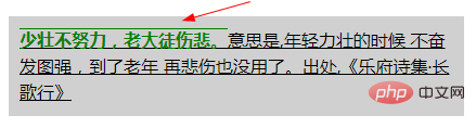
    <p class="textdec">
        <strong>少壮不努力,老大徒伤悲。</strong>意思是,年轻力壮的时候 不奋发图强,到了老年 再悲伤也没用了。出处,《乐府诗集·长歌行》
    </p>
- ① 下划线的 继承性: 由上图可见,子元素
strong设置了 无下划线- 因为父元素 设置了 下划线,子元素
strong这里 仍然 显示下划线,不能取消 从父元素继承的 装饰线,并且装饰线 都是黑色的.
- 因为父元素 设置了 下划线,子元素
- ② 两个 装饰线:
strong {text-decoration: overline;}将导致第二次装饰 出现在“一些强调词”上,而且上划线颜色 是子元素 单独设置的字体颜色.- 可以添加一个装饰线
- 可以在子元素中 再添加一次 装饰线,会变成子元素的颜色.
- 不是父元素的黑色了,变成了子元素的绿色


- 示例2: 同时指定 一段文字的 装饰线的 位置,样式 和 颜色
- css
.decline{
    background-color: #d0d0d0;
    text-decoration:underline wavy #008000;

/*	text-decoration-line: underline;
	text-decoration-style:wavy;
	text-decoration-color: green;*/


}- html
    <p class="decline">
    	<del>纸上得来终觉浅,</del>绝知此事要躬行。
    </p>
text-decoration:underline wavy #008000;属性值 前后顺序 不影响.

8.1 text-decoration-line: 文本 装饰线的位置 (上 中 下)
- ⑴ 文本装饰线的 位置:
text-decorator-line设置用于元素中的文本的 装饰类型(即 文本装饰线类型 )。- (如下划线 或上划线)
- 多值: 文本装饰线 位置
text-decorator-line属性 被指定为none、一个或多个 空格 分隔的 值。
- ⑵ 装饰线位置的 语法
text-decoration-line:none | [ underline || overline || line-through || blink ]
/* 单个 关键字值 Single keyword */
text-decoration-line: none;
text-decoration-line: underline;
text-decoration-line: overline;
text-decoration-line: line-through;
text-decoration-line: blink;

/* 多个 关键字值,同时指定几条装饰线 Multiple keywords */
text-decoration-line: underline overline;               /* Two decoration lines */
text-decoration-line: overline underline line-through;  /* Multiple decoration lines */

/* 全局值  Global values */
text-decoration-line: inherit;
text-decoration-line: initial;
text-decoration-line: unset;
- ⑶ 文本装饰线的 属性值
- ① 无装饰线:
none- 没有文本装饰,没有装饰线
- ② 下划线:
underline- 每一行文字 下面 都有一条 装饰线。
- ③ 上划线:
overline- 每行文字 上面 都有一条 装饰线。
- ④ 删除线(贯穿线):
line-through- 每行文字 中间 都有一条 装饰线。
- ⑤ 文本闪烁:
blink(已弃用的 属性值)- 文本闪烁(在可见和不可见之间交替)。符合规范的用户代理可能根本不会闪烁文本。这个值不赞成CSS动画。
- ① 无装饰线:
- ⑷ 装饰线位置的 浏览器支持
- 都不支持
blink的属性值 需要使用 浏览器前缀
- 都不支持

- 示例1: 给一段文字 添加装饰线
- css
.decline{
    background-color: #d0d0d0;
	text-decoration-line: overline;
	/*text-decoration-line: line-through;*/
	/*text-decoration-line: underline;*/
	/*text-decoration-line: blink;*/

}- html
    <p class="decline">
    	纸上得来终觉浅,绝知此事要躬行。
</p>| 上划线 overline | 删除线(贯穿线) line-through |
|---|---|
 |  |
| 下划线 underline | 闪烁 (无任何效果,blink 属性值浏览器不支持) |
 |  |
8.2 text-decoration-style: 文本 装饰线的 样式
- ⑴ 装饰线的样式:
text-decoration-style - 用于设置由
text-decoration-line设定的 线的样式。- 同一装饰线 不能设置 不同样式:
- 线的样式 会应用到 所有被
text-decoration-line设定的线,不能为 其中的每条线 设置 不同的样式。
- 线的样式 会应用到 所有被
- 语义化的标签:
- 如果 设定的修饰效果 具有特定的语义,例如 删除线, 意味着 某些文本被删除了,开发者 最好使用 有语义的 HTML 标签来表达,比如
<del>或<s>标签 - 因为浏览器 有时可能会 屏蔽某些样式,但语义化的标签 则不会出现这样的问题。
- 如果 设定的修饰效果 具有特定的语义,例如 删除线, 意味着 某些文本被删除了,开发者 最好使用 有语义的 HTML 标签来表达,比如
- 简写属性: 当要设置 装饰线的 修饰属性时,用
text-decoration简写属性 会比分别写多个属性 更方便。
- 同一装饰线 不能设置 不同样式:
- ⑵ 装饰线样式的 语法
text-decoration-style:solid | double | dotted | dashed | wavy
/* 关键字值 Keyword values */
text-decoration-style: solid;
text-decoration-style: double;
text-decoration-style: dotted;
text-decoration-style: dashed;
text-decoration-style: wavy;

/* 全局值 Global values */
text-decoration-style: inherit;
text-decoration-style: initial;
text-decoration-style: unset;
- ⑶ 装饰线样式的 属性值
- 实线:
solid- 画一条实线。
- 双实线:
double- 画一条双实线。
- 点虚线:
dotted- 画一条点划线。
- 虚线:
dashed- 画一条虚线。
- 波浪线:
wavy, 美 /ˈweɪvi/- 画一条波浪线。
- 不画线:
-moz-none(尚未标准化)- 不画线。亦可用
text-decoration-line: none替代。
- 不画线。亦可用
- 实线:
- ⑷ 装饰线样式的 浏览器支持
IE 不支持, 其他浏览器 需要 浏览器前缀

- 示例1: 给一段文字添加 不同的装饰线样式
- css
.decline{
    background-color: #d0d0d0;
	text-decoration-line: underline;
	text-decoration-style:double;
	/*text-decoration-style:dotted;*/
	/*text-decoration-style:dashed;*/
	/*text-decoration-style:wavy;*/

}| 双实线 double | 点虚线 dotted |
|---|---|
 |  |
| 直虚线 dashed | 波浪线 wavy |
 |  |
8.3 text-decoration-color: 文本 装饰线的 颜色
- ⑴ 文本装饰线的 颜色:
text-decoration-color- 用于设置 文本修饰线的 颜色。
- 应用范围: 被指定的颜色 会作用到 该属性值 有效范围内的 所有装饰线上。
- 设置 不同装饰线 不同颜色的方法
- 没有直接的机制 为每种线型 指定唯一的颜色,不过可以通过 嵌套元素的方法 来实现这种效果
- 用
text-decoration-line属性 为每个元素 应用一种线型,再用text-decoration-color指定线的颜色。
- 用于设置 文本修饰线的 颜色。
- ⑵ 装饰线颜色的 语法和属性值
text-decoration-color:<rgb()> | <rgba()> | <hsl()> | <hsla()> | <hex-color> | <named-color> | currentcolor | <deprecated-system-color>- 合法颜色值 都可以使用.
- 示例1: 给一段文字 添加不同颜色的 装饰线
- css
.decline{
    background-color: #d0d0d0;
	text-decoration-line: underline;
	text-decoration-style:wavy;
	text-decoration-color: green;


}

.decline del{
	text-decoration-line: line-through;
	text-decoration-color:red;


}- html
    <p class="decline">
    	<del>纸上得来终觉浅,</del>绝知此事要躬行。
    </p>
9. CSS3 text-emphasis 属性: 添加 文本强调符号
- ⑴ 给文本 添加强调符号:
text-emphasis美 ['ɛmfəsɪs] , 强调将强调标记 应用于文本(空格 和 控制字符除外)。
简写属性
text-emphasis:- 在一个声明中 同时设置 文本强调的样式和颜色
text-emphasis-style和text-emphasis-color。- 所以, 文本强调
text-emphasis不会重置text-emphasis-position位置 的值
- 所以, 文本强调
- ⑵ 强调符号的大小
- 和 ruby 符号一样,强调符号的大小 大约是 字体大小的
50%. - 影响行高: 当前的行距 不足以显示 强调符号时,文本强调
text-emphasis可能会 影响行高。
- 和 ruby 符号一样,强调符号的大小 大约是 字体大小的
- ⑶ 文本强调适合的 字体
- Adobe 的 “
Kenten Generic OpenType Font” 是一个适合 强调标记的字体 - 它专门为 强调标记设计。
- Adobe 的 “
- ⑷ 文本强调的语法
text-emphasis: <'text-emphasis-style'> || <'text-emphasis-color'>;
/* 初始值 Initial value */
text-emphasis: none; /* No emphasis marks */

/* 字符串值 <string> value */
text-emphasis: 'x';
text-emphasis: '点';
text-emphasis: '\25B2';
text-emphasis: '*' #555;
text-emphasis: 'foo'; /* 不应使用。它可以仅被计算为“f” 或呈现为“f” Should NOT use. It may be computed to or rendered as 'f' only */

/* 关键字值 Keywords value */
text-emphasis: filled;
text-emphasis: open;
text-emphasis: filled sesame;
text-emphasis: open sesame;

/* 关键词值 与 颜色 相结合 Keywords value combined with a color */
text-emphasis: filled sesame #555;

/* 全局值 Global values */
text-emphasis: inherit;
text-emphasis: initial;
text-emphasis: unset;
- ⑸ 文本强调
text-emphasis的属性值- 没有强调符号:
none- 没有 文本强调符号.
- Ⅰ. 空心实心
- ① 实心的(填充纯色):
filled- 形状填充了纯色. 既没有
filled,也没有open时,这是默认值.
- 形状填充了纯色. 既没有
- ② 空心的:
open- 形状是 空心的。
- ① 实心的(填充纯色):
- Ⅱ. 强调符号的形状
- ① 小点/小圆圈:
dot- 显示 小圆圈 作为标记。
- 实心点
filled dot:•(U+2022) - 空心点 :
◦(U+25E6).
- 实心点
- 显示 小圆圈 作为标记。
- ② 大点/大圆圈:
circle- 显示 大圆圈 作为标记。
- 实心圆圈:
●(U+25CF) - 空心圆圈:
○(U+25CB). - 这是 水平书写模式下的 默认形状.
- ③ 实心/空心 双圆圈:
double-circle- 显示 双圆圈 作为标记。
- 实心双圆圈
◉(U+25C9), - 空心双圆圈:
◎(U+25CE).
- 实心双圆圈
- 显示 双圆圈 作为标记。
- ④ 实心/空心 三角形:
triangle- 将 三角形 显示为标记。
- 实心三角形:
▲(U+25B2) - 空心三角形:
△(U+25B3).
- 实心三角形:
- 将 三角形 显示为标记。
- ⑤ 芝麻符号:
sesame- 将 芝麻样式 显示为标记。
- (类似 顿号的样式,像是芝麻的种子, 没找到正规表达方式,简记 芝麻符号)
- 实心芝麻符号:
﹅(U+FE45), - 空心芝麻符号:
﹆(U+FE46).
- 实心芝麻符号:
- (类似 顿号的样式,像是芝麻的种子, 没找到正规表达方式,简记 芝麻符号)
- 这是在 没有其他形状的情况下,垂直书写模式的 默认形状.
- 将 芝麻样式 显示为标记。
- ⑥ 指定 字符串:
<string>- 将 给定的字符串 显示为标记。
- 仅限一个字符: 不应该在
<string>中 指定一个以上的字符. - 用户代理 可以截断或忽略 由多个字符 组成的字串。
- ① 小点/小圆圈:
- Ⅲ. 颜色:
<color>- 定义 强调符号的颜色。
- 如果没有颜色,则默认为
currentColor。
- 没有强调符号:
- ⑹ 文本强调
text-emphasis和 文本装饰线text-decoration的区别text-decoration文本装饰线 属性 不会继承,并且指定的装饰线 将应用于整个元素。text-emphasis文本强调 会继承,这意味着 可以为后代 更改强调标记。
- ⑺ 文本强调的 浏览器支持
需要浏览器前缀

示例 1: 给一段文字 添加文本强调符号
css
.textemphasis{
    width: 35%;
    /*background-color: #d0d0d0;*/
    padding: 10px;
    border: solid black 2px;
    font-size: 1.2em;
}
.textemphasis strong{
	-webkit-text-emphasis-position:under;
	-webkit-text-emphasis:dot;
	-webkit-text-emphasis:open dot;
	/*-webkit-text-emphasis:circle;*/
	/*-webkit-text-emphasis:open circle;*/
	/*-webkit-text-emphasis:double-circle;*/
	/*-webkit-text-emphasis:open double-circle;*/
	/*-webkit-text-emphasis:triangle;*/
	/*-webkit-text-emphasis:open triangle;*/
	/*-webkit-text-emphasis:sesame;*/
	/*-webkit-text-emphasis:open sesame;*/

	/*指定字符串 作为文本强调的符号*/
	/*-webkit-text-emphasis:"z";*/
	/*-webkit-text-emphasis:"x";*/
	/*-webkit-text-emphasis:"大";*/

    /*同时设置 空心/实心/强调符号/颜色*/
	/*-webkit-text-emphasis: circle open;*/
	/*-webkit-text-emphasis: circle open red;*/


}- html
        <p class="textemphasis">
        	<strong>取其精华,去其糟粕。</strong>是一个汉语成语,读音qǔ qí jīng huá qù qí zāo pò意思是吸取事物中最好的东西,舍弃事物中坏的,无用的东西。
</p>| 小点: dot = filled dot | 小圆圈: open dot |
|---|---|
 |  |
| 大点: circle | 大圆圈: open circle |
 |  |
| 实心 双圆圈: double-circle | 空心 双圆圈: open double-circle |
 |  |
| 实心 三角形: triangle | 空心 三角形: open triangle |
 |  |
| 实心 芝麻符: sesame | 空心 芝麻符: open sesame |
 |  |
| 指定为 英文字符: "z" | 指定为 汉字: "大" |
 |  |
| 默认 颜色/位置:circle | 指定 颜色/位置: circle open red |
 |  |
① 默认的位置: 汉语中,不指定位置,文本强调符号的位置 默认 在上方
② 默认: 实心的.
③ 指定字符 不能指定空心/实心:
- 无效值:
-webkit-text-emphasis:open "z";,会直接跳过.
- 无效值:
视觉效果的 区别: 文本小的时候,有些 相同 文本强调符号 区别看起来不明显.
9.1 text-emphasis-style 属性: 文本强调符号的 样式/形状
- ⑴ 文本强调符号的 样式/形状:
text-emphasis-style- 属性 设置 强调标记的外观/形状。
- 设置和重置: 还可以使用 文本强调的简写
text-emphasis来 设置和重置。
- ⑵ 文本强调 形状样式的 语法
text-emphasis-style:none | [ [ filled | open ] || [ dot | circle | double-circle | triangle | sesame ] ] | <string>;
/* 初始值 Initial value */
text-emphasis-style: none; /* 没有强调符号 No emphasis marks */

/*  值 value */
text-emphasis-style: 'x';
text-emphasis-style: '点';
text-emphasis-style: '\25B2';
text-emphasis-style: '*';
text-emphasis-style: 'foo'; /* 不应使用。它可以仅被计算为“f”或呈现为“f” Should NOT use. It may be computed to or rendered as 'f' only */

/* 关键字值 Keywords value */
text-emphasis-style: filled;
text-emphasis-style: open;
text-emphasis-style: filled sesame;
text-emphasis-style: open sesame;

/* 全局值  Global values */
text-emphasis-style: inherit;
text-emphasis-style: initial;
text-emphasis-style: unset;
⑶ 文本强调 形状样式的 属性值**
- Ⅰ. 空心实心
- ① 实心的(填充纯色):
filled- 形状填充了纯色. 既没有
filled,也没有open时,这是默认值.
- 形状填充了纯色. 既没有
- ② 空心的:
open- 形状是 空心的。
- ① 实心的(填充纯色):
- Ⅱ. 强调符号的形状
- ① 小点/小圆圈:
dot- 显示 小圆圈 作为标记。
- 实心点
filled dot:•(U+2022) - 空心点 :
◦(U+25E6).
- 实心点
- 显示 小圆圈 作为标记。
- ② 大点/大圆圈:
circle- 显示 大圆圈 作为标记。
- 实心圆圈:
●(U+25CF) - 空心圆圈:
○(U+25CB). - 这是 水平书写模式下的 默认形状.
- ③ 实心/空心 双圆圈:
double-circle- 显示 双圆圈 作为标记。
- 实心双圆圈
◉(U+25C9), - 空心双圆圈:
◎(U+25CE).
- 实心双圆圈
- 显示 双圆圈 作为标记。
- ④ 实心/空心 三角形:
triangle- 将 三角形 显示为标记。
- 实心三角形:
▲(U+25B2) - 空心三角形:
△(U+25B3).
- 实心三角形:
- 将 三角形 显示为标记。
- ⑤ 芝麻符号:
sesame- 将 芝麻样式 显示为标记。
- (类似 顿号的样式,像是芝麻的种子, 没找到正规表达方式,简记 芝麻符号)
- 实心芝麻符号:
﹅(U+FE45), - 空心芝麻符号:
﹆(U+FE46).
- 实心芝麻符号:
- (类似 顿号的样式,像是芝麻的种子, 没找到正规表达方式,简记 芝麻符号)
- 这是在 没有其他形状的情况下,垂直书写模式的 默认形状.
- 将 芝麻样式 显示为标记。
- ⑥ 指定 字符串:
<string>- 将 给定的字符串 显示为标记。
- 仅限一个字符: 不应该在
<string>中 指定一个以上的字符. - 用户代理 可以截断或忽略 由多个字符 组成的字串。
- ① 小点/小圆圈:
- Ⅰ. 空心实心
- ⑷ 文本强调符号的形状的 浏览器支持
需要使用 浏览器前缀

9.2 text-emphasis-color 属性: 文本强调符号的 颜色
- ⑴ 文本强调符号的 颜色:
text-emphasis-color- 属性 设置 强调标记的颜色。
- 还可以使用文本强调简写
text-emphasis设置此值。
- ⑵ 文本强调符号的 颜色的 语法
text-emphasis-color: <rgb()> | <rgba()> | <hsl()> | <hsla()> | <hex-color> | <named-color> | currentcolor | <deprecated-system-color>;
/* 初始值 Initial value */
text-emphasis-color: currentColor;

/* 合法颜色值 <color> */
text-emphasis-color: #555;
text-emphasis-color: blue;
text-emphasis-color: rgba(90, 200, 160, 0.8);
text-emphasis-color: transparent;

/* 全局值 Global values */
text-emphasis-color: inherit;
text-emphasis-color: initial;
text-emphasis-color: unset;
- ⑶ 文本强调符号的颜色的 浏览器支持
需要 浏览器前缀

9.3 text-emphasis-position: 文本强调符号的 位置
- ⑴ 文本强调符号的 位置:
text-emphasis-position- 属性 设置 强调符号的位置。
- 影响行高: 像 ruby 文本一样,如果 没有足够的空间 放置强调标记,行高就会增加。
- ⑵ 文本强调符号的 位置的 语法
text-emphasis-position: [ over | under ] && [ right | left ];
/* 初始值 Initial value */
text-emphasis-position: over right;

/* 关键字值 Keywords value */
text-emphasis-position: over left;
text-emphasis-position: under right;
text-emphasis-position: under left;

text-emphasis-position: left over;
text-emphasis-position: right under;
text-emphasis-position: left under;

/* 全局值 Global values */
text-emphasis-position: inherit;
text-emphasis-position: initial;
text-emphasis-position: unset;
- ⑶ 文本强调符号的位置的 属性值
- 针对 不同的书写模式,设置上下,或左右.
- ① 上方:
over- 在水平书写模式下, 在文本上方 画上标记。
- ② 下方:
under- 在水平书写模式下,在文字下方 画上记号。
- ③ 右边:
right- 在垂直书写模式下,在文本右侧 绘制标记。
- ④ 左边:
left- 在垂直书写模式下,在文本的左侧 绘制标记。
- ⑷ 文本强调标记/符号的 首选位置
- 文本强调标记的首选位置 取决于语言。
- 日语中,偏向于 右方,上方
- 汉语中,偏向于 右方,下方
- 几种语言的 文本强调符号的 偏向位置.
| 语言 | 文本强调符号的首选位置 | ||||
|---|---|---|---|---|---|
| 水平 书写模式 | 垂直 书写模式 | ||||
| ① 日语 | 上方 over |  | 右边 right |  | |
| ② 韩语 | |||||
| ③ 蒙古语 | |||||
| ④ 汉语 | 下方 under |  | 右边 right | ||
- ⑸ 文本强调标记/符号的位置的 浏览器支持
需要 浏览器前缀

10. text-indent 属性: (块元素 首行) 文本的 缩进量 (空白长度)
- ⑴ 块元素 首行文本前面的缩进量(空白长度):
text-indent, 美 /ɪn’dɛnt/- 定义 一个块元素 首行文本内容之前的 缩进量。
- 设置 文本块中 首行文本的缩进。
- 属性设置 块中的 第一个内容行的 空白空间长度(缩进)。
- 常用于 建立 一个 “标签页”效果。
- ⑵ 文本缩进的 语法
text-indent:length|%|inherit;
/* 长度值 <length> values */
text-indent: 3mm;
text-indent: 40px;

/* 百分比值 相对于 包含自身的元素的 宽度 <percentage> value
   relative to the containing block width */
text-indent: 15%;

/* 关键字值 目前尚未标准化 不要使用 Keyword values */
text-indent: 5em each-line;
text-indent: 5em hanging;
text-indent: 5em hanging each-line;

/* 全局值 Global values */
text-indent: inherit;
text-indent: initial;
text-indent: unset;
- ⑶ 文本缩进的 属性值: 装饰线的 颜色
- ① 长度值:
length- 使用固定的
<length>长度值 来指定 文本的缩进。- 定义 固定的缩进。
- 允许使用 负值。
- 默认值:
0。
- 使用固定的
- ② 父元素宽度 百分比值:
%- 基于 父元素的宽度 的百分比的 缩进。
- ③ 继承父亲:
inherit- 继承属性值
- 从父元素 继承
text-indent属性的值。
- ④ 缩进每一行:
each-line(实验中属性,尚未标准化)- 文本缩进 会影响第一行,以及使用
<br>强制断行后的 第一行。
- 文本缩进 会影响第一行,以及使用
- ⑤ 反转缩进(类似 悬挂效果):
hanging(实验中属性,尚未标准化)- 该值会对所有的行 进行反转缩进:除了第一行之外的所有的行 都会被缩进,看起来就像第一行 设置了一个负的缩进值。
- ① 长度值:
- ⑷ 文本缩进的 负值
- 允许使用负值。
- 悬挂缩进: 如果使用负值,那么首行 会被缩进到 左边。
- 允许指定 负值,这会产生一种“悬挂缩进”的效果。
⑸ 文本缩进的 浏览器支持

- 示例1: 对一段文字 进行文本缩进
- css
.textindent {
    width: 40%;
    background-color: #d0d0d0;
    padding: 10px;

    /*设置文本缩进*/
    text-indent: 50px;
/*  text-indent: 3em;
    text-indent: -2em;
    text-indent: 10%;*/

}- html
    <p class="textindent">
    	“<strong>勿以恶小而为之,勿以善小而不为。</strong>惟贤惟德,能服于人。” 劝人要进德修业,有所作为。不要因为好事小 而不做,更不能因为坏事小 而去做。小善积多了,就成为利天下的大善,而小恶积多了则 “足以乱国家”。
    </p>
文本不设置缩进时的 默认样式

| 绝对值缩进 50px | 相对值缩进 3em |
|---|---|
 |  |
| 负值缩进 (悬挂缩进) -2em | 百分比缩进 10% |
 |  |
11. CSS3 text-outline 属性: 文本轮廓 (浏览器 都不支持)
- ⑴ 文本轮廓的 浏览器支持
- 目前主流浏览器 都不支持
text-outline属性。- 设置文本轮廓。
text-outline属性- 文本轮廓属性
- 设置文本轮廓。
- 目前主流浏览器 都不支持
- ⑵ 文本轮廓的 语法
text-outline: thickness blur color;
- ⑶ 文本轮廓的 属性值
- ① 粗细。
- thickness
- 必需。
- 轮廓的粗细。
- ② 模糊半径。
- blur
- 可选。轮廓的模糊半径。
- ③ 颜色。
- color
- 必需。轮廓的颜色。
- ① 粗细。
12. CSS3 text-overflow 属性: 隐藏文本溢出时 的显示 (搭配 overflow,white-space,display 属性)
- ⑴ 文本溢出时的 显示:
text-overflow- 当文本溢出 容器时,溢出的内容 怎么显示。
可以 剪切它、显示省略号(’…’)或显示 自定义字符串。
- 当文本溢出 容器时,溢出的内容 怎么显示。

- ⑵ 文本溢出显示
text-overflow属性的适用对象- 块级元素的内容: 只对那些 在块级元素中 溢出的内容 有效
- 方向: 且 溢出的内容 必须要 与块级元素 内联(inline)方向一致,即 行尾(行的 左端/右端)的溢出行为
- (如:内容在盒子的 下方溢出。此时就 不会生效)。
- 块级元素的内容: 只对那些 在块级元素中 溢出的内容 有效
- ⑶ 文本溢出显示
text-overflow和 文本溢出 的关系- 文本溢出属性 不会 强制 文本溢出 的发生。
- 文本溢出 搭配的属性:
- 要使 文本溢出 它的容器,必须设置 搭配 其他的 CSS属性:溢出和空白
overflow,white-space,如 ↓
- 要使 文本溢出 它的容器,必须设置 搭配 其他的 CSS属性:溢出和空白
overflow: hidden;white-space: nowrap;
- ⑷ 文本溢出的 情况:
- 当其因为某种原因 而无法换行(例子:设置了
white-space:nowrap) - 一个单词 因为太长 而不能合理地被安置(fit)。
- 当其因为某种原因 而无法换行(例子:设置了
- ⑸ 文本溢出的 语法
text-overflow: [ clip | ellipsis | <string> ]{1,2};
/* 行尾的 溢出行为  Overflow behavior at line end
   Right end if ltr, left end if rtl */
text-overflow: clip;
text-overflow: ellipsis;
text-overflow: "…";
text-overflow: fade;
text-overflow: fade(10px);
text-overflow: fade(5%);

/* 溢出 在左端|在右端的行为 ,方向性 没有影响 Overflow behavior at left end | at right end
   Directionality has no influence */
text-overflow: clip ellipsis;
text-overflow: "…" "…";
text-overflow: fade clip;
text-overflow: fade(10px) fade(10px);
text-overflow: fade(5%) fade(5%);

/* 全局值 Global values */
text-overflow: inherit;
text-overflow: initial;
text-overflow: unset;
- ⑹ 文本溢出的 属性值
- ① 裁剪 (默认值):
clip- 裁剪文本。
- 文本溢出的 截断位置: 一般在 容器的极限处 进行截断。
- 即 将溢出的文本 裁剪掉, 因此在字符的中间 可能会发生截断。
- 为了能在两个字符过渡处 截断,必须使用 一个空字符串值 (
'')
- ② 省略号:
ellipsis- [ɪ’lɪpsɪs]
- 显示 省略符号 = 被修剪的文本。
- “用一个省略号 (’
…’,U+2026 HORIZONTAL ELLIPSIS)来表示 被截断的文本”。- 减少 显示的文本: 省略号 被添加在 内容区域中,因此 会减少显示的文本。
- 省略号 也可能被截断: 如果空间太小到 连省略号都容纳不下,那么这个省略号 也会被截断。
- ③ 指定 字符串:
string- 使用 给定的字符串 来代表 被修剪的文本。
- 字符串
<string>= 被截断的文本。- 字符串内容 将被添加在 内容区域中,所以会 减少 显示出的文本。
- 如果空间太小到 连字符串 都容纳不下,那么这个字符串 也会被截断。
- ① 裁剪 (默认值):
- 裁剪处 显示空白: 如果想在 裁剪处 显示空白符,可以使用 (
'').
- ⑺ 多值
- 可以使用 1个或 2个值 指定 文本溢出的 属性值。
- 1 个值: 给定一个值
- 它将指定 行尾 的溢出行为
- (从左到右的文本的 右端,从右到左的文本的 左端)。
- 2 个值: 给定两个值
- 第一个: 指定 行左端 溢出行为
- 第二个: 指定 行右端 溢出行为。
- 每个值 被指定为:
- 其中一个关键字值:
clip,ellipsis,fade - 字符串
<string>. fade()函数
- 其中一个关键字值:
- ⑻
overflow和text-overflow的区别- ①
overflow- 针对 所有数据: 是针对容器内 所有的数据 溢出的 统一处理方式,
- 容器内的存储的是 文本/图片, 还是其他的数据 统一取值;
hidden隐藏scroll滚动条显示visible溢出显示
- 容器内的存储的是 文本/图片, 还是其他的数据 统一取值;
- 针对 所有数据: 是针对容器内 所有的数据 溢出的 统一处理方式,
- ②
text-overflow- 针对 溢出的文本: 是专门针对 盒子内的 文本溢出 时的处理方式
- 搭配属性: 必须设置
overflow:hidden,只有这样text-overflow才有效 text-overflow的属性值 是建立在 有隐藏的溢出内容 的基础上- 显示在容器内: 隐藏的溢出内容的 替代符号 都是在容器内显示的,作为文本内容的一部分
- ①
- ⑼ 使用注意事项
- 当设置了 文本溢出显示,却没有效果时 ,要注意 搭配下方的属性
width: 100%;  /*也可以是固定值、min-width这些*/
white-space: nowrap;  /*强制文本不能换行*/
overflow: hidden;  /*隐藏溢出内容*/
text-overflow: ellipsis;
- 必须是块元素:
- 如果是
<a>、<span>这种 行内元素,必须加上display: block成为块元素- 行内元素的默认宽度 就是文字的宽度 且无法设置
width.
- 行内元素的默认宽度 就是文字的宽度 且无法设置
- 如果是
- ⑽ 文本溢出显示的 浏览器支持
- 需要 浏览器前缀
- IE 8 提供了带有 浏览器前缀的版本,
-ms-text-overflow,和text-overflow作用相同。但是并不推荐这样使用。 - Opera 9 和 10 要求带有 浏览器前缀
-o-text-overflow。
- IE 8 提供了带有 浏览器前缀的版本,
倒数四个 都是实验中属性,支持度也很差
- 需要 浏览器前缀

- 示例1: 给一段文字 设置溢出 和 溢出时的显示
- css
.textjoverflow{
    width: 30%;
    background-color: #d0d0d0;
    padding: 10px;
    border: solid black 2px;
    font-size: 1.2em;

    /*设置不换行,才会有文本溢出*/
    white-space: nowrap;
    /*设置 overflow 溢出隐藏,文本溢出显示 才有效*/
    overflow: hidden;
    text-overflow: clip;
    /*text-overflow: ellipsis;*/
    /*目前不支持 指定字符串 所以此值无效*/
    /*text-overflow: "";*/

    /*direction: rtl;*/
}- html
<p class="textjoverflow">金无足赤,人无完人。“黄金无足色,白璧有微瑕。求人不求备,妾愿老君家。” <br />No one is perfect, everyone will make mistakes.</p>
| 默认显示 | 不允许换行时的 默认溢出显示 |
|---|---|
 |  |
| 溢出文本 被隐藏 overflow: hidden; | 隐藏的溢出文本 被裁剪 (默认值) text-overflow: clip; |
 |  |
| 隐藏的溢出文本 = 省略号 text-overflow: ellipsis; | 文本流向 从右向左 direction: rtl; (行尾溢出) |
 |  |
- 让文本溢出时的显示
text-overflow有效的 前提- ① 必须是 块元素的 文本内容:
display: block,行内元素不可以 - ② 必须 有文本溢出,比如,设置不换行:
white-space: nowrap; - ③ 溢出的文本,必须是 隐藏的:
overflow: hidden; - → 最后 设置 隐藏的溢出文本的 显示 :
text-overflow才会有效.
- ① 必须是 块元素的 文本内容:
13. text-transform 属性: 文本 大小写转换
- ⑴ 文本 大小写 转换:
text-transform, 美 /trænsˈfɔːrm/- 控制 文本的大小写。
- 它可以用于 使文本显示为 全大写 或 全小写,也可单独 对每一个单词 进行操作。
- 控制 文本的大小写。
- ⑵ 特定语言的映射
text-transform属性考虑到 特定于语言的 案例映射规则,如以下所示:- 在土耳其语言中
- 特定词汇的 2 种
i: Turkish (tr), Azerbaijani (az), Crimean Tatar (crh), Volga Tatar (tt), and Bashkir (ba),有两种i,带点和不带点,两个大小写配对i/İ和ı/I.
- 特定词汇的 2 种
- 在德语中
- German (de),
ß的大写 变成SS
- German (de),
- 在荷兰语中
- Dutch (nl),
ij变成IJ,即使只设置 首字母大写text-transform: capitalize
- Dutch (nl),
- 在希腊语中
- Greek (el),当整个单词 都是大写时,元音就 失去了它们的重音
ά/Α, (ή/Ή除外). - 同样,在第一个元音上 有重音的双元音 会失去重音,而在第二个元音上 有重音
άι/ΑΪ
- Greek (el),当整个单词 都是大写时,元音就 失去了它们的重音
- 在爱尔兰语中
- Irish (ga),小写字母sigma 有两种形式:
σandς ς仅在西格玛 终止一个单词时使用- 大写西格玛
Σ转化成 小写西格玛时text-transform: lowercase,浏览器 需要根据上下文 选择正确的小写形式。
- Irish (ga),小写字母sigma 有两种形式:
- 在土耳其语言中
- ⑶ 文本大小写转换的 语法
text-transform:none|capitalize|uppercase|lowercase|inherit;
/* 关键字值 Keyword values */
text-transform: none;
text-transform: capitalize;
text-transform: uppercase;
text-transform: lowercase;
text-transform: full-width;
text-transform: full-size-kana;

/* 全局值 Global values */
text-transform: inherit;
text-transform: initial;
text-transform: unset;
- ⑷ 文本大小写转换的 属性值
- 关键点:不转换、首字母大写(每个单词)、全部大写、全部小写、继承。
- ① 不转换大小写 (默认值):
none- 不转换文本的大小写。
- 这个关键字 阻止所有字符的大小写 被转换。
- 字符 保持不变(它们保留 元素文本中 写入的原始大小写)。
- 不转换文本的大小写。
- ② 首字母大写:
capitalize- 美 /ˈkæpɪtəlaɪz/
- 文本中的 每个单词 以大写字母开头。
- 将每个单词的第一个字母 转换为大写的关键字。
- 首字母之外的 原始大小写: 其他字符 保持不变(它们保留 元素文本中 写入的原始大小写)。
- 被忽略的 开头符号: 字母是Unicode字符集 或者 数字里定义的字符 ;因此单词开头的 任何标点符号或者特殊符号 将会被忽略。
- ③ 全大写:
uppercase- 美 /'ʌpɚ,kes/
- 仅有 大写字母。
- 这个关键字 强制所有字符 被转换为大写。
- ④ 全小写:
lowercase- 美 /'loɚ,kes/
- 无大写字母,仅有小写字母。
- 这个关键字 强制所有字符 被转换为小写。
- ⑤ 继承父亲:
inherit- 从父元素继承
text-transform属性的值。
- 从父元素继承
- ① 不转换大小写 (默认值):
- 关键点:不转换、首字母大写(每个单词)、全部大写、全部小写、继承。
- ⑸ 连字符单词的 首字母大写
- 随浏览器而改变
- 例如,文本 “
w3-school” 可以用两种方式显示:- “
W3-school” 和 “W3-School”。
- “
- CSS 并没有规定 哪一种是正确的,所以这两种 都是可以的。
- 示例1: 将一段文字,进行大小写转换
- css
.texttransform{
    width: 35%;
    background-color: #d0d0d0;
    padding: 10px;
    font-weight: bold;
    font-size: 1.2em;

    /*改变文本的大小写*/
    /*text-transform:capitalize;*/
    /*text-transform:uppercase;*/
    /*text-transform:lowercase;*/
}- html
<p class="texttransform">金无足赤,人无完人。<br />No one is perfect, everyone will make mistakes.</p>
| 默认样式 | 首字母大写 capitalize |
|---|---|
 |  |
| 全大写 uppercase | 全小写 lowercase |
 |  |
14. CSS3 text-shadow 属性: 文本的阴影 (含 装饰线 text-decoration)
- ⑴ 文本的阴影:
text-shadow- 为 文字 和 文本装饰线
text-decoration添加阴影 
- 为 文字 和 文本装饰线

- ⑵ 文本阴影的语法
text-shadow:h-shadow v-shadow blur color;
/* x 偏移量 offset-x | y 偏移量 offset-y | 模糊半径 blur-radius | 颜色 color */
text-shadow: 1px 1px 2px black;

/* color | offset-x | offset-y | blur-radius */
text-shadow: #fc0 1px 0 10px;

/* offset-x | offset-y | color */
text-shadow: 5px 5px #558abb;

/* color | offset-x | offset-y */
text-shadow: white 2px 5px;

/* offset-x | offset-y
/* 使用默认的 颜色和模糊半径 */
text-shadow: 5px 10px;

/* 全局值 Global values */
text-shadow: inherit;
text-shadow: initial;
text-shadow: unset;
- ⑶ 文本阴影的 属性值
正值:右下方,负值:左上方
- 关键点:水平阴影,垂直阴影,模糊距离,阴影颜色
① 水平阴影 偏移量(必需):
h-shadow- 水平阴影的 位置。
- 允许负值。
- 这些长度值 指定阴影 相对文字的 偏移量。
<offset-x>指定 水平偏移量- 负值: 若是 负值则 阴影位于 文字左边。
- 允许负值。
- 水平阴影的 位置。
② 垂直阴影 偏移量( 必需):
v-shadow- 垂直阴影的 位置。
- 允许负值。
<offset-y>指定 垂直偏移量- 负值: 若是负值 则阴影位于文字上面。
- 如果水平和垂直偏移量 均为
0,则 阴影位于文字 正后方
- 允许负值。
- 垂直阴影的 位置。
③ 模糊距离:
blur- 可选。模糊的距离。
- 这是 长度值
<length>值。- 默认值: 如果没有指定,则默认为
0。 - 值越大,模糊半径 越大,阴影也就 越大越淡(wider and lighter)。
- 默认值: 如果没有指定,则默认为
④ 阴影颜色:
color- 可选。阴影的颜色。
- 阴影颜色的位置: 可以在 偏移量之前 或之后指定。
- 如果 没有指定颜色,则使用
UA(用户代理)自行选择的颜色。 - 如果想确保 跨浏览器的一致性,请明确地 指定一种颜色.
- 如果 没有指定颜色,则使用
- ⑷ 多个阴影: 可以设置 多个阴影
- 用 逗号
,分隔 的 阴影列表 - 每个阴影的 组成
- 由元素 在 X和Y方向的 偏移量、模糊半径 和 颜色值 组成。
- 省略的长度:
0。
- 每个阴影的 属性值
- 长度值+颜色值: 有两个或三个 长度值 和 一个可选的 颜色值 进行规定。
- ① 前两个 长度
<length>参数- 是以“文字中心”为原点的 坐标轴
- x轴 偏移量
<offset-x> - y轴 偏移量
<offset-y>的值;
- ② 如果有第三个 长度值
<length>参数- 则第三个数值 为形成阴影效果的 半径的数值
<blur-radius>。
- 则第三个数值 为形成阴影效果的 半径的数值
- ① 前两个 长度
- 长度值+颜色值: 有两个或三个 长度值 和 一个可选的 颜色值 进行规定。
- 用 逗号
⑸ 阴影 应用顺序: 当所给的阴影 大于 1 个时,阴影应用的顺序 为 从前到后
- 第一个指定的阴影: 在顶部.
⑹ 文本阴影 适用的伪元素:
- 这个属性 同时适用于
::first-line以及::first-letter伪元素.
- 这个属性 同时适用于
- ⑺ 文本的阴影的 浏览器支持
- 出于 性能考虑,Opera 最多支持
6-9个文本阴影。模糊半径 限制为100px。 - 如果
<color>值 未指定,那么 Firefox 将使用元素的color属性值。 IE 10 才开始支持
- 出于 性能考虑,Opera 最多支持

- 示例1: 给一段文字设置 文本的阴影
- css
.textshadow{
    width: 40%;
    background-color: #d0d0d0;
    padding: 10px;
    font-weight: bold;
    font-size: 1.5em;

    text-shadow:3px 3px green ;
}- html
<p class="textshadow">海纳百川,有容乃大;壁立千仞,无欲则刚。</p>
| 设置 水平和垂直阴影 text-shadow:3px 3px; | 设置指定颜色的 水平和垂直阴影 |
|---|---|
 |  |
| 设置 带模糊距离的 x,y 阴影偏移量 text-shadow:3px 3px 1px green; | 加大模糊半径 text-shadow:3px 3px 10px green; |
 |  |
| x 阴影偏移量 负值 (向左偏移) | y 阴影偏移量 负值 (向上偏移) |
 |  |
- ① 不设置 文本阴影颜色
- 文本阴影颜色 = 文本的颜色
- ② 同时设置: x,y 阴影偏移量 必须同时设置,只设置一个 没效果,没阴影.
- 无效值:
text-shadow:3px green; - 有效值:
text-shadow:3px 3px green;
- 无效值:
- ③ 文本的装饰线 也会出现阴影

15. CSS3 text-wrap 属性: 文本换行 (浏览器 都不支持)
- ⑴ 文本换行的 浏览器支持
- 目前主流浏览器 都不支持
text-wrap属性。- 设置文本的换行规则。
text-wrap属性- 文本换行 属性
- 设置文本的换行规则。
- 目前主流浏览器 都不支持
- ⑵ 文本换行的 语法
text-wrap: normal|none|unrestricted|suppress;
- ⑶ 文本换行的 属性值
- 关键点:允许的换行点 不换行 任意处换行 压缩换行
- ① 允许的换行点。
- normal
- 只在允许的换行点 进行换行。
- ② 不换行。
- none
- 不换行。
- 元素无法容纳的文本 会溢出。
- ③ 任意处换行。
- unrestricted
- 美 [,ʌnrɪ’strɪktɪd]
- 无限制的,自由的。
- 在任意两个字符间 换行。
- ④ 压缩换行。
- suppress
- 美 [sə’prɛs]
- 压缩 元素中的换行。
- 浏览器只在行中 没有其他有效换行点时 进行换行。
16. unicode-bidi 属性: 双向文本的 重写/覆盖 (搭配 direction 属性)
- ⑴ 双向文本的 重写/覆盖
- ① 搭配属性:
unicode-bidi属性和direction属性搭配, 决定 如何处理文档中 的 双向文本 (双向文本 处理)。- 例如,如果一个内容块 同时包含 从左到右 和 从右到左 的文本
- 浏览器使用算法: 那么用户代理 使用复杂的
Unicode统一码算法 来决定 如何显示文本。
- ② 覆盖 浏览器算法:
unicode-bidi属性 覆盖了 这个Unicode统一码算法,允许开发人员 控制文本嵌入。 - ③ 不受
all属性影响:unicode-bidi与direction是仅有的两个 不受all属性 影响的属性。
- ① 搭配属性:
- ⑵ 双向文本重写的 语法
unicode-bidi:normal | embed | isolate | bidi-override | isolate-override | plaintext;
/* 关键字值 Keyword values */
unicode-bidi: normal;
unicode-bidi: embed;
unicode-bidi: isolate;
unicode-bidi: bidi-override;
unicode-bidi: isolate-override;
unicode-bidi: plaintext;
/* 全局值 Global values */
unicode-bidi: inherit;
unicode-bidi: initial;
unicode-bidi: unset;
- ⑶ 双向文本重写
unicode-bidi的 属性值- ① 不嵌入,不覆盖/重写:
normal- 相对于 双向算法:
- 元素不提供 额外的嵌入级别
- 对于内联元素: 隐式重新排序 可以 跨元素边界 进行
- 无嵌入层,不改顺序: 不使用 附加的嵌入层面,原来是什么顺序 就使用什么顺序(默认)
- 相对于 双向算法:
- ② 嵌入,不覆盖/重写:
embed- 内联元素
- 打开与 双向算法相关的 附加嵌入级别。
- 嵌入层的方向: 由方向
direction属性给出。- 有嵌入层,隐式重排序:
direction属性的值 指定嵌入层的方向,在对象内部 进行 隐式 重排序
- 有嵌入层,隐式重排序:
- 内联元素
- ③ 按照方向 严格覆盖/重写:
bidi-override- 内联元素
- 将创建一个覆盖
- 块容器元素
- 为 不在 另一个块容器元素内 的 内联级 (行内)后代 创建覆盖。
- 即 在元素内部,根据 方向
direction属性 严格 按顺序 重新排序;- 不仅文本的流向 会变化,连相邻文字之间的先后顺序,也会变化.
- 忽略了 双向算法的隐式部分。
- 有嵌入层,严格重排序创建一个 附加的嵌入层面,严格按照
direction属性的值重排序
- 内联元素
- 3个新属性值: 下面的属性值 浏览器支持度 不是很好,需要浏览器前缀
- ④
isolate- 计算元素的容器 方向性: 这个关键字表明,应该在 不考虑元素内容 的情况下 计算元素的容器 方向性。
- 和兄弟元素 隔离:
- 因此,该元素 与它的兄弟元素 隔离。
- 在应用其 双向分辨率算法时,其容器元素 将其视为 一个或多个 图像。
- ⑤
isolate-override- 将
isolation关键字的隔离行为 应用于 周围的内容 - 将
bidi-override关键字的覆盖行为 应用于 内部内容
- 将
- ⑥
plaintext- 使元素的 方向性计算 不考虑它的 父双向状态 或 方向
direction属性的值。 - 方向性 计算: 是使用
Unicode双向算法的P2和P3规则 计算的。 - 允许 显示 已经使用
Unicode双向算法的工具 进行格式化的数据。
- 使元素的 方向性计算 不考虑它的 父双向状态 或 方向
- ① 不嵌入,不覆盖/重写:
- ⑷ 双向文本 重写
unicode-bidi的 浏览器支持最新的 3 个属性值的支持度 不好,要使用前缀

- 示例1: 搭配 方向
direction属性,给一段文字分别设置normal,embed,bidi-override属性值- 文本流向为 从左到右时:
direction: ltr;,分别设置 上方三个值,文字 没有变化. - 文本流向为 从右到左时:
direction: rtl;,分别设置 上方三个值,文字变化 如下:
- 文本流向为 从左到右时:
| 文本流向 左到右时 direction: ltr; | 文本流向 右到左时: direction: rtl; (配 normal 值) |
|---|---|
 |  |
| 嵌入,不重写/覆盖 unicode-bidi: embed; | 嵌入,严格重写/覆盖 unicode-bidi: bidi-override; |
 |  |
17. CSS3 word-break 属性: 单词 换行/断行 位置 (能否 词内断行)
- ⑴ 单词 换行/断行 位置:
word-break属性- 设置 是否在单词内部 进行断点换行。
- 指定了 怎样在 单词内 断行。
- 设置 文本将溢出 其内容框的地方 是否出现 换行符。
- 设置 是否在单词内部 进行断点换行。
- ⑵ 单词换行的 语法
word-break:normal | break-all | keep-all | break-word;
/* 关键字值 Keyword values */
word-break: normal;
word-break: break-all;
word-break: keep-all;
word-break: break-word; /* deprecated 已废弃 */

/* 全局值 Global values */
word-break: inherit;
word-break: initial;
word-break: unset;
- ⑶ 单词换行的 属性值
- ① 浏览器 默认换行:
normal- 使用 浏览器 默认的换行规则。
- 单个单词太长时,也可能会出现文本溢出
- ② 任意处/词内 断行(非中日韩文本):
break-all- 为了防止溢出,应该在 任何两个字符之间 插入断字(不包括中文/日文/韩文文本)。
- 允许 可在单词内 换行。
- 对于
non-CJK(CJK = 指中文/日文/韩文) 文本,可在 任意字符间 断行。
- 为了防止溢出,应该在 任何两个字符之间 插入断字(不包括中文/日文/韩文文本)。
- ③ 不能 词内断行:
keep-all- 只能在 半角空格 或 连字符处 换行。
- 中日韩
CJK文本: 不能随意断行,只能在 断点处,一般是 标点符号的位置断行,句子太长,可能会溢出。- 一个句子太长,可能会溢出容器
- 一个句子太长,可能会溢出容器
- 非中日韩
Non-CJK文本: 表现 同 浏览器默认行为normal。
- 中日韩
- 只能在 半角空格 或 连字符处 换行。
- ④ 单词处 断行:
break-word- 与
word-break: normal和overflow-wrap: anywhere具有相同的效果,而不考虑overflow-wrap属性的 实际值。
- 与
- ① 浏览器 默认换行:


⑷ 单词换行/断行 位置的 浏览器支持

示例1: 给一段文字 设置 单词断行位置
css
.wordbreak{
    width: 30%;
    background-color: #d0d0d0;
    padding: 10px;
    border: solid black 2px;
    font-size: 1.2em;

    /*单词换行处 设置*/
    word-break: normal;
    /*word-break: break-all;*/
    /*word-break: keep-all;*/
    /*word-break: break-word;*/

}- html
<p class="wordbreak">金无足赤,人无完人。出自宋·戴复古《寄兴》:“黄金无足色,白璧有微瑕。求人不求备,妾愿老君家。” 也比喻不能要求一个人没有一点缺点错误,应该严以律己,宽以待人。<br />No one is perfect, everyone will make mistakes,be strict with yourself and lenient toward others.</p>
| 默认显示 = word-break: normal; | 任意处断行(可单词内断行) word-break: break-all; |
|---|---|
 |  |
| 不能单词内断行 (中日韩 不断行) word-break: keep-all; | 单词处断行 = = word-break: normal; |
  |   |
18. CSS3 word-wrap / overflow-wrap 属性: 单词 断行时的 断行位置 (断句/断行 方式)
⑴ 单词 断行时的 断行方式 :
word-wrap属性- 用来说明 当一个 不能被分开的字符串 太长 而不能填充其容器时,
- 防止溢出: 为防止 其溢出,浏览器 是否允许 这样的单词 中断换行。
- 允许 长单词或 URL 地址 换行到下一行。
- 防止溢出: 为防止 其溢出,浏览器 是否允许 这样的单词 中断换行。
- 用来说明 当一个 不能被分开的字符串 太长 而不能填充其容器时,
⑵ 重命名和别名:
- 重命名:
word-wrap属性 原本属于微软的 一个私有属性- 在 CSS3 现在的 文本规范草案中 , 已经被重名为
overflow-wrap。
- 在 CSS3 现在的 文本规范草案中 , 已经被重名为
- 别名:
word-wrap现在被当作overflow-wrap的 “别名”。- 稳定的谷歌 Chrome 和 Opera 浏览器版本 支持这种新语法。
- 优先使用
word-wrap属性名,目前 浏览器支持度更好些.
- 重命名:
- ⑶ 单词 换行/断行方式 语法
word-wrap: normal | break-word | anywhere;
/* 关键字值 Keyword values */
overflow-wrap: normal;
overflow-wrap: break-word;
overflow-wrap: anywhere;

/* 全局值 Global values */
overflow-wrap: inherit;
overflow-wrap: initial;
overflow-wrap: unset;
- ⑷ 单词 换行/断行方式 属性值
- ① 断点处 换行 (默认值):
normal- 只在 允许的断字点 换行
- (浏览器 保持默认处理)。
- 表示 在正常的 单词结束处 换行。
- 可能会出现 文本溢出.
- ② (溢出的)长单词/长中文句子 强制分割:
break-word- 如果行内 没有多余的地方 容纳该单词到结尾,则那些正常的 不能被分割的单词 会被强制 分割换行。
- 切断单词,在单词内部 进行换行。
- 在长单词,长中文句子 或 URL 地址 内部 进行换行。
- 不会出现 文本溢出.
- 切断单词,在单词内部 进行换行。
- 如果行内 没有多余的地方 容纳该单词到结尾,则那些正常的 不能被分割的单词 会被强制 分割换行。
- ③ 任意处断行(防溢出):
anywhere(浏览器支持度 很差,不要使用)- 为了 防止溢出,如果行中 没有其他可接受的断点,则可能在任何点上 中断一个原本不可中断的字符串(如 长单词或URL)。
- 在断点处 没有插入 任何连字符。
- ① 断点处 换行 (默认值):
- ⑸
word-break和word-wrap的 区别 .word单词 的概念- 中文中, 一个字 就相当于一个单词,
- 英文中, 要有一个空格 才将他们分割为 一个单词;
word-break强调的是: 能否 单词内的断句,范围是 全部文本.word-wrap强调的是: 单词内 断句方式,范围是 需要断句的文本.- 长单词 强行断句
- ①
word-wrap:break-word与word-break:break-all共同点:- 都能把 长单词 强行断句
- 都不会出现 长单词/长中文句子的 文本溢出.
- ② 不同点: 会不会 开始一个新行
word-wrap:break-word: 会 先起一个新行 来放置长单词,新的行 还是放不下这个长单词 则会对长单词 进行强制断句;word-break:break-all: 不会 把长单词 放在一个新行里,当这一行 放不下的时候 就直接 强制断句了。
- ①
- ⑹ 浏览器支持
- 使用
word-wrap名称, 比overflow-wrap属性名 浏览器支持度更好 anywhere属性值 不要使用,支持度很差
- 使用

- 示例1: 给一段文字 设置 断行 和 单词断行时的方式
- css
.wordbreak{
    width: 20%;
    background-color: #d0d0d0;
    padding: 10px;
    border: solid black 2px;
    font-size: 1.2em;

    /*单词换行处 设置*/
    /*word-break: normal;*/
    /*word-break: break-all;*/
    /*word-break: keep-all;*/
    /*word-break: break-word;*/


}

.wordwrap{

    /*单词 断行位置*/
	/*word-wrap: normal;*/
    /*word-wrap: break-word;*/

}- html
<p class="wordbreak wordwrap">金无足赤,人无完人。出自宋·戴复古《寄兴》:“黄金无足色,白璧有微瑕。求人不求备,妾愿老君家。” 也比喻不能要求一个人没有一点缺点错误,应该严以律己,宽以待人。<br /> No one is perfect, everyone will make mistakes,be strict with yourself and lenient toward others.Nooneisperfecteveryonewillmakemistakes</p>
- 默认显示 =
word-break: normal;=word-wrap: normal;

| 可词内断行 word-break: break-all; | 长单词 强制断行 word-wrap: break-word; |
|---|---|
 |  |
| 不允许 词内断行 word-break: keep-all; | 同时设置 不允许 词内断行 word-break: keep-all; 和 强制长单词 断行 word-wrap: break-word; |
 |  |
- ① 同时设置 词内断行
word-break: break-all;和 长单词 强制断行word-wrap: break-word;- 显示效果 是词内断行的效果,因为 范围是全文,包含了长单词断行,而且,该断行的 都断行/换行了,不需要 再进行 长单词 强制断行设置了.
- ② 同时设置 不允许 词内断行
word-break: keep-all;和 强制长单词 断行word-wrap: break-word;- 两个效果都有,因为 不允许词内断行,可能会 造成文本溢出,有需要进行 长单词强制断行的地方
19. word-spacing 属性: 单词/字 之间的 距离
- ⑴ 单词之间的距离:
word-spacing属性- 增加或减少 单词之间的 空白/间隔距离(即 字间隔)。
- 汉字: 汉字之间没有空格的时候 不受影响,有空格 会受影响.
- 设置元素中 字之间 插入多少空白符。
- 设置 单词之间 和 标签之间 的 空间长度。
- “字” 的定义: 为 由 空白符包围的 一个字符串。
- 设置 单词之间 和 标签之间 的 空间长度。
- 增加或减少 单词之间的 空白/间隔距离(即 字间隔)。
- ⑵ 单词/字间距的 语法
word-spacing:normal|<length> | <percentage>|inherit;
/* 关键字值 Keyword value */
word-spacing: normal;

/* 长度值 <length> values */
word-spacing: 3px;
word-spacing: 0.3em;

/* 百分比值 <percentage> values */
word-spacing: 50%;
word-spacing: 200%;

/* 全局值 Global values */
word-spacing: inherit;
word-spacing: initial;
word-spacing: unset;
- ⑶ 单词/字间距的 属性值
- ① 默认 单词间距(默认值) :
normal- 正常的 单词间距,由 当前字体 或 浏览器 定义。
- 定义 单词间的 标准空间。
- 不改变单词间的间距 =
word-spacing: 0;
- 正常的 单词间距,由 当前字体 或 浏览器 定义。
- ② 额外 单词间距: 长度值:
length- 通过 指定具体的额外间距 来增加字体的 单词间距。
- 单词间的 固定空间。
- 设置为 固定的间距。
- 通过 指定具体的额外间距 来增加字体的 单词间距。
- ③ 额外 单词间距: 百分比值:
<percentage>(浏览器支持度很差,勿用)- 通过 指定 受影响字符的宽度 的百分比 的方式 来增加的间距。
- ④ 继承父亲:
inherit- 从父元素 继承
word-spacing属性的值。
- 从父元素 继承
- 负值: 让字/单词之间 挤得更紧,缩短 单词/字 之间的距离
- 将单词间距 设置为负值,
- ① 默认 单词间距(默认值) :
⑷ 单词/字间距的 浏览器支持

- 示例1: 给一段文字 设置 单词之间的距离
- css
.wordspace {
    width: 25%;
    background-color: #d0d0d0;
    padding: 10px;
    border: solid black 2px;
    font-size: 1.1em;

    /*设置单词/字 之间的距离*/
    word-spacing: normal;
    /*word-spacing:4px;*/
    /*word-spacing:-4px;*/
    /*word-spacing:1em;*/
    /*word-spacing:-1em;*/
    /*百分比值 目前各大主流浏览器 不支持*/
    /*word-spacing:10%;*/
}- html
    <p class="wordspace">金无 足赤,人无 完人。比喻 不能要求一个人 没有一点缺点错误,应该 严以律己,宽以待人。
<br />No one is perfect, everyone will make mistakes,be strict with yourself and lenient toward others.</p>- 默认样式 =
word-spacing: normal;- 在一些汉字中 刻意地 添加了一些空格,观察是否 受
word-spacing的影响 
- 在一些汉字中 刻意地 添加了一些空格,观察是否 受

| 单词/字间距 增加 word-spacing:4px; | 单词/字间距 减少 word-spacing:-4px; |
|---|---|
 |  |
| 单词/字间距 增加 word-spacing:1em; | 单词/字间距 减少 word-spacing:-1em; |
 |  |
- 对汉字的影响: 汉字之间 有空格时,也会受影响,没有空格 则不会受影响.
- 可访问性 问题
- 不可读: 较大的正或负 单词/字间距值 将使 句子不可读。
- ① 对于具有非常大的正数值的文本
- 单词之间的距离 将非常远,以至于它将 不再显示为一个句子。
- ② 对于带有较大负值的文本
- 单词之间会 相互重叠,以至于无法识别 每个单词的开头和结尾。
- ① 对于具有非常大的正数值的文本
- 不同字体 不同单词间距: 清晰的字间距 必须根据具体情况 来确定,因为不同的字体 有不同的 字符宽度。
- 没有一个值 可以确保所有字体 自动保持其易读性。
- 不可读: 较大的正或负 单词/字间距值 将使 句子不可读。
20. white-space 属性: 空白和换行的 处理
- ⑴ 空白和换行的 处理:
white-space属性- 设置如何处理 元素内的空白和换行。
- 设置 建立布局过程中 如何处理元素中的空白符。
- 值
pre-wrap和pre-line是 CSS 2.1 中新增的。
- 值
- ⑵ 空白/换行处理的 语法
white-space:normal|nowrap |pre|pre-line||pre-wrap| inherit;
/* 关键字值 Keyword values */
white-space: normal;
white-space: nowrap;
white-space: pre;
white-space: pre-wrap;
white-space: pre-line;
white-space: break-spaces;

/* 全局值 Global values */
white-space: inherit;
white-space: initial;
white-space: unset;
- ⑶ 空白/换行处理的 属性值
- ① 浏览器 自动处理 (默认值):
normal- 连续的空白符: 会被合并。
- 换行符: 会被 当作空白符 来处理。
- 填充行框 需要换行时,会换行。
- ② 不换行:
nowrap- 连续的空白符: 会被合并。
- 文本内的换行: 无效,不换行。
- 文本会在 同一行上显示,直到遇到 换行
<br>标签 为止。
- 文本会在 同一行上显示,直到遇到 换行
- ③ 保留空白/换行 = 预格式:
pre- 连续的空白符: 会被保留。
- 换行: 只在 遇到换行符 和 使用
<br>元素时 才会换行。 - 行为方式: 类似 HTML 中的 预格式化
<pre>标签。
- ④ 预格式+自动换行:
pre-wrap- 保留 空白符序列,正常地 进行换行。
- 连续的空白符: 会被保留。
- 在 遇到 换行符,
<br>元素,填充行框 需要换行时,会换行
- 保留 空白符序列,正常地 进行换行。
- ⑤ 保留换行+自动换行:
pre-line- 合并 空白符序列,保留 换行符。
- 连续的空白符: 会被合并。
- 在 遇到 换行符,
<br>元素,填充行框 需要换行时,会换行
- 合并 空白符序列,保留 换行符。
- ⑥
break-spaces- 与
pre-wrap的行为 相同,除了:- 任何保留的空白序列 总是占用空间,包括 在行尾。
- 每个 保留的空格字符后 都存在换行机会,包括 空格字符 之间。
- 这样保留的空间 占用空间 而不会挂起,从而 影响盒子的 固有尺寸(最小内容大小 和 最大内容大小)。
- 与
- ⑦ 继承父亲:
inherit- 从父元素继承
white-space属性的值。
- 从父元素继承
- ① 浏览器 自动处理 (默认值):
- ⑷
white-space属性值 之间的区别
| 属性值 | 换行 | 空格和制表符 | 自动换行 | 行尾空格 |
|---|---|---|---|---|
normal | 合并 | 合并 | 自动换行 | 删除 |
nowrap | 合并 | 合并 | 不自动换行 | 删除 |
pre | 保留 | 保留 | 不自动换行 | 保留 |
pre-wrap | 保留 | 保留 | 自动换行 | Hang |
pre-line | 保留 | 合并 | 自动换行 | 删除 |
break-spaces | 保留 | 保留 | 自动换行 | Wrap 保留的空格字符后 都存在换行机会 |
① 默认值
normal和nowrap的区别- 都会合并 空格/制表符 和 换行
normal还可以 在文本需要换行时,自动换行,nowrap则不可以自动换行,没有<br />换行标签,就只能是一行.
②
pre和pre-wrap的 区别- 都会保留 空格/制表符 和换行
- 但
pre-wrap增加了 自动换行, 可以 在文本需要换行时,自动换行,pre则不可以.
③
pre和pre-line的 区别- 都会 保留换行
pre-line不保留空格,且增加了 自动换行
④ 不换行
nowrap和 预格式pre的共同点- 都 不能自动换行
⑸ 空白/换行处理的 浏览器支持

- 示例1: 对一段文字中的 空白和换行 进行处理
- css
.whitespace{
	width: 25%;
    background-color: #d0d0d0;
    padding: 10px;
    border: solid black 2px;
    font-size: 1.1em;

    white-space:normal;
    white-space:nowrap;
    white-space:pre;
    white-space:pre-wrap;
    white-space:pre-line;
    /*white-space:break-space;*/

}- html
    <p class="whitespace">
        <strong>                《题乌江亭》      </strong>
                                唐代·杜牧
        <b>胜败兵家事不期,包羞忍耻是男儿。</b>
        <b>江东子弟多才俊,卷土重来未可知。</b>
        <br />
        译文: 胜败乃是兵家常事,难以事前预料。能够忍辱负重,才是真正男儿。
        西楚霸王啊,江东子弟人才济济,若能重整旗鼓卷土杀回,楚汉相争,谁输谁赢还很难说。
</p>- 默认样式 =
white-space:normal;

| 不换行 white-space:nowrap; | 预格式 保留空格和换行 white-space:pre; |
|---|---|
 |  |
| 预格式+自动换行 white-space:pre-wrap; | 只保留换行+自动换行 white-space:pre-line; |
 |  |
(学习视频分享:web前端入门)
以上就是详解CSS 文本属性(Text)的详细内容,更多请关注php中文网其它相关文章!