
Home > Article > Web Front-end > Analysis of CSS Sprite to intercept small images from large images

This article mainly introduces relevant information about the complete tutorial of using CSS Sprite to intercept small images from large images. Friends who need it can refer to it
I believe that many children who like to study web interfaces have encountered a wonderful thing. Phenomenon: Many picture materials on the web page are combined into one picture.
When Xiaocai imitated the website at first, I often encountered this phenomenon. I didn’t know what technology was available at that time. I couldn’t use the entire picture material. I could only use PS to cut the picture into individual pieces. Use again. . .
In fact, this is a very simple technology. It is because it is too difficult to imagine that we have never been able to find the key to the problem.
To implement CSS cutout, you only need to use one attribute: background-position.
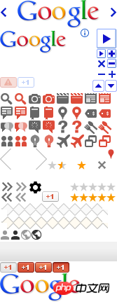
According to the literal understanding, this attribute is background positioning. First look at the material picture of the Google website, as follows:
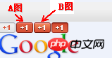
If Xiaocai now wants to make a 1 button , using the material picture above, picture A is displayed in the normal state, and picture B is displayed after the mouse is moved up to achieve such a dynamic effect.
Buttons are used to implement functions. Generally, a hyperlink is used to respond to a click event. However, the background image cannot be added directly to the hyperlink, otherwise it is not called a style. La, because when the text length of the hyperlink changes, the style also changes.
The common approach for people on earth is to put a hyperlink in p. The hyperlink is responsible for implementing the function, and p is responsible for loading the background image. The html structure is as follows:
With the html skeleton, the next step is to write the css style.
If we don’t consider anything, just set the entire picture as the background, the style is as follows:
.btn{ background:url(bg.png);}The effect is as shown:

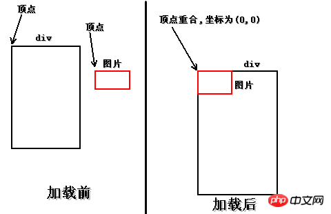
.btn{ background:url(bg.png); background-repeat:no-repeat;}This way I won’t repeat myself. p can be understood as a rectangular box, its upper left corner is the vertex, and the vertex of the background image is also the upper left corner. When p loads the background image, the two vertices will overlap, and the coordinates of the vertex are (0,0 ). If you don’t understand, look at the picture, it’s very simple. . .
.btn{
background:url(bg.png);
background-repeat:no-repeat;
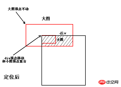
background-position:-25px -374px;
height:16px;
width:24px;
}The effect is as follows:

.btn{
    background:url(bg.png);
    background-repeat:no-repeat;
    background-position:-25px -374px;
    height:16px;
    width:24px;
    text-align:center;
}
.btn a{
    line-height:16px;
}
The effect is as follows:

另外这个下划线比较碍眼,用text-decoration:none;属性去掉,很常见,就不多说了。
样式如下:
.btn{
   background:url(bg.png);
   background-repeat:no-repeat;
   background-position:-25px -374px;
   height:16px;
   width:24px;
   text-align:center;
}
.btn a{
   line-height:16px;
   display:block;
   text-decoration:none;
}
接下来就剩最后一件事了,那就是鼠标移入的时候切换背景。
本例是p里边套a标签,鼠标移入换背景,当然是指鼠标移入p,而且换背景也是换p的背景,可不是a标签的哦!!
因此要在p标签上调用hover,p的样式是btn,因此写成.btn:hover{}。
换背景还需要找到背景图片,这又需要抠小图了,也就是抠上边指出的B图。
刚刚显示的是A小图,B小图和A小图在同一水平线上,因此竖直方向的移动像素是相同的,水平方向差不就是A小图的水平像素加上A小图的宽度。
经过测试,B小图的位移是:-50px -374px,尺寸大小就不用关心了,肯定和A小图一样,不一样就没法做了。
把B小图的定位background-position:-50px -374px;放在.btn:hover{}里即可。
样式如下:
.btn{
   background:url(bg.png);
   background-repeat:no-repeat;
   background-position:-25px -374px;
   height:16px;
   width:24px;
   text-align:center;
}
.btn a{
   line-height:16px;
   display:block;
   text-decoration:none;
}
.btn:hover{
   background-position:-50px -374px;
}
最终效果-鼠标移入之前:

最终效果-鼠标移入之后:

好啦,教程到这就结束了,小菜只是简单的演示了一个完整的制作流程,中间还有很多细节问题,比如浏览器兼容、CSS优化等等,这就需要读者自己探索了。
其实小菜一直在说的CSS抠图,真正的技术名叫CSS Sprite技术,国人习惯叫CSS精灵。
这种技术有好处也有坏处,好处是由于图片都放在一起,请求时只需请求一张图片,减少了与服务器的交互次数,还可以解决hover延迟加载的问题。坏处就是不好控制,扩展性不太好,以后有改动,可谓是牵一发而动全身,而且有时会因为屏幕分辨率不同出现背景断裂现象。
以上就是本文的全部内容,希望对大家的学习有所帮助,更多相关内容请关注PHP中文网!
相关推荐:
CSS3中not()选择器实现最后一行li去除某种css样式的代码
The above is the detailed content of Analysis of CSS Sprite to intercept small images from large images. For more information, please follow other related articles on the PHP Chinese website!