

이 기사에서는 주로 순수 CSS3에서 구현된 수직 보조 탐색 예제 튜토리얼을 소개합니다. 이 탐색 메뉴의 특징은 무제한 레벨을 가질 수 있다는 것입니다. 아래 코드가 있는데, 어떻게 하는지 모르는 친구들도 와서 배울 수 있어요
예전에 네비게이션 메뉴를 많이 알려드린 적이 있어요. 오늘은 CSS3로만 구현된 수직 보조 탐색 기능을 소개합니다. 이 탐색 메뉴는 무한할 수 있습니다. 렌더링을 살펴보겠습니다.
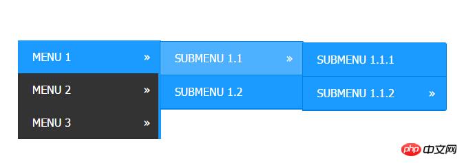
구현된 코드.
html 코드:
<p style="width: 700px; margin: auto;">
        <p class="W1-h16">
            <ul>
                <li class="has-sub"><a href="#">Menu 1</a>
                    <ul>
                        <li class="has-sub"><a href="#">Submenu 1.1</a>
                            <ul>
                                <li><a href="#">Submenu 1.1.1</a></li>
                                <li class="has-sub"><a href="#">Submenu 1.1.2</a>
                                    <ul>
                                        <li><a href="#">Submenu 1.1.2.1</a></li>
                                        <li><a href="#">Submenu 1.1.2.2</a></li>
                                    </ul>
                                </li>
                            </ul>
                        </li>
                        <li><a href="#">Submenu 1.2</a></li>
                    </ul>
                </li>
                <li class="has-sub"><a href="#">Menu 2</a>
                    <ul>
                        <li><a href="#">Submenu 2.1</a></li>
                        <li><a href="#">Submenu 2.2</a></li>
                    </ul>
                </li>
                <li class="has-sub"><a href="#">Menu 3</a>
                    <ul>
                        <li><a href="#">Submenu 3.1</a></li>
                        <li><a href="#">Submenu 3.2</a></li>
                    </ul>
                </li>
            </ul>
        </p>
</p>css3 코드:
.W1-h16 {
  padding: 0;
  margin: 0;
  border: 0;
  line-height: 1;
}
.W1-h16 ul,
.W1-h16 ul li,
.W1-h16 ul ul {
  list-style: none;
  margin: 0;
  padding: 0;
}
.W1-h16 ul {
  position: relative;
  z-index: 500;
  float: left;
}
.W1-h16 ul li {
  float: left;
  min-height: 0.05em;
  line-height: 1em;
  vertical-align: middle;
  position: relative;
}
.W1-h16 ul li.hover,
.W1-h16 ul li:hover {
  position: relative;
  z-index: 510;
  cursor: default;
}
.W1-h16 ul ul {
  visibility: hidden;
  position: absolute;
  top: 100%;
  left: 0px;
  z-index: 520;
  width: 100%;
}
.W1-h16 ul ul li {
  float: none;
}
.W1-h16 ul ul ul {
  top: 0;
  rightright: 0;
}
.W1-h16 ul li:hover > ul {
  visibility: visible;
}
.W1-h16 ul ul {
  top: 0;
  left: 99%;
}
.W1-h16 ul li {
  float: none;
}
.W1-h16 ul ul {
  margin-top: 0.05em;
}
.W1-h16 {
  width: 13em;
  background: #333333;
  font-family: 'Oxygen Mono', Tahoma, Arial, sans-serif;
  zoom: 1;
}
.W1-h16:before {
  content: '';
  display: block;
}
.W1-h16:after {
  content: '';
  display: table;
  clear: both;
}
.W1-h16 a {
  display: block;
  padding: 1em 1.3em;
  color: #ffffff;
  text-decoration: none;
  text-transform: uppercase;
}
.W1-h16 > ul {
  width: 13em;
}
.W1-h16 ul ul {
  width: 13em;
}
.W1-h16 > ul > li > a {
  border-right: 0.3em solid #1b9bff;
  color: #ffffff;
}
.W1-h16 > ul > li > a:hover {
  color: #ffffff;
}
.W1-h16 > ul > li a:hover,
.W1-h16 > ul > li:hover a {
  background: #1b9bff;
}
.W1-h16 li {
  position: relative;
}
.W1-h16 ul li.has-sub > a:after {
  content: '»';
  position: absolute;
  rightright: 1em;
}
.W1-h16 ul ul li.first {
  -webkit-border-radius: 0 3px 0 0;
  -moz-border-radius: 0 3px 0 0;
  border-radius: 0 3px 0 0;
}
.W1-h16 ul ul li.last {
  -webkit-border-radius: 0 0 3px 0;
  -moz-border-radius: 0 0 3px 0;
  border-radius: 0 0 3px 0;
  border-bottom: 0;
}
.W1-h16 ul ul {
  -webkit-border-radius: 0 3px 3px 0;
  -moz-border-radius: 0 3px 3px 0;
  border-radius: 0 3px 3px 0;
}
.W1-h16 ul ul {
  border: 1px solid #0082e7;
}
.W1-h16 ul ul a {
  color: #ffffff;
}
.W1-h16 ul ul a:hover {
  color: #ffffff;
}
.W1-h16 ul ul li {
  border-bottom: 1px solid #0082e7;
}
.W1-h16 ul ul li:hover > a {
  background: #4eb1ff;
  color: #ffffff;
}
.W1-h16.align-rightright > ul > li > a {
  border-left: 0.3em solid #1b9bff;
  border-right: none;
}
.W1-h16.align-rightright {
  float: rightright;
}
.W1-h16.align-rightright li {
  text-align: rightright;
}
.W1-h16.align-rightright ul li.has-sub > a:before {
  content: '+';
  position: absolute;
  top: 50%;
  left: 15px;
  margin-top: -6px;
}
.W1-h16.align-rightright ul li.has-sub > a:after {
  content: none;
}
.W1-h16.align-rightright ul ul {
  visibility: hidden;
  position: absolute;
  top: 0;
  left: -100%;
  z-index: 598;
  width: 100%;
}
.W1-h16.align-rightright ul ul li.first {
  -webkit-border-radius: 3px 0 0 0;
  -moz-border-radius: 3px 0 0 0;
  border-radius: 3px 0 0 0;
}
.W1-h16.align-rightright ul ul li.last {
  -webkit-border-radius: 0 0 0 3px;
  -moz-border-radius: 0 0 0 3px;
  border-radius: 0 0 0 3px;
}
.W1-h16.align-rightright ul ul {
  -webkit-border-radius: 3px 0 0 3px;
  -moz-border-radius: 3px 0 0 3px;
  border-radius: 3px 0 0 3px;
} 위 내용은 모두의 학습에 도움이 되기를 바랍니다. PHP 중국어 웹사이트로!
관련 권장 사항:
CSS3을 사용하여 원형 진행률 표시줄을 구현하는 방법
CSS3을 사용하여 가로 및 세로 화면을 일치시키는 방법
위 내용은 CSS3로 구현된 수직 보조 탐색의 상세 내용입니다. 자세한 내용은 PHP 중국어 웹사이트의 기타 관련 기사를 참조하세요!


![[웹 프런트엔드] Node.js 빠른 시작](https://img.php.cn/upload/course/000/000/067/662b5d34ba7c0227.png)


