


새로운 CSS 기능으로 CSS 시간 기반 애니메이션 최적화

글: Emmanuel Odioko✏️
오랫동안 수학 함수에 대한 제한된 지원으로 인해 시간 기반 CSS 애니메이션을 만드는 것이 훨씬 더 어려워졌습니다. 전통적인 애니메이션은 복잡한 계산을 기반으로 한 시간 기반 업데이트의 유연성이 부족한 키프레임과 지속 시간에 의존했습니다. mod(), round() 및 삼각 함수와 같은 CSS 함수의 도입으로 개발자는 이제 CSS에서 시간 기반 애니메이션을 마스터하는 방법을 탐색할 수 있습니다.
시작하기 전에 알아야 할 사항
새로운 CSS 기능을 사용하여 CSS의 시간 기반 애니메이션에 대한 이 글을 최대한 활용하려면 CSS 애니메이션 및 전환에 대해 잘 이해하고 있어야 합니다. @keyframes를 사용하여 애니메이션을 생성하고 타이밍을 제어하는 방법을 알 수 있어야 합니다. 또한 DOM 요소를 조작하고 사용자 이벤트에 응답하는 기능에 더 중점을 두는 JavaScript에 대한 기본 이해가 있어야 합니다.
마지막으로 calc()와 같은 새로운 CSS 함수에 대한 이해와 mod(), sin() 및 cos()를 포함한 삼각 함수, round()와 같은 새로운 기능을 탐색할 준비가 되어 있으면 좋은 기초가 될 것입니다.
이 기사를 다 읽고 나면 JavaScript를 사용하여 HTML 캔버스에서 애니메이션이 전통적으로 어떻게 구현되었는지, 그리고 최신 CSS 기능과 어떻게 비교되는지 이해하게 될 것입니다. 기존 CSS 키프레임에 비해 mod(), round() 및 삼각 함수를 사용하는 것이 얼마나 쉬운지 이해하게 됩니다.
CSS 시간 기반 애니메이션이란 무엇입니까?
시간 기반 애니메이션은 새로운 것이 아닙니다. 10년 넘게 존재해 왔습니다. 일부는 사용하기 복잡하지만 일부는 그렇지 않습니다. 수학적 계산이 기본인 CSS 파일을 알고 계십니까? 시간 기반 애니메이션이 그 일부입니다.
이름에서 알 수 있듯이 이러한 애니메이션은 시간에 따라 위치, 크기, 색상, 불투명도 등 요소의 속성이 변경된다는 점에서 시간과 밀접한 관련이 있습니다. CSS 시간 기반 애니메이션은 웹 애플리케이션의 느낌을 향상시키고 더 나은 사용자 경험을 제공하는 부드러운 전환을 생성합니다.
시간 기반 CSS 애니메이션은 주로 정의된 시작 및 종료 타임라인과 보간 지점으로 구성됩니다. 여기서 보간이란 애니메이션이 진행됨에 따라 특정 기간 동안 애니메이션의 시작과 끝 사이의 중간 값을 계산하는 것을 의미합니다. 보간을 하는 이유는 초기 상태에서 최종 상태로의 원활한 전환을 제공하기 위한 것입니다.
시간 기반 애니메이션은 CSS 변수와 몇 가지 수학 함수의 조합으로 발생합니다. 이러한 통합을 통해 개발자는 시간이 지남에 따라 변경되는 애니메이션을 만들 수 있으며 키프레임 애니메이션에서는 꿈만 꿀 수 있는 보다 유연한 애니메이션을 만들 수 있습니다. 주요 개념과 작동 방식을 자세히 살펴보겠습니다.
시간 기반 애니메이션 분석
이 섹션에서는 시간 기반 애니메이션을 만드는 일반적인 구조를 주요 구성 요소로 분석합니다.
초기 상태
초기 상태는 애니메이션이 시작되기 전 요소의 시작 속성을 정의합니다. 위치, 크기, 색상, 불투명도 등을 지정할 수 있습니다. 아래 예:
.box {
  opacity: 0;
  transform: translateY(-20px);
}
위 코드에는 불투명도 및 변형 속성을 정의하는 상자 클래스가 있는 요소의 초기 상태가 있습니다.
애니메이션 트리거는 애니메이션을 시작하는 이벤트를 지정합니다. 일반적인 트리거에는 클릭이나 마우스 오버 등의 사용자 상호 작용, 페이지 로드 이벤트 또는 사용자 작업 완료와 같은 애플리케이션의 특정 조건이 포함됩니다.
애니메이션의 속성에는 애니메이션 지속 시간, 타이밍 기능, 지연, 반복 횟수, 방향 및 채우기 모드가 포함됩니다. 애니메이션에는 이러한 속성 중 일부 또는 전부가 있을 수 있습니다. 호버 선택기를 사용한 트리거 예시는 다음과 같습니다.
.box:hover {
  animation: fadeIn 1s ease-in-out forwards;
}
이는 클래스 상자가 있는 요소에 마우스를 올려 놓을 때 트리거되고 1초간 지속되는 애니메이션 fadeIn의 추가를 보여줍니다. 애니메이션 동작과 타이밍도 지정됩니다. 애니메이션 및 전환 타이밍 기능에 대한 자세한 내용은 이 문서를 읽어보세요.
보간점
앞서 언급했듯이 이는 타임라인의 다양한 지점에 있는 애니메이션의 중간 상태입니다. 각 키프레임은 특정 순간의 요소 속성을 지정하여 초기 상태와 최종 상태 사이의 점진적인 전환을 허용합니다. 보간점 구현의 예는 CSS 키프레임 속성입니다.
@keyframes fadeIn {
  0% {
    opacity: 0;
    transform: translateY(-20px);
  }
  100% {
    opacity: 1;
    transform: translateY(0);
  }
}
위의 예에서는 키프레임을 사용하여 애니메이션 진행률이 0과 100%인 fadeIn 애니메이션의 속성을 정의합니다.
Common uses of time-based animations
Time-based animation has become increasingly essential in web applications as it helps with better user experience. The usage of these animations ranges from subtle micro-interactions to significant site transitions, giving web apps a more dynamic feel. Below are common use cases of these animations.
Micro-interactions
Micro-interactions are small, often subtle, and reusable animations that occur in response to user actions. These brief animations provide feedback. You may have come across animations such as pop-up warnings, loading spinners indicating ongoing processes, or a button indicating a click action. All of these are micro-interactions and consist of time-based animations.  Image source: https://userpilot.com/blog/micro-interaction-examples/[/caption]
In the image above, we have a submit button which shows a loader and a tick when the user clicks on it. The essence of these micro interactions is to commit to the user the process of the submission and the success of the operation.
Transitions
Site transitions are used to indicate state or page changes on a web application to create a fluid user experience using effects such as fading, sliding, or scaling elements. With time-based animations, these transitions are possible. Common transition effect applications are toggling navigation and side menus, parallax animations, opening and closing of modals, etc.
Image source: https://medium.com/@9cv9official/create-a-beautiful-hover-triggered-expandable-sidebar-with-simple-html-css-and-javascript-9f5f80a908d1[/caption] Image source: https://medium.com/@9cv9official/create-a-beautiful-hover-triggered-expandable-sidebar-with-simple-html-css-and-javascript-9f5f80a908d1
In the GIF above, there is a sidebar which uses a transition animation to expand the sidebar on a mouse hover event.
Exploring new CSS functions
Let’s get into the new mathematical CSS functions mod(), round(), and the trigonometric functions sin(), cos() and tan() while discussing each in detail.
Mod () function
Like the JavaScript modulo operator %, this function returns the remainder after an arithmetic modulus operation has been carried out on two operands. In essence, the modulus is the leftover value after the dividend is divided by the other operand, the divisor, and no more division can occur. In JavaScript, using the modulo operator will take the following form:10%4.
This operation would leave behind a Modulus of 2 as 10 is only divisible by the divisor 4 twice, leaving behind a remainder of 2. Similarly, the CSS Mod function would perform the same function with the following syntax instead: mod(10, 4).
It is also important to note that the modulus takes the sign of the divisor. As such, the result of mod(10, -4) would be -2 instead.
Mod() parameters and syntax
The mod() function primarily accepts two sets of parameters mod(dividend, divisor) which are essentially two comma-separated values. These operands must be of the same dimension for them to be valid and can take a variety of values as parameters thereby improving the range of its application. Operands passed to mod() can be numbers, percentages, or dimensions.
Mod() can also take in the unit of its operands (e.g. px, rem, vh, deg) and can also handle mathematical calculations as dividend or divisor. Below are some examples showing the use of this CSS function:
/* using <numbers> without units */
scale: mod(18, 7); /* result is 4 */

/* <percentage> and <dimension>  with units  */
height: mod(100vh, 30vh); /* result is 10vh */
width: mod(500px, 200px); /* result is 100px */
transform: rotate(mod(90deg, 20deg)); /* result is 10deg */

/* negative <percentage> and <dimension>  with units  */
height: mod(18rem, -4rem); /* result is 2rem */
rotate: mod (180deg, -100deg); /* result is 80deg */

/* working with calculations */
width: mod(40px*2, 15px); /* result is 5px */
transform: scale(mod(2*3, 1.8)); /* result is 0.6 */
rotate: mod(10turn, 8turn/2); /* result is 2turn */
The code block above shows different applications of the mod() in CSS styles.
While the examples shown use known values, time-based functions are expected to be used with CSS variables which are dynamic and make it possible for the styles to change values depending on the variable passed to the function. The outcome of the operation is then dependent on the calculation using the specified variables, and can produce a wider range of outcomes compared to when hardcoded values are used.
Below you’ll find the general syntax for all possibilities of mod() as illustrated by MDN:
<mod()> =
  mod( <calc-sum> , <calc-sum> )

<calc-sum> =
  <calc-product> [ [ '+' | '-' ] <calc-product> ]*

<calc-product> =
  <calc-value> [ [ '*' | '/' ] <calc-value> ]*

<calc-value> =
  <number>        |
  <dimension>     |
  <percentage>    |
  <calc-keyword>  |
  ( <calc-sum> )

<calc-keyword> =
  e          |
  pi         |
  infinity   |
  -infinity  |
  NaN
In the syntax above, calc-sum represents the operands of the modulus operation. The syntax also shows the types of values calc-sum can contain and the possibility of negative and positive values. Furthermore, the syntax above also shows the possible calc-keywords e, pi, infinity, -infinity, and NaN.
round() function
The CSS round() function value is based on a specified rounding strategy. Note that strategy refers to the pattern of rounding the value such as rounding up or down, rounding to zero, rounding to the nearest occurrence of a number, etc..
round() parameters and syntax
The syntax for applying the CSS round() is given below:
round(<rounding-strategy>, valueToRound, roundingInterval)
Here's a breakdown of the CSS round() function into smaller bits and highlights of the functions of each keyword and the possible values they can take.
rounding-strategy
The rounding strategy is the type of technique that would be used to round a specified value. This is optional (defaults to nearest if unspecified), and can be one of the following:
- up — rounds value up to the nearest integer multiple of the specified roundingInterval. This operation is similar to JavaScript’s Math.ceil() method and will produce a more positive result if the value is negative
- down — rounds valueToRound down to the nearest integer multiple of the specified roundingInterval. This is similar to JavaScript’s Math.floor() method and will produce a more negative result if the value is negative
- nearest — rounds the valueToRound to the nearest integer multiple of roundingInterval. The result obtained may be higher or lower than the value, depending on how close it is to a multiple of the roundingInterval
- to-zero — rounds the value to the nearest integer multiple of roundingInterval closer to/towards zero and is equivalent to JavaScript’s trunc() method
valueToRound
This is the value we intend to round using the function, and it can be a
roundingInterval
The rounding interval refers to the interval a value is rounded with a reference to. This entry can be a
Below is an example illustrating the use of the CSS round() function:
<!DOCTYPE html>
<html lang="en">
<head>
  <meta charset="UTF-8">
  <meta name="viewport" content="width=device-width, initial-scale=1.0">
  <title>Document</title>
  <style>
    body{
      display: flex;
      justify-content: center;
      align-items: center;
      height: 100vh;
      margin: 0;
    }

    /* using the round() function */
    .ball {
      width: 100px;
      height: 100px;
      background-color: red;
      color: white;
      text-align: center;
      line-height: 100px;
      margin: 10px;
    }
    .ball-1{
        border-radius: round(down, 70%, var(--rounding-interval)); /*rounded down to the interval of 50% */
    }

    .ball-2{
        border-radius: round(up, 70%, var(--rounding-interval2)); /* rounded up to interval of 100% */
    }

    .ball-3{
        border-radius: round(nearest, 15%, var(--rounding-interval3)); /* rounded to the nearest interval 25% */
    }

  </style>
</head>
<body>
    <!-- rounded containers -->
  <div class="ball ball-1" style="--rounding-interval:50%;">rounded 50%</div>
  <div class="ball ball-2" style="--rounding-interval2:100%;"> rounded 100%</div>
  <div class="ball ball-3" style="--rounding-interval3:25%;"> rounded 25%</div>
</body>
</html>
In this example, we used round() and CSS variables to round values to a specified roundingInterval in the style of each element. Below is the outcome of this example: 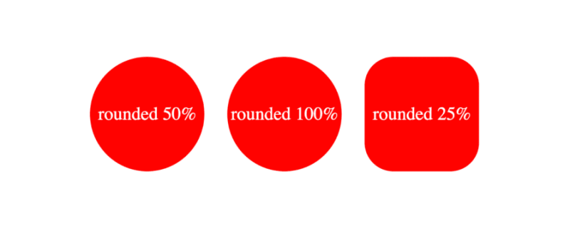 The formal syntax of the CSS round() function according to MDN docs is given by the following:
<round()> =
  round( <rounding-strategy>? , <calc-sum> , <calc-sum>? )

<rounding-strategy> =
  nearest  |
  up       |
  down     |
  to-zero

<calc-sum> =
  <calc-product> [ [ '+' | '-' ] <calc-product> ]*

<calc-product> =
  <calc-value> [ [ '*' | '/' ] <calc-value> ]*

<calc-value> =
  <number>        |
  <dimension>     |
  <percentage>    |
  <calc-keyword>  |
  ( <calc-sum> )

<calc-keyword> =
  e          |
  pi         |
  infinity   |
  -infinity  |
  NaN
In the syntax above, rounding-strategy is the intended rounding pattern and calc-sum represents the operands. The formula also shows the possible entries for rounding-strategy and calc-sum. Finally, it outlines the possible calc-keywords e, pi, infinity, -infinity, and NaN.
Trigonometric functions
The CSS trigonometric functions perform the same operations as in mathematics, as such, the sin() function returns the sine of a number as a value between the range of -1 and 1, cos() returns the cosine of a value, and tan() returns the tangent of a specified value.
Arguments passed to these functions must be either a number or an angle, and they will be treated as radians. Units such as deg and turn represent angle and can be used with arguments here.
Example applications of these functions are shown below:
scale: sin(45deg); /* result is 0.7071067811865475 */
rotate: cos(30deg); /* result is 0.8660254037844387 */
height: calc(50px * tan(30deg)); /* result is 28.86751345948129px */
All trigonometric CSS functions bear similarity, taking in only a single parameter that is resolved to an angle.
Parameters and syntax of sin()
Sin() takes in only one parameter which must be a number or angle, or a mathematical expression that resolves to either of them. The syntax of sin() is as follows: \
sin(angle)
The formal syntax of sin() is shown below: \
<sin()> =
  sin( <calc-sum> )

<calc-sum> =
  <calc-product> [ [ '+' | '-' ] <calc-product> ]*

<calc-product> =
  <calc-value> [ [ '*' | '/' ] <calc-value> ]*

<calc-value> =
  <number>        |
  <dimension>     |
  <percentage>    |
  <calc-keyword>  |
  ( <calc-sum> )

<calc-keyword> =
  e          |
  pi         |
  infinity   |
  -infinity  |
  NaN
The syntax above shows the possible values for calc-sum and calc-keyword.
Parameters and syntax of cos()
The parameter of cos() is either a number, an angle, or contains a single calculation that must resolve to either type.
As such, the syntax for cos() is the following:
cos(angle)
The formal syntax of all possibilities of cos() is below:
<cos()> =
  cos( <calc-sum> )

<calc-sum> =
  <calc-product> [ [ '+' | '-' ] <calc-product> ]*

<calc-product> =
  <calc-value> [ [ '*' | '/' ] <calc-value> ]*

<calc-value> =
  <number>        |
  <dimension>     |
  <percentage>    |
  <calc-keyword>  |
  ( <calc-sum> )

<calc-keyword> =
  e          |
  pi         |
  infinity   |
  -infinity  |
  NaN
Where calc-sum is the parameter, calc-value is the allowed types of parameters, and calc-keywords are possible units that can be added to the mathematical expression.
Parameters and syntax of tan()
The tan() function also takes a number, an angle, or a single calculation that must resolve to either type, similar to the other trigonometric functions. The syntax of tan() is given by the following:
tan(angle)
The formal syntax of this function is shown below:
<tan()> =
  tan( <calc-sum> )

<calc-sum> =
  <calc-product> [ [ '+' | '-' ] <calc-product> ]*

<calc-product> =
  <calc-value> [ [ '*' | '/' ] <calc-value> ]*

<calc-value> =
  <number>        |
  <dimension>     |
  <percentage>    |
  <calc-keyword>  |
  ( <calc-sum> )

<calc-keyword> =
  e          |
  pi         |
  infinity   |
  -infinity  |
  NaN
This syntax shows all possible values of calc-sum, the operand, and the calc-keyword.
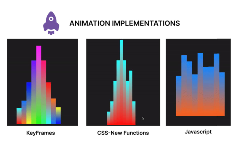
Comparing timing animations between CSS functions and keyframes
In this section, we will create an animation using CSS functions, keyframes for an alternative, and JavaScript for a second alternative. In the end, we will compare the code and contrast the approaches to determine the benefits of usingCSS functions in creating CSS animations over other options.
Creating animation with CSS functions
Let's start by creating our music beat bar animation using CSS functions. This animation focuses on animating multiple bars, changing the property of the height and background colors using values generated with CSS functions:
<!DOCTYPE html>
<html lang="en">

<head>
  <meta charset="UTF-8">
  <meta name="viewport" content="width=device-width, initial-scale=1.0">
  <title>Beats Bar Animation with CSS Functions</title>
  <style>
    :root {
      /* change the value of --t infinitely */
      animation: animate-time 1000ms linear infinite;
    }

    @keyframes animate-time {
      from {
        --t: 0;
      }

      to {
        --t: 100000;
      }
    }

    body {
      display: flex;
      justify-content: center;
      align-items: center;
      height: 100vh;
      background-color: #222;
      margin: 0;
    }

    .container {
      height: 500px;
      width: 250px;
      position: relative;
      display: flex;
      gap: 10px;
    }

    .bar {
      position: absolute;
      bottom: 0;
      width: 20px;
      height: 20px;
      --frequency: 1;
      --time: calc(var(--t) / 1000 / var(--frequency));
      --rounded-time: round(nearest, var(--time));
      /* Adjust frequency of animation */
      --amplitude: 30px;
      /* base height */
      --base-height: 20px;
      /* Transition for smooth height change */
      transition: height 0.5s ease-in-out, background 1s ease-in-out;
      /* Calculate dynamic hue using mod and round */
      --hue: mod(round(nearest, calc(var(--time) * 10)), 360);
      --alpha: calc(0.5 + 0.5 * cos(calc(var(--time) * 1turn)));
      /* Apply dynamic linear gradient background */
      background: linear-gradient(to top,
          hsla(var(--hue), 100%, 50%, var(--alpha)),
          hsla(calc(var(--hue) + 180), 100%, 50%, var(--alpha)));
    }

    .bar1 {
      /* Calculate height based on rounded time */
      height: calc(var(--base-height) + var(--amplitude) * var(--rounded-time)/46 * var(--index-a));
      margin-left: 10px;
    }

    .bar2 {
      /* Calculate height based on rounded time */
      height: calc(var(--base-height) + var(--amplitude) * var(--rounded-time)/46 * var(--index-b));
      margin-left: 30px;
    }

    .bar3 {
      /* Calculate height based on rounded time */
      height: calc(var(--base-height) + var(--amplitude) * var(--rounded-time)/46 * var(--index-c));
      margin-left: 50px;
    }

    .bar4 {
      /* Calculate height based on rounded time */
      height: calc(var(--base-height) + var(--amplitude) * var(--rounded-time)/46 * var(--index-d));
      margin-left: 70px;
    }

    .bar5 {
      /* Calculate height based on rounded time */
      height: calc(var(--base-height) + var(--amplitude) * var(--rounded-time)/46 * var(--index-e));
      margin-left: 90px;
    }

    .bar6 {
      /* Calculate height based on rounded time */
      height: calc(var(--base-height) + var(--amplitude) * var(--rounded-time)/46 * var(--index-f));
      margin-left: 110px;
    }

    .bar7 {
      /* Calculate height based on rounded time */
      height: calc(var(--base-height) + var(--amplitude) * var(--rounded-time)/46 * var(--index-g));
      margin-left: 130px;
    }

    .bar8 {
      /* Calculate height based on rounded time */
      height: calc(var(--base-height) + var(--amplitude) * var(--rounded-time)/46 * var(--index-h));
      margin-left: 150px;
    }

    .bar9 {
      /* Calculate height based on rounded time */
      height: calc(var(--base-height) + var(--amplitude) * var(--rounded-time)/46 * var(--index-i));
      margin-left: 170px;
    }
  </style>
</head>

<body>
  <div class="container">
    <div class="bar bar1" style="--index-a: 1;"></div>
    <div class="bar bar2" style="--index-b: 2;"></div>
    <div class="bar bar3" style="--index-c: 4;"></div>
    <div class="bar bar4" style="--index-d: 6;"></div>
    <div class="bar bar5" style="--index-e: 8;"></div>
    <div class="bar bar6" style="--index-f: 6;"></div>
    <div class="bar bar7" style="--index-g: 4;"></div>
    <div class="bar bar8" style="--index-h: 5;"></div>
    <div class="bar bar9" style="--index-i: 2;"></div>
  </div>
</body>

</html>
Here’s a breakdown of the code block above:
- Created a root animation to change the value of a variable --t infinitely
- Styled the body and container class
- Created the initial state for the bar class and declared some variables we would use in our animation. Here we also created a transition property and used round() and mod() CSS functions to generate dynamic values for the background colors of the bars
- Next, we applied a height transition to each of the bars, depending on the values obtained from the variables
- Finally, we have the HTML element structure
The code above produces the following animation: 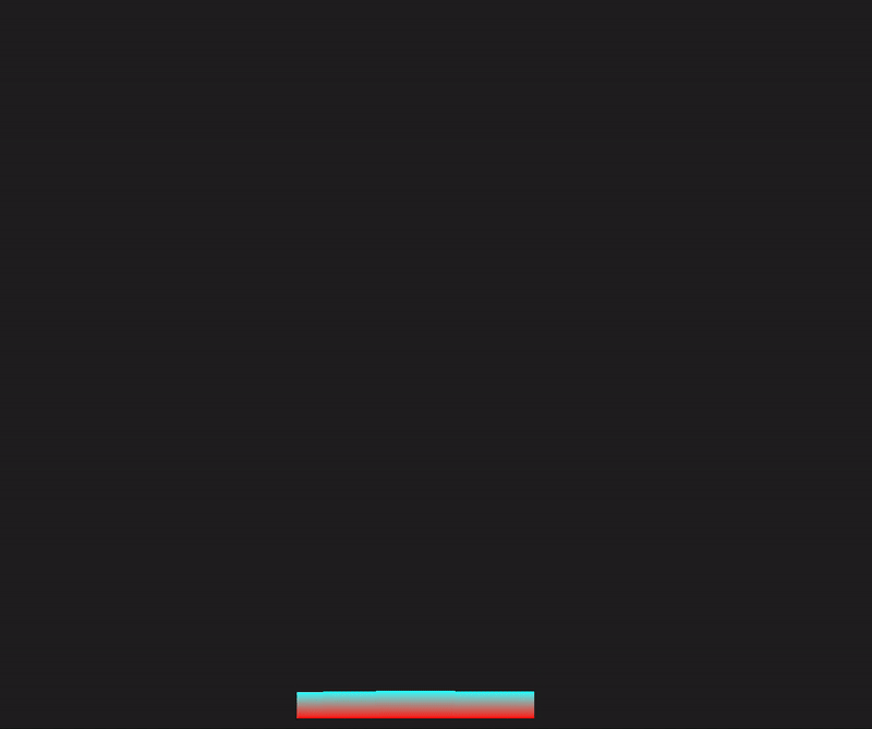
Recreating the animation with CSS keyframes
In this section, we will rebuild the sound bar animation, but we’ll use animations and CSS keyframes instead:
<!DOCTYPE html>
<html lang="en">

<head>
  <meta charset="UTF-8">
  <meta name="viewport" content="width=device-width, initial-scale=1.0">
  <title>Beats Bar Animation with CSS Keyframes</title>
  <style>
    body {
      display: flex;
      justify-content: center;
      align-items: center;
      height: 100vh;
      background-color: #222;
      margin: 0;
    }

    .container {
      height: 500px;
      width: 250px;
      position: relative;
      display: flex;
      gap: 10px;
    }

    .bar {
      position: absolute;
      bottom: 0;
      width: 20px;
      height: 20px;
      --amplitude: 30px;
      --base-height: 20px;
      --frequency: 1;
      transition: height 0.5s ease-in-out;
      animation: bounce 1s infinite;
    }

    @keyframes bounce {

      0%,
      100% {
        height: calc(var(--base-height) + var(--amplitude) * 0.5);
      }

      50% {
        height: calc(var(--base-height) + var(--amplitude));
      }
    }

    .bar1 {
      animation: bounce1 1s infinite, colorChange1 2s infinite;
      margin-left: 10px;
    }

    .bar2 {
      animation: bounce2 1s infinite, colorChange2 2s infinite;
      margin-left: 30px;
    }

    .bar3 {
      animation: bounce3 1s infinite, colorChange3 2s infinite;
      margin-left: 50px;
    }

    .bar4 {
      animation: bounce4 1s infinite, colorChange4 2s infinite;
      margin-left: 70px;
    }

    .bar5 {
      animation: bounce5 1s infinite, colorChange5 2s infinite;
      margin-left: 90px;
    }

    .bar6 {
      animation: bounce6 1s infinite, colorChange6 2s infinite;
      margin-left: 110px;
    }

    .bar7 {
      animation: bounce7 1s infinite, colorChange7 2s infinite;
      margin-left: 130px;
    }

    .bar8 {
      animation: bounce8 1s infinite, colorChange8 2s infinite;
      margin-left: 150px;
    }

    .bar9 {
      animation: bounce9 1s infinite, colorChange9 2s infinite;
      margin-left: 170px;
    }

    @keyframes colorChange1 {

      0%,
      100% {
        background: linear-gradient(to top, hsla(0, 100%, 50%, 1), hsla(180, 100%, 50%, 1));
      }

      50% {
        background: linear-gradient(to top, hsla(180, 100%, 50%, 1), hsla(360, 100%, 50%, 1));
      }
    }

    @keyframes colorChange2 {

      0%,
      100% {
        background: linear-gradient(to top, hsla(30, 100%, 50%, 1), hsla(210, 100%, 50%, 1));
      }

      50% {
        background: linear-gradient(to top, hsla(210, 100%, 50%, 1), hsla(390, 100%, 50%, 1));
      }
    }

    @keyframes colorChange3 {

      0%,
      100% {
        background: linear-gradient(to top, hsla(60, 100%, 50%, 1), hsla(240, 100%, 50%, 1));
      }

      50% {
        background: linear-gradient(to top, hsla(240, 100%, 50%, 1), hsla(420, 100%, 50%, 1));
      }
    }

    @keyframes colorChange4 {

      0%,
      100% {
        background: linear-gradient(to top, hsla(90, 100%, 50%, 1), hsla(270, 100%, 50%, 1));
      }

      50% {
        background: linear-gradient(to top, hsla(270, 100%, 50%, 1), hsla(450, 100%, 50%, 1));
      }
    }

    @keyframes colorChange5 {

      0%,
      100% {
        background: linear-gradient(to top, hsla(120, 100%, 50%, 1), hsla(300, 100%, 50%, 1));
      }

      50% {
        background: linear-gradient(to top, hsla(300, 100%, 50%, 1), hsla(480, 100%, 50%, 1));
      }
    }

    @keyframes colorChange6 {

      0%,
      100% {
        background: linear-gradient(to top, hsla(150, 100%, 50%, 1), hsla(330, 100%, 50%, 1));
      }

      50% {
        background: linear-gradient(to top, hsla(330, 100%, 50%, 1), hsla(510, 100%, 50%, 1));
      }
    }

    @keyframes colorChange7 {

      0%,
      100% {
        background: linear-gradient(to top, hsla(180, 100%, 50%, 1), hsla(360, 100%, 50%, 1));
      }

      50% {
        background: linear-gradient(to top, hsla(360, 100%, 50%, 1), hsla(540, 100%, 50%, 1));
      }
    }

    @keyframes colorChange8 {

      0%,
      100% {
        background: linear-gradient(to top, hsla(210, 100%, 50%, 1), hsla(390, 100%, 50%, 1));
      }

      50% {
        background: linear-gradient(to top, hsla(390, 100%, 50%, 1), hsla(570, 100%, 50%, 1));
      }
    }

    @keyframes colorChange9 {

      0%,
      100% {
        background: linear-gradient(to top, hsla(240, 100%, 50%, 1), hsla(420, 100%, 50%, 1));
      }

      50% {
        background: linear-gradient(to top, hsla(420, 100%, 50%, 1), hsla(600, 100%, 50%, 1));
      }
    }

    @keyframes bounce1 {

      0%,
      100% {
        height: calc(var(--base-height) + var(--amplitude) * 0.5);
      }

      50% {
        height: calc(var(--base-height) + var(--amplitude) * 1.5);
      }
    }

    @keyframes bounce2 {

      0%,
      100% {
        height: calc(var(--base-height) + var(--amplitude) * 1.5);
      }

      50% {
        height: calc(var(--base-height) + var(--amplitude) * 2.5);
      }
    }

    @keyframes bounce3 {

      0%,
      100% {
        height: calc(var(--base-height) + var(--amplitude) * 2.5);
      }

      50% {
        height: calc(var(--base-height) + var(--amplitude) * 5);
      }
    }

    @keyframes bounce4 {

      0%,
      100% {
        height: calc(var(--base-height) + var(--amplitude) * 4.5);
      }

      50% {
        height: calc(var(--base-height) + var(--amplitude) * 8);
      }
    }

    @keyframes bounce5 {

      0%,
      100% {
        height: calc(var(--base-height) + var(--amplitude) * 6.5);
      }

      50% {
        height: calc(var(--base-height) + var(--amplitude) * 10);
      }
    }

    @keyframes bounce6 {

      0%,
      100% {
        height: calc(var(--base-height) + var(--amplitude) * 4.5);
      }

      50% {
        height: calc(var(--base-height) + var(--amplitude) * 8);
      }
    }

    @keyframes bounce7 {

      0%,
      100% {
        height: calc(var(--base-height) + var(--amplitude) * 2.5);
      }

      50% {
        height: calc(var(--base-height) + var(--amplitude) * 5);
      }
    }

    @keyframes bounce8 {

      0%,
      100% {
        height: calc(var(--base-height) + var(--amplitude) * 1.4);
      }

      50% {
        height: calc(var(--base-height) + var(--amplitude) * 2.8);
      }
    }

    @keyframes bounce9 {

      0%,
      100% {
        height: calc(var(--base-height) + var(--amplitude) * 0.5);
      }

      50% {
        height: calc(var(--base-height) + var(--amplitude) * 1.6);
      }
    }
  </style>
</head>

<body>
  <div class="container">
    <div class="bar bar1"></div>
    <div class="bar bar2"></div>
    <div class="bar bar3"></div>
    <div class="bar bar4"></div>
    <div class="bar bar5"></div>
    <div class="bar bar6"></div>
    <div class="bar bar7"></div>
    <div class="bar bar8"></div>
    <div class="bar bar9"></div>
  </div>
</body>

</html>
In the code above, we have styles for the body, container, and bar elements. We added an initial fallback animation state bounce and defined the animation properties with keyframes. Furthermore, we had to create separate keyframes animations for each bar’s height and background color change. The output of this animation is shown below: 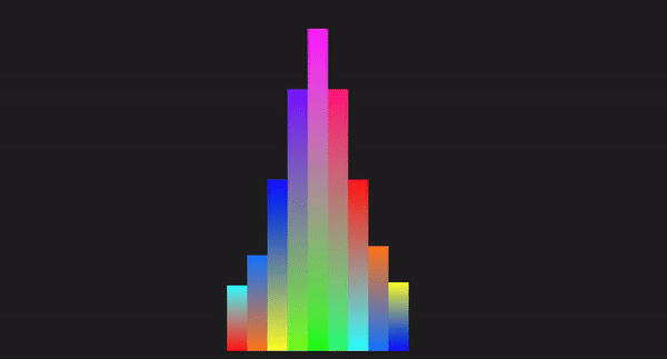
Creating the animation with JavaScript
Here, we will demonstrate how we can work with HTML, CSS, and JavaScript to recreate the animation in the previous section:
<!DOCTYPE html>
<html lang="en">

<head>
  <meta charset="UTF-8">
  <meta name="viewport" content="width=device-width, initial-scale=1.0">
  <title>Beats Bar Animation with JavaScript</title>
  <style>
    body {
      display: flex;
      justify-content: center;
      align-items: center;
      height: 100vh;
      background-color: #222;
      margin: 0;
    }

    .container {
      display: flex;
      gap: 0;
      position: relative;
    }

    .bar {
      width: 20px;
      position: absolute;
      bottom: 0;
      transition: height 0.1s ease-in-out, background 0.1s ease-in-out;
    }

    .bar1 {
      left: 0;
    }

    .bar2 {
      left: 20px;
    }

    .bar3 {
      left: 40px;
    }

    .bar4 {
      left: 60px;
    }

    .bar5 {
      left: 80px;
    }

    .bar6 {
      left: 100px;
    }

    .bar7 {
      left: 120px;
    }

    .bar8 {
      left: 140px;
    }

    .bar9 {
      left: 160px;
    }
  </style>
</head>

<body>
  <div class="container">
    <div class="bar bar1" data-index="1"></div>
    <div class="bar bar2" data-index="2"></div>
    <div class="bar bar3" data-index="3"></div>
    <div class="bar bar4" data-index="4"></div>
    <div class="bar bar5" data-index="5"></div>
    <div class="bar bar6" data-index="6"></div>
    <div class="bar bar7" data-index="7"></div>
    <div class="bar bar8" data-index="8"></div>
    <div class="bar bar9" data-index="9"></div>
  </div>

  <script>
    const bars = document.querySelectorAll('.bar');
    const baseHeight = 100; // Base height of bars
    const amplitude = 150; // Amplitude of height changes
    const frequency = 2; // Frequency of the animation
    const animationSpeed = 0.1; // Speed of the animation

    function animateBars() {
      const currentTime = Date.now() / 1000; // Get the current time in seconds we will use this as a flux value

      bars.forEach((bar, index) => {
        // Calculate the height of the bar based on the current time
        const timeOffset = index * frequency;
        const height = baseHeight + amplitude * Math.abs(Math.sin(currentTime * frequency + timeOffset));
        bar.style.height = `${height}px`;

        const hue = (currentTime * 50) % 360; // Dynamic hue based on time
        const alpha = 1; // alpha of 1 to avoid transparency at any point
        // Set the background color of the bar using a linear gradient
        bar.style.background = `linear-gradient(to top, hsla(${hue}, 100%, 50%, ${alpha}), hsla(${(hue + 180) % 360}, 100%, 50%, ${alpha}))`;
      });

      requestAnimationFrame(animateBars);
    }

    function initializeBars() {
      // Set the initial height and color of the bars
      bars.forEach((bar, index) => {
        const initialHeight = baseHeight + amplitude * Math.abs(Math.sin(index * frequency));
        bar.style.height = `${initialHeight}px`;

        const initialHue = (index * 50) % 360; // Initial hue based on index
        const initialAlpha = 1; // Set initial alpha to 1 to avoid transparency
        bar.style.background = `linear-gradient(to top, hsla(${initialHue}, 100%, 50%, ${initialAlpha}), hsla(${(initialHue + 180) % 360}, 100%, 50%, ${initialAlpha}))`;
      });
    }

    // Initialize the bars with their initial heights and colors
    initializeBars();

    // Start the animation
    animateBars();
  </script>
</body>

</html>
In the code above, we styled the elements with CSS and created the HTML structure. We used JavaScript to select all elements with the class bar and also declared the variables. Next, we used a set of mathematical calculations to offset the bar height property and apply visual changes to the background gradient. The result is shown in the GIF below: 
Code comparison
Let’s compare these different methods using certain technical aspects:
| Technical aspect | CSS functions | Keyframes | JavaScript |
|---|---|---|---|
| Code length | Generally shorter, making use of variables and functions | Can be lengthy depending on the number of keyframes and the interpolation points defined | The length depends on factors such as the elements to be manipulated, the logic, and properties to be applied. |
| Ease of implementation | Simple for dynamic, repetitive patterns | Simple for predefined animations | Complex logic handling and interaction |
| Performance | High performance, offloaded to the GPU, and less CPU-intensive | High performance, offloaded to the GPU, less CPU intensive | Can be less performant, dependent on the JavaScript engine and the amount of JavaScript to be executed on the web |
| Control | Dynamic and flexible | Static, predefined frames | Highly dynamic and interactive |
| Maintenance | Easy to maintain, concise syntax | Easy to maintain but can get verbose | Can become complex and harder to maintain, and make changes to the logic |
| Animation types | Best for simple, repetitive, mathematical animations | Great for detailed, multi-step animations | Best for interactive and responsive animations |
| Reusability | High reusability with CSS variables since mathematical functions can create different values for the same variable | Moderate, requires duplication for different animations | High reusability with functions and logic |
| Browser compatibility | `Mod()` and `Round()` are not compatible with Opera and Samsung browsers, the rest are fine | Keyframes have been around for a while, so it will be compatible for time-based animations | JavaScript is compatible with all browsers for time-based animations |
위에서 애니메이션에 사용할 때 CSS 기능이 다른 구현에 비해 단순성, 코드 재사용성, 제어 및 성능이 우수하다는 것을 알 수 있습니다.
결론
이 기사에서는 mod(), round(), 삼각 함수에 이르는 시간 기반 애니메이션을 다루었습니다.
또한 이러한 기능을 키프레임 및 Javascript와 비교한 결과, 시간 기반 애니메이션이 복잡한 애니메이션에 비해 가볍고 성능에 영향을 미칠 가능성이 적기 때문에 주로 단순성, 향상된 재사용성 및 성능 최적화로 인해 성장한다는 것을 알 수 있었습니다. 애니메이션.
이는 결과적으로 사용자 경험을 향상하는 데 도움이 됩니다. 이러한 기능을 계속 탐색하고 코딩을 계속하세요!!
프런트엔드가 사용자의 CPU를 많이 사용하고 있나요?
웹 프런트엔드가 점점 더 복잡해짐에 따라 리소스를 많이 사용하는 기능으로 인해 브라우저에서 점점 더 많은 것을 요구하게 됩니다. 프로덕션에 있는 모든 사용자의 클라이언트측 CPU 사용량, 메모리 사용량 등을 모니터링하고 추적하는 데 관심이 있다면 LogRocket을 사용해 보세요.
LogRocket은 웹 앱, 모바일 앱 또는 웹사이트에서 일어나는 모든 일을 기록하는 웹 및 모바일 앱용 DVR과 같습니다. 문제가 발생한 이유를 추측하는 대신 주요 프런트엔드 성능 지표를 집계 및 보고하고, 애플리케이션 상태와 함께 사용자 세션을 재생하고, 네트워크 요청을 기록하고, 모든 오류를 자동으로 표시할 수 있습니다.
웹 및 모바일 앱 디버깅 방법을 현대화하고 무료로 모니터링을 시작해 보세요.
위 내용은 새로운 CSS 기능으로 CSS 시간 기반 애니메이션 최적화의 상세 내용입니다. 자세한 내용은 PHP 중국어 웹사이트의 기타 관련 기사를 참조하세요!

핫 AI 도구

Undress AI Tool
무료로 이미지를 벗다

Undresser.AI Undress
사실적인 누드 사진을 만들기 위한 AI 기반 앱

AI Clothes Remover
사진에서 옷을 제거하는 온라인 AI 도구입니다.

Clothoff.io
AI 옷 제거제

Video Face Swap
완전히 무료인 AI 얼굴 교환 도구를 사용하여 모든 비디오의 얼굴을 쉽게 바꾸세요!

인기 기사
뜨거운 도구

메모장++7.3.1
사용하기 쉬운 무료 코드 편집기

SublimeText3 중국어 버전
중국어 버전, 사용하기 매우 쉽습니다.

스튜디오 13.0.1 보내기
강력한 PHP 통합 개발 환경

드림위버 CS6
시각적 웹 개발 도구

SublimeText3 Mac 버전
신 수준의 코드 편집 소프트웨어(SublimeText3)
뜨거운 주제
 8648
8648
 17
1790
16
1733
56
1583
29
1453
31
17
1790
16
1733
56
1583
29
1453
31

 '렌더 블로킹 CSS'란 무엇입니까?
Jun 24, 2025 am 12:42 AM
'렌더 블로킹 CSS'란 무엇입니까?
Jun 24, 2025 am 12:42 AM
CSS는 페이지 렌더링 브라우저가 기본적으로 인라인 및 외부 CSS를 기본적으로 핵심 리소스로보고, 특히 수입 된 스타일 시트, 헤더가 많은 양의 인라인 CSS 및 최적화되지 않은 미디어 쿼리 스타일을 사용하기 때문에 페이지 렌더링. 1. 임계 CSS를 추출하여 HTML에 포함 시키십시오. 2. JavaScript를 통한 비정규 CSS 지연; 3. 미디어 속성을 사용하여 인쇄 스타일과 같은로드를 최적화합니다. 4. CSS를 압축하고 병합하여 요청을 줄입니다. 주요 CSS를 추출하기 위해 도구를 사용하고 Rel = "Preload"비동기로드를 결합하고, 미디어 지연 로딩을 합리적으로 사용하여 과도한 분할 및 복잡한 스크립트 제어를 피하십시오.
 autopRefixer 란 무엇이며 어떻게 작동합니까?
Jul 02, 2025 am 01:15 AM
autopRefixer 란 무엇이며 어떻게 작동합니까?
Jul 02, 2025 am 01:15 AM
AutoPrefixer는 대상 브라우저 범위를 기반으로 공급 업체 접두사를 CSS 속성에 자동으로 추가하는 도구입니다. 1. 오류가있는 접두사를 수동으로 유지하는 문제를 해결합니다. 2. PostCSS 플러그인 양식, CSS를 구문 분석하고 접두사를 조정 해야하는 속성을 분석하고 구성에 따라 코드를 생성합니다. 3. 사용 단계에는 플러그인 설치, 브라우저리스트 설정 및 빌드 프로세스에서이를 활성화하는 것이 포함됩니다. 4. 참고에는 수동으로 접두사를 추가하지 않고 구성 업데이트, 접두사가 모든 속성이 아닌 접두사를 유지하며 전처리기와 함께 사용하는 것이 좋습니다.
 Conic-Gradient () 함수는 무엇입니까?
Jul 01, 2025 am 01:16 AM
Conic-Gradient () 함수는 무엇입니까?
Jul 01, 2025 am 01:16 AM
theconic-gradient () functionincsscreatescurcular gradientsthattroTecolorstopsaroundacentral point
 끈적 끈적한 헤더 또는 바닥 글을 만드는 CSS 튜토리얼
Jul 02, 2025 am 01:04 AM
끈적 끈적한 헤더 또는 바닥 글을 만드는 CSS 튜토리얼
Jul 02, 2025 am 01:04 AM
ToTeCreatesTickyHeaders andfooterswithcss, 사용 위치 : stickyforheaderswithTopvalueAndz-index
 CSS 사용자 정의 속성의 범위는 얼마입니까?
Jun 25, 2025 am 12:16 AM
CSS 사용자 정의 속성의 범위는 얼마입니까?
Jun 25, 2025 am 12:16 AM
CSS 사용자 정의 속성의 범위는 선언의 컨텍스트에 따라 다르고, 글로벌 변수는 일반적으로 다음과 같이 정의되며, 로컬 변수는 구성 요소화 및 스타일의 분리를 위해 특정 선택기 내에 정의됩니다. 예를 들어 .card 클래스에 정의 된 변수는 클래스와 자녀와 일치하는 요소에 대해서만 사용할 수 있습니다. 모범 사례는 다음과 같습니다. 1. 사용 : 주제 색상과 같은 글로벌 변수를 정의하기위한 루트; 2. 구성 요소 내부의 로컬 변수를 정의하여 캡슐화를 구현합니다. 3. 동일한 변수를 반복적으로 선언하지 마십시오. 4. 선택기 특이성으로 인해 발생할 수있는 적용 범위 문제에주의하십시오. 또한 CSS 변수는 사례에 민감하며 오류를 피하기 위해 사용하기 전에 정의해야합니다. 변수가 정의되지 않았거나 참조가 실패하면 폴백 값 또는 기본값 초기가 사용됩니다. 브라우저 개발자를 통해 디버그를 수행 할 수 있습니다
 CSS 그리드의 FR 장치는 무엇입니까?
Jun 22, 2025 am 12:46 AM
CSS 그리드의 FR 장치는 무엇입니까?
Jun 22, 2025 am 12:46 AM
thefrunitincssgriddistributesaveailablespaceproproproproproproprically.1.itworksbydividingspacebasedonthesumoffrvalues, 예를 들어, 1fr2frgives-thirdandtwo-thirds.2.itenablesflexiblelayouts, propehmanualcalculations, andsupportsronspons responsevestessinconsponsponsevestesnevestesnevesteStonsponsevesteSponsevesteSponsevesteStronsponsevesteStonsprongesteSports responsevesteStonSpronsponseves.
 CSS 그리드 품목 내부에 Flexbox 컨테이너를 중첩 할 수 있습니까?
Jun 22, 2025 am 12:40 AM
CSS 그리드 품목 내부에 Flexbox 컨테이너를 중첩 할 수 있습니까?
Jun 22, 2025 am 12:40 AM
예, CSSGRID 항목에서 FlexBox를 사용할 수 있습니다. 구체적인 접근법은 먼저 그리드로 페이지 구조를 나누고 하위 함유기를 플렉스 컨테이너로 그리드 셀로 설정하여보다 미세한 정렬 및 배열을 달성하는 것입니다. 예를 들어, 디스플레이와 함께 div를 둥지 : HTML의 Flex 스타일; 이를 수행하는 이점에는 계층 적 레이아웃, 쉬운 반응 형 디자인 및보다 친근한 구성 요소 개발이 포함됩니다. 디스플레이 속성은 직접 자식 요소에만 영향을 미치고 과도한 중첩을 피하며 이전 브라우저의 호환성 문제를 고려합니다.
 모바일 우선 디자인에 중점을 둔 CSS 튜토리얼
Jul 02, 2025 am 12:52 AM
모바일 우선 디자인에 중점을 둔 CSS 튜토리얼
Jul 02, 2025 am 12:52 AM
Mobile-FirstcsSdesignRequiresTtingTheviewPortMetatag, RelativeUnits, StylingFromsMallScreensup, 최적화 획기적인 andtouchtargets.first, addtocontrolscaling.second, 사용%, em, orreminsteadofpixelsforflexelayouts.third
