

작가: Rahul Chhodde✏️
기본 대화 상자와 팝오버 요소는 현대 프런트엔드 웹 개발에서 잘 정의된 고유한 역할을 가지고 있습니다. 대화 상자 요소는 사용자와 통신하고 입력을 수집하는 것으로 알려져 있는 반면, 팝오버는 우선 순위가 낮은 보조 정보를 사용자에게 제공하는 데 더 적합합니다.
대화상자와 팝오버에 관한 이전 기사에서 우리는 이 두 요소 모두에 이 두 요소를 최대한 활용할 수 있는 전용 JavaScript API가 있다는 점을 논의했습니다.
이러한 요소에 애니메이션과 상호작용을 추가하는 경우 CSS보다 JavaScript 라이브러리가 선호됩니다. 이러한 요소에는 일반적으로 최소한의 애니메이션이 필요하며 단지 몇 가지 간단한 효과를 추가하기 위해 거대한 애니메이션 라이브러리를 사용하면 앱의 불필요한 로드가 크게 증가할 수 있습니다.
이 문제를 해결하기 위해 이 문서는 순수 CSS 기술을 사용하여 대화 상자 및 팝오버에 애니메이션 효과를 코딩하는 데 도움이 됩니다. 향상된 성능으로 섬세한 애니메이션을 만드는 데 사용할 수 있는 CSS 키프레임과 새로 도입된 @starting-style at-rule에 대해 알아 보겠습니다.
대화상자와 팝오버는 오버레이 요소입니다. 즉, 브라우저에서 렌더링한 최상위 레이어에서 작동합니다. 이전에 설명한 대로 이러한 요소는 전용 API를 사용하여 디스플레이 및/또는 양식을 관리합니다.
기존 CSS 전환 기술을 사용하여 대화상자와 팝오버에 애니메이션을 적용할 때 직면하는 문제를 살펴보겠습니다.
CSS는 일반적으로 표시와 같은 개별 속성을 한 값에서 다른 값으로 전환하는 것을 허용하지 않습니다. 이는 전환 생성을 위한 표준 불투명도 0~100% 접근 방식도 작동하지 않음을 의미합니다. 표시 속성은 전환 완료를 위한 값 전환 간의 지연을 허용하지 않기 때문입니다.
대화 상자 및 팝오버 요소의 계산된 표시 속성을 살펴보면 각 요소의 API에서 제공하는 방법을 사용하는 것을 제외하고는 브라우저가 추가 노력 없이 이를 지능적으로 관리하는 방법을 알 수 있습니다. 
참고: DevTools의 팝오버 요소에 대해 계산된 디스플레이는 어떤 이유로든 자동으로 업데이트되지 않습니다. 업데이트된 값을 보려면 다른 노드를 선택한 다음 팝오버 노드를 다시 선택해야 합니다.
위에 표시된 것처럼 대화 상자 및 팝오버 요소의 화면 표시 여부는 CSS 표시 속성을 사용하여 브라우저에서 내부적으로 처리됩니다.
다음 데모에서는 디스플레이 속성에 대한 대화 상자 및 팝오버 요소의 종속성이 표준 CSS 전환 접근 방식을 어떻게 비효율적으로 만드는지 보여줍니다.
CodePen에서 Rahul(@_rahul)이 작성한 대화 상자 및 팝오버에서 펜 불투명도/가시성 전환이 작동하지 않는 것을 확인하세요.
전환을 생성하기 위한 불투명도 및 변형에 집중하기 전에 관련 요소가 화면에 표시되는 방식을 제어하는 디스플레이 속성을 먼저 고려해야 합니다.
오버레이 요소의 또 다른 문제는 초기 스타일이 없다는 것입니다. 이는 DOM에 동적으로 추가되거나 표시 속성을 통해 가시성이 동적으로 제어되는 요소에 대한 적절한 전환을 보장하는 데 중요합니다.
웹 페이지에서 렌더링되는 동안 요소가 페이드 인되어야 한다고 가정해 보겠습니다. 이 경우 요소의 초기 불투명도를 0으로 설정한 다음 페이지에서 완전히 렌더링되면 100%로 전환해야 합니다. 우리가 일반적으로 사용할 수 있는 유일한 초기 상태는 요소의 현재 상태입니다. 불투명도가 0으로 제공되면 요소가 화면에서 사라지게 됩니다.
이를 기능적 효과로 전환하려면 JavaScript를 사용하여 프로그래밍 방식 지연, 클래스 전환 또는 CSS 키프레임 애니메이션을 추가하여 전환과 같은 효과를 에뮬레이트할 수 있습니다.
다음 섹션에서는 디스플레이 속성이 전환을 지원할 수 없고 렌더링 전 초기 요소 스타일이 부족한 문제를 해결하는 방법을 살펴보겠습니다.
위에서 설명한 것처럼 대화 상자 및 팝오버 요소는 화면 가시성을 위해 표시 속성에 의존하므로 CSS 전환을 사용하여 애니메이션을 적용하는 것이 거의 불가능합니다.
표시 속성은 불연속적 특성을 갖고 있어 값 간에 갑자기 변경됩니다. 예를 들어 전환 기간에 정의된 지연을 고려하지 않고 차단에서 없음으로 변경될 수 있습니다. 이는 불투명도, 너비, 높이 등과 같은 추가 값을 허용하는 속성에서 볼 수 있듯이 해당 값 사이에 논리적 중간 상태가 없기 때문입니다.
CSS 전환과 호환되는 개별 속성을 만들기 위해 전환 동작이라는 새로운 전환 속성이 도입되었습니다. 이를 통해 전환이 특정 방식으로 동작하도록 할 수 있습니다. 특히 숫자 형식의 추가 값이 없는 개별 요소의 경우 픽셀 또는 백분율.
값 사이를 원활하게 전환하는 대신 이산 허용 동작은 지정된 전환 기간이 경과할 때까지 하나의 이산 값에서 다른 이산 값으로의 변경을 연기합니다.
.dynamic-display {
  transition: opacity 0.5s, translate ..., display 0.5s allow-discrete;
  ...
}
위 스니펫에서 이산 허용 동작은 표시 값이 갑자기 전환되는 대신 전환 기간에 지정된 대로 0.5초 동안 대기하도록 보장합니다.
이산 값 전환의 지연으로 인해 추가 값이 있는 다른 속성에 대한 전환이 작업을 완료하는 데 충분한 시간을 허용합니다.
CodePen에서 Rahul(@_rahul)이 수행한 펜 허용-이산 전환 동작을 확인하세요.
이제 개별 전환 허용 동작을 통해 렌더링 또는 디스플레이가 동적으로 관리되는 요소에 종료 전환을 추가할 수 있는 방법을 이해했습니다. 그러나 사전 렌더링 스타일이 없으면 항목 전환이 작동하지 않습니다. 다음 몇 섹션에서는 항목 전환을 추가하는 몇 가지 기술을 살펴보겠습니다.
지금까지 동적으로 추가되고 관리되는 요소에 종료 전환을 통합하는 방법을 배웠으며 이제 동일한 기술을 대화 상자와 팝오버에 적용하겠습니다.
시작 애니메이션과 종료 애니메이션을 모두 선언하는 것부터 시작해 디스플레이에 관계없이 모든 요소에 대한 전환을 위한 진입점을 추가하는 데 CSS 키프레임이 어떻게 효과적인지 살펴보겠습니다.
CSS 키프레임을 사용하여 요소의 시작 스타일을 모방하는 것은 간단합니다. 두 요소 모두에 대한 시작 및 종료 애니메이션과 대화 상자 요소의 배경을 추가하는 것부터 시작하겠습니다.
몇 가지 CSS 키프레임을 추가하여 요소에 대한 미묘한 페이드인 및 페이드아웃 애니메이션을 만들어 보겠습니다. 요소와 해당 배경(의사 요소)에 대한 키프레임을 별도로 정의해야 합니다.
/* Keyframes for dialog and popover elements */
@keyframes fadeIn {
  from { opacity: 0 }
  to { opacity: 1 }
}
@keyframes fadeOut {
  from { opacity: 1 }
  to { opacity: 0 }
}

/* Keyframes for the backdrop pseudo-element */
@keyframes backdropFadeIn {
  from { background: hsl(0 0% 0% / 0%) }
  to { background: hsl(0 0% 0% / 50%) }
}
@keyframes backdropFadeOut {
  from { background: hsl(0 0% 0% / 50%) }
  to { background: hsl(0 0% 0% / 0%) }
}
이제 요소의 다양한 부분에서 위의 애니메이션 키프레임을 사용할 수 있습니다. 또한 다음 코드 조각에 표시된 대로 [open] 속성과 :popover-open 의사 클래스를 사용하여 대화 상자 및 팝오버의 열린 상태를 대상으로 지정할 수 있습니다.
.my-dialog {
  animation: fadeOut 0.5s forwards;
  &::backdrop {
    animation: backdropFadeOut 0.5s forwards;
  }
  &[open] {
    animation: fadeIn 0.5s forwards;
    &::backdrop {
      animation: backdropFadeIn 0.5s forwards;
    }
  }
}

.my-popover {
  animation: fadeOut 0.5s forwards;
  &:popover-open {
    animation: fadeIn 0.5s forwards;
  }
}
위의 코드 조각을 결합하여 대화상자와 팝오버 요소에 사용하면 결과는 아래 공유된 데모와 유사합니다. 이 기술은 시작 애니메이션에 적합하지만 종료 애니메이션 부분을 완전히 건너뜁니다.
CodePen에서 Rahul(@_rahul)이 작성한 CSS 키프레임이 포함된 펜 HTML5 대화 상자 및 팝오버 항목 애니메이션을 참조하세요.
마이크로 상호작용에 관심이 있다면 대화 상자를 열 때 페이드 인 시작 애니메이션이 잘 작동하지만 대화 상자를 닫거나 취소하면 페이드 아웃 종료 애니메이션이 제대로 작동하지 않는 것 같습니다. 일하다. 다음 섹션에서 그 이유를 알아보겠습니다.
위 데모에서 종료 애니메이션이 작동하지 않는 이유는 팝오버 및 대화 상자 API로 인해 요소의 계산된 표시가 갑자기 변경되었기 때문입니다. 이전에 전환 동작 속성이 전환과 함께 개별 CSS 속성을 관리하는 데 어떻게 도움이 되는지 논의했습니다. 이 시나리오에서 전환 동작 속성을 사용해 문제가 해결되는지 확인해 보겠습니다.
CodePen에서 Rahul(@_rahul)이 제작한 CSS 키프레임이 포함된 펜 HTML5 대화 상자와 팝오버 시작 및 종료 애니메이션을 확인하세요.
다행히 디스플레이 및 오버레이 속성에 이산 허용 동작을 추가하여 종료 애니메이션 문제가 해결되었습니다. 이제 진입 및 종료 애니메이션이 모두 올바르게 작동합니다.
제작 과정에서 이 접근 방식은 애니메이션 선언의 각 블록에 대해 2~3개의 공급업체별 변형이 포함된 훨씬 더 큰 코드로 끝납니다. 여기서 구현한 효과는 너무 복잡하지 않으며 대화 상자 및 팝오버 요소가 없었다면 CSS 전환을 사용하여 얻을 수 있었습니다.
CSS 키프레임은 키프레임 애니메이션을 생성하는 데 가장 적합하지만, 그렇게 보일지라도 사전 렌더링 최적화를 제공하지 않습니다. 그러나 새로 도입된 @starting 스타일 at-규칙을 사용하면 CSS 키프레임 애니메이션을 사용하지 않고도 전환 기반 효과를 얻을 수 있습니다.
앞서 우리는 DOM 종속 요소가 초기 스타일 전환을 위한 시작점이 어떻게 필요한지 논의했으며, 이것이 바로 새로운 @starting-style CSS at-rule이 제공하는 것입니다.
@starting-style at-rule은 첫 번째 스타일 업데이트부터 시작하여 전환 요소의 속성에 대한 시작 값을 선언하는 데 사용되는 CSS 전환 레벨 2 기능입니다.
The following syntax allows you to specify a starting point for the styles of a given element from which the transition will pick up and operate. The properties included within the selectors of this at-rule should be the ones that will be involved in the associated transitions:
@starting-style {
  .selector {
    opacity: 0;
    ...
  }
}
Try re-rendering the element dynamically in the below demo by pressing the trigger button, and see how straightforward it is to create an entry point for the transitions with @starting-style before the associated elements are rendered:
See the Pen HTML5 Dialog and popover entry & exit animations w/ CSS keyframes by Rahul (@_rahul) on CodePen.
The @starting-style feature is expected to gain solid support across major web browsers, and currently, it is well-supported on Chromium and Webkit-based browsers. See the latest support here.
Following the pattern above, we can add subtle animations to dialog and popover elements using the allow-discrete transition behavior and @starting-style.
Before moving ahead, let’s first ensure that we use the allow-discrete behavior for the transition of display and overlay properties. This can be done explicitly by defining the transition-behavior property inside the selectors, or you can combine it in the transition property alongside other transitions as shown below:
.my-dialog,
.my-popover {
  transition: opacity 0.5s, translate 0.5s,
              overlay 0.5s allow-discrete,
              display 0.5s allow-discrete;
  &::backdrop {
    transition: background 0.5s,
                overlay 0.5s allow-discrete,
                display 0.5s allow-discrete;
  }
}
To handle the initial styles for the open state, we should add a @starting-style block and add the properties that are responsible for our transition effect. You don't need to include the display and overlay properties here, as those are already managed by the dialog and popover APIs behind the scenes:
@starting-style {
  .my-dialog[open],
  .my-popover:popover-open {
    opacity: 0;
    transform: translateY(-1em);
  }

  .my-dialog[open]::backdrop {
    background-color: hsl(0 0 0 / 0%);
  }
}
With dialogs and popovers, we have the API advantage to ourselves, which means we can use certain attributes and pseudo-classes like dialog[open] and :popover-open to target the open states:
.my-dialog[open],
.my-popover:popover-open {
  opacity: 1;
  transform: translateY(0);
}

.my-dialog[open]::backdrop {
  background-color: hsl(0 0 0 / 10%);
}
Lastly, you can give the original elements styles that correspond to a closing transition, which is basically the closing state. In other words, keep the dialog element faded out and slid up by default:
.my-dialog,
.my-popover {
  opacity: 0;
  translate: 0 -1em;
}

.my-dialog {
  &::backdrop {
    background-color: transparent;
  }
}
The following demo reflects the outcomes of applying allow-discrete behavior to transitions, defining initial styles with @starting-style, and styling for both open and closed states. Now both the entry and exit animations work smoothly with our dialog and popover elements, and we used less code compared to CSS keyframes:
See the Pen HTML5 Dialog and popover entry & exit animations w/ @starting-style by Rahul (@_rahul) on CodePen.
If you want to remember this sequence of states we covered when constructing the above example, refer to the below graphic which visually illustrates the changes and communication between states: 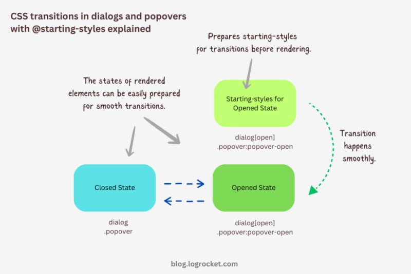
Let’s take it one step further by implementing different animations for dialog elements. The baseline remains the same: only the properties related to transformations and transitions will change.
The idea behind creating a stylish rotating dialog box involves playing with the opacity and a couple of CSS transformation properties:
.my-dialog {
  transition: opacity 0.5s, translate 0.5s, rotate 0.5s,
              overlay 0.5s allow-discrete,
              display 0.5s allow-discrete;
}
The starting styles for the open state of the dialog include the following:
Here’s the code:
@starting-style {
  .my-dialog[open] {
    opacity: 0;
    translate: -50% -100%;
    rotate: -180deg;
  }
}
The closed state resembles the starting styles but with altered translations and rotations to reflect an opposite movement when exiting the dialog element:
.my-dialog {
  /* Previous styles */
  opacity: 0;
  translate: 50% 100%;
  rotate: 180deg;
}
The dialog element in the open state has 100 percent opacity, no translation on either axis, and no rotation, effectively positioning it at the center of the screen:
.my-dialog[open] {
  opacity: 1;
  translate: 0 0;
  rotate: 0deg;
}
The final output looks something like below:
See the Pen HTML5 Dialog and popover rotating animation by Rahul (@_rahul) on CodePen.
To create a bouncing effect without using CSS keyframe animations, we can utilize a Bezier curve as the transition-timing function for the transformation and opacity transitions of our dialog. We’ll use the scale transformation for this effect.
Feel free to experiment with different x1, y1, x2, and y2 values for the Bezier curve, and implement them in your animation projects:
.my-dialog {
  transition: opacity 0.4s cubic-bezier(0.4, 1.6, 0.4, 0.8),
              scale 0.4s cubic-bezier(0.4, 1.6, 0.4, 0.8),
              overlay 0.4s allow-discrete,
              display 0.4s allow-discrete;
}
Now we can easily determine the starting styles and the open and closed states. The initial styles for the open and closed states will be the same — the dialog box will be scaled down to zero and completely transparent.
In the open state, the dialog box will have 100 percent opacity and be scaled to one. The rest of the transition effects will be handled by the Bezier curve-powered transitions:
@starting-style {
  .my-dialog[open] {
    opacity: 0;
    scale: 0;
  }
}

.my-dialog {
  opacity: 0;
  scale: 0;

  &[open] {
    opacity: 1;
    scale: 1;
  }
}
Here’s how this looks in action:
See the Pen HTML5 Dialog and popover bouncing animation by Rahul (@_rahul) on CodePen.
We will use the same Bezier curve in this animation to keep things simple, but the effect will be different compared to the previous one. The idea is to translate the dialogue along the y-axis instead of scaling it, as we did with the last effect:
.my-dialog {
  transition:
    opacity 0.5s cubic-bezier(0.4, 1.6, 0.4, 0.8),
    translate 0.5s cubic-bezier(0.4, 1.6, 0.4, 0.8),
    overlay 0.5s allow-discrete,
    display 0.5s allow-discrete;
}
The idea is to keep the dialog way up the viewport on the y-axis initially. Then, we will transform the dialog to zero when it is opened and finally translate it down the axis:
@starting-style {
  .my-dialog[open] {
    opacity: 0;
    translate: 0 -200%;
  }
}

.my-dialog {
  opacity: 0;
  translate: 0 200%;

  &[open] {
    opacity: 1;
    translate: 0 0;
  }
}
Instead of applying a 100 percent positive or negative translation, I doubled it to create the impression of urgency in the dialog box. See it in action below:
See the Pen HTML5 Dialog and popover slide-up-down bouncing animation by Rahul (@_rahul) on CodePen.
The above effects suit the dialog elements well, but they won’t look great with the popover elements. This section is dedicated to some nice popover animation effects, which make the popover look like popovers and nothing more.
This effect resembles the popover effect we created initially. In that example, the popover appeared from the top and slide-fading down the y-axis, which isn’t what you’d expect from a popup in the bottom-right corner of the viewport.
Let’s rectify that by adding the same translation on the y-axis for the starting styles and the close state. Everything else remains unchanged:
See the Pen Rising up and down popover animation by Rahul (@_rahul) on CodePen.
The process of creating a growing and shrinking effect is simple and involves the use of scale transformation with a twist.
By setting the transformation origin to the absolute bottom-right, we can ensure that the popover expands from the right, aligning with its current position at the bottom-right.
See the Pen Growing and shrinking popover animation by Rahul (@_rahul) on CodePen.
This technique is commonly used to create animations for notification toasts. To achieve this effect, you simply need to translate the popover element 100 percent to the right, putting it out of the viewport. Then, in the open state, you can translate it back to zero to complete the effect.
See the Pen Slide in out from right popover animation by Rahul (@_rahul) on CodePen.
We learned about incorporating CSS transition-based animations in dialog and popover elements using pure CSS. We discussed the complexities and issues of traditional transitioning with overlay elements, and then we addressed these problems one by one using CSS keyframes and, more importantly, the @starting-style at-rule, which is specially developed for transitions.
However, the @starting-style feature is fairly new and not yet available globally. Consequently, using CSS keyframes and the Web Animation API is an option that makes sense in production and provides more granular control over adding animation effects.
Having said that, I recommend the @starting-style approach once it gets adopted widely to keep things simple and lightweight with CSS transition applications.
As web frontends get increasingly complex, resource-greedy features demand more and more from the browser. If you’re interested in monitoring and tracking client-side CPU usage, memory usage, and more for all of your users in production, try LogRocket.

LogRocket is like a DVR for web and mobile apps, recording everything that happens in your web app, mobile app, or website. Instead of guessing why problems happen, you can aggregate and report on key frontend performance metrics, replay user sessions along with application state, log network requests, and automatically surface all errors.
Modernize how you debug web and mobile apps — start monitoring for free.
위 내용은 CSS @starting-style을 사용하여 대화상자 및 팝오버 요소에 애니메이션 적용하기의 상세 내용입니다. 자세한 내용은 PHP 중국어 웹사이트의 기타 관련 기사를 참조하세요!


![[웹 프런트엔드] Node.js 빠른 시작](https://img.php.cn/upload/course/000/000/067/662b5d34ba7c0227.png)


