


1. Requirements Analysis
In native development, it is common to customize Views. Often the system controls cannot meet the actual needs. A variety of product designs require us to create different views. There are many blog posts on the Internet about custom View content. This blog will share with you how to implement drawer menu control effects with custom components in React Native. The importance of sharing function in App must be self-evident, so how to achieve this effect in RN? This article mainly introduces you to the example of the drawer menu at the bottom of the React Native custom control.
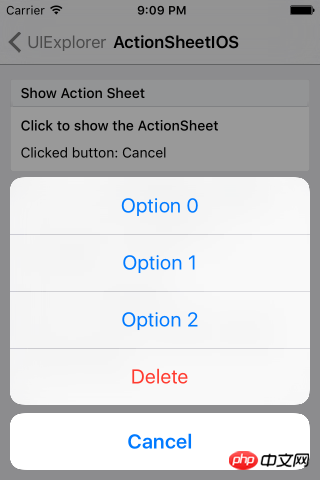
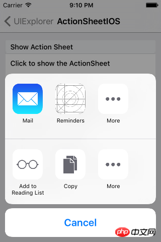
The React Native system library only provides the implementation of IOS, namely ActionSheetIOS. There are two implementations of the display mode of this control:
(1) showActionSheetWithOptions
(2) showShareActionSheetWithOptions
The first is to display an ActionSheet pop-up box on the iOS device. The second implementation is to display a share popup on the iOS device. Borrowing the official picture description is as follows:
The implementation system on IOS devices has been provided, and then we need to adapt to Android. In native development, customizing View also has a basic process:
(1) Customize the control class, inherit View or system control.
(2) Custom properties
(3) Get custom properties and initialize a series of tool classes
(4) Override the onMeasure method to measure the control
(5) If it is a custom layout, you also need to rewrite onLayout for layout
The idea of customizing components in React Native is basically similar to native customization. So according to this process, we can implement it step by step.
2. Function implementation
1. Custom component, implement Component
export default class AndroidActionSheet extends Component
2. Custom attribute
// 1.声明所需要的属性
static propTypes= {
  title: React.PropTypes.string, // 标题
  content: React.PropTypes.object, // 内容
  show: React.PropTypes.func, // 显示
  hide: React.PropTypes.func, // 隐藏
}constructor(props) {
super(props);
this.translateY = 150;
this.state = {
visible: false,
sheetAnim: new Animated.Value(this.translateY)
}
this.cancel = this.cancel.bind(this);
}3. Basic implementation Layout
/**
* Modal为最外层,ScrollView为内容层
*/
render() {
    const { visible, sheetAnim } = this.state;
    return(
      <Modal
      visible={ visible }
      transparent={ true }
      animationType="none"
      onRequestClose={ this.cancel }
      >
      <View style={ styles.wrapper }>
              <TouchableOpacity style={styles.overlay} onPress={this.cancel}></TouchableOpacity>
          <Animated.View
            style={[styles.bd, {height: this.translateY, transform: [{translateY: sheetAnim}]}]}>
            { this._renderTitle() }
            <ScrollView
                      horizontal={ true }
                      showsHorizontalScrollIndicator={ false }>
              {this._renderContainer()}
            </ScrollView>
          </Animated.View>
        </View>
      </Modal>
    )
}You can see that we have defined the basic layout above. The _renderTitle() method is used in the layout to render the title part. The content area is ScrollView and it is horizontal scrolling, that is, when the menu item exceeds the screen width , you can slide horizontally to select. The renderContainer method is called internally to render the menu:
/**
* 标题
*/
_renderTitle() {
  const { title,titleStyle } = this.props;
  if (!title) {
    return null
  }
    // 确定传入的是不是一个React Element,防止渲染的时候出错
  if (React.isValidElement(title)) {
    return (
      <View style={styles.title}>{title}</View>
    )
  }
  return (
    <Text style={[styles.titleText,titleStyle]}>{title}</Text>
  )
}

/**
* 内容布局
*/
_renderContainer() {
    const { content } = this.props;
    return (
      <View style={styles.container}>
        { content }
      </View>
    )
}When we need to click Modal to close, we also need to process the closing operation. Modal does not provide us with external closing processing, so we need to implement it separately, from In the layout code, we see TouchableOpacity as the mask layer, and add a stand-alone event, calling cancel to process:
/**
 * 控制Modal点击关闭,Android返回键关闭
 */
 cancel() {
  this.hide();
}4. Custom method, external call
Externally we need to control the control Display and hide, so the method of displaying and closing needs to be disclosed to the outside world:
/**
 * 显示
 */
show() {
  this.setState({visible: true})
  Animated.timing(this.state.sheetAnim, {
    toValue: 0,
    duration: 250
  }).start();
}/**
* 隐藏
*/
hide() {
this.setState({ visible: false })
Animated.timing(this.state.sheetAnim, {
toValue: this.translateY,
duration: 150
}).start();
}5. Use
<ActionSheet
ref='sheet'
title='分享'
content={this._renderContent()}
/>At this point, our custom component is completed. Overall, the basic principle is still very simple. It can be easily implemented by mainly using custom attributes, parameter transfer, and animation. The focus of this blog is not to let everyone know how to write this effect, but to let everyone understand how to implement it step by step when we encounter an implementation that needs to be customized.
3. Rendering

Related recommendations:
Drawer menu for WeChat mini program development Detailed explanation of examples
The above is the detailed content of React Native custom component implements drawer menu control effect. For more information, please follow other related articles on the PHP Chinese website!
 How to return to the homepage from an html subpage
 What directory search engines are there?
 word insert table
 How to connect to database with sqlplus
 The difference between scilab and matlab
 C language to find the least common multiple
 How to solve http request 415 error
 How to recover permanently deleted files on computer


![[Web front-end] Node.js quick start](https://img.php.cn/upload/course/000/000/067/662b5d34ba7c0227.png)


