


Triggering the accordion can be triggered through the custom data-toggle attribute. The data-toggle value is set to collapse, data-target="#collapse area identifier".
The first step is to design a panel combination with three folding areas:
<div class="panel-group" id="myAccordion">
  <div class="panel panel-accordion panel-default"></div>
  <div class="panel panel-accordion panel-default"></div>
  <div class="panel panel-accordion panel-default"></div>
</div>
Step 2: Add content to the panel . Each panel includes two parts. The first is the panel title panel-heading, and add the title panel-title inside. The second part is the panel content, which is the folding area, using the panel-collapse style.
<div class="panel panel-accordion panel-default">
  <div class="panel-heading">
    <h4 class="panel-title">标题一</h4>
  </div>
  <div class="panel-collapse">
    <div class="panel-body">折叠区内容...</div>
  </div>
</div>
The third step, in order to bundle the title and content area , you can connect the title area and panel area together through anchor links:
<div class="panel-group" id="myAccordion">
  <div class="panel panel-accordion panel-default">
    <div class="panel-heading">
      <h4 class="panel-title"><a href="#panel1">标题一</a></h4>
    </div>
    <div class="panel-collapse" id="panel1">
      <div class="panel-body">折叠区内容...</div>
    </div>
  </div>
  <div class="panel panel-accordion panel-default">
    <div class="panel-heading">
      <h4 class="panel-title"><a href="#panel2">标题二</a></h4>
    </div>
    <div class="panel-collapse" id="panel2">
      <div class="panel-body">折叠区内容...</div>
    </div>
  </div>
  ......
</div>
The fourth step is to control whether the content area of the panel is visible. In the Bootstrap framework, if you want the content area to be invisible, just add collapse
The content area of each panel is hidden and becomes invisible, but sometimes I want the content of the first panel to be visible by default. What should I do? In fact, the author of Bootstrap has already considered this for everyone. You only need to add the in style on top of collapse.
<div class="panel panel-accordion panel-default">
  <div class="panel-heading">
    <h4 class="panel-title"><a href="#panel1">标题一</a></h4>
  </div>
  <div class="panel-collapse collapse" id="panel1">
    <div class="panel-body">折叠区内容...</div>
  </div>
</div>
The fifth step is to activate the accordion interactive behavior. To complete the interactive behavior, you need to customize two attributes in the title link. One is data-toggle, and its value is collapse; the other is data-target, and its value is the identifier of the content area of each panel, such as Speaking of IDs, in this example they are #panel1, #panel2 and #panel3
div class="panel panel-accordion panel-default">
  <div class="panel-heading">
    <h4 class="panel-title"><a href="#panel1" data-toggle="collapse" data-target="#panel1">标题一</a></h4>
  </div>
  <div class="panel-collapse collapse in" id="panel1">
    <div class="panel-body">折叠区内容...</div>
  </div>
</div> Note: It is okay not to add data-target="#panel1" in this case, because there is already href="#panel1" before, but if it is a button button As a trigger, you must use the data-target="#panel1" statement.
The sixth step is to define the data-parent attribute , so that when one of the elements is clicked, all folding areas will be closed, and then the clicked area will be opened (if the clicked area is displayed, it will be closed ). The data-parent value matches the identifier of the accordion panel container, which in this example is #myAccordion:
<div class="panel-group" id="myAccordion">
  <div class="panel panel-accordion panel-default">
    <div class="panel-heading">
      <h4 class="panel-title">
        <a href="#panel1" data-toggle="collapse" data-target="#panel1" data-parent="#myAccordion">标题一</a>
      </h4>
    </div>
...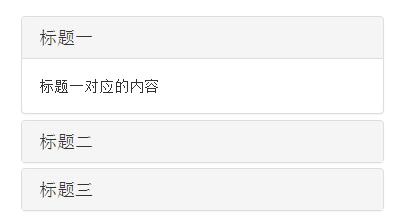
七 7. Complete code
<div class="panel-group" id="accordion">
  <div class="panel panel-default">
    <div class="panel-heading">
      <h4 class="panel-title"><a data-toggle="collapse" data-parent="#accordion" href="#collapseOne">标题一</a></h4>
    </div>
    <div id="collapseOne" class="panel-collapse collapse in">
      <div class="panel-body">标题一对应的内容</div>
    </div>
  </div>
  <div class="panel panel-default">
    <div class="panel-heading">
      <h4 class="panel-title"><a data-toggle="collapse" data-parent="#accordion" href="#collapseTwo">标题二</a></h4>
    </div>
    <div id="collapseTwo" class="panel-collapse collapse">
      <div class="panel-body">标题二对应的内容</div>
    </div>
  </div>
  <div class="panel panel-default">
    <div class="panel-heading">
      <h4 class="panel-title"><a data-toggle="collapse"data-parent="#accordion"href="#collapseThree">标题三</a></h4>
    </div>
    <div id="collapseThree" class="panel-collapse collapse">
      <div class="panel-body">标题三对应的内容</div>
    </div>
  </div>
</div>Rendering
The above is a comprehensive analysis of the Bootstrap accordion effect. I hope it will be helpful to everyone's learning.


![[Web front-end] Node.js quick start](https://img.php.cn/upload/course/000/000/067/662b5d34ba7c0227.png)


