


This article mainly introduces you to implement a cool menu plug-in based on Vue. This tutorial requires you to have certain basic knowledge of css and vue. This article introduces you step by step in very detail. Friends who need it can refer to it. I hope Can help everyone.
Written in front
I recently saw a very cool menu plug-in, and I have always wanted to tinker with it into vue form. Who told me that I am a die-hard fan of vue, if this Not even love :pensive:. :laughing: Let’s have a little fun and explore black magic together. Readers watching this tutorial need to have certain knowledge of vue and css3.
Structure of this article
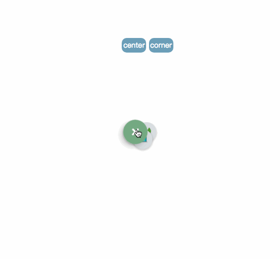
1. Effect demonstration
2. Introduction to usage
3. Explanation of key steps
Text
1. Effect demonstration
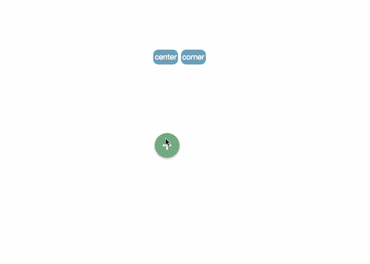
pic_1
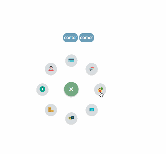
pic2
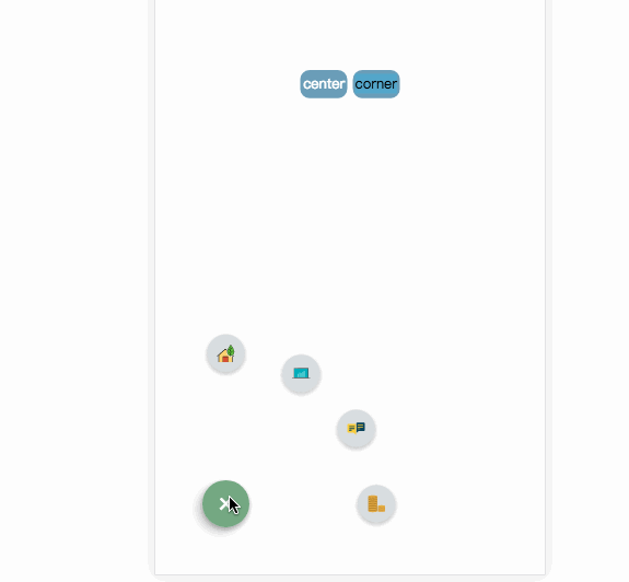
pic_3
Online demonstration live demo
2. Introduction to use
Project address: github .com/MingSeng-W/vue-bloom-menu, clone the project to the local
a. First introduce the menu component in the single file component, and import menuConfig.stylus.
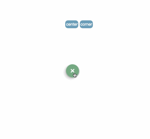
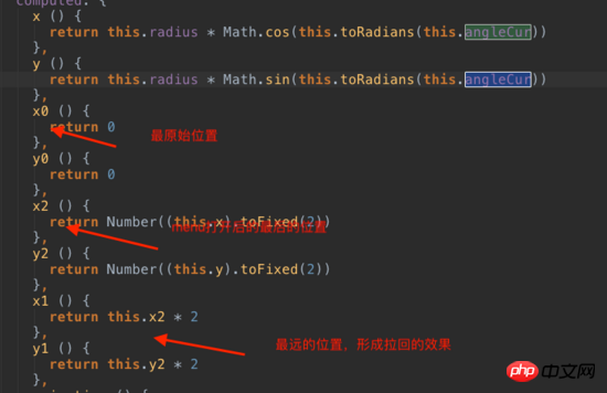
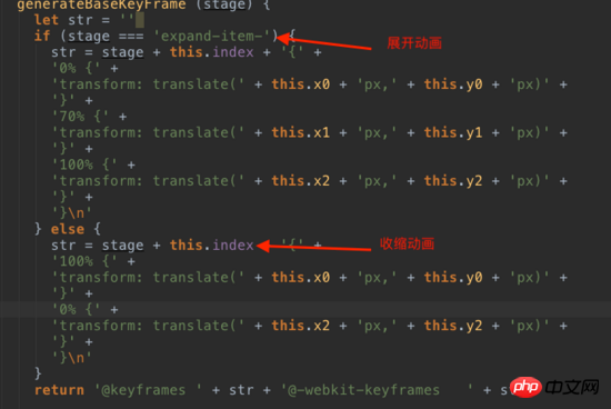
# in the common folder stylus. ##b. Configure the corresponding parameters Optional parameters * radius: default is 100px, the distance between the item and the menu button. * startAngle: defaut is 0, the angle at which the item starts is recorded as 0 with the 3 o'clock direction of the clock, and then the clockwise direction is the increasing direction. * endAngle: default is 315, the angle of the last item. * itemNum: default is 8* animationDuration: default is 0.5s, the execution time of each item animation * itemAnimationDelay: default is 0.04s, each item Interval delay time between animation triggersRequired parameters* iconImgArrImport the icon you need, and then generate iconImgArr (computed attribute binding) and pass it as props For the menu componentThe position of the menuCurrently there are two positions, center and corner, which are specified in the menu class. center’s class: .menu-center-wrappercorner’s class: .menu-left-corner-wrapper. Of course, it’s OK to specify the location yourself. A simple example 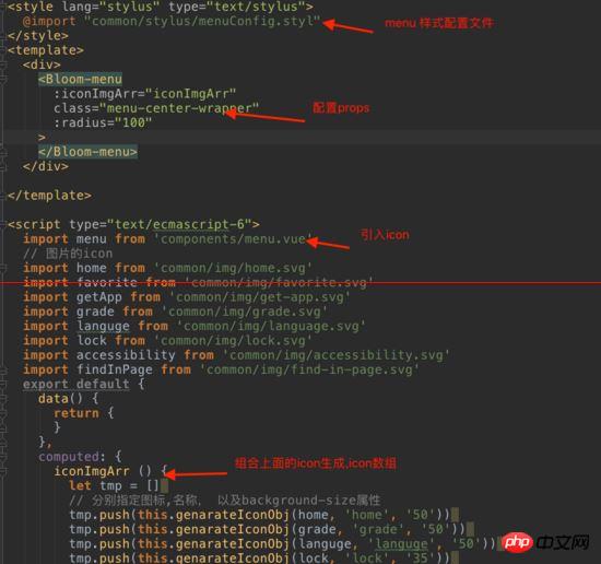


code
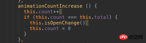
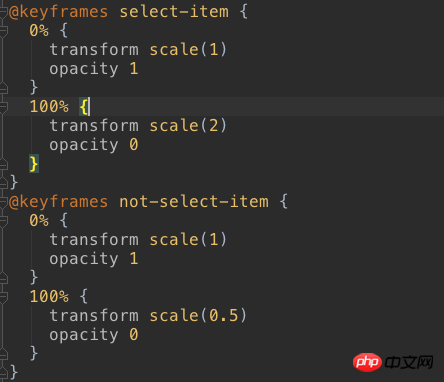
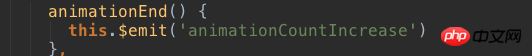
When you open the menu again, check whether the showItem bound to the item is false, and if so, set it to true. When clicking, you need to get the index of the clicked item, and get the global currentIndex, which is the index of the clicked item. The clicked one uses the zoom-in animation, otherwise the zoom-out animation is used.
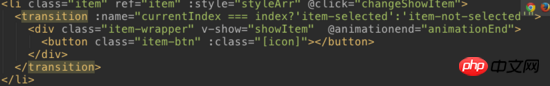
pic_6
Related recommendations:
html: menu tag Detailed explanation of defining menu list
Recommended 10 articles about Menu
Detailed explanation of examples bootstrap uses dropdown-menu to implement context menu
The above is the detailed content of Detailed explanation of implementing a cool menu plug-in in Vue. For more information, please follow other related articles on the PHP Chinese website!
 What are the jquery plug-ins?
 Introduction to the plug-ins required for vscode to run java
 pci device universal driver
 Modify file name in linux
 How to set cad point style
 Excel table slash divided into two
 What to do if there is no cursor when clicking on the input box
 Why can't win11 be installed?


![[Web front-end] Node.js quick start](https://img.php.cn/upload/course/000/000/067/662b5d34ba7c0227.png)


