This article mainly introduces the relevant information on the sticky footer layout that explains the classic CSS layout in detail. The editor thinks it is quite good, so I will share it with you now and give it as a reference. Let’s follow the editor to take a look, I hope it can help everyone.
What is Sticky footer layout?
Our common web page layout methods are generally divided into header (header) part, content (content area) part and footer (footer) part. When there is less content in the header area and content area, the footer area is not arranged along with the content area but is always displayed at the bottom of the screen. When there is a lot of content in the content area, the footer can be displayed at the bottom of the page as the document flows. This is the legendary Sticky footer layout. Isn't it easy to understand? It doesn’t matter if you don’t understand. Let me give you a simple example.
For example
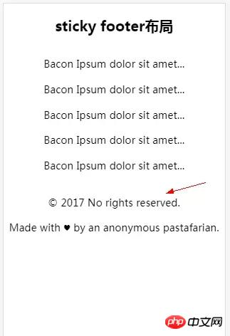
When there is less content, the normal document flow is displayed as follows:

In normal document flow, when there is less content, the footer section is not always fixed at the bottom of the screen. At this time it’s time for the legendary sitcky footer layout to appear.
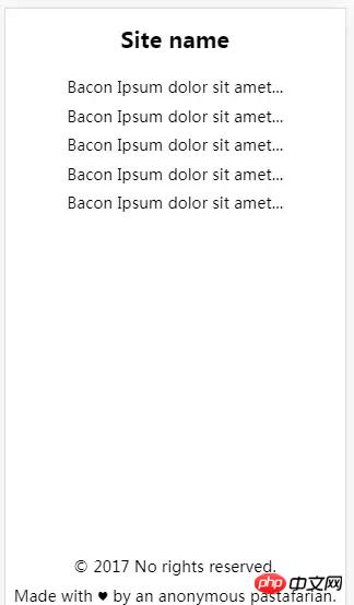
The sticky footer layout effect is as shown below:

No matter how much content there is in the content area, the footer is always displayed at the bottom of the screen. When the content area exceeds the height of the screen. The footer will always appear at the very bottom of the page. Now that everyone knows the true face of sticky footer, let’s take a look at how it is implemented.
Sticky footer layout implementation
Negative margin layout method
html code:
这里是头部
这里是main content区域...
这里是main content区域...
这里是main content区域...
这里是main content区域...
© 2017 No rights reserved.
Made with ♥ by an anonymous pastafarian.
css code:
p,h1,p{margin:0; padding: 0;} .detail{ position:fixed; overflow:auto; width:100%; height:100%; } .wrapper{ min-height:100%; width:100%; } .title h1{ font-size:40px; text-align: center; } .main{ margin-top:64px; padding-bottom:64px; } .main p{ font-size: 25px; text-align: center; } .footer{ margin:-64px auto 0 auto; font-size:32px; } .footer p{ text-align: center; } .clearfix::after { display: block; content: "."; height: 0; clear: both; visibility: hidden; }
Note: The padding-bottom in main and the negative margin value in footer must be consistent.
flex layout method
html code:
Site name
Bacon Ipsum dolor sit amet...
Bacon Ipsum dolor sit amet...
Bacon Ipsum dolor sit amet...
Bacon Ipsum dolor sit amet...
css code:
body{display: flex; flex-flow: column; min-height: 100vh; overflow:auto;} h1{font-size: 60px; text-align: center;} p{font-size: 24px; text-align: center;} .main{flex:1;}
The flex layout structure is simple and the code is streamlined. Because of the compatibility of flex, you need to pay attention when using this method of layout.
Summary
This concludes our discussion. I hope it will be helpful to my friends. This is also my first time recording a blog. I hope you guys will bear with me and provide guidance if there are some imperfections. The sticky footer layout is also a classic layout in CSS. Beginners should be familiar with this layout. Of course, if you use it a lot, you will naturally learn it.
Related recommendations:
Sticky Footer Detailed explanation of two absolute bottom routine examples
What is the layout of Sticky footer?
CSS Sticky Footer: Perfect CSS absolute bottom_html/css_WEB-ITnose
The above is the detailed content of Detailed explanation of CSS classic layout Sticky footer layout. For more information, please follow other related articles on the PHP Chinese website!


