84669 人が学習中
152542 人が学習中
20005 人が学習中
5487 人が学習中
7821 人が学習中
359900 人が学習中
3350 人が学習中
180660 人が学習中
48569 人が学習中
18603 人が学習中
40936 人が学習中
1549 人が学習中
1183 人が学習中
32909 人が学習中
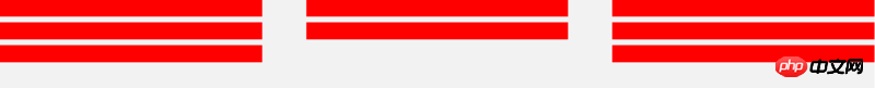
就是这种,不过其中的红色元素是根据父元素自适应的,每一行的第一个和最后一个元素紧贴父元素,这种应该怎么写,我现在用的css3的flex属性写的,感觉会有兼容问题,大家有更好的方法吗
走同样的路,发现不同的人生
提供两个解决方案:
<!-- html -->
<p class="adv">
  <ul>
    <li></li>
    <li></li>
    <li></li>
    <li></li>
    <li></li>
    <li></li>
    <li></li>
    <li></li>
    <li></li>
  </ul>
</p>
/* css */
*{
  margin:0;
  padding: 0;
}
.adv{
  width: 920px;
  height:620px;
  background: green;
}
.adv ul li{
  width: 300px;
  height: 200px;
  float: left;
  margin-right: 10px;
  margin-bottom: 10px;
  background: blue;
  list-style: none;
}
.adv ul li:nth-child(3n){
  margin-right: 0;
}
.adv ul li:nth-child(n+7){
  margin-bottom: 0;
}
效果图如下:
<!-- html -->
<p class="adv">
  <ul>
    <li></li>
    <li></li>
    <li class="no-mr"></li>
    <li></li>
    <li></li>
    <li class="no-mr"></li>
    <li></li>
    <li></li>
    <li class="no-mr no-mb"></li>
  </ul>
</p>
/* css */
*{
  margin:0;
  padding: 0;
}
.adv{
  width: 920px;
  height:620px;
  background: green;
}
.adv ul li{
  width: 300px;
  height: 200px;
  float: left;
  margin-right: 10px;
  margin-bottom: 10px;
  background: blue;
  list-style: none;
}
.no-mr{
  margin-right: 0 !important;
}
.no-mb{
  margin-bottom: 0 !important;
}
效果图同上.
望采纳,Thx!
inline-block 也行啊
常规方法是用float~
还有个方法是用inline-block
<!DOCTYPE html>
<html>
<head lang="en">
    <meta charset="UTF-8">
    <title>html5</title>
    <style type="text/css">

    .box{
        width: 30%;
        display: inline-block;
        border:1px solid #440239;
        height: 50px;
        margin: 1%;
    }
    </style>
</head>
<body>

    <p class="box"></p>
    <p class="box"></p>
    <p class="box"></p>
    <p class="box"></p>
    <p class="box"></p>
    <p class="box"></p>
    <p class="box"></p>
    <p class="box"></p>
    <p class="box"></p>
</body>
</html>


![[Web フロントエンド] Node.js クイック スタート](https://img.php.cn/upload/course/000/000/067/662b5d34ba7c0227.png)


提供两个解决方案:
效果图如下:
效果图同上.
望采纳,Thx!
inline-block 也行啊
常规方法是用float~
还有个方法是用inline-block