


この記事では主にCSS3で実装された10種類のローディングエフェクトを詳しく紹介します。そのエフェクトの実装はシンプルで斬新で、興味のある方は参考にしてください。
CSS3を使用していくつかの一般的なローディングエフェクトが実装されています。とてもシンプルなので、今でも共有してメモを取っています...
最初のエフェクト:

コードは次のとおりです:
<p class="loading">
        <span></span>
        <span></span>
        <span></span>
        <span></span>
        <span></span>
</p>.loading{
width: 80px;
height: 40px;
margin: 0 auto;
margin-top:100px;
}
.loading span{
display: inline-block;
width: 8px;
height: 100%;
border-radius: 4px;
background: lightgreen;
-webkit-animation: load 1s ease infinite;
}
@-webkit-keyframes load{
0%,100%{
height: 40px;
background: lightgreen;
}
50%{
height: 70px;
margin: -15px 0;
background: lightblue;
}
}
.loading span:nth-child(2){
-webkit-animation-delay:0.2s;
}
.loading span:nth-child(3){
-webkit-animation-delay:0.4s;
}
.loading span:nth-child(4){
-webkit-animation-delay:0.6s;
}
.loading span:nth-child(5){
-webkit-animation-delay:0.8s;
} 2 番目のエフェクト:
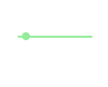
コードは次のとおりです:
<p class="loading">
        <span></span>
</p>.loading{
width: 150px;
height: 4px;
border-radius: 2px;
margin: 0 auto;
margin-top:100px;
position: relative;
background: lightgreen;
-webkit-animation: changeBgColor 1.04s ease-in infinite alternate;
}
.loading span{
display: inline-block;
width: 16px;
height: 16px;
border-radius: 50%;
background: lightgreen;
position: absolute;
margin-top: -7px;
margin-left:-8px;
-webkit-animation: changePosition 1.04s ease-in infinite alternate;
}
@-webkit-keyframes changeBgColor{
0%{
background: lightgreen;
}
100%{
background: lightblue;
}
}
@-webkit-keyframes changePosition{
0%{
background: lightgreen;
}
100%{
margin-left: 142px;
background: lightblue;
}
} 3 番目から 5 番目の効果:


コードは次のとおりです:
<p class="loading">
        <span></span>
        <span></span>
        <span></span>
        <span></span>
        <span></span>
</p> 3 番目の CSS スタイル-5番目の効果は、 :
.loading{
            width: 150px;
            height: 15px;
            margin: 0 auto;
            position: relative;
            margin-top:100px;
        }
        .loading span{
            position: absolute;
            width: 15px;
            height: 100%;
            border-radius: 50%;
            background: lightgreen;
            -webkit-animation: load 1.04s ease-in infinite alternate;
        }
        @-webkit-keyframes load{
            0%{
                opacity: 1;
                -webkit-transform: translate(0px);
            }
            100%{
                opacity: 0.2;
                -webkit-transform: translate(150px);
            }
        }
        .loading span:nth-child(1){
            -webkit-animation-delay:0.13s;
        }
        .loading span:nth-child(2){
            -webkit-animation-delay:0.26s;
        }
        .loading span:nth-child(3){
            -webkit-animation-delay:0.39s;
        }
        .loading span:nth-child(4){
            -webkit-animation-delay:0.52s;
        }
        .loading span:nth-child(5){
            -webkit-animation-delay:0.65s;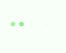
} 6 番目から 8 番目の効果:


コードは次のとおりです:
<p class="loading">
        <span></span>
        <span></span>
        <span></span>
        <span></span>
        <span></span>
</p> 6 番目から 8 番目の CSS スタイル番目の効果は次のとおりです:
.loading{
            width: 150px;
            height: 15px;
            margin: 0 auto;
            margin-top:100px;
            text-align: center;
        }
        .loading span{
            display: inline-block;
            width: 15px;
            height: 100%;
            margin-right: 5px;
            background: lightgreen;
            -webkit-animation: load 1.04s ease infinite;
        }
        .loading span:last-child{
            margin-right: 0px;
        }
        @-webkit-keyframes load{
            0%{
                opacity: 1;
            }
            100%{
                opacity: 0;
            }
        }
        .loading span:nth-child(1){
            -webkit-animation-delay:0.13s;
        }
        .loading span:nth-child(2){
            -webkit-animation-delay:0.26s;
        }
        .loading span:nth-child(3){
            -webkit-animation-delay:0.39s;
        }
        .loading span:nth-child(4){
            -webkit-animation-delay:0.52s;
        }
        .loading span:nth-child(5){
            -webkit-animation-delay:0.65s;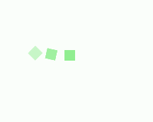
} No. 9 -10 の効果:


コードは次のとおりです:
<p class="loadEffect">
        <span></span>
        <span></span>
        <span></span>
        <span></span>
        <span></span>
        <span></span>
        <span></span>
        <span></span>
</p>CSS スタイルは次のとおりです:
.loadEffect{
            width: 100px;
            height: 100px;
            position: relative;
            margin: 0 auto;
            margin-top:100px;
        }
        .loadEffect span{
            display: inline-block;
            width: 16px;
            height: 16px;
            border-radius: 50%;
            background: lightgreen;
            position: absolute;
            -webkit-animation: load 1.04s ease infinite;
        }
        @-webkit-keyframes load{
            0%{
                opacity: 1;
            }
            100%{
                opacity: 0.2;
            }
        }
        .loadEffect span:nth-child(1){
            left: 0;
            top: 50%;
            margin-top:-8px;
            -webkit-animation-delay:0.13s;
        }
        .loadEffect span:nth-child(2){
            left: 14px;
            top: 14px;
            -webkit-animation-delay:0.26s;
        }
        .loadEffect span:nth-child(3){
            left: 50%;
            top: 0;
            margin-left: -8px;
            -webkit-animation-delay:0.39s;
        }
        .loadEffect span:nth-child(4){
            top: 14px;
            rightright:14px;
            -webkit-animation-delay:0.52s;
        }
        .loadEffect span:nth-child(5){
            rightright: 0;
            top: 50%;
            margin-top:-8px;
            -webkit-animation-delay:0.65s;
        }
        .loadEffect span:nth-child(6){
            rightright: 14px;
            bottombottom:14px;
            -webkit-animation-delay:0.78s;
        }
        .loadEffect span:nth-child(7){
            bottombottom: 0;
            left: 50%;
            margin-left: -8px;
            -webkit-animation-delay:0.91s;
        }
        .loadEffect span:nth-child(8){
            bottombottom: 14px;
            left: 14px;
            -webkit-animation-delay:1.04s;
} PS: 実際には CSS の繰り返しがたくさんありますスタイルコード、主にアニメーションが異なるためですが、後で直接使用すると便利なので、今は整理しません。
上記がこの記事の全内容です。その他の関連コンテンツについては、PHP 中国語 Web サイトをご覧ください。
関連する推奨事項:
CSS は、角丸の効果を実現するためにスプライト技術を使用します
CSS3 によって生成される約 20 個の読み込みアニメーション効果
以上がCSS3 によって実装される 10 個の読み込みエフェクトの詳細内容です。詳細については、PHP 中国語 Web サイトの他の関連記事を参照してください。


![[Web フロントエンド] Node.js クイック スタート](https://img.php.cn/upload/course/000/000/067/662b5d34ba7c0227.png)


