


この記事は主にWeChatミニプログラムUIとコンテナコンポーネントの概要に関する関連情報を紹介します
WeChatミニプログラムUIとコンテナコンポーネントの概要
2.コンテナ コンポーネント 2.1 コンポーネント コンテナ (ビュー)2.2 スクロール ビュー
2.3 スムーズ ビュー ビュー コンテナ (スワイパー)
1. 概要と概要
1.1 UI コンポーネントの概要図
1.2 概要 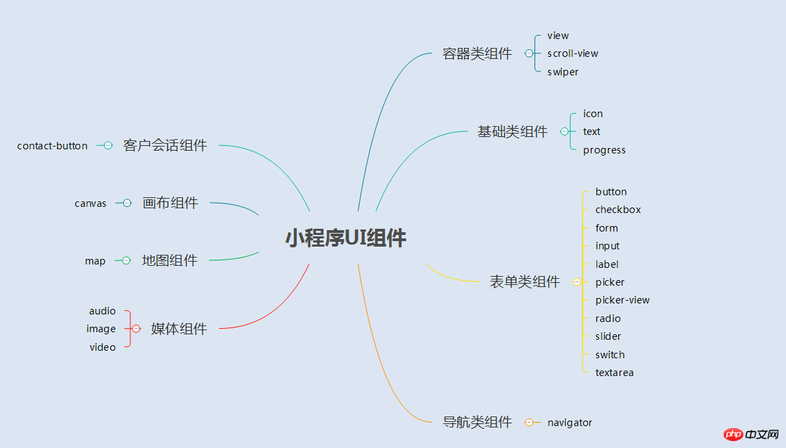
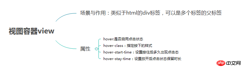
2. コンテナ コンポーネント (ビュー)
(2) 例レンダリング
page.wxml
<view>
 <text class="row-view-title">水平布局:</text>
 <view class="flex-wrp-row">
  <view class="flex-item-red" hover="true" hover-class="hover-style"><text class="color-text">red</text></view>
  <view class="flex-item-green" hover="true" hover-class="hover-style"><text class="color-text">green</text></view>
  <view class="flex-item-blue" hover="true" hover-class="hover-style"><text class="color-text">blue</text></view>
 </view>
</view>
<view>
 <text class="column-view-title">垂直布局:</text>
 <view class="flex-wrp-column" >
  <view class="flex-item-red" hover="true" hover-class="hover-style"><text class="color-text" >red</text></view>
  <view class="flex-item-green" hover="true" hover-class="hover-style"><text class="color-text">green</text></view>
  <view class="flex-item-blue" hover="true" hover-class="hover-style"><text class="color-text">blue</text></view>
 </view>
</view>
page.wxss
.flex-item-red{
 background-color: red;
 height: 200rpx;
 width: 200rpx;
 text-align: center;
 line-height: 200rpx;
}
.flex-item-green{
 background-color: green;
 height: 200rpx;
 width: 200rpx;
 text-align: center;
 line-height: 200rpx
}
.flex-item-blue{
 background-color: blue;
 height: 200rpx;
 width: 200rpx;
 text-align: center;
 line-height: 200rpx
}
.flex-wrp-row{
 flex-direction: row;
 display: flex;
 margin-left: 10rpx;
 margin-top: 20rpx;
}
.flex-wrp-column{
 flex-direction: column;
 display: flex;
 margin-left: 10rpx;
  margin-top: 20rpx;
}
.color-text{
 color: snow;
 font-family: 'Times New Roman', Times, serif;
 font-weight: bold;
}
.hover-style{
 background-color: black;
}
.row-view-title,.column-view-title{
 margin-left: 20rpx;
 font-family: 'Times New Roman', Times, serif;
 font-weight: bold;
}
/*重要属性:
 display: flex; //与display:box;是类似,是flexbox的最新语法格式,有更好的适配效果
 flex-direction: column; //表示子布局垂直布局
 flex-direction: row; //表示子布局为水平布局
*/
2.2 スクロール可能なビューコンテナ (scroll -view)
 (1) 概要
レンダリング:

page.wxml
<view>
<text>水平滚动布局</text>
</view>
<view class="x-view">
 <scroll-view class="scroll-view-x" scroll-x="true" bindscrolltoupper="scrollXToUpper" bindscrolltolower="scrollXToLower" bindscroll="scroll" scroll-left="0" scroll-into-view="{{green}}">
  <view id="green" class="x_green"></view>
  <view id="red" class="x_red"></view>
  <view id="yellow" class="x_yellow"></view>
  <view id="blue" class="x_blue"></view>
 </scroll-view>
</view>
<view>
<text>垂直滚动布局</text>
</view>
<view class="y-view">
 <scroll-view class="scroll-view-y" scroll-y="true" bindscrolltoupper="scrollYToUpper" bindscrolltolower="scrollYToLower" bindscroll="scroll" scroll-top="0" scroll-into-view="{{green}}">
  <view id="green" class="y_green"></view>
  <view id="red" class="y_red"></view>
  <view id="yellow" class="y_yellow"></view>
  <view id="blue" class="y_blue"></view>
 </scroll-view>
</view>page.wxss
.x_green{
 background-color: green;
 width: 500rpx;
 height: 300rpx;
 display: inline-flex;
}
.x_red{
 background-color: red;
 width: 500rpx;
 height: 300rpx;
 display: inline-flex;

}
.x_blue{
 background-color: blue;
 width: 500rpx;
 height: 300rpx;
 display: inline-flex;
}
.x_yellow{
 background-color: yellow;
 width: 500rpx;
 height: 300rpx;
 display: inline-flex;
}
.y_green{
 background-color: green;
 width: 100%;
 height: 300rpx;
}
.y_red{
 background-color: red;
 width: 100%;
 height: 300rpx;
}
.y_yellow{
 background-color: yellow;
 width: 100%;
 height: 300rpx;
}
.y_blue{
 background-color: blue;
 width: 100%;
 height: 300rpx;
}
.scroll-view-x{
 display: flex;
 white-space: nowrap;
 width: 100%;
 margin-bottom: 20px;
 margin-top: 10px;
 height: 300rpx;
}
.scroll-view-y{
 height: 400rpx;
}
/*重要属性:
 white-space: nowrap;//设置内部元素不换行显示,与display: inline-flex;属性联合使用才会有水平布局的效果
*/ page.js
//index.js
//获取应用实例
var app = getApp()
//var color_index=['green','red','yellow','blue'];
Page({
data:{
toview:'red',
},
/*滑动到左边触发*/
scrollXToUpper:function(){
console.log('scrollXToUpper')
},
/*滑动到右边触发 */
scrollXToLower:function(){
console.log('scrollXToLower')
},
/*滑动到顶部触发*/
scrollYToUpper:function(){
console.log('scrollYToUpper')
},
/*滑动到左边触发 */
scrollYToLower:function(){
console.log('scrollYToLower')
},
/*滑动触发 */
scroll:function(){
console.log("scroll")
},
onLoad: function () {
console.log('onLoad')
var that = this
},
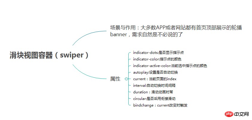
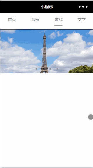
})2.3 スライダービューコンテナ(スワイパー) 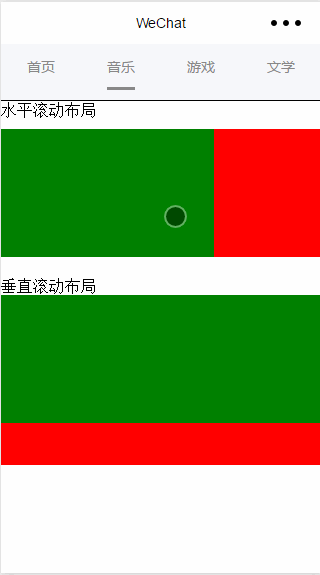
(2) 例 レンダリング:
page.wxml
<swiper data-current="0" current="0" bindchange="itemChangeFunc" circular="true" indicator-dots="{{indicatorDots}}"
 autoplay="{{autoplay}}" interval="{{interval}}" duration="{{duration}}">
 <block wx:for="{{imgUrls}}" wx:key="swiperkeys">
  <swiper-item>
  <image src="{{item}}" class="slide-image" width="355" height="150"/>
  </swiper-item>
 </block>
</swiper>page.js
//game.js
Page({
 data: {
 imgUrls: [
  '/image/wechat.png',
  'http://img02.tooopen.com/images/20150928/tooopen_sy_143912755726.jpg',
  'http://img06.tooopen.com/images/20160818/tooopen_sy_175866434296.jpg',
  'http://img06.tooopen.com/images/20160818/tooopen_sy_175833047715.jpg'
 ],
 indicatorDots: true,
 autoplay: true,
 interval: 3000,
 duration: 1000,
 current:1,
 },

 durationChange: function(e) {
 this.setData({
  duration: e.detail.value
 })
 },
 durationChange: function(e) {
 this.setData({
  duration: e.detail.value
 })
 },
itemChangeFunc:function(e){
 // console.log(e.target.dataset.current)

 console.log(e.detail)
}
})上記が全内容ですこの記事が皆さんの学習に役立つことを願っています。その他の関連コンテンツについては、PHP 中国語 Web サイトに注目してください。
WeChat ミニ プログラム ボタン コンポーネントの使用方法の概要
WeChat ミニ プログラム チャート プラグイン (wx-チャート)
以上がWeChat ミニ プログラムの UI およびコンテナ コンポーネントの概要の詳細内容です。詳細については、PHP 中国語 Web サイトの他の関連記事を参照してください。


![[Web フロントエンド] Node.js クイック スタート](https://img.php.cn/upload/course/000/000/067/662b5d34ba7c0227.png)


