


この記事では、Angular でモーダル ボックスをポップアップする 2 つの方法を主に紹介します。これは非常に優れており、必要な方は参考にしていただければ幸いです。
ブログを始める前に、まず ngx-bootstrap-modal をインストールする必要があります
npm install ngx-bootstrap-modal --save
そうしないと、モーダル ボックスの効果が見づらくなり、吐きたくなるでしょう
1. ポップアップ方法 1 (この方法は、 https://github .com/cipchk/ngx-bootstrap-modal)
1.アラートポップアップボックス
(1)デモディレクトリ
--------app.component.ts
- ------- app.component.html
--------app.module.ts
--------詳細(フォルダ)
------ -----detail .component.ts
---------------detail.component.html
(2)デモコード
app.module.tsは、必要なBootstrapModalModuleとModalModuleをインポートします。そして登録します
//app.module.ts
import { BrowserModule } from '@angular/platform-browser';
import { NgModule } from '@angular/core';
//这种模态框只需要导入下面这两个
import { BootstrapModalModule } from 'ngx-bootstrap-modal';
import { ModalModule } from 'ngx-bootstrap/modal';
import { AppComponent } from './app.component';
import { DetailComponent } from './detail/detail.component';
@NgModule({
 declarations: [
 AppComponent,
 DetailComponent
 ],
 imports: [
 BrowserModule,
 BootstrapModalModule
 ],
 providers: [],
 entryComponents: [
 DetailComponent
 ],
 bootstrap: [AppComponent]
})
export class AppModule { }app.component.html モーダルボックスをポップアップできるボタンを作成します
<p class="container">
 <p class="row">
 <button type="button" class="btn btn-primary" (click)="showAlert()">alert模态框</button>
 </p>
</p>
app.component.ts このボタンのアクションを記述します showAlert()
import { Component } from '@angular/core';
import { DialogService } from "ngx-bootstrap-modal";
import { DetailComponent } from './detail/detail.component'
@Component({
 selector: 'app-root',
 templateUrl: './app.component.html',
 styleUrls: ['./app.component.css']
})
export class AppComponent {
 title = 'app';
 constructor(public dialogService: DialogService) {
 }
 showAlert() {
  this.dialogService.addDialog(DetailComponent, { title: 'Alert title!', message: 'Alert message!!!' });
 }
}detail.component.html レイアウトを記述しますアラート ポップアップ ボックスの
<p class="modal-dialog">
 <p class="modal-content">
  <p class="modal-header">
   <button type="button" class="close" (click)="close()" >×</button>
   <h4 class="modal-title">{{title}}</h4>
  </p>
  <p class="modal-body">
   这是alert弹框
  </p>
  <p class="modal-footer">
   <button type="button" class="btn btn-primary" (click)="close()">取消</button>
   <button type="button" class="btn btn-default">确定</button>
  </p>
 </p>
</p>detail.component .ts を使用してモーダル ボックス コンポーネントを作成するには、コンポーネントを作成する必要があります。その後、ngx-bootstrap-model が起動をガイドします
このコンポーネントについては、次のことを継承する必要がありますDialogComponent
T 外部パラメーターはモーダル ボックスのタイプに渡されます。
T1 モーダル ボックスの戻り値の型。
したがって、DialogService は DialogComponent のコンストラクター パラメーターである必要があります。
import { Component } from '@angular/core';
import { DialogComponent, DialogService } from 'ngx-bootstrap-modal';
export interface AlertModel {
 title: string;
 message: string;
}
@Component({
 selector: 'alert',
 templateUrl: './detail.component.html',
 styleUrls: ['./detail.component.css']
})
export class DetailComponent extends DialogComponent<AlertModel, null> implements AlertModel {
 title: string;
 message: string;
 constructor(dialogService: DialogService) {
 super(dialogService);
 }
}2.ポップアップボックスの確認
(1)デモディレクトリ
--------app.component.ts
--------app.component.html
--- -- ---app.module.ts
----------confirm(フォルダ)
-------------confirm.component.ts
-------- - ---confirm.component.html
(2)デモコード
app.module.ts は必要な BootstrapModalModule と ModalModule をインポートして登録します。これらはアラート ポップアップ ボックスと同じです。メソッド 1 のポップアップ メソッド
//app.module.ts
import { BrowserModule } from '@angular/platform-browser';
import { NgModule } from '@angular/core';
//这种模态框只需要导入下面这两个
import { BootstrapModalModule } from 'ngx-bootstrap-modal';
import { ModalModule } from 'ngx-bootstrap/modal';
import { AppComponent } from './app.component';
import { DetailComponent } from './detail/detail.component';
@NgModule({
 declarations: [
 AppComponent,
 DetailComponent
 ],
 imports: [
 BrowserModule,
 BootstrapModalModule
 ],
 providers: [],
 entryComponents: [
 DetailComponent
 ],
 bootstrap: [AppComponent]
})
export class AppModule { }app.component.html モーダル ボックスをポップアップできるボタンを作成します
<p class="container">
 <p class="row">
 <button type="button" class="btn btn-primary" (click)="showConfirm()">modal模态框</button>
 </p>
</p>
app.component.ts このボタンのアクション showconfirm() を記述します
import { Component } from '@angular/core';
import { DialogService } from "ngx-bootstrap-modal";
import { ConfirmComponent } from './confirm/confirm.component'
@Component({
 selector: 'app-root',
 templateUrl: './app.component.html',
 styleUrls: ['./app.component.css']
})
export class AppComponent {
 title = 'app';
 constructor(public dialogService: DialogService,private modalService: BsModalService) {
 }
 showConfirm() {
  this.dialogService.addDialog(ConfirmComponent, {
   title: 'Confirmation',
   message: 'bla bla'
  })
   .subscribe((isConfirmed) => {
   });
 }
}confirm.component .html 確認ポップアップボックスのレイアウトを記述します
<p class="modal-dialog">
 <p class="modal-content">
  <p class="modal-header">
   <button type="button" class="close" (click)="close()" >×</button>
   <h4 class="modal-title">{{title}}</h4>
  </p>
  <p class="modal-body">
   这是confirm弹框
  </p>
  <p class="modal-footer">
   <button type="button" class="btn btn-primary" (click)="close()">取消</button>
   <button type="button" class="btn btn-default">确定</button>
  </p>
 </p>
</p>verify.component.ts はモーダルボックスコンポーネントを作成します
(1)デモディレクトリ
---- ----app.component.ts
------ -app.component.html
(2)デモコード
ポップアップ ボックスには 3 つの形式のアラート確認プロンプトも含まれており、すべていくつかの組み込みスタイルが含まれています
app .module.ts
import { Component } from '@angular/core';
import { DialogComponent, DialogService } from 'ngx-bootstrap-modal';
export interface ConfirmModel {
 title:string;
 message:any;
}
@Component({
 selector: 'confirm',
 templateUrl: './confirm.component.html',
 styleUrls: ['./confirm.component.css']
})
export class ConfirmComponent extends DialogComponent<ConfirmModel, boolean> implements ConfirmModel {
 title: string;
 message: any;
 constructor(dialogService: DialogService) {
 super(dialogService);
 }
 confirm() {
 // on click on confirm button we set dialog result as true,
 // ten we can get dialog result from caller code
 this.close(true);
 }
 cancel() {
 this.close(false);
 }
}app.component.html は非常にシンプルで、ボタン 1 つだけです
import { BrowserModule } from '@angular/platform-browser';
import { NgModule } from '@angular/core';
import { BootstrapModalModule } from 'ngx-bootstrap-modal';
import { ModalModule } from 'ngx-bootstrap/modal';
import { AppComponent } from './app.component';
@NgModule({
 declarations: [
 AppComponent
 ],
 imports: [
 BrowserModule,
 BootstrapModalModule,
 ModalModule.forRoot()
 ],
 providers: [],
 bootstrap: [AppComponent]
})
export class AppModule { }app.component。 ts は非常にシンプルで、コンポーネントのレイアウトを記述する必要さえありません。アイコンやサイズなどのパラメーターを渡すだけです。
<p class="container">
 <p class="row">
 <button type="button" class="btn btn-default" (click)="show()">内置</button>
 </p>
</p>
2. ポップアップ メソッド 2 (このメソッドは https:/ からのものです) /valor-software.com/ngx-bootstrap/#/modals)
前の方法と同じですが、最初に ngx-bootstrap-modal をインストールしてから、ブートストラップ スタイルの Table
1.demo ディレクトリをインポートします
-- ------app.component.ts
----------app.component.html--------app.module.ts
2.デモコード
app.module .ts は対応するモジュールをインポートして登録します
import { Component } from '@angular/core';
import { DialogService, BuiltInOptions } from "ngx-bootstrap-modal";
@Component({
 selector: 'app-root',
 templateUrl: './app.component.html',
 styleUrls: ['./app.component.css']
})
export class AppComponent {
 title = 'app';
 constructor(public dialogService: DialogService) {
 }
 show(){
  this.dialogService.show(<BuiltInOptions>{
   content: '保存成功',
   icon: 'success',
   size: 'sm',
   showCancelButton: false
  })
 }
}app.component.ts
//app.module.ts
import { BrowserModule } from '@angular/platform-browser';
import { NgModule } from '@angular/core';
import { ModalModule } from 'ngx-bootstrap/modal';
import { AppComponent } from './app.component';
@NgModule({
 declarations: [
 AppComponent
 ],
 imports: [
 BrowserModule,
 ModalModule.forRoot()
 ],
 providers: [],
 entryComponents: [
 ],
 bootstrap: [AppComponent]
})
export class AppModule { }app.component.html
import { Component,TemplateRef } from '@angular/core';
import { BsModalService } from 'ngx-bootstrap/modal';
import { BsModalRef } from 'ngx-bootstrap/modal/modal-options.class';
@Component({
 selector: 'app-root',
 templateUrl: './app.component.html',
 styleUrls: ['./app.component.css']
})
export class AppComponent {
 title = 'app';
 public modalRef: BsModalRef;
 constructor(private modalService: BsModalService) {
 }
 showSecond(template: TemplateRef<any>){//传入的是一个组件
  this.modalRef = this.modalService.show(template,{class: 'modal-lg'});//在这里通过BsModalService里面的show方法把它显示出来
 };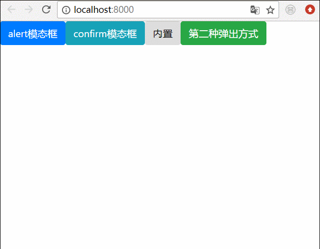
}3. 最終的な効果
上記をすべて結合します。すべてのポップアップ ボックスを一緒に書き込みます。効果は次のとおりです
 関連する推奨事項:
以上がAngular でモーダル ボックスをポップアップする 2 つの方法の詳細内容です。詳細については、PHP 中国語 Web サイトの他の関連記事を参照してください。


![[Web フロントエンド] Node.js クイック スタート](https://img.php.cn/upload/course/000/000/067/662b5d34ba7c0227.png)


