


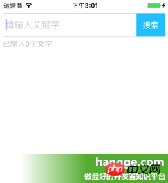
テキストを入力するページにTextInputを追加し、関連するプレースホルダーテキストとスタイルを設定します。
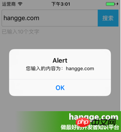
入力ボックス内のテキストが変更されると、以下のTextコンポーネントが入力テキストの長さをリアルタイムでカウントして表示します。
入力ボックスの右側にある「検索」ボタンをクリックして、入力ボックスの内容をポップアップ表示します。

|
1
2
3
5
6
7
8 9
10
11
12
13
14
15
16
17
18
19
20 21 2223242579
80
81
82
83
84
85
86
87
88
89
90 91
92
93
94
95
96
97
98
99
|
import React, { Component } from 'react'<code class="js plain">;import React, { Component } from 'react';
import { AppRegistry,
StyleSheet,
Text,
View,
TextInput,
} from 'react-native';
//输入框组件class Search extends Component { //构造函数
constructor(props) {
super(props);
this.state = {text: ''};
}
//组件渲染
render() {
return (
<View style={styles.flex}>
<View style={[styles.flexDirection, styles.inputHeight]}>
<View style={styles.flex}>
<TextInput
style={styles.input}import { AppRegistry,🎜 スタイルシート、🎜 テキスト、🎜 ビュー、 🎜 TextInput,🎜} from 'react-native';🎜<div class="linenumber9index8alt2"> 🎜<divclass><codeclass comments>//输入框组件🎜<div class="linenumber11index10alt2">
<code class="js plain">クラス検索はコンポーネントを拡張します {🎜 //构造関数🎜 constructor(props) {🎜 super(props);🎜 this.state = {text: ''}; 🎜 }🎜 🎜
//组件渲染🎜return (🎜 <View style={styles.flex}>🎜 <View style={[styles.flexDirection,styles.inputHeight]}>🎜 <View style={styles.flex}>🎜<TextInput🎜 style={styles.input}🎜 returnKeyType="search" placeholder="请输入关键字" onChangeText={(text) => this.setState({text})}/>
</View>
<View style={styles.btn}>
<Text style={styles.search} onPress={this.search.bind(this)}>搜索</Text>
</View>
</View>
<Text style={styles.tip}>已输入{this.state.text.length}个文字</Text>
</View>
);
}
//搜索按钮点击
search(){
alert("您输入的内容为:"+this.state.text);
}
}//默认应用的容器组件class App extends Component { render() {
return (
<View style={[styles.flex, styles.topStatus]}>
<Search></Search>
</View>
);
}
}
//样式定义const styles = StyleSheet.create({ flex:{
flex: 1,
},
flexDirection:{
flexDirection:'row'
},
topStatus:{
marginTop:25,
},
inputHeight:{
height:45,
},
input:{
height:45,
borderWidth:1,
marginLeft: 5,
paddingLeft:5,
borderColor: '#ccc',
borderRadius: 4
},
btn:{
width:55,
marginLeft:-5,
marginRight:5,
backgroundColor:'#23BEFF',
height:45,
justifyContent:'center',
alignItems: 'center'
},
search:{
color:'#fff',
fontSize:15,
fontWeight:'bold'
},
tip:{
marginLeft: 5,
marginTop: 5,
color: '#C0C0C0',
}
});AppRegistry.registerComponent('HelloWorld', () => App);
|
以上がTextInput コンポーネントの詳細な紹介の詳細内容です。詳細については、PHP 中国語 Web サイトの他の関連記事を参照してください。


![[Web フロントエンド] Node.js クイック スタート](https://img.php.cn/upload/course/000/000/067/662b5d34ba7c0227.png)


