


このチュートリアルでは、Plotly を使用してインタラクティブなビジュアライゼーションを作成する方法を学びます。私たちのプロジェクトは、サイコロを振った結果を分析することに焦点を当てています。 1 つの 6 面サイコロを振ると、1 から 6 までのどの数字も同じ確率で出現します。ただし、複数のサイコロを振ると、一部の数字が他の数字よりも確率が高くなります。私たちの目標は、サイコロの出目をシミュレートし、データセットを作成することによって、これらの確率を決定することです。その後、複数のロールの結果を視覚的に表現して、どの結果が統計的により可能性が高いかを示します。
Plotly は、ユーザーがインタラクティブな Web ベースのビジュアライゼーションを作成できるオープンソースのグラフ作成ライブラリです。折れ線グラフ、散布図、棒グラフなど、多くの種類のグラフをサポートしています。 Plotly は、ズーム、パン、ホバー情報などのインタラクティブな機能を提供するため、Web アプリケーションに埋め込むことができるビジュアライゼーションの作成に特に役立ちます。
pip を使用して Plotly をインストールします。 Plotly Express は Plotly Express に依存しているため、データを効率的に操作するためのライブラリである pandas もインストールする必要があります。
$ python -m pip install --user plotly
$ python -m pip install --user pandas
Plotly の Web サイトにあるチャート タイプのギャラリーにアクセスして、Plotly で作成できるさまざまなビジュアライゼーションを確認してください。
まず、サイコロの目をシミュレートするために次の Die クラスを作成します。ファイルに Die.py という名前を付けます。
from random import randint

class Die:
    """A class representing a single die."""

    def __init__(self, num_sides = 6):
        """Assume a six-sided die"""
        self.num_sides = num_sides


    def roll(self):
        """Return a random value between 1 and number of sides."""
        return randint(1, self.num_sides)
__ init __ メソッドはオプションの引数を 1 つ受け取ります。 Die のインスタンスが作成されるとき、引数が指定されていない場合、面の数は 6 になります。引数が与えられると、サイコロの面の数が設定されます。
roll() メソッドは randint() 関数を使用して、1 から辺の数までの乱数を返します。この関数は、開始値 (1)、終了値 (num_sides)、またはその間の任意の整数を返すことができます。サイコロは面の数に応じて名前が付けられます。6 面のサイコロは D6、10 面のサイコロは D10 などと呼ばれます。
最初に、plotly.express を繰り返し入力しないように、エイリアス px を使用して Plotly Express モジュールをインポートします。 2 つの D8 サイコロを振ることをシミュレートするサイコロのインスタンスを作成します。このファイルに dice_visual.py.
という名前を付けます。
import plotly.express as px

from die import Die

# Create two D8.
die_1 = Die(8)
die_2 = Die(8)

# Make some rolls, and store results in a list.
results = []
for roll_num in range(500_000):
    result = die_1.roll() + die_2.roll()
    results.append(result)
可能な最小の結果は、各サイコロの最小の数字の合計です (2)。可能な最大の結果は、max_results に割り当てられる各サイコロの最大数の合計 (16) です。変数 max_result により、poss_results を生成するコードの可読性が向上します。 range (2,16) と書くこともできましたが、これは 2 つの D8 ダイスに対してのみ機能します。現実世界の状況をシミュレートするときは、幅広いシナリオを容易に処理できるコードを開発するのが最善です。
# Analyze the result.
frequencies = []
max_results = die_1.num_sides + die_2.num_sides
poss_results = range(2, max_results + 1)
for value in poss_results:
    frequency = results.count(value)
    frequencies.append(frequency)
タイトルを定義し、「title」に割り当てました。軸ラベルを指定する辞書を作成しました。辞書のキーはカスタマイズするラベルを表し、値は使用するカスタム ラベルを表します。 x 軸に「結果」、y 軸に「結果の頻度」という名前を付けます。棒グラフを作成するには、px.bar() 関数を使用し、オプションの変数 'title' と 'labels' を渡します。
# Visualize the results.
title = "Results of Rolling Two D8 Dice 500,000 Times"
labels = {'x': 'Result', 'y': 'Frequency of Result'}
fig = px.bar(x = poss_results, y = frequencies, title = title,
 labels = labels)
fig.show()
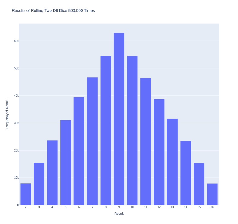
下の図に示すように、プロットは各軸に適切なタイトルとラベルを付けて生成されます。

作成したばかりのプロットには、対処する必要がある問題が 1 つあります。バーが 11 本あるため、デフォルトの X 軸レイアウト設定では、一部のバーにラベルが付けられていません。ほとんどのビジュアライゼーションにはデフォルト設定で十分ですが、このグラフはすべての棒にラベルを付けた方が見やすくなります。
Plotly は、Figure の作成後にさまざまな変更を加えることができる update_layout() メソッドを提供します。 Plotly に各バーに独自のラベルを付けるように指示する方法は次のとおりです。
# Further customize chart.
fig.update_layout(xaxis_dtick = 1)
fig.show()
#fig.write_html('dice_visual_d6d10.xhtml')
update_layout() メソッドは、グラフ全体を表す fig オブジェクトに適用されます。 xaxis_dtick オプションを使用して、x 軸上の目盛り間の距離を設定します。各バーにラベルが付けられるように、間隔を 1 に設定します。 dice_visual.py を再度実行すると、各バーにラベルが表示されるはずです。
このコードは、さまざまなサイズのサイコロを振ることをシミュレートするために簡単にカスタマイズできます。 D6 と D10 を作成するには、2 つのダイ インスタンスを作成するときに引数 6 と 10 を渡します。最初のループを目的のロール数に変更し、それに応じてグラフのタイトルを変更します。
We can get our program to save the chart as an HTML file automatically by replacing the call to fig.show() with a call to fig.write_html().
The write_html() method requires one argument: the name of the file to write to. If you only provide a filename, the file will be saved in the same directory as the .py file. You can also call write_html() with a Path object to save the output file anywhere on your system.
Here is the complete code:
import plotly.express as px

from die import Die

# Create two D8.
die_1 = Die(8)
die_2 = Die(8)

# Make some rolls, and store results in a list.
results = []
for roll_num in range(500_000):
    result = die_1.roll() + die_2.roll()
    results.append(result)

# Analyze the result.
frequencies = []
max_results = die_1.num_sides + die_2.num_sides
poss_results = range(2, max_results + 1)
for value in poss_results:
    frequency = results.count(value)
    frequencies.append(frequency)

# Visualize the results.
title = "Results of Rolling Two D8 Dice 500,000 Times"
labels = {'x': 'Result', 'y': 'Frequency of Result'}
fig = px.bar(x = poss_results, y = frequencies, title = title, labels = labels)

# Further customize chart.
fig.update_layout(xaxis_dtick = 1)
fig.write_html('dice_visual.xhtml')
For clarity, the listings in this section use the long form of for loops. We can refactor the code by using list comprehensions for one or both of the loops. Here is the code using list comprehension:
import plotly.express as px

from die import Die

# Create two D8.
die_1 = Die(8)
die_2 = Die(8)

# Make some rolls, and store results in a list.
results = [die_1.roll() + die_2.roll() for roll_num in range(500_000) ]

# Analyze the result.
max_results = die_1.num_sides + die_2.num_sides
poss_results = range(2, max_results + 1)
frequencies = [results.count(value) for value in poss_results]

# Visualize the results.
title = "Results of Rolling Two D8 Dice 500,000 Times"
labels = {'x': 'Result', 'y': 'Frequency of Result'}
fig = px.bar(x = poss_results, y = frequencies, title = title, labels = labels)

# Further customize chart.
fig.update_layout(xaxis_dtick = 1)

fig.write_html('dice_visual_list_comprehension.xhtml')
In conclusion, analyzing and presenting statistical data becomes powerful and engaging with Plotly for interactive dice roll data visualization. By simulating dice rolls and visualizing the outcomes, we can better understand the probabilities of different results. Plotly's interactive features, such as hover information, panning, and zooming, enhance the user experience and make data more accessible. Additionally, the ability to customize and save visualizations as HTML files makes it easy to share and integrate them into web applications. This article demonstrates how to use Plotly's features to create informative and attractive charts. Plotly is an excellent tool for data analysis and presentation.
以上がPlotly を使用したインタラクティブなサイコロの目データの視覚化の詳細内容です。詳細については、PHP 中国語 Web サイトの他の関連記事を参照してください。


![[Web フロントエンド] Node.js クイック スタート](https://img.php.cn/upload/course/000/000/067/662b5d34ba7c0227.png)


