


What are the styles of bootstrapt buttons?


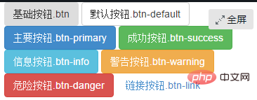
Abstract: Bootstrap button styles mainly include: basic button, default button, main button, success button, information button, warning button, danger button , link button.
1. Introduction to buttons:
Buttons are also one of the core contents of the Bootstrap framework. Because buttons are an indispensable thing in Web production.
Moreover, different Web pages have different button styles, and even the same Web website or application has multiple button styles, such as different button colors, sizes, and states.
<button class="btn" type="button">基础按钮.btn</button>
   <button class="btn btn-default" type="button">默认按钮.btn-default</button>
   <button class="btn btn-primary" type="button">主要按钮.btn-primary</button>
   <button class="btn btn-success" type="button">成功按钮.btn-success</button>
   <button class="btn btn-info" type="button">信息按钮.btn-info</button>
   <button class="btn btn-warning" type="button">警告按钮.btn-warning</button>
   <button class="btn btn-danger" type="button">危险按钮.btn-danger</button>
   <button class="btn btn-link" type="button">链接按钮.btn-link</button>
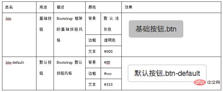
2. Basic buttons
Bootstrap Framework V3 The basic buttons of the .x version are the same as the basic buttons of the V2.x version, and are implemented through the class name "btn".
The difference is that the V3.x version is much simpler, and a large number of special effects in CSS3 in the V2.x version have been removed, such as text-shadow and gradient background ), border shadow (box-shadow), etc.
The Bootstrap framework takes into account the parsing differences of different browsers and performs relatively safe compatibility processing so that the button effects are basically the same in different browsers.
For the source code, please refer to lines 1992 to 2010 of the bootstrap.css file:
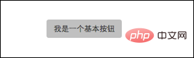
The buttons of the Bootstrap framework are very simple to use. The usage method is as follows:
<button class="btn" type="button">我是一个基本按钮</button>
3. Default button
The Bootstrap framework first passes the base class name ".btn" defines a basic button style, and then ".btn-default" defines a default button style.
The default button style is based on the basic button style, with the background color, border color and text color modified.
For the source code, please refer to lines 2040 to 2044 of the bootstrap.css file
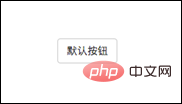
Using the default button style is also very simple, just add the basic button "btn" Basically, just add the class name "btn-default":
<button class="btn btn-default" type="button">默认按钮</button>
4. Multi-label support (multiple label production buttons)
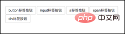
General production In addition to using the <button> tag element, buttons can also use <input type="submit"> and <a> tags, etc.
Similarly, when making buttons in the Bootstrap framework, in addition to the label elements just mentioned, you can also use them on other label elements. The only thing you need to pay attention to is that you need to use the label element when making the button. Add the class name "btn".
If you don’t add it, there will be no button effect.
<button class="btn btn-default" type="button">button标签按钮</button><input type="submit" class="btn btn-default" value="input标签按钮"/><a href="##" class="btn btn-default">a标签按钮</a><span class="btn btn-default">span标签按钮</span><p class="btn btn-default">p标签按钮</p>
Although the button style can be achieved using any label element in the Bootstrap framework, I personally do not recommend using it in this way, in order to avoid Due to browser compatibility issues, I strongly recommend using button or a tags to make buttons.
5. Customize buttons of different styles
As mentioned at the beginning of the introduction to buttons, Web pages may have different button styles. Then the Bootstrap framework is also considered.
In addition to the default button style in the Bootstrap framework, there are six other button styles. Each style is actually the same. The difference is the background color, border color and text color of the button.
Different button styles in the Bootstrap framework are implemented through different class names. During use, developers only need to choose different class names:
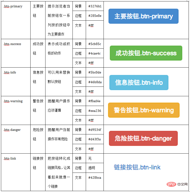
It is very simple to use, just like the default button introduced earlier, you only need to add the corresponding to the basic button ".btn" Class name , you can get the desired button style. Such as:
<button class="btn" type="button">基础按钮.btn</button><button class="btn btn-default" type="button">默认按钮.btn-default</button><button class="btn btn-primary" type="button">主要按钮.btn-primary</button><button class="btn btn-success" type="button">成功按钮.btn-success</button><button class="btn btn-info" type="button">信息按钮.btn-info</button><button class="btn btn-warning" type="button">警告按钮.btn-warning</button><button class="btn btn-danger" type="button">危险按钮.btn-danger</button><button class="btn btn-link" type="button">链接按钮.btn-link</button>
六、按钮大小
在Bootstrap框架中,对于按钮的大小,也是可以定制的。类似于input一样,通过在基础按钮“.btn”的基础上追加类名来控制按钮的大小。
在Bootstrap框架中提供了三个类名来控制按钮大小:
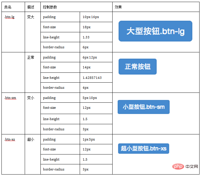
从上表中不难发现,在Bootstrap框架中控制按钮的大小都是通过修改按钮的padding、line-height、font-size和border-radius几个属性。
源码查阅bootstrap.css文件中第2319行~第2339行
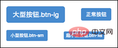
那么在实际使用中,这几个类名可以配合按钮中其他颜色类名一起使用,但唯一一点不能缺少“.btn”类名:
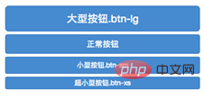
<button class="btn btn-primary btn-lg" type="button">大型按钮.btn-lg</button>
    <button class="btn btn-primary" type="button">正常按钮</button>
    <button class="btn btn-primary btn-sm" type="button">小型按钮.btn-sm</button>
七、块状按钮
Bootstrap框架中提供了一个类名“btn-block”。
按钮使用这个类名就可以让按钮充满整个容器,并且这个按钮不会有任何的padding和margin值。在实际当中,常把这种按钮称为块状按钮。
具体源码请查阅bootstrap.css文件第2340行~第2353行:
使用方法和前面的类似,只需要在原按钮类名上添加“.btn-block”类名,当然“.btn”类名是不可或缺的:
<button class="btnbtn-primary btn-lg btn-block" type="button">大型按钮.btn-lg</button><button class="btnbtn-primary btn-block" type="button">正常按钮</button><button class="btnbtn-primary btn-sm btn-block" type="button">小型按钮.btn-sm</button><button class="btnbtn-primary btn-xs btn-block" type="button">超小型按钮.btn-xs</button>
八、按钮状态——活动状态
Bootstrap框架针对按钮的状态做了一些特殊处理。在Bootstrap框架中针对按钮的状态效果主要分为两种:活动状态和禁用状态。
Bootstrap按钮的活动状态主要包括按钮的悬浮状态(:hover),点击状态(:active)和焦点状态(:focus)几种。
源码请查看bootstrap.css文件第2011行~第2029行
不同风格下的按钮都具有这几种状态效果,只是颜色做了一定的调整,我们以默认风格(btn-default)为例:
源码请查看bootstrap.css文件第2045行~第2058行
当按钮处理正在点击状态(也就是鼠标按下的未松开的状态),对于<button>元素是通过“:active”伪类实现,而对于<a>这样的标签元素则是通过添加类名“.active”来实现。
<button class="btn" type="button">基础按钮.btn</button>
   <button class="btn btn-default" type="button">默认按钮.btn-default</button>
   <button class="btn btn-primary" type="button">主要按钮.btn-primary</button>
   <button class="btn btn-success" type="button">成功按钮.btn-success</button>
   <button class="btn btn-info" type="button">信息按钮.btn-info</button>
   <button class="btn btn-warning" type="button">警告按钮.btn-warning</button>
   <button class="btn btn-danger" type="button">危险按钮.btn-danger</button>
   <button class="btn btn-link" type="button">链接按钮.btn-link</button>
九、按钮状态——禁用状态
和input等表单控件一样,在Bootstrap框架的按钮中也具有禁用状态的设置。
禁用状态与其他状态按钮相比,就是背景颜色的透明度做了一定的处理,opcity的值从100%调整为65%。
在Bootstrap框架中,要禁用按钮有两种实现方式:
方法1:在标签中添加disabled属性
方法2:在元素标签中添加类名“disabled”
两者的主要区别是:
“.disabled”样式不会禁止按钮的默认行为,比如说提交和重置行为等。
如果想要让这样的禁用按钮也能禁止按钮的默认行为,则需要通过JavaScript这样的语言来处理。
对于<a>标签也存在类似问题,如果通过类名“.disable”来禁用按钮,其链接行为是无法禁止。
而在元素标签中添加“disabled”属性的方法是可以禁止元素的默认行为的。
<button class="btnbtn-primary btn-lgbtn-block" type="button" disabled="disabled">通过disabled属性禁用按钮</button><button class="btnbtn-primary btn-block disabled" type="button">通过添加类名disabled禁用按钮</button><button class="btnbtn-primary btn-smbtn-block" type="button">未禁用的按钮</button>
The above is the detailed content of What are the styles of bootstrapt buttons?. For more information, please follow other related articles on the PHP Chinese website!

Hot AI Tools

Undress AI Tool
Undress images for free

AI Clothes Remover
Online AI tool for removing clothes from photos.

Undresser.AI Undress
AI-powered app for creating realistic nude photos

ArtGPT
AI image generator for creative art from text prompts.

Stock Market GPT
AI powered investment research for smarter decisions

Hot Article
Popular tool

Notepad++7.3.1
Easy-to-use and free code editor

SublimeText3 Chinese version
Chinese version, very easy to use

Zend Studio 13.0.1
Powerful PHP integrated development environment

Dreamweaver CS6
Visual web development tools

SublimeText3 Mac version
God-level code editing software (SublimeText3)
Hot Topics
 20516
20516
 7
13629
4
7
13629
4

 How to animate Bootstrap components for a more dynamic feel? (Advanced CSS)
Mar 13, 2026 am 01:13 AM
How to animate Bootstrap components for a more dynamic feel? (Advanced CSS)
Mar 13, 2026 am 01:13 AM
The fade and show classes of Bootstrap5 are only status markers and do not contain animation logic. You need to manually add @keyframes or transitions to achieve fade-in and fade-out; custom components need to configure additional animation rules, and when JS controls the display, the show class must be added with delay to ensure redrawing.
 How to ensure your Bootstrap site is fully accessible (WCAG)? (Accessibility)
Mar 08, 2026 am 01:25 AM
How to ensure your Bootstrap site is fully accessible (WCAG)? (Accessibility)
Mar 08, 2026 am 01:25 AM
The Bootstrap component does not automatically add the aria attributes required for complete WCAG. You need to manually complete aria-expanded, role="dialog", aria-labelledby, etc.; the form must be equipped with an explicit label; :focus needs to use :focus-visible to ensure that the keyboard focus is visible; the color contrast must reach 4.5:1.
 How to create a login and registration page layout with Bootstrap? (User Authentication UI)
Mar 05, 2026 am 01:34 AM
How to create a login and registration page layout with Bootstrap? (User Authentication UI)
Mar 05, 2026 am 01:34 AM
Bootstrap5 forms need to wrap each field with form-control and semantic labels; login and registration should be separated into separate routes to reuse the card UI; password verification requires front-end and back-end double verification; responsiveness needs to control the container width and title size; buttons must be disabled and prompts cleared after submission.
 How to integrate Bootstrap with a JavaScript framework like React or Vue? (Integration)
Mar 12, 2026 am 01:22 AM
How to integrate Bootstrap with a JavaScript framework like React or Vue? (Integration)
Mar 12, 2026 am 01:22 AM
Only BootstrapCSS should be introduced in React/Vue instead of JS to avoid global style pollution and jQuery dependency; SCSS modules should be imported on demand to reduce the size; interactive functions must be imported with encapsulation libraries (such as react-bootstrap) or ESM; grid classes need to adapt to JSX/Vue syntax, and explicit and implicit classes should be used with SSR with caution.
 How to create a professional-looking landing page with Bootstrap? (Project-Based)
Mar 10, 2026 am 12:22 AM
How to create a professional-looking landing page with Bootstrap? (Project-Based)
Mar 10, 2026 am 12:22 AM
Bootstrap’sdefaultstylingfeelsgenericduetouncustomizedspacing,typography,andcolor—fixableviaCSSvariablesorSass,notdirectedits;avoidfixedwidths,misuseofgridclasses,andrender-blockingassetstoensureresponsivenessandfastLCP.
 How to properly install and set up Bootstrap 5 in your web project? (Getting Started)
Mar 16, 2026 am 12:40 AM
How to properly install and set up Bootstrap 5 in your web project? (Getting Started)
Mar 16, 2026 am 12:40 AM
To correctly introduce Bootstrap5, you need to load bootstrap.min.css first, then load bootstrap.bundle.min.js (including Popper), and ensure that the viewport tag exists; after npm installation, you need to manually introduce compiled files in the dist directory. SCSS customization must be preceded by variable declarations, and JS components must be explicitly initialized to avoid jQuery contamination.
 How to use Bootstrap utility classes to speed up your workflow? (Efficiency)
Mar 11, 2026 am 12:18 AM
How to use Bootstrap utility classes to speed up your workflow? (Efficiency)
Mar 11, 2026 am 12:18 AM
Use mt-3 to represent the top margin, mb-3 to represent the bottom margin, and the suffixes t/b/s/e correspond to top/bottom/start/end respectively; ms-auto implements right alignment in the flex container, me-2 replaces the abandoned mr-2, and responsive classes such as mt-md-4 need to have breakpoint prefixes.
 How to implement a carousel or image slider with Bootstrap? (Content Display)
Mar 07, 2026 am 01:01 AM
How to implement a carousel or image slider with Bootstrap? (Content Display)
Mar 07, 2026 am 01:01 AM
Need not. Bootstrap5's carousel is automatically initialized by default. You need to manually call newbootstrap.Carousel() only when data-bs-ride is modified or the element is dynamically inserted.
