


本篇文章给大家分享6个值得一学的前端HTML+CSS特效。有一定的参考价值,有需要的朋友可以参考一下,希望对大家有所帮助。
前言:学习不能止步于收藏,必须自己来一遍,加入自己的思考。
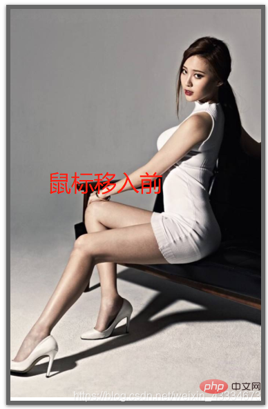
当我们在看图片时,可能觉得图片有点小,那我们就给用户一种体验,当用户把鼠标移入时,图片慢慢变大。
效果图:
知识点:
CSS3之“过渡”:transition()----定义如何放大图片和放大过程的时间
CSS3之“2D转换”:transform:scale()----放大图片
CSS3之“溢出”:overflow:hidden----当图片放大时,溢出要隐藏
代码:
.imgDiv{
    width:300px;
    overflow: hidden;
    box-shadow: 0 1px 4px rgba(0,0,0,0.6);
    border:5px solid rgba(0,0,0,0.6);
    box-sizing: border-box;
}
.imgDiv img{
    width:300px;
}
.imgDiv img:hover{
    transform:scale(1.1) ;
    transition: 0.5s linear;
}
知识点:
1. CSS之“filter”。
2. CSS灰色滤镜:grayscale()
3. CSS深褐色滤镜:sepia()
代码:
.imgDiv{
    width:300px;
    overflow: hidden;
    border:5px solid rgba(0,0,0,0.6);
    box-sizing: border-box;
    display: flex;
    flex:auto;
    margin-top:100px;
    margin-left:100px;
}
.imgDiv img{
    width:300px;
    filter:grayscale(100%);<-新增->
}
.imgDiv img:hover{
    transform:scale(1.1) ;
    transition: 0.5s linear;
    filter:grayscale(0);<-新增->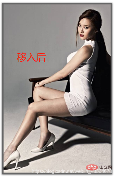
}效果图:
知识点:
1、CSS之滤镜:invert()—将图片颜色反转,当图片颜色为白色时,invert(0)为白;invert(1)为黑;反之。
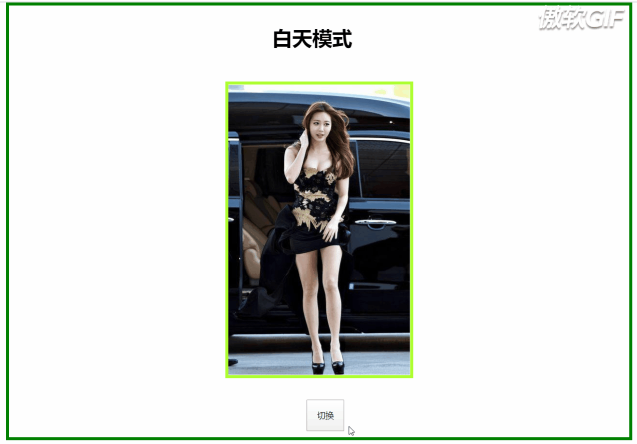
isChange:boolean=true; translate(){ var body=document.getElementById("body"); var text=document.getElementById("text"); var container=document.getElementById("container"); if(this.isChange){ body.setAttribute("style","filter:invert(100%)"); text.innerHTML="白天模式"; this.isChange=false; }else{ body.setAttribute("style","filter:invert(0%)"); text.innerHTML="黑夜模式"; this.isChange=true; } }白天模式

效果图:
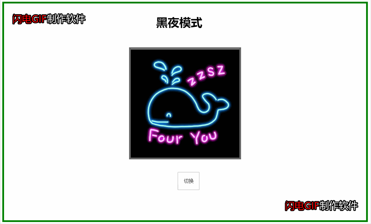
注意:
这不是“正经”的白天与黑夜模式,因为在父元素设置了反转滤镜之后,其子元素的颜色也会被反转。这样会导致像图片这类型的子元素失去本该有的样子。
在运用反转滤镜,需先给元素设置背景颜色,否则不起作用。
反转滤镜不只是对黑白反转,每种颜色有对应的反转。
知识点:
1. CSS之过渡:transition
2. 在这里子元素也用到了上面的invert(),将字体换色,也可以直接用js将字体的color属性转换,但滤镜效率更高
代码:
<-只展示id=translate的css-> #translate{ position: absolute; width:0px; height:0px; transition:width 2s,height 2s; background-color:black; } export class HoverToLargeImageComponent implements OnInit { isChange:boolean=true; translate(){ var text=document.getElementById("text"); var translate=document.getElementById("translate"); if(this.isChange){ translate.setAttribute("style","width:990px;height:690px;"); text.innerHTML="黑夜模式"; text.setAttribute("style","filter:invert(100%)") this.isChange=false; }else{ translate.setAttribute("style","width:0px;height:0px"); text.innerHTML="白天模式"; text.setAttribute("style","filter:invert(0)") this.isChange=true; } } }白天模式

效果图:
注意:
这个白天/黑夜模式是不会影响其它元素背景色,因此字体颜色如果为白色或黑色的就需要随着切换模式来字体颜色,否则字体看不见。
有兴趣的可以将
小容器移动到大容器任意部位,例如移到中间,设置使得效果向两边延伸或以圆的方式呈现。
知识点:
CSS之混合模式:mix-blend-mode
该属性有16个值:
normal 正常
multiply 正片叠底
screen 滤色
overlay 叠加
darken 变暗
lighten 变亮
color-dodge 颜色减淡
color-burn 颜色加深
hard-light 强光
soft-light 柔光
difference 差值
exclusion 排除
hue 色相
saturation 饱和度
color 颜色
luminosity 亮度
代码:
    混合模式学习


.first{
    background-image: url(https://source.unsplash.com/1920x1080?city);
}
.second{
    background-image: url(https://source.unsplash.com/1920x1080?landscape);
}
.third{
    background-image: url(https://source.unsplash.com/1920x1080?portrait);
}
.fourth{
    background-image: url(https://source.unsplash.com/1920x1080?stars);
}
.container,.middle:before{
    height: 200px;
    width:300px;
    position: fixed;
    box-sizing: content-box;
    top:50%;
    left:50%;
    transform: translate(-50%,-50%);
    text-align: center;
    line-height: 200px;
    mix-blend-mode: lighten;
}
.container{
    background-color:cornsilk;
    z-index: 10;
}
.background{
    height:750px;
    width:1500px;
    position: relative;
    margin:0px auto;
    background-size: cover;
    background-repeat: no-repeat;

}
.middle:before{
    content:"  ";
    padding:50px;
}


.middle{
    position: absolute;
    width:500px;
    height:100%;
    margin-left: 500px;
    clip:rect(auto,auto,auto,auto);
}
.first .middle:before{
    background-color: red;
    mix-blend-mode: lighten;
}
.second .middle:before{
    background-color:gold;
    mix-blend-mode: difference;
}
.third .middle:before{
    background-color: aqua;
    mix-blend-mode: color-dodge;
}
.fourth .middle:before{
    background-color: brown;
    mix-blend-mode: soft-light;
}
效果:
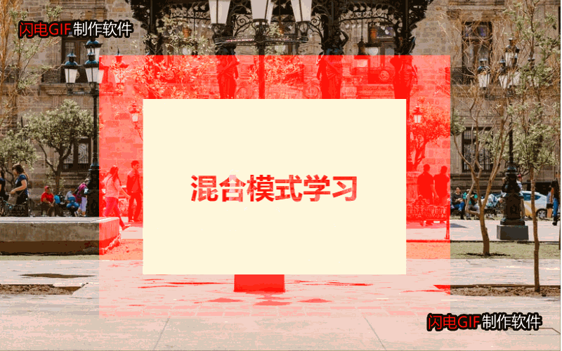
注意:
z-index属性:z-index属性设置元素的堆叠顺序。拥有更高堆叠顺序的元素总会处于堆叠顺序较低的元素的前面。
所在的HTML位置,本该被后面的元素覆盖而无法显示出来,但使用了z-index之后就可以解决元素覆盖问题。
isolation属性:隔离,主要与mix-blend-mode属性一起使用,将混合模式只应用于某一个元素或某一组元素。可取值:auto|isolate(创建新的堆叠上下文)。使用了isolate之后,该元素就不会再与父元素混合,而是与它的子元素混合。
这里用了四张图片,四种不同的混合属性值和背景色,感受混合模式的炫。
知识点:
CSS之背景固定:background-attachment
上代码:
.container { height: 100vh; } .parallax-img { background-attachment: fixed; background-position: center; background-repeat: no-repeat; background-size: cover; height: 100%; background-image: url("http://ppe.oss-cn-shenzhen.aliyuncs.com/collections/182/7/thumb.jpg"); } .title{ position: relative; width:300px; height: 150px; left: 50%; top:50%; transform: translate(-50%,-50%); background-color: gray; line-height: 150px; text-align: center; color:tan; } .myLove{ display: flex; height:400px; width:100%; background-color: gray; } .myLove div{ width:30%; height: 80%; margin-left: 100px; margin-top:50px; } .myLove div img{ width:100%; height:100%; } .myLove .article{ margin-left: 250px; } .parallax-img1 { background-attachment: fixed; background-position: center; background-repeat: no-repeat; background-size: cover; height: 100%; background-image: url("http://ppe.oss-cn-shenzhen.aliyuncs.com/collections/182/5/thumb.jpg"); } .parallax-img2{ background-attachment: fixed; background-position: center; background-repeat: no-repeat; background-size: cover; height: 100%; background-image: url("http://ppe.oss-cn-shenzhen.aliyuncs.com/collections/181/10/thumb.jpg"); } .parallax-img1 div,.parallax-img2 div { position: relative; left: 50%; top:50%; transform: translate(-50%,-50%); background-color: gray; width:40%; height:50px; text-align: center; color: tan; }因为爱,所以爱
与你一见如故,是我今生最美丽的相遇。 与你一诺相许,是我素色年华里最永恒的风景。 一直想说,无论走到哪里,最想去的是你的身边。 愿我们彼此相爱,一直到时间的尽头。 我相信我们可以一起,等青丝变白发。 你在,我在,就是海枯石烂。 没有过多的华丽,只有一句我喜欢你,却能让彼此牵挂于心。 亲爱的,你知道吗,哪怕遍体鳞伤,我仍有爱你的余力。 有的人你只看了一眼,却影响其一生。 生活就像是包饺子,不管你是什么馅,我都会紧紧的把你包在我心里,任生活的沸水怎样煮,都磨不掉 我对你的爱! 好久没有见你了,心中十分挂念,可是又不敢去看你,因为害怕打扰你,你会不开心,所以我尽力的控制自己思念的心。 不知道这些日子,你是不是跟我一样,牵挂你,想念你;我是真的特别想你,想看看你的笑,想看看你纯真的脸;想着你,我就特别来劲,晚上都无法睡好! 我爱你,无畏人海的拥挤
你小心一吻便颠倒众生 一吻便救一个人
效果图:
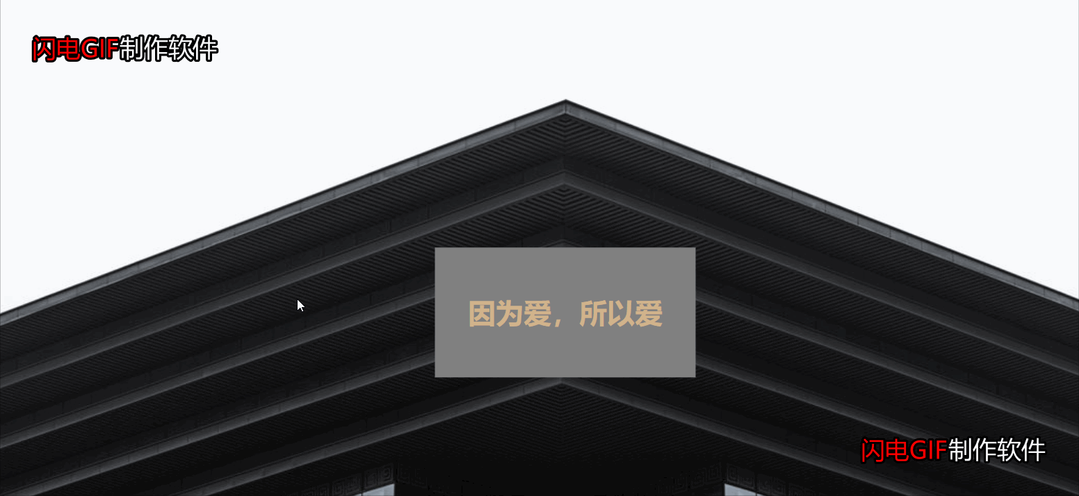
注意:
如果能录全屏则效果更佳,但由于图片上传大小限制,只能录制中间部分和快速拉过。如果喜欢,可以自己试试,代码已全部粘贴出来。
其实就是一个CSS属性的知识,就看你如何配置图片、色效使效果更炫酷。
图片能决定视图效果,因此,上面三张图片来源于原博客。
更多编程相关知识,请访问:编程视频!!
以上是值得一学的6个前端HTML+CSS特效的详细内容。更多信息请关注PHP中文网其他相关文章!
 Python est-il front-end ou back-end ?
 Comment implémenter la messagerie instantanée sur le front-end
 La différence entre front-end et back-end
 Introduction à la relation entre php et front-end
 Comment enregistrer des images dans la zone de commentaires Douyin sur un téléphone mobile
 transition css3
 Quel protocole est UDP ?
 Comment lire les fichiers py en python


![[Web front-end] Démarrage rapide de Node.js](https://img.php.cn/upload/course/000/000/067/662b5d34ba7c0227.png)


