


需求:gift图片的小动画每隔2s执行一次。
需求就一句话,我们看一下实现过程。


DOCTYPE html>
html lang="en">

head>
    meta charset="UTF-8">
    title>Documenttitle>
    style>
    a {
        display: inline-block;
        background-color: #cc2222;
        text-decoration: none;
        color: #fff;
        font-size: 14px;
        padding: 10px 12px;
        width: 100px;
        position: relative;
    }

    .ico {
        position: absolute;
        width: 14px;
        height: 16px;
        background: url(images/ico.png) no-repeat center;
        background-size: 100%;
        position: absolute;
        top: 4px;
        right: 27px;
    }
    style>
head>

body>
    nav>
        a href="javascript:;" class="box">
                            一元夺宝
                            div class="ico">div>
                        a>
    nav>
body>

html>
原始动画效果为:鼠标hover上去出现动画。
动画样式如下:
/*动画*/
    .ico:hover{
    -webkit-animation: Tada 1s both;
    -moz-animation: Tada 1s both;
    -ms-animation: Tada 1s both;
    animation: Tada 1s both
}
/*浏览器兼容性部分略过*/
@keyframes Tada {
    0% {
        transform: scale(1);
        transform: scale(1)
    }

    10%,20% {
        transform: scale(0.9) rotate(-3deg);
        transform: scale(0.9) rotate(-3deg)
    }

    30%,50%,70%,90% {
        transform: scale(1.1) rotate(3deg);
        transform: scale(1.1) rotate(3deg)
    }

    40%,60%,80% {
        transform: scale(1.1) rotate(-3deg);
        transform: scale(1.1) rotate(-3deg)
    }

    100% {
        transform: scale(1) rotate(0);
        transform: scale(1) rotate(0)
    }
}
效果:鼠标hover上去gift图片会动一动。

需求变动,要求不再是hover上去展示动画,而是每隔2s展示一次动画。
思路:不需要hover上去出现动画,就把hover去掉,每隔2s显示一次动画,很容易想到延迟2s,然后动画一直执行。
此时相关样式变成:
.ico{
-webkit-animation: Tada 1s  2s both infinite;
-moz-animation: Tada 1s 2s both infinite;
-ms-animation: Tada 1s 2s both infinite;
animation: Tada 1s 2s both infinite;
}
但是显示的效果是:页面加载第一次出现动画会延迟2s,后面的动画将不再有延迟。如下,这是不符合需求的。
为了看出效果,下图为延迟6s的效果。

此时换种思路,不要延迟执行动画,而是动画的效果本身就是前2s元素不动,后1s是元素动,然后一直循环执行。 这样在视觉上就会看起来是延迟2s执行1s动画。
计算一下,原来的百分比节点变成了多少。
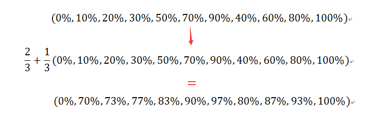
将动画总时长变成3s,用计算出的百分比替换原来的百分比,代码如下:
.ico{
    -webkit-animation: Tada 3s both infinite;
    -moz-animation: Tada 3s both infinite;
    -ms-animation: Tada 3s both infinite;
    animation: Tada 3s both infinite;
}
@keyframes Tada {
    0% {
        transform: scale(1);
        transform: scale(1)
    }

    70%,73%{
        transform: scale(0.9) rotate(-3deg);
        transform: scale(0.9) rotate(-3deg)
    }

    77%,83%,90%,97%  {
        transform: scale(1.1) rotate(3deg);
        transform: scale(1.1) rotate(3deg)
    }

    80%,87%,93%{
        transform: scale(1.1) rotate(-3deg);
        transform: scale(1.1) rotate(-3deg)
    }

    100% {
        transform: scale(1) rotate(0);
        transform: scale(1) rotate(0)
    }
}
效果就是我们期望的了。

完整代码如下:
DOCTYPE html>
html lang="en">

head>
    meta charset="UTF-8">
    title>demo of staroftitle>
    style>
    a {
        display: inline-block;
        background-color: #cc2222;
        text-decoration: none;
        color: #fff;
        font-size: 14px;
        padding: 10px 12px;
        width: 100px;
        position: relative;
    }

    .ico {
        position: absolute;
        width: 14px;
        height: 16px;
        background: url(images/ico.png) no-repeat center;
        background-size: 100%;
        position: absolute;
        top: 4px;
        right: 27px;
    }
    /*动画*/
    .ico{
    -webkit-animation: Tada 3s both infinite;
    -moz-animation: Tada 3s both infinite;
    -ms-animation: Tada 3s both infinite;
    animation: Tada 3s both infinite;
}
@-webkit-keyframes Tada {
    0% {
        -webkit-transform: scale(1);
        transform: scale(1)
    }

    70%,73% {
        -webkit-transform: scale(0.9) rotate(-3deg);
        transform: scale(0.9) rotate(-3deg)
    }

    77%,83%,90%,97% {
        -webkit-transform: scale(1.1) rotate(3deg);
        transform: scale(1.1) rotate(3deg)
    }

    80%,87%,93% {
        -webkit-transform: scale(1.1) rotate(-3deg);
        transform: scale(1.1) rotate(-3deg)
    }

    100% {
        -webkit-transform: scale(1) rotate(0);
        transform: scale(1) rotate(0)
    }
}

@-moz-keyframes Tada {
    0% {
        -moz-transform: scale(1);
        transform: scale(1)
    }

    70%,73% {
        -moz-transform: scale(0.9) rotate(-3deg);
        transform: scale(0.9) rotate(-3deg)
    }

    77%,83%,90%,97% {
        -moz-transform: scale(1.1) rotate(3deg);
        transform: scale(1.1) rotate(3deg)
    }

    80%,87%,93%{
        -moz-transform: scale(1.1) rotate(-3deg);
        transform: scale(1.1) rotate(-3deg)
    }

    100% {
        -moz-transform: scale(1) rotate(0);
        transform: scale(1) rotate(0)
    }
}

@-ms-keyframes Tada {
    0% {
        -ms-transform: scale(1);
        transform: scale(1)
    }

    70%,73% {
        -ms-transform: scale(0.9) rotate(-3deg);
        transform: scale(0.9) rotate(-3deg)
    }

    77%,83%,90%,97% {
        -ms-transform: scale(1.1) rotate(3deg);
        transform: scale(1.1) rotate(3deg)
    }

    80%,87%,93% {
        -ms-transform: scale(1.1) rotate(-3deg);
        transform: scale(1.1) rotate(-3deg)
    }

    100% {
        -ms-transform: scale(1) rotate(0);
        transform: scale(1) rotate(0)
    }
}

@keyframes Tada {
    0% {
        transform: scale(1);
        transform: scale(1)
    }

    70%,73%{
        transform: scale(0.9) rotate(-3deg);
        transform: scale(0.9) rotate(-3deg)
    }

    77%,83%,90%,97%  {
        transform: scale(1.1) rotate(3deg);
        transform: scale(1.1) rotate(3deg)
    }

    80%,87%,93%{
        transform: scale(1.1) rotate(-3deg);
        transform: scale(1.1) rotate(-3deg)
    }

    100% {
        transform: scale(1) rotate(0);
        transform: scale(1) rotate(0)
    }
}

    style>
head>

body>
    nav>
        a href="javascript:;" class="box">
                            一元夺宝
                            div class="ico">div>
        a>
    nav>
body>

html>
本文只是介绍一种思路,关于动画各个参数详情可参考:
本文作者starof,因知识本身在变化,作者也在不断学习成长,文章内容也不定时更新,为避免误导读者,方便追根溯源,请诸位转载注明出处:http://www.cnblogs.com/starof/p/5443445.html有问题欢迎与我讨论,共同进步。
 Qu'est-ce que la topologie de réseau en étoile ?
 Comment apprendre la programmation Python à partir de zéro
 Utilisation de la fonction sqrt en Java
 Comment acheter et vendre du Bitcoin légalement
 Comment désactiver le téléchargement automatique de WeChat
 Comment utiliser la fonction mid
 Quels sont les métiers sous Linux ?
 Quelle est l'adresse email et comment la renseigner ?


![[Web front-end] Démarrage rapide de Node.js](https://img.php.cn/upload/course/000/000/067/662b5d34ba7c0227.png)


