


Écrit par Rahul Chhodde✏️
Les éléments de dialogue et de popover natifs ont leurs propres rôles bien définis dans le développement Web frontal moderne. Les éléments de dialogue sont connus pour communiquer avec l'utilisateur et collecter ses entrées, tandis que les popovers sont plus susceptibles de fournir des informations secondaires de faible priorité à l'utilisateur.
Dans un article précédent sur les boîtes de dialogue et les popovers, nous avons expliqué que ces deux éléments ont leurs API JavaScript dédiées qui nous permettent de tirer le meilleur parti de ces deux éléments.
Quand il s'agit d'ajouter des animations et de l'interactivité à ces éléments, les bibliothèques JavaScript sont préférées aux CSS. De tels éléments nécessitent généralement un minimum d'animations, et l'utilisation d'énormes bibliothèques d'animations simplement pour ajouter quelques effets simples peut augmenter considérablement la charge inutile sur votre application.
Pour remédier à cela, cet article vous aidera à coder des effets d'animation dans des boîtes de dialogue et des popovers en utilisant des techniques CSS pures. Nous aborderons les images clés CSS et la nouvelle règle at @starting-style, qui peuvent toutes deux être utilisées pour créer des animations subtiles avec des performances améliorées.
Les boîtes de dialogue et les popovers sont des éléments de superposition, ce qui signifie qu'ils fonctionnent sur la couche supérieure rendue par le navigateur. Comme évoqué précédemment, ces éléments s’appuient également sur des API dédiées pour gérer leur affichage et/ou modalité.
Examinons les défis auxquels nous sommes confrontés lors de l'animation de boîtes de dialogue et de popovers à l'aide des techniques de transition CSS traditionnelles.
CSS en général ne vous permet pas de faire passer une propriété discrète comme l'affichage d'une valeur à l'autre. Cela signifie que l'approche standard d'opacité de zéro à 100 % pour la création de transitions ne fonctionnera pas non plus, car la propriété display ne permet pas de délais entre les changements de valeur pour que les transitions se terminent.
Si vous inspectez la propriété d'affichage calculée des éléments de dialogue et de popover, vous remarquerez comment le navigateur la gère intelligemment sans aucun effort supplémentaire de notre part, sauf en utilisant les méthodes fournies par les API des éléments respectifs :
Remarque : l'affichage calculé pour l'élément popover dans DevTools ne se met pas à jour automatiquement pour une raison quelconque. Vous devez sélectionner un autre nœud, puis resélectionner le nœud popover pour voir la valeur mise à jour.
Comme indiqué ci-dessus, la visibilité à l'écran des éléments de dialogue et de popover est gérée par le navigateur en interne à l'aide de la propriété d'affichage CSS.
La démo suivante illustre comment la dépendance des éléments de dialogue et de popover sur la propriété display rend les approches de transition CSS standard inefficaces pour eux :
Voir que les transitions Pen Opacité/Visibilité ne fonctionnent pas avec les boîtes de dialogue et les popovers de Rahul (@_rahul) sur CodePen.
Avant de nous concentrer sur l'opacité et les transformations pour créer des transitions, nous devons d'abord considérer la propriété d'affichage, qui régit la façon dont les éléments associés sont affichés à l'écran.
Un autre problème avec les éléments de superposition est le manque de styles initiaux, ce qui est crucial pour assurer une transition appropriée pour les éléments qui sont ajoutés dynamiquement au DOM ou dont la visibilité est contrôlée dynamiquement avec la propriété display.
Disons que notre élément doit apparaître en fondu lors de son affichage sur la page Web. Dans ce cas, nous devons définir l’opacité initiale de l’élément sur zéro, puis la faire passer à 100 % une fois qu’il est complètement affiché sur la page. Le seul état initial dont nous disposons généralement est l'état actuel des éléments, qui, s'il avait une opacité de zéro, ferait disparaître l'élément à l'écran.
Pour transformer cela en un effet fonctionnel, nous pouvons utiliser JavaScript pour ajouter des retards programmatiques, un changement de classe ou des animations d'images clés CSS pour émuler un effet de type transition.
Dans les prochaines sections, nous explorerons les moyens de remédier à l'incapacité de la propriété d'affichage à prendre en charge les transitions et au manque de styles d'éléments initiaux avant le rendu.
Comme indiqué ci-dessus, les éléments de dialogue et de popover dépendent de la propriété display pour leur visibilité à l'écran, ce qui les rend presque impossibles à animer à l'aide de transitions CSS.
La propriété d'affichage est de nature discrète, ce qui signifie qu'elle change brusquement entre les valeurs. Par exemple, il peut passer de block à none sans tenir compte du délai défini dans la durée de transition. En effet, il n'existe pas d'états intermédiaires logiques entre ces valeurs, comme nous le voyons avec les propriétés acceptant des valeurs additives telles que l'opacité, la largeur, la hauteur, etc.
Um diskrete Eigenschaften mit CSS-Übergängen kompatibel zu machen, wurde eine neue Übergangseigenschaft namens „transition-behavior“ eingeführt, mit der Sie festlegen können, dass sich Übergänge auf eine bestimmte Weise verhalten, insbesondere für diskrete Elemente, die keine additiven Werte in numerischer Form haben, Pixel, oder Prozentsätze.
Anstatt einen reibungslosen Übergang zwischen Werten zu ermöglichen, verschiebt das Verhalten „Zulassen von Diskretion“ den Wechsel von einem diskreten Wert zu einem anderen, bis die angegebene Übergangsdauer abgelaufen ist:
.dynamic-display { transition: opacity 0.5s, translate ..., display 0.5s allow-discrete; ... }
Im obigen Snippet stellt das „allow-discrete“-Verhalten sicher, dass die Anzeigewerte eine halbe Sekunde warten, wie durch die Übergangsdauer angegeben, anstatt abrupt zu wechseln.
Diese Verzögerung beim Umschalten diskreter Werte gibt Übergängen für andere Eigenschaften mit additiven Werten genügend Zeit, ihre Aufgabe abzuschließen:
Sehen Sie sich das zulässige diskrete Übergangsverhalten des Stifts in Aktion von Rahul (@_rahul) auf CodePen an.
Mit dem Verhalten „Zulassen diskreter Übergänge“ verstehen wir nun, wie die Ausgangsübergänge zu Elementen hinzugefügt werden können, deren Rendering oder Anzeige dynamisch verwaltet wird. Der Eingangsübergang funktioniert jedoch nicht, wenn keine Pre-Render-Stile vorhanden sind. In den nächsten Abschnitten werden einige Techniken zum Hinzufügen von Eingangsübergängen erläutert.
Bisher haben wir gelernt, wie man Exit-Übergänge in dynamisch hinzugefügte und verwaltete Elemente integriert, und jetzt werden wir dieselbe Technik auf Dialoge und Popovers anwenden.
Beginnen wir mit der Deklaration sowohl der Eingangs- als auch der Ausgangsanimationen und untersuchen wir, wie CSS-Keyframes wirksam sein können, indem sie eine Art Einstiegspunkt für Übergänge zu jedem Element hinzufügen, unabhängig von seiner Anzeige.
Die Verwendung von CSS-Keyframes zur Nachahmung der Startstile für Elemente ist einfach. Wir beginnen mit dem Hinzufügen von Ein- und Ausstiegsanimationen sowohl für die Elemente als auch für den Hintergrund für das Dialogelement.
Fügen wir einige CSS-Keyframes hinzu, um eine subtile Ein- und Ausblendanimation für die Elemente zu erstellen. Beachten Sie, dass wir die Keyframes für die Elemente und ihren jeweiligen Hintergrund (Pseudoelement) separat definieren müssen:
/* Keyframes for dialog and popover elements */ @keyframes fadeIn { from { opacity: 0 } to { opacity: 1 } } @keyframes fadeOut { from { opacity: 1 } to { opacity: 0 } } /* Keyframes for the backdrop pseudo-element */ @keyframes backdropFadeIn { from { background: hsl(0 0% 0% / 0%) } to { background: hsl(0 0% 0% / 50%) } } @keyframes backdropFadeOut { from { background: hsl(0 0% 0% / 50%) } to { background: hsl(0 0% 0% / 0%) } }
Wir können jetzt die oben genannten Animations-Keyframes in verschiedenen Teilen unserer Elemente verwenden. Wir können den offenen Zustand unserer Dialoge und Popovers auch mit dem Attribut [open] und der Pseudoklasse :popover-open anvisieren, wie im folgenden Codeausschnitt gezeigt:
.my-dialog { animation: fadeOut 0.5s forwards; &::backdrop { animation: backdropFadeOut 0.5s forwards; } &[open] { animation: fadeIn 0.5s forwards; &::backdrop { animation: backdropFadeIn 0.5s forwards; } } } .my-popover { animation: fadeOut 0.5s forwards; &:popover-open { animation: fadeIn 0.5s forwards; } }
Wenn wir die oben genannten Codeausschnitte kombinieren und sie in einem Dialog und einem Popover-Element verwenden, ähnelt das Ergebnis der unten gezeigten Demonstration. Diese Technik eignet sich hervorragend für die Eingangsanimation, überspringt jedoch den Teil der Ausgangsanimation vollständig:
Sehen Sie sich den Pen-HTML5-Dialog und die Popover-Eingabeanimation mit CSS-Keyframes von Rahul (@_rahul) auf CodePen an.
Wenn Sie ein Auge für Mikrointeraktionen haben, werden Sie feststellen, dass die Einblend-Animation beim Öffnen des Dialogfelds gut funktioniert, beim Schließen oder Abbrechen jedoch die Ausblend-Animation beim Verlassen nicht zu funktionieren scheint. Warum das so ist, erfahren Sie im nächsten Abschnitt.
Der Grund, warum die Exit-Animation in der obigen Demo nicht funktioniert, ist die abrupte Änderung in der berechneten Anzeige der Elemente aufgrund der Popover- und Dialog-APIs. Wir haben zuvor besprochen, wie die Eigenschaft „transition-behavior“ uns dabei hilft, diskrete CSS-Eigenschaften neben Übergängen zu verwalten. Versuchen wir in diesem Szenario, die Eigenschaft „transition-behavior“ zu verwenden, um zu sehen, ob das Problem dadurch behoben wird.
Sehen Sie sich den Pen-HTML5-Dialog und Popover-Animationen zum Ein- und Ausstieg mit CSS-Keyframes von Rahul (@_rahul) auf CodePen an.
Glücklicherweise wurde das Problem mit der Exit-Animation durch das Hinzufügen des Verhaltens „Diskretes Zulassen“ zu den Anzeige- und Overlay-Eigenschaften behoben. Sowohl die Ein- als auch die Ausstiegsanimationen funktionieren jetzt ordnungsgemäß.
In der Produktion führt dieser Ansatz zu einem viel größeren Code mit zwei bis drei herstellerspezifischen Variationen für jeden Block der Animationsdeklaration. Die hier implementierten Effekte sind nicht allzu komplex und hätten mithilfe von CSS-Übergängen erzielt werden können, wenn es nicht die Dialog- und Popover-Elemente gegeben hätte.
CSS-Keyframes eignen sich am besten zum Erstellen von Keyframe-Animationen, bieten jedoch keine Optimierung vor dem Rendern, auch wenn dies den Anschein hat. Mit der neu eingeführten @starting-style at-rule können wir jedoch übergangsbasierte Effekte erzielen, ohne CSS-Keyframe-Animationen zu verwenden.
Zuvor haben wir besprochen, dass DOM-abhängige Elemente einen Ausgangspunkt für den Übergang von Anfangsstilen benötigen, und genau das liefert die neue @starting-style CSS at-rule.
Die @starting-style at-rule ist eine CSS-Übergangsebene-2-Funktion, die zum Deklarieren von Startwerten für Eigenschaften eines Übergangselements ab dessen erster Stilaktualisierung verwendet wird.
The following syntax allows you to specify a starting point for the styles of a given element from which the transition will pick up and operate. The properties included within the selectors of this at-rule should be the ones that will be involved in the associated transitions:
@starting-style { .selector { opacity: 0; ... } }
Try re-rendering the element dynamically in the below demo by pressing the trigger button, and see how straightforward it is to create an entry point for the transitions with @starting-style before the associated elements are rendered:
See the Pen HTML5 Dialog and popover entry & exit animations w/ CSS keyframes by Rahul (@_rahul) on CodePen.
The @starting-style feature is expected to gain solid support across major web browsers, and currently, it is well-supported on Chromium and Webkit-based browsers. See the latest support here.
Following the pattern above, we can add subtle animations to dialog and popover elements using the allow-discrete transition behavior and @starting-style.
Before moving ahead, let’s first ensure that we use the allow-discrete behavior for the transition of display and overlay properties. This can be done explicitly by defining the transition-behavior property inside the selectors, or you can combine it in the transition property alongside other transitions as shown below:
.my-dialog, .my-popover { transition: opacity 0.5s, translate 0.5s, overlay 0.5s allow-discrete, display 0.5s allow-discrete; &::backdrop { transition: background 0.5s, overlay 0.5s allow-discrete, display 0.5s allow-discrete; } }
To handle the initial styles for the open state, we should add a @starting-style block and add the properties that are responsible for our transition effect. You don't need to include the display and overlay properties here, as those are already managed by the dialog and popover APIs behind the scenes:
@starting-style { .my-dialog[open], .my-popover:popover-open { opacity: 0; transform: translateY(-1em); } .my-dialog[open]::backdrop { background-color: hsl(0 0 0 / 0%); } }
With dialogs and popovers, we have the API advantage to ourselves, which means we can use certain attributes and pseudo-classes like dialog[open] and :popover-open to target the open states:
.my-dialog[open], .my-popover:popover-open { opacity: 1; transform: translateY(0); } .my-dialog[open]::backdrop { background-color: hsl(0 0 0 / 10%); }
Lastly, you can give the original elements styles that correspond to a closing transition, which is basically the closing state. In other words, keep the dialog element faded out and slid up by default:
.my-dialog, .my-popover { opacity: 0; translate: 0 -1em; } .my-dialog { &::backdrop { background-color: transparent; } }
The following demo reflects the outcomes of applying allow-discrete behavior to transitions, defining initial styles with @starting-style, and styling for both open and closed states. Now both the entry and exit animations work smoothly with our dialog and popover elements, and we used less code compared to CSS keyframes:
See the Pen HTML5 Dialog and popover entry & exit animations w/ @starting-style by Rahul (@_rahul) on CodePen.
If you want to remember this sequence of states we covered when constructing the above example, refer to the below graphic which visually illustrates the changes and communication between states: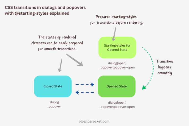
Let’s take it one step further by implementing different animations for dialog elements. The baseline remains the same: only the properties related to transformations and transitions will change.
The idea behind creating a stylish rotating dialog box involves playing with the opacity and a couple of CSS transformation properties:
.my-dialog { transition: opacity 0.5s, translate 0.5s, rotate 0.5s, overlay 0.5s allow-discrete, display 0.5s allow-discrete; }
The starting styles for the open state of the dialog include the following:
Here’s the code:
@starting-style { .my-dialog[open] { opacity: 0; translate: -50% -100%; rotate: -180deg; } }
The closed state resembles the starting styles but with altered translations and rotations to reflect an opposite movement when exiting the dialog element:
.my-dialog { /* Previous styles */ opacity: 0; translate: 50% 100%; rotate: 180deg; }
The dialog element in the open state has 100 percent opacity, no translation on either axis, and no rotation, effectively positioning it at the center of the screen:
.my-dialog[open] { opacity: 1; translate: 0 0; rotate: 0deg; }
The final output looks something like below:
See the Pen HTML5 Dialog and popover rotating animation by Rahul (@_rahul) on CodePen.
To create a bouncing effect without using CSS keyframe animations, we can utilize a Bezier curve as the transition-timing function for the transformation and opacity transitions of our dialog. We’ll use the scale transformation for this effect.
Feel free to experiment with different x1, y1, x2, and y2 values for the Bezier curve, and implement them in your animation projects:
.my-dialog { transition: opacity 0.4s cubic-bezier(0.4, 1.6, 0.4, 0.8), scale 0.4s cubic-bezier(0.4, 1.6, 0.4, 0.8), overlay 0.4s allow-discrete, display 0.4s allow-discrete; }
Now we can easily determine the starting styles and the open and closed states. The initial styles for the open and closed states will be the same — the dialog box will be scaled down to zero and completely transparent.
In the open state, the dialog box will have 100 percent opacity and be scaled to one. The rest of the transition effects will be handled by the Bezier curve-powered transitions:
@starting-style { .my-dialog[open] { opacity: 0; scale: 0; } } .my-dialog { opacity: 0; scale: 0; &[open] { opacity: 1; scale: 1; } }
Here’s how this looks in action:
See the Pen HTML5 Dialog and popover bouncing animation by Rahul (@_rahul) on CodePen.
We will use the same Bezier curve in this animation to keep things simple, but the effect will be different compared to the previous one. The idea is to translate the dialogue along the y-axis instead of scaling it, as we did with the last effect:
.my-dialog { transition: opacity 0.5s cubic-bezier(0.4, 1.6, 0.4, 0.8), translate 0.5s cubic-bezier(0.4, 1.6, 0.4, 0.8), overlay 0.5s allow-discrete, display 0.5s allow-discrete; }
The idea is to keep the dialog way up the viewport on the y-axis initially. Then, we will transform the dialog to zero when it is opened and finally translate it down the axis:
@starting-style { .my-dialog[open] { opacity: 0; translate: 0 -200%; } } .my-dialog { opacity: 0; translate: 0 200%; &[open] { opacity: 1; translate: 0 0; } }
Instead of applying a 100 percent positive or negative translation, I doubled it to create the impression of urgency in the dialog box. See it in action below:
See the Pen HTML5 Dialog and popover slide-up-down bouncing animation by Rahul (@_rahul) on CodePen.
The above effects suit the dialog elements well, but they won’t look great with the popover elements. This section is dedicated to some nice popover animation effects, which make the popover look like popovers and nothing more.
This effect resembles the popover effect we created initially. In that example, the popover appeared from the top and slide-fading down the y-axis, which isn’t what you’d expect from a popup in the bottom-right corner of the viewport.
Let’s rectify that by adding the same translation on the y-axis for the starting styles and the close state. Everything else remains unchanged:
See the Pen Rising up and down popover animation by Rahul (@_rahul) on CodePen.
The process of creating a growing and shrinking effect is simple and involves the use of scale transformation with a twist.
By setting the transformation origin to the absolute bottom-right, we can ensure that the popover expands from the right, aligning with its current position at the bottom-right.
See the Pen Growing and shrinking popover animation by Rahul (@_rahul) on CodePen.
This technique is commonly used to create animations for notification toasts. To achieve this effect, you simply need to translate the popover element 100 percent to the right, putting it out of the viewport. Then, in the open state, you can translate it back to zero to complete the effect.
See the Pen Slide in out from right popover animation by Rahul (@_rahul) on CodePen.
We learned about incorporating CSS transition-based animations in dialog and popover elements using pure CSS. We discussed the complexities and issues of traditional transitioning with overlay elements, and then we addressed these problems one by one using CSS keyframes and, more importantly, the @starting-style at-rule, which is specially developed for transitions.
However, the @starting-style feature is fairly new and not yet available globally. Consequently, using CSS keyframes and the Web Animation API is an option that makes sense in production and provides more granular control over adding animation effects.
Having said that, I recommend the @starting-style approach once it gets adopted widely to keep things simple and lightweight with CSS transition applications.
As web frontends get increasingly complex, resource-greedy features demand more and more from the browser. If you’re interested in monitoring and tracking client-side CPU usage, memory usage, and more for all of your users in production, try LogRocket.

LogRocket is like a DVR for web and mobile apps, recording everything that happens in your web app, mobile app, or website. Instead of guessing why problems happen, you can aggregate and report on key frontend performance metrics, replay user sessions along with application state, log network requests, and automatically surface all errors.
Modernize how you debug web and mobile apps — start monitoring for free.
Ce qui précède est le contenu détaillé de. pour plus d'informations, suivez d'autres articles connexes sur le site Web de PHP en chinois!
 utilisation de la fonction jsreplace
 Comment résoudre l'exception de débordement de pile Java
 Excel génère un code QR
 Quelles sont les nouvelles fonctionnalités de Hongmeng OS 3.0 ?
 Que sont les logiciels de programmation en langage C ?
 Écran gelé de l'ordinateur bloqué
 Utilisation de while
 Quels sont les cinq types de fonctions d'agrégation ?


![[Web front-end] Démarrage rapide de Node.js](https://img.php.cn/upload/course/000/000/067/662b5d34ba7c0227.png)


