
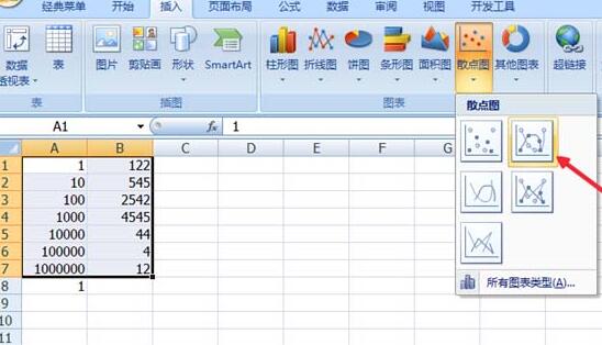
1. Insert a data table, select the data, and click [Insert] - [Scatter Plot].
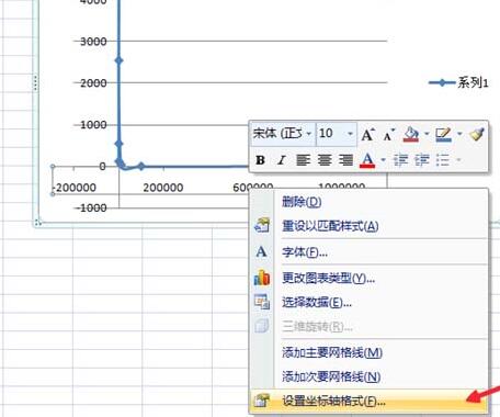
2. Right-click the abscissa and select [Format Axis].
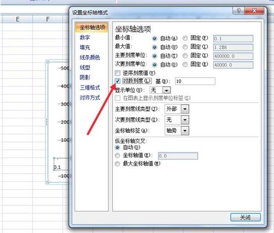
3. In the pop-up dialog box, select [Coordinate Axis Options] - [Logarithmic Scale] and check the box in front. Then [Close].
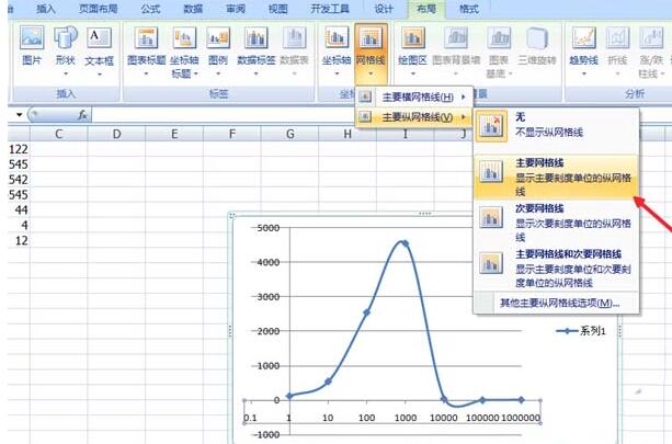
4. Click on the chart, and click [Chart Tools] - [Layout] in the top options.
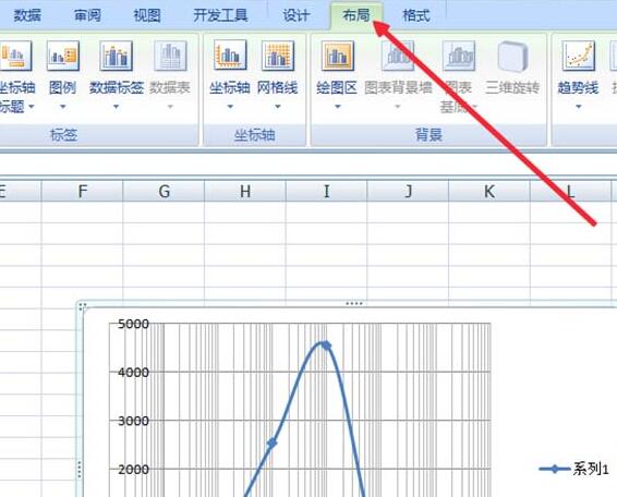
5. Select the grid lines in [Layout], select [Main Vertical Coordinate Grid Lines] - [Main Grid Lines], of course you can also add other horizontal ( Vertical) coordinates are the primary (secondary) grid lines.
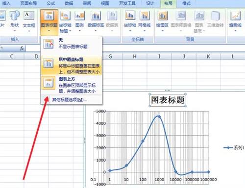
6. After adding the grid lines, you also need to add a title, so that it can be considered a complete chart. Still in [Layout], select [Chart Title] to add a title.
The above is the detailed content of A simple way to create a logarithmic chart in Excel. For more information, please follow other related articles on the PHP Chinese website!


