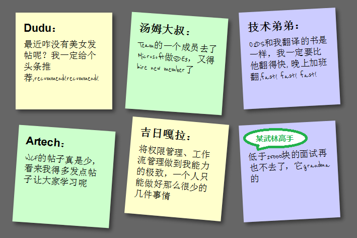
What this article will show you is how to use HTML5/CSS3 to create an HTML page with a sticky note effect in just 5 steps. The rendering is as follows:
(Note: The text in the picture is purely fabricated and is for funny purposes. , any similarity is purely coincidental, thank you! )

Note: This effect can be seen in Safari, Chrome, Firefox and Opera. Due to incomplete support for HTML5, IE No visible effect.
Step 1: Create basic HTML and squares
First add the basic HTML structure and build the basic square, the code is as follows:
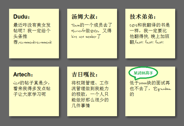
In this step, we want to achieve the shadow effect of the square and change the font to cursive (English only). Since Google provides Font API support, we It can be used directly. First add a call to the Google API:
font-size: 140%;
font-weight: bold;
padding-bottom: 10px;
}
ul li p
{
font-family: "Reenie Beanie" ,arial,sans-serif,Microsoft Yahei;
font-size: 110%;
}
Regarding shadows, since each browser does not fully support it, it needs to be handled separately. The code is as follows:
ul li a
{
text-decoration: none;
color: #000;
background: #ffc;
display: block;
height: 10em;
width: 10em;
padding: 1em; /* Firefox */
-moz-box-shadow: 5px 5px 7px rgba(33,33,33 ,1); /* Safari Chrome */
-webkit-box-shadow: 5px 5px 7px rgba(33,33,33,.7); /* Opera */
box-shadow: 5px 5px 7px rgba(33,33,33,.7);
}
The effect is as follows:

Step 3: Tilt the square
In order to tilt the square , we need to add the following code in li->a:
ul li a{
-webkit-transform:rotate(-6deg);
-o-transform:rotate(-6deg);
-moz-transform:rotate(-6deg) ;
}
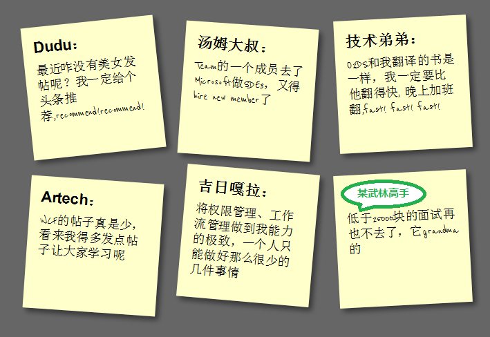
But in order to make the squares tilt randomly instead of all tilting, we need to use the new CSS3 selector to tilt the squares by 4 degrees every 2 and every 3 Each tilt has negative 3 deg, and every 6 tilts have 5 deg:
ul li:nth-child(even) a{
-o-transform:rotate(4deg);
-webkit-transform:rotate(4deg);
-moz-transform :rotate(4deg);
position:relative;
top:5px;
}
ul li:nth-child(3n) a{
-o-transform:rotate(-3deg );
-webkit-transform:rotate(-3deg);
-moz-transform:rotate(-3deg);
position:relative;
top:-5px;
}
ul li:nth-child(5n) a{
-o-transform:rotate(5deg);
-webkit-transform:rotate(5deg);
-moz-transform:rotate(5deg );
position:relative;
top:-10px;
}
The effect is as follows:

Step 4: Hover and Focus Zoom square
To achieve the zoom effect during hover and focus, we need to add the following code:
ul li a:hover,ul li a:focus{
-moz-box-shadow:10px 10px 7px rgba(0,0,0,.7 );
-webkit-box-shadow: 10px 10px 7px rgba(0,0,0,.7);
box-shadow:10px 10px 7px rgba(0,0,0,.7);
-webkit-transform: scale(1.25);
-moz-transform: scale(1.25);
-o-transform: scale(1.25);
position:relative;
z- index:5;
}
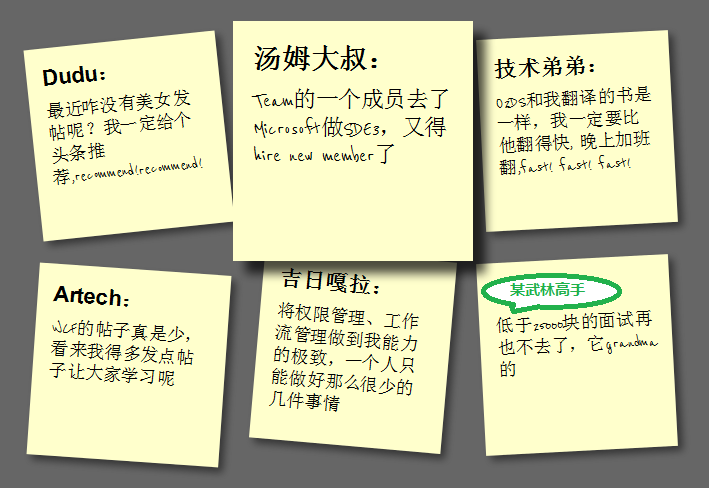
Setting z-index to 5 is to allow the square to cover other squares when zoomed in. At the same time, because focus is also set, it also supports Tab key switching access. The effect As follows:

Step 5: Smooth transition and add color
The special effects in step 4 look a bit stiff. We can add Transition to achieve the effect of smooth animation. In addition, the color is relatively single. We can set different colors. First add Transition in ul->li->a:
-moz-transition:-moz-transform .15s linear;
-o-transition:-o-transform .15s linear;
-webkit-transition :-webkit-transform .15s linear;
Then define different colors in even and 3n:
ul li:nth-child(even) a{
-o-transform:rotate(4deg);
-webkit- transform:rotate(4deg);
-moz-transform:rotate(4deg);
position:relative;
top:5px;
background:#cfc;
}
ul li:nth-child(3n) a{
-o-transform:rotate(-3deg);
-webkit-transform:rotate(-3deg);
-moz-transform:rotate(-3deg );
position:relative;
top:-5px;
background:#ccf;
}
In this way, we have completed our final effect:

Summary
At this point, we have used the basic features of HTML5 and CSS3 to create a pretty good sticky note effect. HTML5/CSS3 is indeed very It is powerful. If you add some advanced features, such as combining it with JavaScript, you can achieve even more awesome effects. You can see this from the HTML5 Lab series of articles that Dang Knight Brick has given you.
Also: The text in the picture is purely fabricated. Any similarity is purely coincidental. Thank you!

