


I saw how to make a dynamic tooltip using svg last night, so I learned to do it on a whim today, and I successfully made it. I also understand the principle and gained a lot! Next, I need to learn more about svg. This is a good thing.
We also paid attention to how to do some details that we usually struggle with, such as:
<article>
<section id="sound1">
</section>
<section id="sound2">
</section>
</article>
The article tag length is 600px, the section is 300px respectively, and then set it to display:inline-block; then the following effect:

According to common sense, the avatars should be arranged horizontally. This is because display:inline-block; will render the space between the article tag and the section tag into spaces and space booths, so the images will not be in the same row. The solution is to add the following css code to the article tag and section tag:
article{
width:600px;
margin:200px;
font-size:0;
}
article section{
display:inline-block;
width:300px;
font-size:14px;
position:relative;
}
So the white space is removed!
In addition, for svg web images, we can modify them so that the image style can be modified. Its format is roughly as follows (an example):
<?xml version="1.0" encoding="utf-8"?> <!-- Generator: Adobe Illustrator 17.0.0, SVG Export Plug-In . SVG Version: 6.00 Build 0) --> <!DOCTYPE svg PUBLIC "-//W3C//DTD SVG 1.1//EN" "http://www.w3.org/Graphics/SVG/1.1/DTD/svg11.dtd"> <svg version="1.1" id="Layer_1" xmlns="http://www.w3.org/2000/svg" xmlns:xlink="http://www.w3.org/1999/xlink" x="0px" y="0px" width="600px" height="300px" viewBox="0 0 600 300" enable-background="new 0 0 600 300" xml:space="preserve"> <polygon points="89.571,6.648 513.333,6.648 590.25,75.342 553.002,215.306 313.065,273.358 300,293.352 288.876,272.71 48.936,215.306 9.75,75.342 "/> </svg>
So it is impossible for us to introduce it into the html file. If there are many such svg images, it will be very troublesome to modify!
So I used ajax to load this image:
html dom:
// Question 2: How do we import the svg image? It is impossible to import the entire svg, which is inconvenient to modify and edit
// Tip 2: Use js to load
$('svg[data-src]').each(function(index, svg) {
var src = $(svg).data('src'); //data用于获取data-*属性的路径
$.ajax({
url: src,
dataType: 'xml',
success: function(content) {
var doc = content.documentElement;
$(doc).attr({
width: $(svg).attr('width'),
height: $(svg).attr('height')
});
$(svg).after(doc).remove();
}
})
});
There is also a good method for the stroke animation effect of pictures, only for svg images:
Use stroke-dasharray (dashed line stroke, you can keep trying to adjust it to suit the size to achieve the effect of the entire stroke) stroke-dashoffset (dashed line interval, adjust to the entire svg without stroke effect), and then Use transition to implement this animation
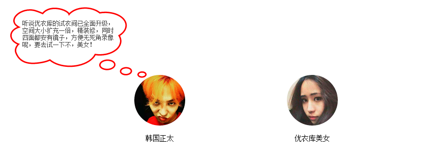
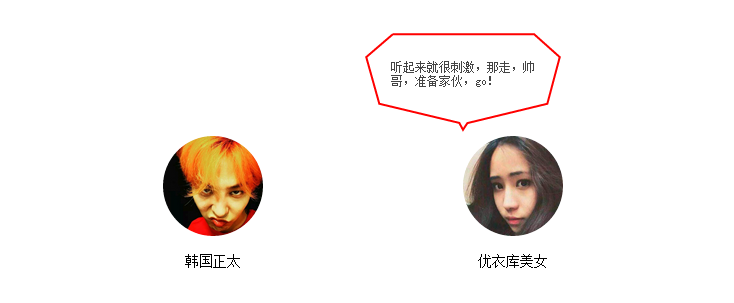
The final effect (as shown in the picture, there is no online demonstration, the animation effect cannot be produced, but directly copy the code posted below, and then download two svg images and avatar to use)
The code is as follows:
<!DOCTYPE html>
<html lang="zh-cn">
<head>
<title>toolTip聊天对话框制作</title>
<meta charset="utf-8"/>
<meta name="keywords" content="" />
<meta name="description" content="" />
<script type="text/javascript" src="jquery.js"></script>
<style type="text/css">
h1{
color:red;
font-size:18px;
}
article{
width:600px;
margin:200px;
font-size:0;
}
article section{
/*问题一:对于display:inline-block;会出现两个section无法并排排列,由于使用此属性会将article与section之间的空白处渲染成空格,于是无法并排*/
/*技巧一: 父元素设置 font-size:0;清除空白*/
display:inline-block;
width:300px;
font-size:14px;
position:relative;
}
.text-center{
text-align:center;
}
#sound1,#sound2{
cursor:pointer;
}
#sound1 img,#sound2 img{
width:100px;
height:100px;
border-radius:100%;
}
.sound_1,.sound_2{
position:absolute;
top:-104px;
width:200px;
height:100px;
box-sizing: border-box;
opacity:1;
}
.sound_2{
padding:28px;
}
.sound_1{
padding: 25px 68px 25px 30px;
left: -150px;
top: -134px;
width: 280px;
height: 140px;
}
.sound_1 svg ,.sound_2 svg{
position:absolute;
top:0;
left:0;
}
.sound_1 p,.sound_2 p{
position:relative;
margin:0;
color:#444;
font-size:12px;
}
.sound_1 svg path, .sound_2 svg polygon{
fill:#fff;/*填充的颜色*/
stroke:red;/*描边的颜色*/
stroke-width: 6px;/*边的宽度*/
}
.sound_1 svg #path1 {
transform: scale(0, 0);
transform-origin: center;
opacity: 0;
transition-duration: .3s;
transition-delay: 0;
}
.sound_1 svg #path2 {
transform: scale(0, 0);
transform-origin: center;
opacity: 0;
transition-duration: .3s;
transition-delay: .1s;
}
.sound_1 svg #path3 {
transform: scale(0, 0);
transform-origin: center;
opacity: 0;
transition-duration: .3s;
transition-delay: .2s;
}
.sound_1 svg #path4 {
transform: scale(0, 0);
transform-origin: center;
opacity: 0;
transition-duration: .3s;
transition-delay: .25s;
}
.sound_1 p {
transition: .2s .35s;
opacity: 0;
transform: translate(0, -10px);
}
#sound1:hover .sound_1 svg #path1,#sound1:hover .sound_1 svg #path2,#sound1:hover .sound_1 svg #path3,#sound1:hover .sound_1 svg #path4{
transform: scale(1, 1);
opacity: 1;
transition-delay: 0;
}
#sound1:hover .sound_1 p{
opacity: 1;
transform: translate(0, 0);
}
/*问题三:对于图片的描边动画效果,这里又怎么个好的方法,只针对svg图像*/
/*技巧三:使用stroke-dasharray(虚线描边,可以不断尝试,使其调至适应大小,实现描边的效果)stroke-dashoffset(虚线间隔,调至整个svg没有描边的效果),然后使用transition实现这个动画 */
.sound_2 svg polygon{
stroke-dasharray: 1500;
stroke-dashoffset: 1500;
fill-opacity: 0;
transition: .6s;
}
.sound_2 p {
transition: .4s;
transform: scale(-0.5);
opacity: 0;
transform: translate(0, -10px);
}
#sound2:hover .sound_2 svg polygon{
stroke-dashoffset: 0;
fill-opacity: 1;
}
#sound2:hover .sound_2 p {
transform: scale(0);
opacity: 1;
transform: translate(0, 0);
}
</style>
</head>
<body>

<h1>toolTip聊天对话框制作</h1>

<article>
<section id="sound1">
<div class="text-center"><img src="nan.jpg" /></div>
<p class="text-center">韩国正太</p>
<div class="sound_1">
<svg data-src="bubble1.svg" width="280" height="140"></svg>
<p>听说优衣库的试衣间已全面升级,空间大小扩充一倍,精装修,同时四面都安有镜子,方便无死角录像呢,要去试一下不,美女!</p>
</div>
</section>
<section id="sound2">
<div class="text-center"><img src="nv.jpg" /> </div>
<p class="text-center">优衣库美女</p>
<div class="sound_2">
<svg data-src="bubble2.svg" width="200" height="100"></svg>
<p>听起来就很刺激,那走,帅哥,准备家伙,go!</p>
</div>
</section>
</article>
<script type="text/javascript">
$(document).ready(function() {
// 问题二:对于svg图像我们要如何引入,不可能将整个svg都引入吧,不便于修改编辑
// 技巧二:使用js进行加载
$('svg[data-src]').each(function(index, svg) {
var src = $(svg).data('src'); //data用于获取data-*属性的路径
$.ajax({
url: src,
dataType: 'xml',
success: function(content) {
var doc = content.documentElement;
$(doc).attr({
width: $(svg).attr('width'),
height: $(svg).attr('height')
});
$(svg).after(doc).remove();
}
})
});
})
</script>
</body>
</html>
The above is the entire content of this article, I hope you all like it.


![[Web front-end] Node.js quick start](https://img.php.cn/upload/course/000/000/067/662b5d34ba7c0227.png)


