Sometimes the task is to analyze a data set and visualize the data using charts or plots. Plotly is a great open source graphics library that can be used with Python for quickly and easily making a variety of plots and charts. In this article, you use two different examples to plot scatter plots using a Python library called Plotly with Python code. In the first example, the Python installed in the computer system is used to run a Python program written to make a scatter plot. Another example, using Google Colab, shows how you can still use Python and Plotly and make scatter plots without Python installed on your computer. In both examples, Kaggle's open source datasets were used for data analysis and visualization.
sepal_length,sepal_width,petal_length,petal_width,species
5.1,3.5,1.4,0.2,Iris-setosa
4.9,3,1.4,0.2,Iris-setosa
4.7,3.2,1.3,0.2,Iris-setosa
4.6,3.1,1.5,0.2,Iris-setosa
5,3.6,1.4,0.2,Iris-setosa
5.4,3.9,1.7,0.4,Iris-setosa
4.6,3.4,1.4,0.3,Iris-setosa
5,3.4,1.5,0.2,Iris-setosa
4.4,2.9,1.4,0.2,Iris-setosa
…….., ….., ……, ……., ……..
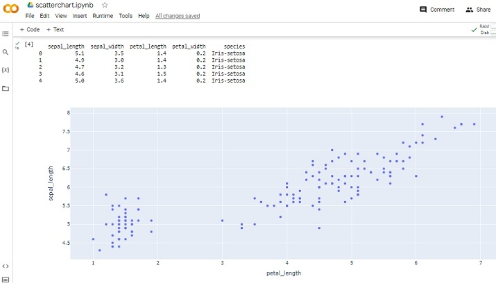
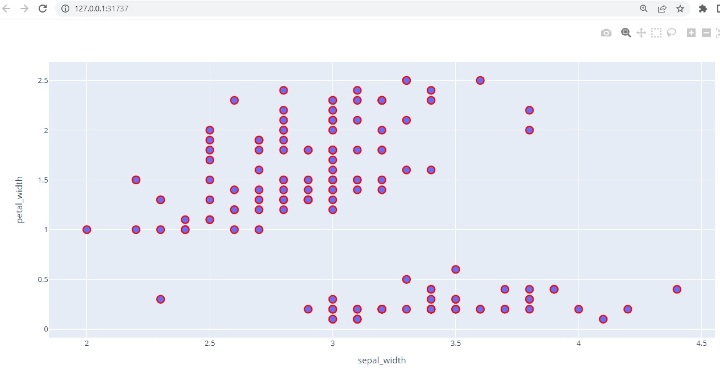
This CSV file contains five columns named sepal_length, sepal_width, petal_length, petal_width, and species. Among them, we will use sepal_width and petal_width as the scatter plot in example 1 and sepal_length and petal_length as the scatter plot in example 2.
Step 1 - First import pandas and draw. Plotly, an open source graphics library for Python, will be used to create scatter plots.
Step 2 - Now read the IRIS.csv file as the dataset given here will be used to make the scatter plot.
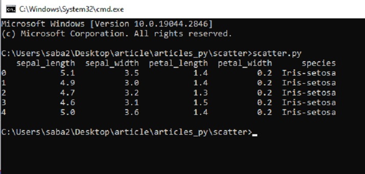
Step 3 - Make a data frame dff and display the columns and contents of the data frame.
Step 4 - Use the scatter() function to draw a scatter plot, specifying sepal_width for the x-axis and petal_width for the y-axis.
Step 5 - Set the style of the marker, such as size and color.
Step 6 - Write a function to display a scatter plot. Run the program using cmd window. The graph will open in a new tab in your browser.
Step 1 - Sign in with your Google Account. Go to Google Colab. Open a new Colab Notebook and write Python code in it.
Step 2 - Upload the IRIS.csv file downloaded and saved from Kaggle using the link given in Example 1 as the dataset given here will be used to make scatter points picture.
Step 3 - Now import pandas and plot. Plotly, an open source graphics library for Python, will be used to create scatter plots.
Step 4 - Make a data frame dff and display the columns and contents of the data frame.
Step 5 - Use the scatter() function to draw a scatter plot, specifying petal_length for the x-axis and sepal_length for the y-axis.
Step 6 - Write a function to display a scatter plot. Run the program by clicking the play button on a given code cell. Check the results as it will appear in the Colab notebook.
To make the scatter plot, we will use the data available on Kaggle. Log in to Kaggle and download the CSV file from this link -
Create a file named Scatter.py. Write the following code in this file
#include the required libraries
import pandas as pd

#This library is needed to make the scatter plot
import plotly.express as pxx

#read the CSV file and make a dataframe
dff = pd.read_csv("IRIS.csv")

#print the columns and data

print(dff.head())

#make the scatter plot
figg = pxx.scatter(dff, x="sepal_width", y="petal_width")

#set the properties of the scatter plot
figg.update_traces(marker=dict(size=12, line=dict(width=2, color="red")), selector=dict(mode='markers'))

#display the chart
figg.show()


#Uploading the csv
from google.colab import dfiles
data_to_load = dfiles.upload()
import pandas as pdd
import plotly.express as pxx

dff = pdd.read_csv("IRIS.csv")
print(dff.head())
figg = pxx.scatter(dff, x="petal_length", y="sepal_length")
figg.show()

In this Python and Plotly article, two different examples are given on how to make a scatter plot using a Python library called Plotly. First, the method of downloading and saving data sets from Kaggle for analysis is given. Then write a Python program to plot a scatter plot using functions in Plotly. In the second example, write a Python program using Google Colab and make a scatter plot using the same library and the same dataset.
The above is the detailed content of How to make a basic scatter plot using Python-Plotly?. For more information, please follow other related articles on the PHP Chinese website!


