
Microsoft has successfully solved web browser issues on Windows by migrating EdgeHTML-based Edge to the Chromium engine. The company is now adopting a similar strategy with its Outlook app and has begun rolling out the new email client for Windows 11 and Windows 10 through the Office Insider channel.
For those who don’t know, Windows currently supports two desktop email clients – the pre-installed UWP-based Mail app and Outlook Win32 bundled with the Microsoft Office productivity suite. It's no secret that Microsoft is working on maintaining two versions of Outlook for Windows and other platforms.
For example, the UWP version lacks too many features compared to the full version of the email client. According to sources, Microsoft has moved the UWP Mail app into maintenance mode, which means users should not expect any improvements to the old app now.
Outlook’s new app for Windows 11 is apparently based on the Chromium-based Edge WebView, which is a web wrapper. However, Outlook is a web application that is so well designed that most people won't even notice that it is a web application.
It has all the features you would expect from a modern application, including the ability to locate documents using @files and @documents. This is similar to the existing feature that lets you @mention someone to add them to an email.
There's another new feature that will remind you when you miss a message and Outlook deems it important.

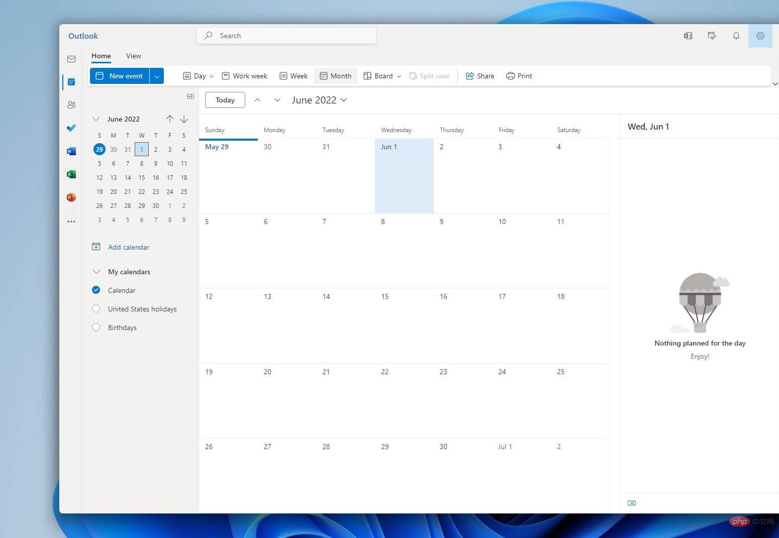
It also comes with built-in calendar integration, which means you no longer need to maintain a separate calendar application. The interface allows you to organize the most important things and manage them in one view.

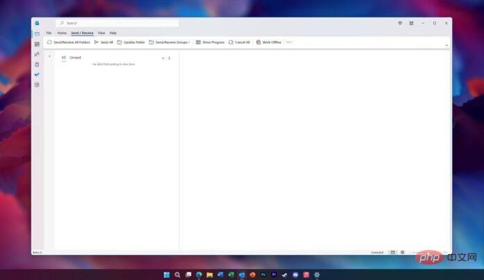
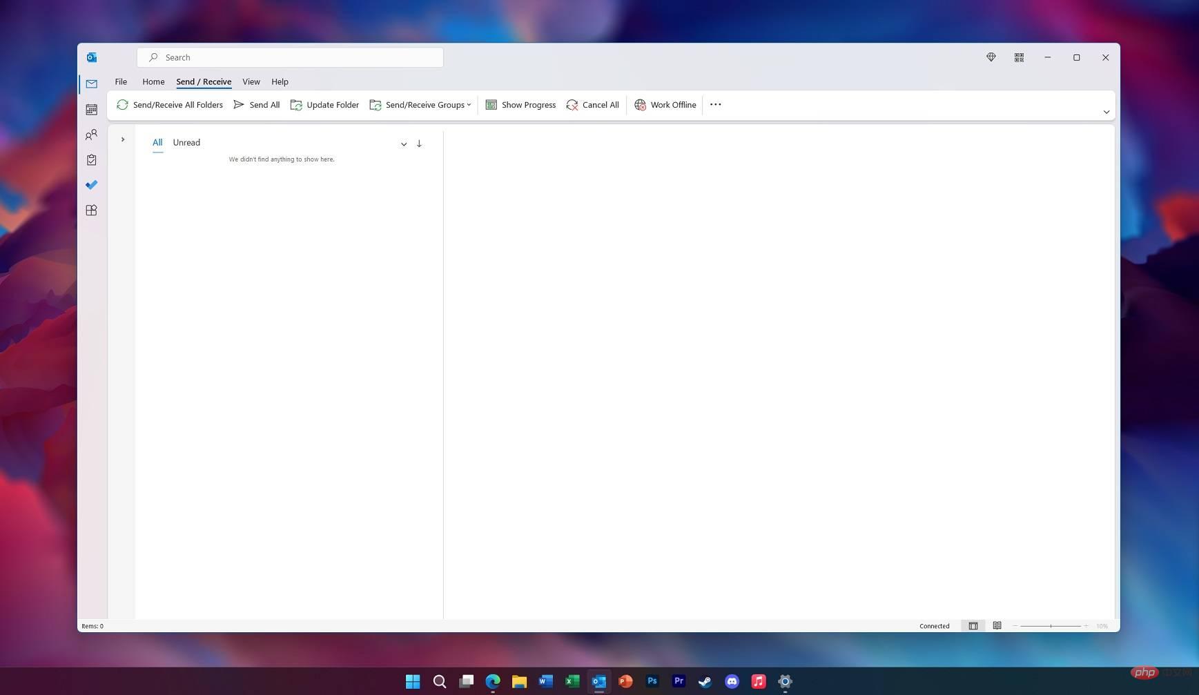
Interestingly, Microsoft appears to be developing a mica material for Outlook as well. As you can see in the screenshot above, Mica worked after modifying Outlook's Windows registry.
Of course, Microsoft may also use Fluent Design’s acrylic material. In fact, Microsoft Edge’s context menu or main menu already supports acrylic-like transparent/translucent effects.
In addition to the new design, Microsoft has also added My Day integration to help you stay connected with important topics while you work. You can easily drag and drop messages as tasks into your to-do list, or better manage tasks in your calendar.
It’s worth noting that other UI improvements to the Mail app are still expected later this year, with new features added via server-side updates. The focus has now shifted to the design and accessibility of this new Outlook on the web-based application.
The above is the detailed content of A closer look at Windows 11's new Outlook email app, featuring Mica design and more. For more information, please follow other related articles on the PHP Chinese website!


