This article brings you relevant knowledge about front-end buttons. It mainly talks about how to use Clip-path to realize button flowing border animation. Friends who are interested can take a look at it together. I hope it will be helpful to everyone. helpful.

<div>苏苏_icon</div>

div {
  position: relative;
  width: 220px;
  height: 64px;
  line-height: 64px;
  text-align: center;
  color: #fff;
  font-size: 20px;
  background: #55557f;
  cursor: pointer;
  border-radius: 10px;
}
div::after,
div::before {
   content: "";
   position: absolute;
   width: 240px;
   height: 84px;
   border: 2px solid #55557f;
   border-radius: 10px;
 }
div::before{
 border: 2px solid orange;
}
div::after,
div::before{
 + left: calc(110px - 120px);
 + top: calc(32px - 42px);
}inset attribute: used to set left/right/bottom/top
div::after,
div::before{
 - left: calc(110px - 120px);
 - top: calc(32px - 42px);
 - inset: -10px;
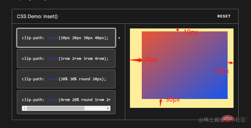
}clip-path: The clip-path CSS property uses clipping to create the displayable area of an element. Parts within the area are displayed and parts outside the area are hidden. inset() defines an inset rectangle.
clip-path: inset(20px 50px 10px 0 round 50px);
When all four parameters are provided:
They represent the top, right, bottom, and left offsets inward from the reference box, which define where the edges of the inserted rectangle are inserted. These parameters follow the syntax of margin shorthand, allowing you to set one, two, or four values for all four illustrations.
Optional border-radiu parameter:
Use border-radius shorthand syntax to define rounded corners for the inserted rectangle


div::after,
div::before{
  + clip-path: inset(0 0 98% 0);
}
div::after,
div::before{
  + clip-path: inset(0 98% 0 0);
}
div::after,
div::before{
  + clip-path: inset( 98% 0  0 0);
}
div::after,
div::before{
 + clip-path: inset(0  0 0  98% ) ;
} ##
##
div::after,
div::before{
  + animation: pathRotate 3s infinite linear;
}@keyframes pathRotate { 0%, 100% {
clip-path: inset(0 0 98% 0);
} 25% {
clip-path: inset(0 98% 0 0);
} 50% {
clip-path: inset(98% 0 0 0);
} 75% {
clip-path: inset(0 0 0 98%);
}
}
animation-delay: The
CSS property specifies the time to wait from applying animation to an element to starting the animation. quantity. The animation can start later, immediately from the beginning, or immediately in the middle of the animation.
Positive values indicate that the animation should start after the specified amount of time has passed. The default value of 0s means the animation should start immediately after application.
Negative values cause the animation to start immediately, but midway through its loop. For example, if you specify a -1s animation delay time, the animation will start immediately, but 1 second after the animation sequence begins. If you specify a negative value for the animation delay but the start value is implicit, the start value is taken from the moment the animation is applied to the element.div::after { animation-delay: -1.5s; }Copy after login

-div::before {
 -  border: 2px solid orange;
-}
div:hover {
  filter: brightness(1.5);
}div{ /* 添加过渡效果 */
transition: all 0.5s;
}
The above is the detailed content of Detailed graphic explanation of Clip-path to implement button flowing border animation. For more information, please follow other related articles on the PHP Chinese website!
 what is search engine
 What are the parameters of marquee?
 How to solve the problem of dns server not responding
 How to solve Permission denied
 How to solve the problem that the device manager cannot be opened
 How to switch settings between Huawei dual systems
 Why is the mobile hard drive so slow to open?
 How to eliminate html code