
html5 form elements include basic controls: 1. Single-line text input box; 2. Password input box; 3. Multi-line text input box (text field); 4. Drop-down list; 5. Radio button; 6. Check box; 7. Submit button; 8. Reset button; 9. Fieldest control; 10. Legend control, etc.

The operating environment of this tutorial: Windows 7 system, HTML5 version, Dell G3 computer.
Forms are generally used to collect user information, allowing users to fill in, select, and submit relevant information; on web pages, we also need to interact with users and collect user information. At this time Forms are also required; HTML forms for user input are created using the <form></form> tag
In HTML, a complete form usually consists of form controls (form elements ), prompt information and form fields.
Form control
Contains specific form function items, such as: single-line text input box , password input box, radio button, check box, submit button, reset button, etc.
Prompt information
Usually in a form It also needs to contain some explanatory text to prompt users to fill in and operate
Form field
is equivalent to a container to accommodate all For form controls and prompt information, the url address of the program used to process form data can be defined through the form field, as well as the method for submitting data to the server; if the form field is not defined, the data in the form cannot be transmitted to the background. Server
The complete form contains the following elements
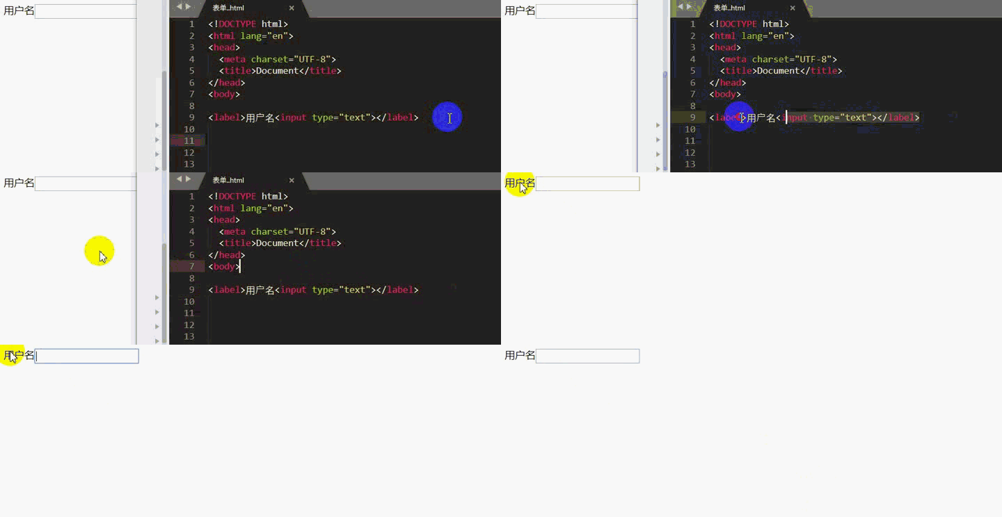
form used to create the HTML forminput Control, single label, can be used to set input boxes, radio boxes, check boxes, upload files, submit buttons, etc. label is the corresponding The input tag defines the annotation (can be considered as a mark or description); if the annotated input box is an input box, the cursor will automatically focus on the input box when clicking on the annotated content textarea control, used for Create a multi-line text input box (text field) select is used to define a drop-down list and needs to be used in conjunction with the option tag; when using select, you need to set the name attribute, which is used to submit to the server Identify the form dataoption Define the items in the drop-down list. By default, only one item can be selected; you need to set the value attribute when using it. When submitting the form, the corresponding option value will be submitted to Server fieldest Groups related form elements, usually used in conjunction with the legend tag legend for fieldest Group element definition title button Define a button. If this element is used in a form, this element has the function of submitting the form; usually the form submission is set through the type attribute of the input tag in the form. Button<form></form> Label name Set the name of the form
action The submission action of the form indicates where the form will be submitted; the value is the URL and can be a relative address. Or absolute address
method The submission method of the form, which HTTP method to use to submit the form; the general value is get or post
enctype Set the encoding method for form data encoding; the server will decode the submitted data according to the set encoding method;
There are three values:
application/x-www-form-urlencoded Encode all characters before sending (default) multipart/form-data Do not encode characters; This value must be used when using a form that contains a file upload controltext/plain Spaces are converted to " " plus signs, but special characters are not encoded<input> Label name Defines the name of the input element; submits the current label to the server This attribute needs to be set when the data in
#value Set the value of the input element
The value attribute has different usage for different input types:
For text, password, hidden types, used to define the initial (default) value in the input box
For checkbox, radio, image Type, used to define the value related to the input element. When the form is submitted, the value will be sent to the action URL of the form
For button, reset, and submit types, used to define the button Displayed text content
Note: When the input type is checkbox and radio, the value attribute must be set
maxlength Set the maximum number of characters in the input tag. The value is of numeric type. The part exceeding the maximum number of characters will not be entered; generally used for input boxes
autofocus If this attribute is set, it will automatically focus when the page is loaded. The attribute value does not need to be written; a form can only have one input tag with this attribute set, and it is mostly used for input boxes.
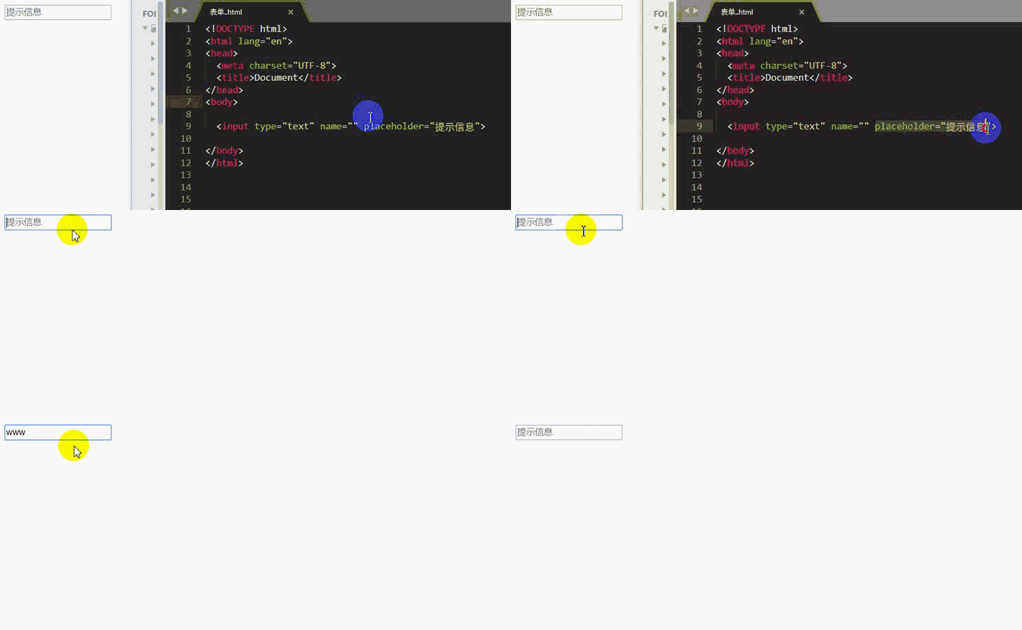
placeholder Used to set short prompt text; mostly used in input boxes, the prompt information disappears automatically when inputting content
checked Set an option to be selected by default; the attribute value is checked, which can be omitted; This attribute is only valid for type="checkbox" or type="radio"
accept Set the type of submitted file, which is only valid for type="file"; after clicking the "Select File" button, only the file type will be displayed in the pop-up resource manager. The matching file type
attribute values are:
audio/* All audio files video/* All video filesimage/* All picture files##src Set to be displayed as a submit button The position of the image, the value is url; this attribute is used in conjunction with type="image"
alt The alternative text when the image of the image button cannot be displayed; this attribute Can only be used with type="image"
type is used to determine the display type of the input tag; there are many corresponding attribute values, and different attribute values correspond to Different types, the default is text. The corresponding attribute value of type
text Single-line text input box, the default width is 20 English characters
<input>
 Set the default value:
<input>
 Set the maximum number of characters:
<input>
 Set prompt information:
<input>
Password input box, the input content will be Display in dot form; same as text, you can also set value, maxlength, etc. <input>

<input>男<input>女
<input>男<input>女


<input>妩媚<input>柔美<input>可爱<input>妖娆
Set multiple defaults to be selected:
<input>妩媚<input>柔美<input>可爱<input>妖娆

 ##file
<input>
##image Use the image as a submit button
<input>
Set the clickable button; set the text displayed by the button through the value attribute, and create a click event through the onclick attribute
<input>
<ul>
<li>
<code>submit
用于定义提交按钮;点击该按钮会对表单进行提交;可以通过 value 属性设置按钮显示的文本,未设置 value 时默认显示为 “提交”
<input>

react 设置重置按钮;点击该按钮后会对表单进行重置(在表单中填写的内容会被清空)
hidden 用于定义隐藏字段,隐藏字段对于用户不可见<input>
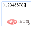
<textarea></textarea> 标签name 文本域的名称cols 设置文本区内的可见宽度(每行显示的英文字符个数,列数);值为数值类型rows 设置文本区内的可见行数(行数)required 设置为必填项;值为 requireddisabled 禁用<textarea></textarea>
p 标签设置 contenteditable="true" 也可以实现文本域效果
<p></p>
相关 CSS 样式:
p {
    width: 600px;
    height: 300px;
    min-height: 200px;
    _height: 200px;
    /*消除聚焦时出现的高亮边框*/
    outline: 0;
    /*当内容溢出时,自动添加滚动条*/
    overflow: auto;
    border: 1px solid gray;}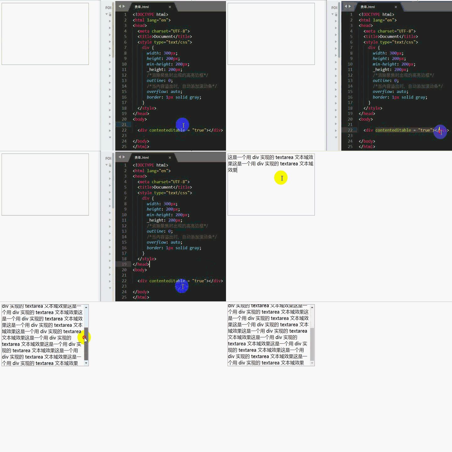
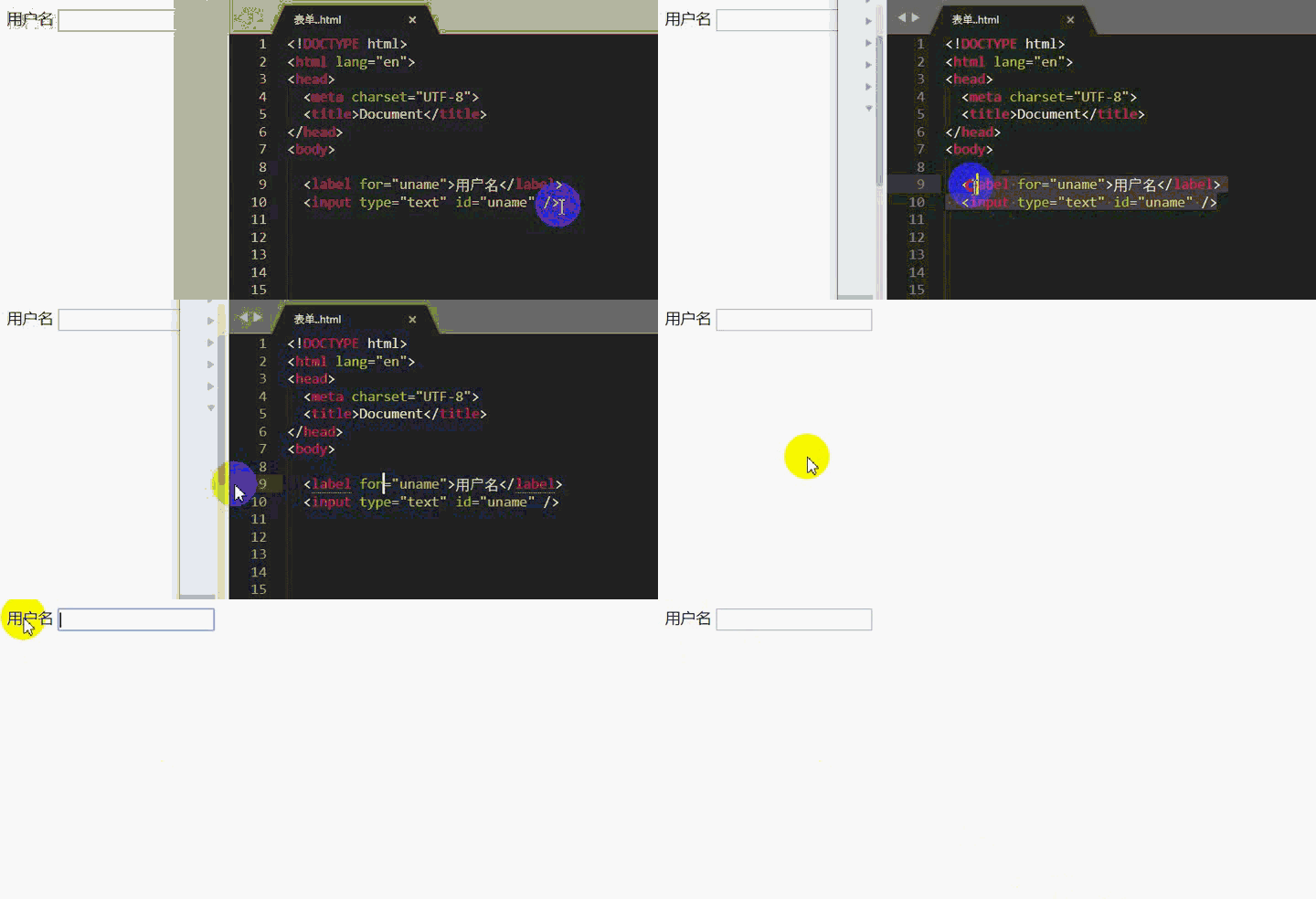
<label></label> 标签for 规定与哪个表单元素进行绑定,其值为 input 标签的 id 属性对应的值<input>
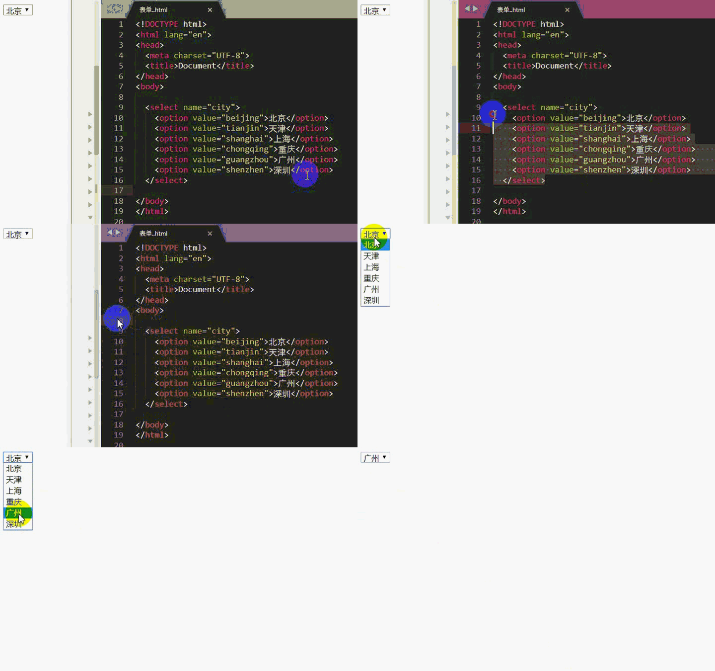
<select></select> 标签name 定义下拉列表的名称size 设置显示下拉列表中可选项的数目disabled 禁用下拉列表(无法点击选择)<option></option> 标签value 用于设置选项值,被选中的项对应的值在表单提交时会传给服务器disabled 设置禁用项,设置该属性的选项会被禁用selected 设置默认选中项默认效果:
<select>
   <option>北京</option>
   <option>天津</option>
   <option>上海</option>
   <option>重庆</option>
   <option>广州</option>
   <option>深圳</option>          </select>
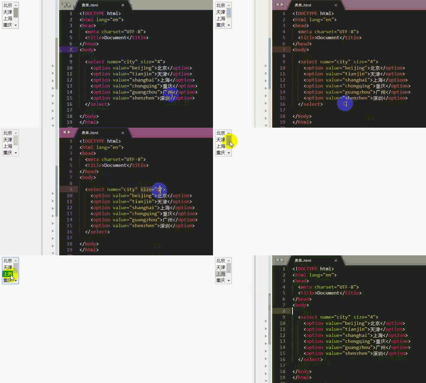
select 标签设置了 size 后的效果
<select></select>
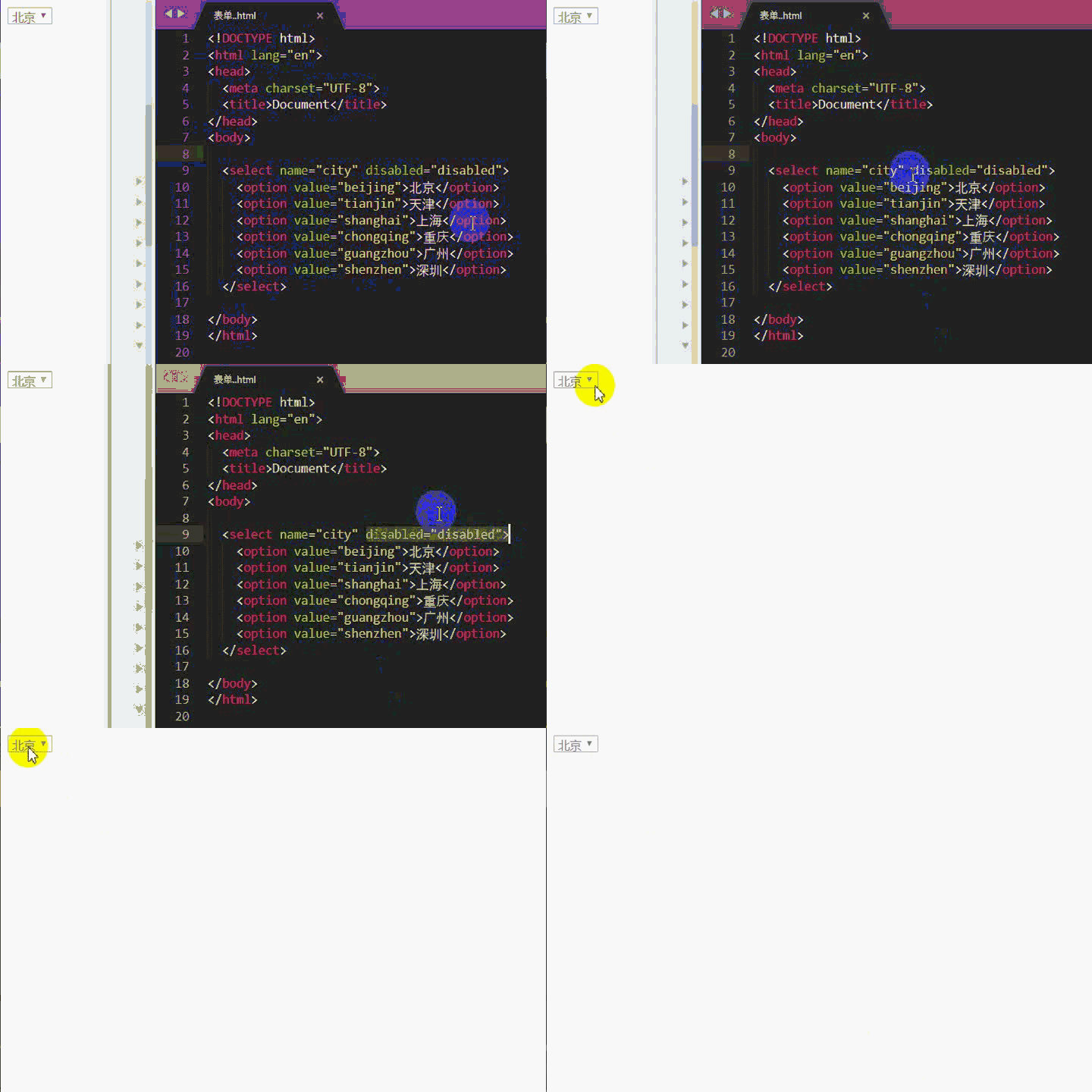
select 标签设置了 disabled 后的效果
<select></select>
<fieldest><fieldest></fieldest></fieldest> 标签name 定义 fieldest 的名称disabled 禁用<legend></legend> 标签align 标题文本的对齐方式;值为 top、bottom、left、right
<button></button> 标签button 可点击按钮;IE 默认值submit 提交按钮;除 IE 外其他浏览器的默认值reset 重置按钮,清除表单数据推荐教程:《html视频教程》
The above is the detailed content of What basic controls does html5 form elements include?. For more information, please follow other related articles on the PHP Chinese website!
 What are the production methods of html5 animation production?
 The difference between HTML and HTML5
 ones function usage
 Is OuYi Exchange legal?
 Virtual mobile phone number to receive verification code
 How to open php in a web page
 linux view ip command
 What is the difference between 4g and 5g mobile phones?