
#The method of generating chart data from an Excel table is as follows:
1. Open Excel and frame-select the data to be generated into the chart.
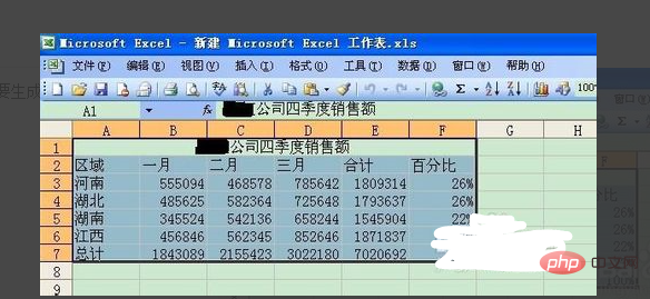
#2. Select "Insert" - "Chart" in the toolbar.
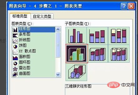
#3. At this time, select the chart type, such as three-dimensional clustered column chart, and click "Next".
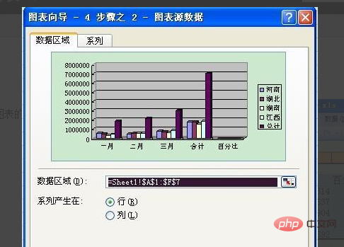
#4, you will be asked to select the chart source data. Since we have already selected it in the first step, click "Next" directly.
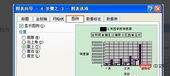
#5, then enter the chart title and the meaning of the data represented by each axis (default is none).
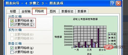
#6, you can also add network lines to the chart (default is none).
#7, you can also choose the location of the legend (default is to the right). After setting these, click "Next".
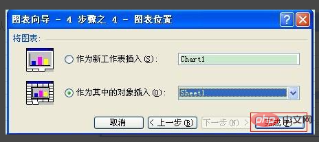
#8, then select the insertion position, which defaults to the current page.
#9, you can adjust the size of the chart according to your work needs.
10, and then drag the chart to the appropriate location in Excel.
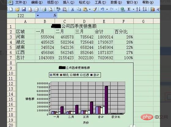
#11, finally save Excel.
For more Excel-related technical articles, please visit the Excel Basic Tutorial column to learn!
The above is the detailed content of How to create data charts in Excel tables. For more information, please follow other related articles on the PHP Chinese website!
 Compare the similarities and differences between two columns of data in excel
 excel duplicate item filter color
 How to copy an Excel table to make it the same size as the original
 Excel table slash divided into two
 Excel diagonal header is divided into two
 Absolute reference input method
 java export excel
 Excel input value is illegal