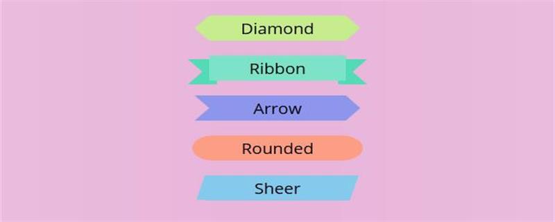
A variety of button effects can be achieved through CSS. For example, the color gradient effect button can be set through the CSS gradient attribute, and the press effect button can be realized through box-shadow.
Today in this article I will share how to create several different styles of button effects, which are flat, border, gradient and shadow and press style buttons. Next, in the article, I will introduce in detail how to achieve the effect through CSS code.

HTML code
<div class="pm">
	<button>平面按钮</button>
</div>
Basic CSS style code
button{
display: inline-block;
margin: 0 10px 0 0;
padding: 15px 45px;
font-size:20px;
font-family:"Bitter",serif;
line-height: 20px;
appearance: none;
 box-shadow:none;
 border-radius: 0;
}(1) Flat style CSS button
The use of flat style buttons is very popular now and is in line with the ubiquitous flat design trend. , these flat style buttons look great. The following code is the button in a normal state
.pm button {
  color:#fff;
  background-color:#6496c8;
  border:none;
}Rendering:

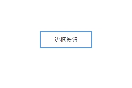
(2 )Border style CSS button
Border style buttons belong to the same category as flat buttons. The only difference is that we will be using a border instead of the background color used for the flat button. The following code is the normal state of the button
.pm button {
  color:#444;
 border:5px solid #6496c8;
  background-color: #fff;
}Rendering:

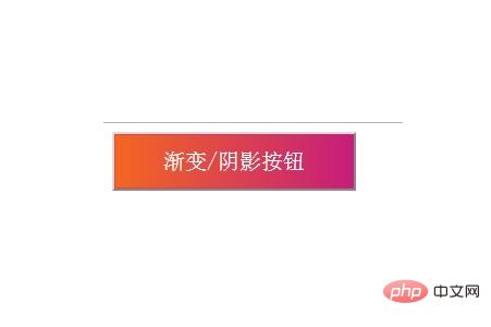
(3) Gradient and Shadow Style CSS Button
This gradient and shadow style button is more in line with the button effects we have seen in days gone by. If you like those with colorful colors then gradient/shadow style buttons are for you. The nice thing about creating this button is that its effects are all done in CSS, so it can be easily scaled up or down without worrying about losing resolution or having to create a new image. The following code is the button's normal state
.pm button {
  color:#fff;
  text-align: center;
  box-shadow:inset 0 0 0 1px #e91e637d;
  background: -webkit-linear-gradient(left, red , blue); /* Safari 5.1 - 6.0 */
  background: -o-linear-gradient(right, rgb(244,103,34), rgb(197,29,124));
  background: -moz-linear-gradient(right, rgb(244,103,34), rgb(197,29,124));
  background: linear-gradient(to right, rgb(244,103,34) , rgb(197,29,124));}
}Rendering:

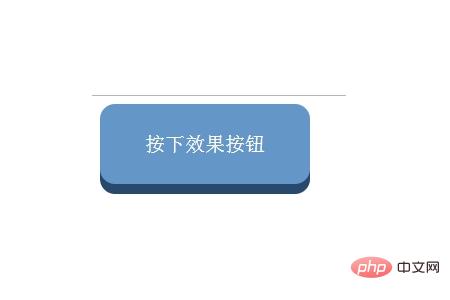
(4 ) Press Styled CSS Buttons
These "press" style buttons combine some flat design and illusion to make the user feel like they actually pressed the button. When the user presses it, it appears to be stuck in the page. Its implementation requires the use of shadows to set it up to give it a 3D pop-up appearance. The following code is the button in a normal state
.pm button {
  color: #fff;
  background-color: #6496c8;
  border: none;
  border-radius: 15px;
  box-shadow: 0 10px #27496d;
}Rendering:

Summary: The above is the summary of this article That’s all. I hope this article can help everyone learn to use CSS to create button effects.
The above is the detailed content of How to create buttons with different effects through CSS. For more information, please follow other related articles on the PHP Chinese website!