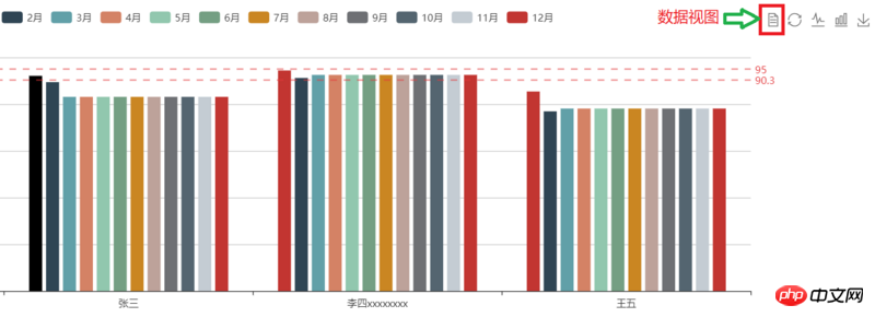
The content of this article is about how echarts optimizes the style (code example) in the data view dataView. It has certain reference value. Friends in need can refer to it. I hope it will be helpful to you.
During the process of using echart, there is a dataView view mode in the toolbox, and the data in it is not aligned, which affects the display effect. The situation is as follows:


##Change the solution to the problem to handle it in the optionTocontent callback function. The specific code is as follows:
toolbox:{
   show: true,
  feature: {
     dataView: {
         show: true,
         title: '数据视图',
         optionToContent: function (opt) {
         var axisData = opt.xAxis[0].data;
         var series = opt.series;
         var tdHeads = '<td>名称</td>';
         series.forEach(function (item) {
         tdHeads += '<td>'+item.name+'</td>';
         });
var table = '| '+ series[j].data[i]+' | '; } } table += '
| '+axisData[i]+' | '+ tdBodys +'

The above is the detailed content of How echarts optimizes the style in data view dataView (code example). For more information, please follow other related articles on the PHP Chinese website!


