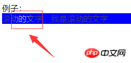
The content of this article is about the example code for implementing scrolling text in CSS. It has certain reference value. Friends in need can refer to it. I hope it will be helpful to you.

Picture description: The arrow points to the part, with a white background, scrolling from left to right. (Not applicable to IE)
<div>
例子:
<div>
<span>滚动的文字,我是滚动的文字</span>
</div>
</div>
.box {
    height: auto;
    background-color: blue;
}

.box-text{
    color: white;
    background: -ms-gradient(linear,left top,right top,color-stop(0,#4d4d4d),color-stop(.4,#4d4d4d),color-stop(.5,#fff),color-stop(.6,#4d4d4d),color-stop(1,#4d4d4d));
    background: -webkit-gradient(linear,left top,right top,color-stop(0,#4d4d4d),color-stop(.4,#4d4d4d),color-stop(.5,#fff),color-stop(.6,#4d4d4d),color-stop(1,#4d4d4d));
    background-clip: text;
    -webkit-text-fill-color: transparent;
    animation: slidetounlock 3s infinite;
    -webkit-animation: slidetounlock 3s infinite;
}

@-webkit-keyframes slidetounlock{
    0%  {
        background-position:-200px 0
    }

    100% {
        background-position:200px 0
    }
}1. Animation effect
@-webkit-keyframes
Define a set of animations. In this animation, the position of the background is changed (note the position of the text)
2. Why choose text instead of the entire background for the background?
background-clip: text;
作用:指定绘图区的背景
除了text外,还包括 :border-box|padding-box|content-box;三个属性
3. How to achieve a small change effect?
gradient()
Function: Gradient
As you can see from the actual effect, everything outside the white part is gray. The closer to the white, the whiter it becomes.
-ms-gradient(linear,left top,right top,color-stop(0,#4d4d4d),color-stop(.4,#4d4d4d),color-stop(.5,#fff),color-stop(.6,#4d4d4d),color-stop(1,#4d4d4d));
Description: Gradient type, linear gradient (z=x*y)
to left:
Set the gradient from right to left. Equivalent to: 270deg
to right:
sets the gradient from left to right. Equivalent to: 90deg
to top:
Set the gradient from bottom to top. Equivalent to: 0deg
to bottom:
sets the gradient from top to bottom. Equivalent to: 180deg. This is the default value, which is equivalent to leaving it blank.
This achieves the gradient font part
-webkit-text-fill-color: transparent;
Font fill color: inherited from the background, so the font color is the background of the set box-text, not the background color of the box.
Just add an animation and move in a loop, and it's achieved.
The above is the detailed content of Example code for scrolling text using css. For more information, please follow other related articles on the PHP Chinese website!