This article mainly explains the style of buttons.
1.Option
2. Size
3.Activity status
4. Disabled state
5. Html tags that can be used as buttons
Options

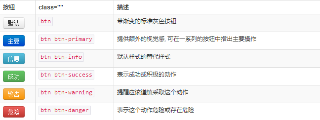
Use the classes listed above to quickly create a styled button.
 <button type="button" class="btn btn-default">Default</button>
 <button type="button" class="btn btn-primary">Primary</button>
 <button type="button" class="btn btn-success">Success</button>
 <button type="button" class="btn btn-info">Info</button>
 <button type="button" class="btn btn-warning">Warning</button>
 <button type="button" class="btn btn-danger">Danger</button>
 <button type="button" class="btn btn-link">链接</button>

Size
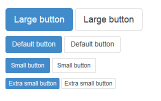
Need the buttons to be different sizes? Use .btn-lg, .btn-sm, .btn-xs to get buttons of different sizes.
<p>
 <button type="button" class="btn btn-primary btn-lg">Large button</button>
 <button type="button" class="btn btn-default btn-lg">Large button</button>
</p>
<p>
 <button type="button" class="btn btn-primary">Default button</button>
 <button type="button" class="btn btn-default">Default button</button>
</p>
<p>
 <button type="button" class="btn btn-primary btn-sm">Small button</button>
 <button type="button" class="btn btn-default btn-sm">Small button</button>
</p>
<p>
 <button type="button" class="btn btn-primary btn-xs">Extra small button</button>
 <button type="button" class="btn btn-default btn-xs">Extra small button</button>
</p>

By adding .btn-block to the button, it can fill 100% of the width of the parent node, and the button also becomes a block element.
<button type="button" class="btn btn-primary btn-lg btn-block">Block level button</button>
<button type="button" class="btn btn-default btn-lg btn-block">Block level button</button>

Activity status
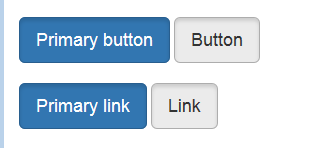
When a button is active, it appears to be pressed (darker background, darker border, built-in shadow). For the B
<button type="button" class="btn btn-primary btn-lg active">Primary button</button>
<button type="button" class="btn btn-default btn-lg active">Button</button>

Link element
You can add .active class for .
<a href="#" class="btn btn-primary btn-lg active" role="button">Primary link</a>
<a href="#" class="btn btn-default btn-lg active" role="button">Link</a>
You can compare it with the button above.

Disabled status
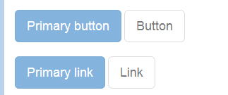
By fading the button’s background color by 50%, you can create an unclickable effect.
Button element
Add disabled attribute to
<button type="button" class="btn btn-lg btn-primary" disabled="disabled">Primary button</button>
<button type="button" class="btn btn-default btn-lg" disabled="disabled">Button</button>

You can put the mouse on the button and click to see the effect.
Cross-browser compatibility
If you add the disabled attribute to
Link element
Add .disabled class for .
<a href="#" class="btn btn-primary btn-lg disabled" role="button">Primary link</a>
<a href="#" class="btn btn-default btn-lg disabled" role="button">Link</a>

This is a comparison with the button above.
We use .disabled as a tool class, just like .active class, so there is no need to add a prefix.
Link functions are not affected
The classes mentioned above only change the appearance of and do not affect the functionality. In this document, we have disabled the default functionality of links via JavaScript code.
Html tags that can be used as buttons
You can add button classes to ,
 <a class="btn btn-default" href="#" role="button">Link</a>
 <button class="btn btn-default" type="submit">Button</button>
 <input class="btn btn-default" type="button" value="Input">
 <input class="btn btn-default" type="submit" value="Submit">

Cross-browser performance
As a best practice, we strongly recommend using the
For other reasons, this Firefox bug prevents us from setting line-height for buttons based on the tag, which results in their height being inconsistent with other buttons on Firefox.
This section mainly explains the styles of button buttons. You can flexibly run these styles for control. I hope it will be helpful to your learning.


