


CSS3 rem (set font size) tutorial
This time I will bring you a tutorial on how to use CSS3 rem (setting font size). What are the precautions when using CSS3 rem (setting font size). The following is a practical case. Let’s take a look. .
css3NewThe relative unit rem is added. Using rem is the same relative font size unit as em. The difference is that rem is relative to the HTML root element. Since many netizens mentioned rem, I will summarize one of them here.
What unit should be used to define the font size of the page in the Web? There is still a fierce debate today. Some people say that PX is a good unit, some say that EM has many advantages, and some people say that percentage is convenient. , so that there is a PK situation like CSS Font-Size: em vs. px vs. pt vs. percent. Unfortunately, there are still different pros and cons that make each technique less than ideal but still hard not to use.
Before introducing rem in detail, let us first review the two commonly used units of measurement, which are also the two most controversial ones:
PX is the unit
EM is in units
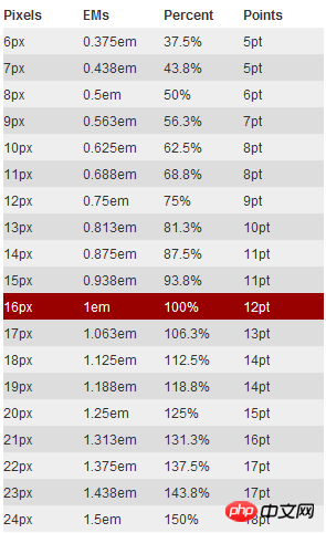
#px is in units
In the initial production of the Web page, we We all use "px" to set our text because it is more stable and precise. But there is a problem with this method. When the user browses the Web page we created in the browser, he changes the font size of the browser, and then our Web page layout will be broken. This is a big problem for users who are concerned about the usability of their websites. Therefore, it was proposed to use "em" to define the font of the Web page.
em is the unit
As mentioned before, using "px" as the unit is more convenient and consistent, but it is difficult to zoom in or zoom out in the browser. There will be a problem when using the page. To solve this problem, we can use the "em" unit.
This technique requires a reference point, which is generally based on the "font-size" of
. For example, we use "1em" equals "10px" to change the default value "1em=16px". In this way, when we set the font size to be equivalent to "14px", we only need to set its value to "1.4em".body {
font-size: 62.5%;/*10 ÷ 16 × 100% = 62.5%*/
}
h1 {
font-size: 2.4em; /*2.4em × 10 = 24px */
}
p {
font-size: 1.4em; /*1.4em × 10 = 14px */
}
li {
font-size: 1.4em; /*1.4 × ? = 14px ? */
}
Why is it a question mark whether "1.4em" of "li" is "14px"? If you understand "em", you will feel that this question is too much to ask. As briefly introduced before, when using "em" as the unit, you must know the settings of its parent element, because "em" is a relative value, and it is a value relative to the parent element. Its real calculation The formula is:
1 ÷ font-size of the parent element × pixel value to be converted = em value
In this case "1.4em" can be "14px" or " 20px", or "24px", is an uncertain value. To solve this problem, either you know the value of its parent element, or use "1em" in any child element. This may not be the method we need.
rem is the unit
With the emergence of CSS3, he also introduced some new units, including what we call rem today. Rem is described on the W3C official website like this - "font size of the root element". Let’s take a closer look at rem.
As mentioned earlier, "em" sets the font size relative to its parent element, so there will be a problem. For any element setting, you may need to know the size of its parent element. In many of our When used for the first time, there is a risk of unpredictable errors. And rem is relative to the root element , which means that we only need to determine a reference value in the root element and set the font size in the root element. This can be completely based on your own needs. You can also Refer to the picture below:
Let’s look at a simple example:
html {font-size: 62.5%;/*10 ÷ 16 × 100% = 62.5%*/}
body {font-size: 1.4rem;/*1.4 × 10px = 14px */}
h1 { font-size: 2.4rem;/*2.4 × 10px = 24px*/}
I defined a basic font size in the root element 62.5% (that is, 10px. Setting this value is mainly to facilitate calculation. If it is not set, it will be based on "16px"). From the above calculation results, we can use "rem" as conveniently as "px", and at the same time solve the difference between "px" and "em".
Browser compatibility
rem is a newly introduced unit of measurement in CSS3. Everyone will definitely feel frustrated and worried about browser support. In fact, there is no need to be afraid. You may be surprised that there are quite a lot of supported browsers, such as: Mozilla Firefox 3.6+, Apple Safari 5+, Google Chrome, IE9+ and Opera11+. It's just that poor IE6-8 can't, so just treat them as transparent. I've always been like this.
However, when using units to set fonts, you cannot completely ignore IE. If you want to use this REM, but also want to be compatible with the effect under IE, you can consider using "px" and "rem" together. Use "px" to achieve the effect under IE6-8, and then use "Rem" to achieve the effect of the browser. Just let IE6-8 not change with the change of text. Who makes this Ie6-8 so old!
With
I believe you have mastered the method after reading the case in this article. For more exciting information, please pay attention to other related articles on the php Chinese website!
Recommended reading:
How to use the linear-gradient linear gradient of CSS3
Detailed explanation of the mask-image attribute of CSS
The above is the detailed content of CSS3 rem (set font size) tutorial. For more information, please follow other related articles on the PHP Chinese website!

Hot AI Tools

Undress AI Tool
Undress images for free

Undresser.AI Undress
AI-powered app for creating realistic nude photos

AI Clothes Remover
Online AI tool for removing clothes from photos.

Clothoff.io
AI clothes remover

Video Face Swap
Swap faces in any video effortlessly with our completely free AI face swap tool!

Hot Article
Hot Tools

Notepad++7.3.1
Easy-to-use and free code editor

SublimeText3 Chinese version
Chinese version, very easy to use

Zend Studio 13.0.1
Powerful PHP integrated development environment

Dreamweaver CS6
Visual web development tools

SublimeText3 Mac version
God-level code editing software (SublimeText3)


 How to use the CSS backdrop-filter property?
Aug 02, 2025 pm 12:11 PM
How to use the CSS backdrop-filter property?
Aug 02, 2025 pm 12:11 PM
Backdrop-filter is used to apply visual effects to the content behind the elements. 1. Use backdrop-filter:blur(10px) and other syntax to achieve the frosted glass effect; 2. Supports multiple filter functions such as blur, brightness, contrast, etc. and can be superimposed; 3. It is often used in glass card design, and it is necessary to ensure that the elements overlap with the background; 4. Modern browsers have good support, and @supports can be used to provide downgrade solutions; 5. Avoid excessive blur values and frequent redrawing to optimize performance. This attribute only takes effect when there is content behind the elements.
 How to style links in CSS?
Jul 29, 2025 am 04:25 AM
How to style links in CSS?
Jul 29, 2025 am 04:25 AM
The style of the link should distinguish different states through pseudo-classes. 1. Use a:link to set the unreached link style, 2. a:visited to set the accessed link, 3. a:hover to set the hover effect, 4. a:active to set the click-time style, 5. a:focus ensures keyboard accessibility, always follow the LVHA order to avoid style conflicts. You can improve usability and accessibility by adding padding, cursor:pointer and retaining or customizing focus outlines. You can also use border-bottom or animation underscore to ensure that the link has a good user experience and accessibility in all states.
 What are user agent stylesheets?
Jul 31, 2025 am 10:35 AM
What are user agent stylesheets?
Jul 31, 2025 am 10:35 AM
User agent stylesheets are the default CSS styles that browsers automatically apply to ensure that HTML elements that have not added custom styles are still basic readable. They affect the initial appearance of the page, but there are differences between browsers, which may lead to inconsistent display. Developers often solve this problem by resetting or standardizing styles. Use the Developer Tools' Compute or Style panel to view the default styles. Common coverage operations include clearing inner and outer margins, modifying link underscores, adjusting title sizes and unifying button styles. Understanding user agent styles can help improve cross-browser consistency and enable precise layout control.
 How to create a dashed line with CSS?
Jul 28, 2025 am 03:34 AM
How to create a dashed line with CSS?
Jul 28, 2025 am 03:34 AM
Use the border attribute to set the dashed style to quickly create dotted lines, such as border-top:2pxdashed#000; 2. You can customize the appearance of the dotted line by adjusting the border width, color and style; 3. When applying the dotted line to dividers or inline elements, it is recommended to set height:0 or reset the default style of hr; 4. If you need to accurately control the length and spacing of the dotted line, you should use background-image and linear-gradient to cooperate with linear-gradient, for example, background:linear-gradient(toright, black33%, transparent33%) repe
 How to create a bouncing animation with CSS?
Aug 02, 2025 am 05:44 AM
How to create a bouncing animation with CSS?
Aug 02, 2025 am 05:44 AM
Define@keyframesbouncewith0%,100%attranslateY(0)and50%attranslateY(-20px)tocreateabasicbounce.2.Applytheanimationtoanelementusinganimation:bounce0.6sease-in-outinfiniteforsmooth,continuousmotion.3.Forrealism,use@keyframesrealistic-bouncewithscale(1.1
 how to center a div css
Jul 30, 2025 am 05:34 AM
how to center a div css
Jul 30, 2025 am 05:34 AM
Tocenteradivhorizontally,setawidthandusemargin:0auto.2.Forhorizontalandverticalcentering,useFlexboxwithjustify-content:centerandalign-items:center.3.Alternatively,useCSSGridwithplace-items:center.4.Forolderbrowsers,useabsolutepositioningwithtop:50%,l
 How to overlap elements in CSS?
Jul 30, 2025 am 05:43 AM
How to overlap elements in CSS?
Jul 30, 2025 am 05:43 AM
To achieve CSS element overlap, you need to use positioning and z-index attributes. 1. Use position and z-index: Set elements to non-static positioning (such as absolute, relative, etc.), and control the stacking order through z-index, the larger the value, the higher the value. 2. Common positioning methods: absolute is used for precise layout, relative is used for relatively offset and overlap adjacent elements, fixed or sticky is used for fixed positioning of suspended layers. 3. Actual example: By setting the parent container position:relative, child element position:absolute and different z-index, the card overlap effect can be achieved.
 css modal popup example
Jul 28, 2025 am 04:33 AM
css modal popup example
Jul 28, 2025 am 04:33 AM
Use pure CSS to implement modal pop-up windows to control the visible and hidden checkbox. 1. Use input[type="checkbox"] as the status switch; 2. Use: checked .modal to control the display of modal boxes; 3. Use label[for] to trigger checking to achieve opening and closing; 4. Add @keyframes animation to achieve fade-in pop-up effect; 5. The close button or mask click area in the modal box can be bound to label control hidden. The entire process does not require JavaScript, is very compatible and has strong accessibility, and is suitable for static pages or lightweight interactive scenarios.
