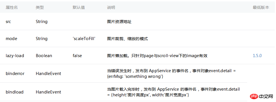
This article mainly introduces the method of WeChat applet to realize the adaptive width ratio display of the image component, briefly describes the common attributes of the image component, and analyzes the related operation skills of WeChat applet to realize the adaptive width ratio of images in the form of examples. , friends in need can refer to it, I hope it can help everyone.
The example in this article describes the method of WeChat applet to realize adaptive width proportion display of image component pictures. Share it with everyone for your reference, the details are as follows:
1. Understand the image component

Because of image There are default fixed width and height, which makes it difficult for us to adapt the image. Let’s solve it together
2. Method
(1). Use mode: widthFix
widthFix: The width remains unchanged and the height changes automatically, keeping the aspect ratio of the original image unchanged.
First we set the image mode to widthFix, and then add a fixed rpx width to the image, such as: 730rpx.
This way the picture can also be adapted. . Because the rpx of the mini program itself is an adaptive display unit
(2). Use the bindload binding function to dynamically adapt.
We can bind a function to the image. With this function, like the bindload description above, we can get the width and height of the original image.
Then calculate their width to height ratio. . Then set a width size (rpx), and finally set the width and height of the image dynamically through style. The code is as follows:
1. Write the page structure index.wxml:
2. Set the data index.js
//获取应用实例 var app = getApp() Page({ data: { screenWidth: 0, screenHeight:0, imgwidth:0, imgheight:0, }, onLoad: function() { var _this = this; wx.getSystemInfo({ success: function(res) { _this.setData({ screenHeight: res.windowHeight, screenWidth: res.windowWidth, }); } }); }, imageLoad: function(e) { var _this=this; var $width=e.detail.width, //获取图片真实宽度 $height=e.detail.height, ratio=$width/$height; //图片的真实宽高比例 var viewWidth=500, //设置图片显示宽度, viewHeight=500/ratio; //计算的高度值 this.setData({ imgwidth:viewWidth, imgheight:viewHeight }) } })

Related recommendations
Detailed explanation of CSS percentage padding to create image adaptive layout
Detailed explanation of examples Javascript prevents adaptive processing of image stretching
How to implement image size adaptation
The above is the detailed content of WeChat applet implements image component picture adaptive width ratio example sharing. For more information, please follow other related articles on the PHP Chinese website!
 Mini program path acquisition
 How to modify the text in the picture
 What to do if the embedded image is not displayed completely
 How to make ppt pictures appear one by one
 How to make a round picture in ppt
 Regular expression tool
 What are the python artificial intelligence libraries?
 503 error solution


