


This article mainly introduces the two ways of popping up the modal box in Angular. It is very good and has reference value. Friends who need it can refer to it. I hope it can help everyone.
Before starting our blog, we must first install ngx-bootstrap-modal
npm install ngx-bootstrap-modal --save
Otherwise, the effect of our modal box will be ugly and you will want to vomit
1. Pop-up method one (this method comes from https://github.com/cipchk/ngx-bootstrap-modal)
1.alert pop-up box
(1)demo directory
--------app.component.ts
--------app.component.html
--------app.module .ts
--------detail(folder)
------------detail.component.ts
------------detail.component.html
(2)demo code
app.module.ts import the necessary BootstrapModalModule and ModalModule, and then register them
//app.module.ts import { BrowserModule } from '@angular/platform-browser'; import { NgModule } from '@angular/core'; //这种模态框只需要导入下面这两个 import { BootstrapModalModule } from 'ngx-bootstrap-modal'; import { ModalModule } from 'ngx-bootstrap/modal'; import { AppComponent } from './app.component'; import { DetailComponent } from './detail/detail.component'; @NgModule({ declarations: [ AppComponent, DetailComponent ], imports: [ BrowserModule, BootstrapModalModule ], providers: [], entryComponents: [ DetailComponent ], bootstrap: [AppComponent] }) export class AppModule { }
app.component.htmlCreate a button that can pop up a modal box
app.component.tsWrite the action showAlert() of this button
import { Component } from '@angular/core'; import { DialogService } from "ngx-bootstrap-modal"; import { DetailComponent } from './detail/detail.component' @Component({ selector: 'app-root', templateUrl: './app.component.html', styleUrls: ['./app.component.css'] }) export class AppComponent { title = 'app'; constructor(public dialogService: DialogService) { } showAlert() { this.dialogService.addDialog(DetailComponent, { title: 'Alert title!', message: 'Alert message!!!' }); } }
detail.component .html writes the layout of the alert pop-up box
{{title}}
这是alert弹框
detail.component.ts to create the modal box component. We need to create a component, and then ngx-bootstrap-model will help guide the startup
This component needs to be inherited DialogComponent
T The type of external parameter passed to the modal box.
T1 modal box return value type.
Therefore, DialogService should be a constructor parameter of DialogComponent.
import { Component } from '@angular/core'; import { DialogComponent, DialogService } from 'ngx-bootstrap-modal'; export interface AlertModel { title: string; message: string; } @Component({ selector: 'alert', templateUrl: './detail.component.html', styleUrls: ['./detail.component.css'] }) export class DetailComponent extends DialogComponent implements AlertModel { title: string; message: string; constructor(dialogService: DialogService) { super(dialogService); } }
2.confirm pop-up box
(1)demo directory
--------app.component.ts
----- ---app.component.html
--------app.module.ts
--------confirm(folder)
------- -----confirm.component.ts
------------confirm.component.html
(2)demo code
app.module .ts imports the necessary BootstrapModalModule and ModalModule, and then registers them. These are the same as the alert pop-up box, because these are the pop-up methods of method 1
//app.module.ts import { BrowserModule } from '@angular/platform-browser'; import { NgModule } from '@angular/core'; //这种模态框只需要导入下面这两个 import { BootstrapModalModule } from 'ngx-bootstrap-modal'; import { ModalModule } from 'ngx-bootstrap/modal'; import { AppComponent } from './app.component'; import { DetailComponent } from './detail/detail.component'; @NgModule({ declarations: [ AppComponent, DetailComponent ], imports: [ BrowserModule, BootstrapModalModule ], providers: [], entryComponents: [ DetailComponent ], bootstrap: [AppComponent] }) export class AppModule { }
app.component.htmlCreate a modal box that can pop up Button
app.component.tsWrite the action of this button showConfirm()
import { Component } from '@angular/core'; import { DialogService } from "ngx-bootstrap-modal"; import { ConfirmComponent } from './confirm/confirm.component' @Component({ selector: 'app-root', templateUrl: './app.component.html', styleUrls: ['./app.component.css'] }) export class AppComponent { title = 'app'; constructor(public dialogService: DialogService,private modalService: BsModalService) { } showConfirm() { this.dialogService.addDialog(ConfirmComponent, { title: 'Confirmation', message: 'bla bla' }) .subscribe((isConfirmed) => { }); } }
confirm.component.htmlWrite the layout of the confirm pop-up box
{{title}}
这是confirm弹框
confirm.component. ts creates modal box component
import { Component } from '@angular/core'; import { DialogComponent, DialogService } from 'ngx-bootstrap-modal'; export interface ConfirmModel { title:string; message:any; } @Component({ selector: 'confirm', templateUrl: './confirm.component.html', styleUrls: ['./confirm.component.css'] }) export class ConfirmComponent extends DialogComponent implements ConfirmModel { title: string; message: any; constructor(dialogService: DialogService) { super(dialogService); } confirm() { // on click on confirm button we set dialog result as true, // ten we can get dialog result from caller code this.close(true); } cancel() { this.close(false); } }
3. Built-in pop-up box
(1)demo directory
--------app.component.ts
--------app.component.html
--------app.module.ts
(2)demo code
The built-in pop-up box also includes three forms of alert confirm prompt, all with some built-in styles
app.module.ts
import { BrowserModule } from '@angular/platform-browser'; import { NgModule } from '@angular/core'; import { BootstrapModalModule } from 'ngx-bootstrap-modal'; import { ModalModule } from 'ngx-bootstrap/modal'; import { AppComponent } from './app.component'; @NgModule({ declarations: [ AppComponent ], imports: [ BrowserModule, BootstrapModalModule, ModalModule.forRoot() ], providers: [], bootstrap: [AppComponent] }) export class AppModule { }
app.component.html is very simple, just one button
app.component.ts is very simple, you don’t even need to write the layout of the component, just pass in some parameters such as icon, size, etc.
import { Component } from '@angular/core'; import { DialogService, BuiltInOptions } from "ngx-bootstrap-modal"; @Component({ selector: 'app-root', templateUrl: './app.component.html', styleUrls: ['./app.component.css'] }) export class AppComponent { title = 'app'; constructor(public dialogService: DialogService) { } show(){ this.dialogService.show({ content: '保存成功', icon: 'success', size: 'sm', showCancelButton: false }) } }
2. Pop-up method 2 (this method comes from https://valor-software.com/ngx-bootstrap/#/modals)
Still the same as the previous method, install ngx-bootstrap-modal first, and then import the bootstrap style sheet
1.demo directory
--------app.component.ts
--------app.component.html
------- -app.module.ts
2.demo code
app.module.ts imports the corresponding modules and registers them
//app.module.ts import { BrowserModule } from '@angular/platform-browser'; import { NgModule } from '@angular/core'; import { ModalModule } from 'ngx-bootstrap/modal'; import { AppComponent } from './app.component'; @NgModule({ declarations: [ AppComponent ], imports: [ BrowserModule, ModalModule.forRoot() ], providers: [], entryComponents: [ ], bootstrap: [AppComponent] }) export class AppModule { }
app.component.ts
import { Component,TemplateRef } from '@angular/core'; import { BsModalService } from 'ngx-bootstrap/modal'; import { BsModalRef } from 'ngx-bootstrap/modal/modal-options.class'; @Component({ selector: 'app-root', templateUrl: './app.component.html', styleUrls: ['./app.component.css'] }) export class AppComponent { title = 'app'; public modalRef: BsModalRef; constructor(private modalService: BsModalService) { } showSecond(template: TemplateRef){//传入的是一个组件 this.modalRef = this.modalService.show(template,{class: 'modal-lg'});//在这里通过BsModalService里面的show方法把它显示出来 }; }
app.component.html
第二种模态框
第二种模态框弹出方式
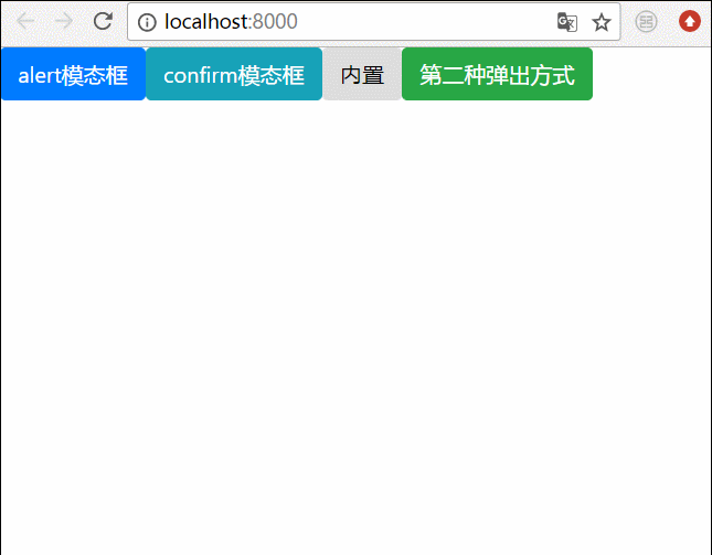
3. Final effect
We write all the bullet boxes above together, and then the effect is like this
Related recommendations:
How to solve the problem that the BootStrap modal box is not vertically centered
bootstrap modal box nesting, tabindex attribute, How to remove shadow
Detailed explanation of bootstrap3-dialog-master modal box usage
The above is the detailed content of Two ways to pop up a modal box in Angular. For more information, please follow other related articles on the PHP Chinese website!


![[Web front-end] Node.js quick start](https://img.php.cn/upload/course/000/000/067/662b5d34ba7c0227.png)


