

1. What is flex?
Flex is a layout method introduced in CSS3. It can control the arrangement and alignment of elements very flexibly and efficiently. Most people call it elastic. Layout.
2. How to use flex?
Any container can be designated as flex layout
1 #box { 2 display:flex; 3 }
3. The basics of flex Terminology
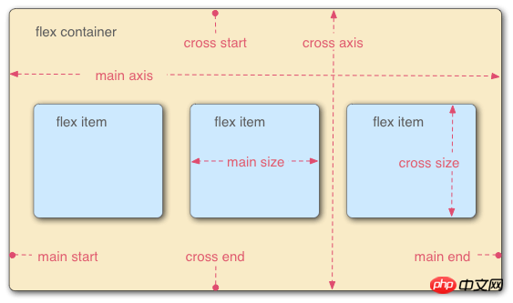
Elements that use flex layout are calledflex containers (flex containers), its child elements areflex elements (flex items).
The flex container contains two mutually perpendicular axes, namely themain axis ( main axis)andsecondary axis (cross axis).
The flex element moves along the main axis frommain start(main start)toMain end(main end)Arranged in sequence.
If the flex container contains multiple rows of flex elements, thenflex lines(flex lines)Arrange them sequentially along the secondary axis fromcross start(cross start)tocross end(cross end).
Single flex elements The main axis space occupied is calledmain axis length (main size), and the secondary axis space occupied is calledsecondary axis length (cross size).
4. There are six attributes set on the parent container to control the display mode of child elements:
五、flex-direction,设置主轴的对齐方向,有四个值:
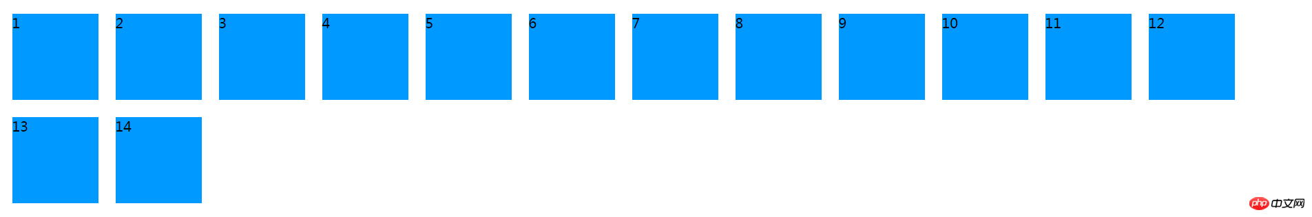
row(默认值):主轴为水平方向,起点在左端。
row-reverse:主轴为水平方向,起点在右端。
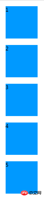
column:主轴为垂直方向,起点在上沿。
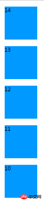
column-reverse:主轴为垂直方向,起点在下沿。
flex布局 - by ghostwu
1
2
3
4
5
6
7
8
9
10
11
12
13
14
flex-direction设置为row:

flex-direction设置为row-reverse
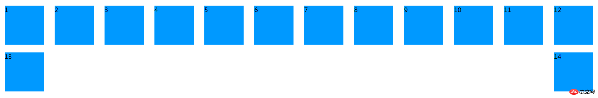
flex-direction设置为column,下面的示意图我只截取了前面5个p,后面如果截取的话,图片占的位置太多了,影响体验.
flex-direction设置为column-reverse:
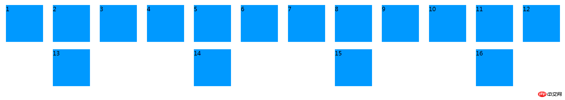
六、flex-wrap :定义子元素超过一行,如何换行,常用属性值:
nowrap(默认值):默认不换行。
wrap:换行,第二行在第一行下面,从左到右
wrap-reverse:换行,第二行在第一行上面,从左到右
1 #box { 2 display: flex; 3 flex-direction: row; 4 flex-wrap: nowrap; 5 }
flex-wrap:nowrap;
flex-wrap: wrap;
flex-wrap: wrap-reverse;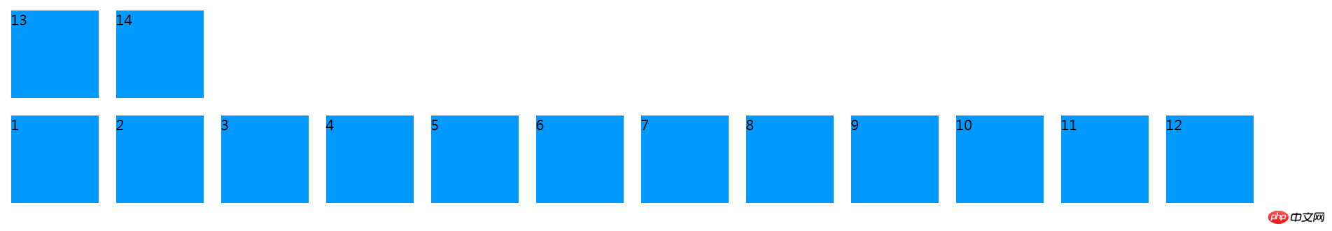
七、flex-flow:是flex-direction 和flex-wrap的简写形式,默认是 row nowrap
#box { display:flex; /* flex-flow: row nowrap; */ /* flex-flow: row wrap; */ /* flex-flow: row wrap-reverse; */ /* flex-flow: row-reverse wrap-reverse; */ flex-flow: column wrap; }
八、 justify-content: 子元素在主轴对齐方式
flex-start(默认值):左对齐
flex-end:右对齐
center: 居中
space-between:两端对齐,项目之间的间隔都相等。
space-around:每个项目两侧的间隔相等。
#box { display:flex; flex-flow: row wrap; /* justify-content: flex-start; */ /* justify-content: flex-end; */ /* justify-content: center; */ /* justify-content: space-between; */ justify-content: space-around; }
这里主要搞清楚space-between和space-around的区别
justify-content: space-between;
justify-content: space-around;
The above is the detailed content of css3 flexible box model flex knowledge. For more information, please follow other related articles on the PHP Chinese website!
 flex tutorial
 css3 tutorial
 What are the css3 gradient properties?
 Solution to garbled characters when opening excel
 Is Yiouoky a legal software?
 Word document encryption tutorial
 jquery implements paging method
 What should I do if my computer starts up and the screen shows a black screen with no signal?


| Attributes | Meaning |
|---|---|
flex-direction |
Spindle direction |
flex-wrap |
Line wrap style |
flex-flow |
Abbreviation of the first two |
##justify-content | Main axis alignment
|
align-items | Single line secondary axis alignment
|
align-content | Multiple lines Secondary axis alignment


![[Web front-end] Node.js quick start](https://img.php.cn/upload/course/000/000/067/662b5d34ba7c0227.png)


