

Recently I saw that on Ele.me App and h5 website, after ordering food on the merchant details page, there is an element at the bottom that can pop up a modal box to view the order details after clicking. There is a background mask layer gradient. Revealing and concealing effects.
,
Based on my little experience, my first thought was that this mask layer should be hidden and displayed using display:none;, but this The attribute will destroy the transition animation. That is to say, if the mask layer uses this attribute to control the display and hiding, then the effect of gradual revealing and hiding seems to be difficult to achieve. The effect should be instantaneous display and hiding.
Using Chrome to simulate the mobile terminal, I checked the implementation of Ele.me, and then I realized that Ele.me uses vue. This animation effect is actually achieved by using the transition animation and hook function that comes with vue. .
Using the framework to achieve this effect is really so easy, without having to code.
// HTML// CSS.box1 { width: 200px; height: 200px; background-color: green; } .fade-enter-active, .fade-leave-active { transition: opacity .5s } .fade-enter, .fade-leave-to{ opacity: 0; }
No pictures, no truth, look at the effect to add to the fun:

It couldn’t be simpler
React’s own separate library does not have its own transition animation, but there is an Animation Add-Ons: react-addons-css-transition-group
import React, {Component} from 'react'import ReactDOM from 'react-dom'import ReactCSSTransitionGroup from 'react-addons-css-transition-group'class TodoList extends React.Component { constructor(props) { super(props)this.state = { show: true} } render() {return ( { this.state.show &&
}
) } changeShow() {this.setState({ show: !this.state.show }) } }
The style is as follows:
.box1 { width: 100px; height: 100px; background-color: green; transition: opacity .5s; } .fade-leave.fade-leave-active, .fade-enter { opacity: 0; } .fade-enter.fade-enter-active, .fade-leave { opacity: 1; }
It is still very easy


The above are all framework implementations, but if the project has a long history, these blinding frameworks are not used at all. At best, a 1.2 version of jquery is used, then the above There are no other methods available. I hope to find a universal native method without using any framework.
One of the solutions is as shown in the title, because the visibility attribute can also control the visibility of elements, and the visibility attribute does not switch back and forth between the values visible and hidden. Will destroy the element's transition animation.
However, there are still some differences in the final effect of controlling the visibility of elements between visibility and display.
The element with visibility:hidden; is indeed visually invisible, but the element still occupies the position it occupies, and will still exist in the document flow, affecting the layout of the page, but this is set The attribute's element is not visible visually, leaving a blank space in its original position on the page (if the element has a width and height and uses default positioning).
The element with display:none; set is visually invisible and does not occupy space, which means it has disappeared from the document flow.
The visibility of the visibility control element also occurs instantaneously, but this instantaneous occurrence is different from the instantaneous occurrence of display. Display does not pay attention to the set transition transition attribute at all. It's the same as not setting it.
But visibility may care about this value, but only the transition-duration attribute.
For example, when changing from visibility:hidden to visibility:visible; if the transition time is set to 3s, then after the event occurs, the element will not immediately show the effect from hidden to visible, but As shown in the picture below, it will wait for 3 seconds and then hide instantly. The time from display to final disappearance from sight is indeed 3 seconds, but it does not appear gradually.

There seems to be a problem with the picture above, from showing to hiding It did wait for 3 seconds, but from hiding to showing, it seemed to be completed instantly, and there was no such thing as waiting for 3 seconds.
This is indeed the case visually, but this is just a visual feeling. In fact, this waiting time really exists, it is just invisible. In addition, the waiting here is not really nothing. Pure waiting.
之所以 display会破坏 transition动画,有个说法是,因为 transition对元素在整个过渡过程中的状态控制,是根据元素过渡前后起始的状态来计算得出的,例如从 opacity:0 到 opacity:1的变化,用时 3s,那么 transition会计算在这 3s内的每一帧画面中元素该有的 opacity值,从而完成过渡效果,其他的一些属性,例如 width、 scale、 color等都可以转化为数字进行计算 (说明文档参见), 但 display是个尴尬的属性,从 display:none到 display:block 该怎么计算值呢?
计算不了,所以就只能 破坏了, visibility同样如此,只不过 visibility比 display稍好一点,因为最起码 visibility不会破罐子破摔,不会搞破坏。
从 visibility:hidden到 visibility:visible的过程中。因为没办法计算过渡阶段没帧的值,所以元素就直接显示出来了,但内在的过渡操作依旧在元素显示出来后显示了 3s,而从 visibility:visible 到 visibility:hidden,元素在视觉上看起来等待的 3s内,实际在内部已经在进行 transition过渡操作,只不过还是因为没办法计算值,所以到了过渡阶段的最后一刻时,就直接将元素设置为结束状态,也就是隐藏了。
想要验证这种说法,还需要配合另外一个属性: opacity,此属性也是配合 visibility完成过渡效果的搭配属性。
实现代码如下
// HTML
// CSS.box1 { width: 200px; height: 200px; background-color: green; opacity: 0; visibility: hidden; transition: all 2s linear; } .show { opacity: .6; visibility: visible; }
js控制显隐效果代码如下:
let box1 = document.querySelector('.box1') let btn = document.querySelector('button') btn.addEventListener('click', ()=>{ let boxClassName = box1.className boxClassName.includes('show')? box1.className = boxClassName.slice(0, boxClassName.length-5) : box1.className += ' show'})
效果依旧没问题:
因为虽然 visibility没办法计算值,但 opacity可以,过渡的效果实际上是 opacity在起作用。
其实 opacity本身就能控制元素的显隐,把上面代码中的所有 visibility 全部删除,效果依旧不变,并且和 visibility 一样,设置了 opacity:0; 的元素依旧存在于文档流中, but,相比于 visibility:hidden, opacity:0 的元素并不会出现点透。
而 visibility:hidden的元素就会出现点透,点击事件会穿透 visibility:hidden的元素,被下面的元素接收到,元素在隐藏的时候,就不会干扰到其他元素的点击事件。
关于这个说法,似乎网上有些争论,但是我用迄今最新版的 Chrome Firefox 以及 360浏览器 进行测试, 都是上面的结果。
如果你只是想让元素简单的渐进显隐,不用管显隐元素会不会遮挡什么点击事件之类的,那么完全可以不用加 visibility 属性,加了反而是自找麻烦,但是如果需要考虑到这一点,那么最好加上。
如果不使用 visibility的话还好,但是如果使用了此属性,那么上述的解决方案其实还有点小瑕疵,因为 visibility从 IE10以及 Android4.4才开始支持,如果你需要支持这种版本的浏览器,那么 visibility 就派不上用场了。
哎呦呦,公司网站最低要求都是 IE9,用不了了诶。
怎么办?再回到 display 这个属性上。
为什么 display 这个属性会影响到 transition 动画的原因上面已经大致说了下,既然问题是出在了 display上,那么我可以同样参考上面 visibility的做法,加个 opocity属性进行辅助,又因为考虑到 display 比起 visibility 来说破坏性较大,所以再让 opocity 与 display 分开执行不就行了吗?
你如果写成这种形式:
box1.style.display='block'box1.style.opacity=1
其实还是没用的,尽管 display值的设定在代码上看起来好像是在 opacity前面,但是执行的时候却是几乎同时发生的。
我的理解是应该是浏览器对代码进行了优化,浏览器看到你分两步为同一个元素设置 CSS属性,感觉有点浪费,为了更快地完成这两步,它帮你合并了一下,放在一个 tick(参见 [http://md.barretlee.com/(http://www.infoq.com/cn/articles/javascript-high-performance-animation-and-page-rendering] )内执行,变成一步到位了,也就是同步执行了这两句代码。
那么如何明确地让浏览器不要合并到一个 tick内执行呢? setTimeOut就派上了用场。
setTimeOut 一个重要功能就是延迟执行,只要将 opacity属性的设置延迟到 display后面执行就行了。
// CSS.box1 { width: 200px; height: 200px; background-color: green; display: none; opacity: 0; transition: all 2s linear; }
下面是控制元素渐进显示的代码:
// JSlet box1 = document.querySelector('.box1') let btn = document.querySelector('.btn') btn.addEventListener('click', ()=>{ let boxDisplay = box1.style.displayif(boxDisplay === 'none') { box1.style.display='block' setTimeout(()=> { box1.style.opacity = 0.4}) } })
上述代码中,最关键的就是 setTimeOut 这一句,延迟元素 opacity属性的设定。
setTiomeOut的第二个可选的时间 delay参数,我在最新版的 Chrome和 360 浏览器上测试,此参数可以不写,也可以写成 0或者其他数值,但是在 firefox上,此参数必须写,不然渐进效果时灵时不灵,而且不能为 0,也不能太小,我测出来的最小数值是 14,这样才能保证渐进效果,所以为了兼容考虑,最好还是都统一加上时间。
至于为什么是 14,我就不清楚了,不过记得以前看过一篇文章,其中说 CPU能够反应过来的最低时间就是 14ms,我猜可能与这个有关吧。
显示的效果有了,那么要隐藏怎么办? setTimeOut 当然也可以,在 JS代码的 if(boxDisplay==='none')后面再加个 else
else { box1.style.opacity = 0 setTimeout(()=>{ box1.style.display = 'none' }, 2000) }

隐藏时先设置 opacity,等 opacity过渡完了,再设置 display:none;。
但是这里有点不太合理,因为虽然 setTimeOut的 delay参数 2000ms和 transition 时间 2s一样大,但因为 JS是单线程,遵循时间轮询,所以并不能保证 display属性的设置刚好是在 opacity过渡完了的同时执行,可能会有更多一点的延迟,这取决于过渡动画完成之刻, JS主线程是否繁忙。
当然,就算是延迟,一般也不会延迟多长时间的,人眼不太可能感觉得到,如果不那么计较的话其实完全可以无视,但是如果我就吹毛求疵,要想做到更完美,那怎么办?
transition 动画结束的时候,对应着一个事件: transitionend,MDN [https://developer.mozilla.org/en-US/docs/Web/Events/transitionend] 上关于此事件的详细如下:
transitionend 事件会在 CSS transition 结束后触发. 当 transition完成前移除 transition时,比如移除 css的 transition-property 属性,事件将不会被触发,如在 transition完成前设置 display:none,事件同样不会被触发。
如果你能够使用 transition,那么基本上也就能够使用这个事件了,只不过此事件需要加前缀的浏览器比较多(现在最新版的所有 主流浏览器,都已经不用写前缀了),大致有如下写法:
transitionend webkitTransitionEnd mozTransitionEnd oTransitionEnd
使用此属性,就可以避免上面 setTimeOut可能出现的问题了 ,使用示例如下:
// ...else { box1.style.opacity = 0 box1.addEventListener('transitionend', function(e) { box1.style.display = 'none'}); }
需要注意的是, transitionend 事件监听的对象是所有 CSS中transition属性指定的值,例如,如果你为元素设置了 transition:all3s;的 样式,那么元素可能无论是 left top还是 opacity 的改变,都会触发该事件,也就是说此事件可能会被触发多次,并且并不一定每次都是你想要触发的,针对这种情况,最好加一个判断。
既然是 涉及到了 JS实现的动画,那么其实可以考虑一下 把 setTimeout换成 requestAnimationFrame。
btn.addEventListener('click', ()=>{ let boxDisplay = box1.style.displayif(boxDisplay === 'none') { box1.style.display='block'// setTimeOut 换成 requestAnimationFrame requestAnimationFrame(()=> { box1.style.opacity = 0.6}) } else { box1.style.opacity = 0 box1.addEventListener('transitionend', function(e) { box1.style.display = 'none'}); } })
文章最开始说过的 vue 和 react这两个框架实现示例动画的方法,也利用到了这个 API,,监听动画过渡的状态,为元素添加和删除一系列过渡类名的操作,当然,并不是全部,此事件只能监听动画结束的这个时刻,其他时间点是无法监听的。
以下为 transitionEnd 在 react-addons-css-transition-group源码里面出现的形式:
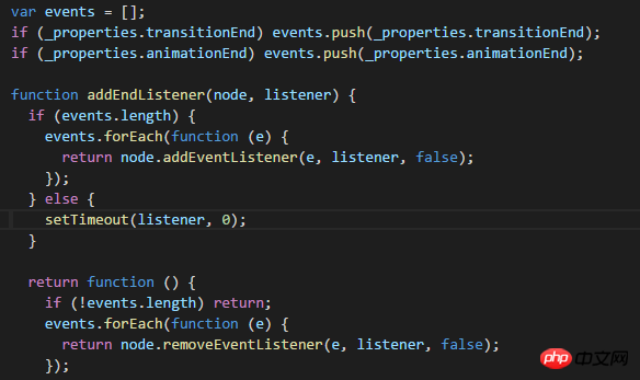
react-addons-css-transition-group对 transitionend做了兼容,如果浏览器支持此属性,则使用,如果不支持,就使用 setTimeOut这种形式。
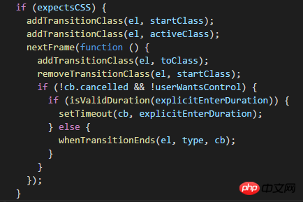
以下为 transitionEnd 在 vue源码里面出现的形式:
In addition, by the way, in addition to the transitionend event, there is also an animationend [https://developer.mozilla.org/en-US/docs/Web/Events/animationend] event, this event corresponds to the animation animation, react-addons-css-transition-group and vue also correspond to the transitionend. This attribute appears, and it will not be expanded here.
The above is the detailed content of How to achieve the transition effect of switching elements between visible and hidden elements. For more information, please follow other related articles on the PHP Chinese website!
 How to find the maximum and minimum value of array elements in Java
 Registration domain name query tool
 Apple pay cannot add card
 How to save pictures in Douyin comment area to mobile phone
 How to learn python programming from scratch
 What is Bitcoin? Is it legal? Is it a scam?
 How to optimize a single page
 How to close port 135


![[Web front-end] Node.js quick start](https://img.php.cn/upload/course/000/000/067/662b5d34ba7c0227.png)


