
This article mainly introduces CSS box-shadow to realize curved edge shadow and warped edge shadow. The editor thinks it is quite good. Now I will share it with you and give it as a reference. Let’s follow the editor and take a look.
Everyone knows that box-shadow is a new attribute of h5, which is used to achieve the effect of shadow on the edge of the box, but we often see various shadow styles in many scenes. , it is not simply the effect of shadows all around. How are they achieved? Today I will share with you two methods of achieving shadows.
1. Curved edge shadow
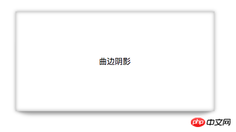
The effect picture is as follows: It is not only surrounded by shadows, but also has a layer of curved edge shadow at the bottom. The principle is actually very simple. First, the box itself has a shadow, and then another box with a shadow is used to overlap it to form the curved shadow in the rendering.

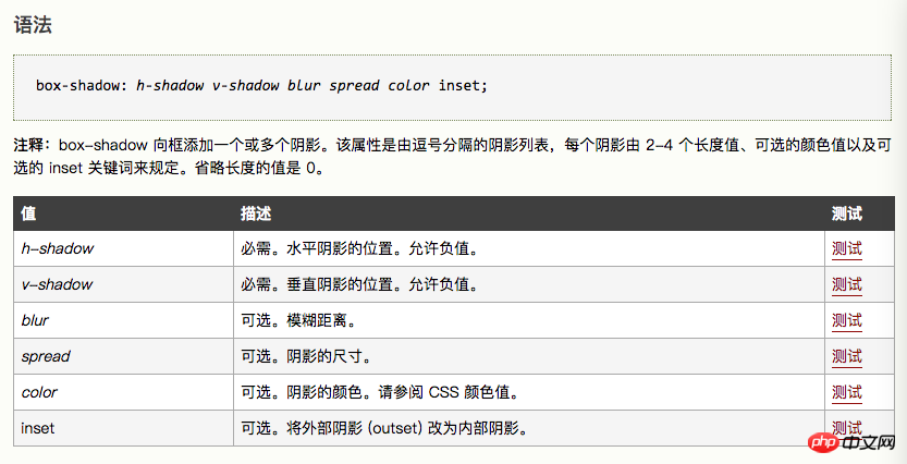
First let’s talk about the syntax of box-shadow. It supports the writing of multiple shadows, separated by commas, as follows
Create a box and use box-shadow to give the box an outer shadow and an inner shadow with a zero bloom radius of 10px in the x-axis and y-axis directions.
style{ .box1{ width: 400px; height: 200px; background: white; border: 1px solid lightgrey; margin: 100px auto; text-align: center; line-height: 200px; box-shadow: 0 0 10px rgba(0,0,0,0.3), 0 0 10px rgba(0,0,0,0.3) inset; } } body{ 曲边阴影
}
Use the after pseudo-class selector to add a virtual label behind the box1 subset. Since it is a virtual label, the browser cannot recognize it, and the display attribute needs to be defined. Also add a shadow to this label. Since it is a curved surface, you need to set the border-radius to give it a curvature. Then use positioning to overlap the virtual label with the original box, and use z-index to change the level so that it is below p. The code is as follows
.box1::after{ display: block; //必须写 content: ""; //必须写 z-index: -1; width: 390px; height: 150px; background: red; position: absolute; bottom: 0; left: 4px; border-radius: 30px/10px; box-shadow: 0 8px 10px rgba(0,0,0,0.3); }
When there is no positioning, the two boxes are arranged as follows:
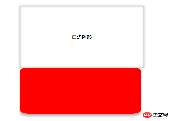
It will be implemented after positioning Curved edge shadow: The result is as follows:
2. Curved edge shadow
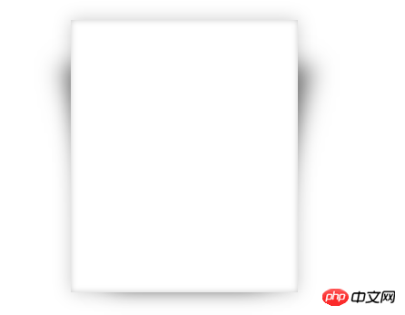
Principle and curved edge shadow The same as the edge shadow, use the pseudo-class selectors ::afteryu and ::before to add two virtual labels, and use the overlap of shadows to achieve edge-warping shadows.
The code is as follows:
.box2::after,.box2::before{ display: block; content: ""; z-index: -1; width: 170px; height: 240px; background: red; position: absolute; bottom: 20px; left: 38px; box-shadow: 30px 10px 40px rgba(0,0,0,0.5); transform: skewX(-15deg); } .box2::before{ box-shadow: -20px 10px 40px rgba(0,0,0,0.5); transform: skewX(15deg); }
In order to make it easier for us to see, a red background is given. The result without changing the level is as follows:
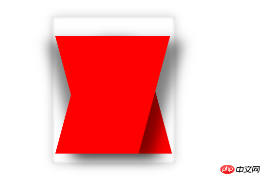
Adjust the levels of the two boxes, the effect is as follows:
The above is the detailed content of Detailed explanation of examples of using box-shadow to realize curved edge shadow and warped edge shadow in css. For more information, please follow other related articles on the PHP Chinese website!


