How to implement such a style in css:

Solution:
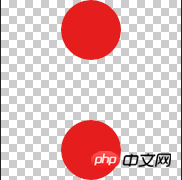
The technology needed here is border-image To use it flexibly, you first need a picture. The one I selected here is like this. In subsequent pictures, you can use this to change the color of the circle to change the color of the sawtooth:

The bottom is transparent and square. The PS screenshot is as follows:

Okay, let’s start the real code:
html:
css:
.ele-card{ height: 130px; width: 70%; position: absolute; z-index: 99; top: 26%; left: 50%; margin-left: -35%; background: #fee94e; }.ele-card-borderImage{ border-top: 15px solid transparent; border-image: url(../img/order_border-min.png) 111 44 round; width: 100%; position: relative; top: -4px; }

The above is the detailed content of Use css border-image to achieve zigzag shape. For more information, please follow other related articles on the PHP Chinese website!


