CSS has many attributes, and each attribute has many values. There are thousands of combinations. The combination of different attributes can also produce different styles. CSS is really a beautiful style design language. The following is a summary of commonly confused attributes and values in work:
1. Line-height (line height) The difference between with and without units:
We know line height It can be inherited. When the line-height value of the parent element does not have a unit, the child element uses its own font size and calculates the line height (the line-height of the child element = the value of line-height in the parent element * the font size of the child element). When the row height value of the parent element has a unit, the parent element first calculates the row height based on its own font size (no calculation is required when the absolute unit is px), and the child element inherits it (the row height of the child element = the row height of the parent element). .
(1). When the row height value of the parent element has units:
<p>
    </p><p>当哈罗德站在斑马线前按下行人按钮时——如果一直是她(莫琳,哈罗德的妻子)在做哈罗德该做的事,那么——“我是谁?”他就这样走过了邮局,连停都没有停下。原本很短的一段路由于内心的呼唤便再也无法停住脚步。</p>
    <p>一路上我记起了很多东西,很多我都没有意识到自己忘了的回忆,有戴维的,还有你和我的。我还记起了我的母亲,有些回忆很不容易,但大部分都很美。我很害怕,我怕有一天,或许很快,我就会把他们弄丢,这一次永远都找不回来了。”哈罗德泪流满面.</p>
body { background-color: #efefef; }p {
    font-size: 12px;
    line-height: 1.5em;
}p { font-size: 22px; }As above: When the font size of the parent element is 12px, the line height is 1.5em, and the font size of the child element is 22px, the display effect is as follows:

Above example , the line height of p is 18px, because it inherits the line height of the parent element p, 1.5em = 12 * 1.5 = 18px; and its own font size is 22px, so it has the effect of being squeezed. In addition, the height occupied by the text has no direct relationship with font-size, but the width occupied by the text is the same as the value of font-size.
(2). When the row height value of the parent element has no unit:
<p>
    </p><p>你以为走路是世界上最简单的事呢?只不过是把一只脚放到另一只脚前面。但我一直很惊讶这些原本是很本能的事情实际上做起来有多困难。而吃,吃也是一样的。说话也是。还有爱。这些东西都可以很难。</p>
    <p>我们大家都以为哈罗德徒步是因为很多年前他与奎妮有一段罗曼史。但那不是事实。哈罗德走这条路,是因为奎妮救了他,而他从来没有说过一句谢谢。</p>
body { background-color: #efefef; }p {
    font-size: 12px;
    line-height: 1.5;
}p { font-size: 22px; }As above: When the font size of the parent element is 12px, the line height is 1.5, and the font size of the child element is 22px, the display effect is as follows:

In the above example , the line height of p is 33px, because it inherits the line height of 1.5 from the parent element p, and its own font size is 22px, so its own line height value is 22 * 1.5 = 33px, and the first case will not occur. The squeezed effect.
2. The value of display (display mode) is the usage environment and difference of inline-block, table, and flex:
(1). display: inline-block ;
When an element is displayed in display: block;, the effect of not defining the width and defining the width as: width: 100%; or width: auto; is the same, because the block-level element will inherit the parent The width value of the element defines its own width according to the value of 100% (that is, the same width as the parent element). However, in actual projects, sometimes we do not need the width to be 100%, but we also want to set the width, height (or padding) and other attributes of the element. At this time, you need to use display: inline-block;
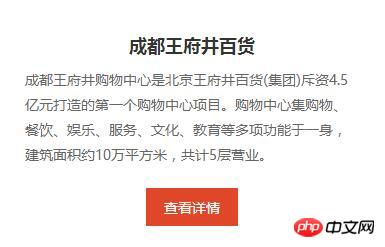
dom as follows:
<p>
    </p><h3>成都王府井百货</h3>
    <p>成都王府井购物中心是北京王府井百货(集团)斥资4.5亿元打造的第一个购物中心项目。购物中心集购物、餐饮、娱乐、服务、文化、教育等多项功能于一身,建筑面积约10万平方米,共计5层营业。</p>
    <p><a>查看详情</a></p>
.text > p {
    margin-top: 1.2rem;
    text-align: center;
}.text a.look-details {
    display: inline-block;
    padding: .5rem 1rem;
    font-size: .8rem;
    color: #fff;
    background-color: #e04728;
}For the view details link above, if it is defined as display: inline-block;, you can achieve the height and width you want by setting padding without setting the width and height. The display effect is as follows:

#And setting text-align: center; for its parent element can achieve the purpose of horizontal centering.
Set the element to display: inline-block;, which has the effect of both display: block; and display: inline;. You can set its height, center it, and avoid the width being 100%.
Extension:
Parent element text-align: center; Child element display: inline-block; Usually used for paging effects such as news list pages.
.pagination {
    display: inline-block;
    text-align: center;
}.pagination:before,
.pagination:after {
    display: table;
    content: "";
}.pagination:after { clear: both; }.pagination {
    display: inline-block;
    text-align: center;
}.pagination > li {
    float: left;
    display: inline-block;
}.pagination > li > a {
    display: block;
    margin-left: -1px; /*消除两个 a 在一起时引起的双倍左外边距*/
    padding: 6px 12px;
    color: #337ab7;
    text-decoration: none;
    background-color: #fff;
    border: 1px solid #ddd;
}.pagination > li:first-child > a {
    margin-left: 0; /*第一个 a 不需要消除左外边距*/
    border-top-left-radius: 4px;
    border-bottom-left-radius: 4px;
}.pagination > li:last-child > a {
    border-top-right-radius: 4px;
    border-bottom-right-radius: 4px;
}.pagination > li > a:hover,
.pagination > li > a:focus {
    z-index: 2;
    color: #23527c;
    background-color: #eee;
    border-color: #ddd;
}.pagination > .active > a,
.pagination > .active > a:hover,
.pagination > .active > a:focus {
    z-index: 3;
    color: #fff;
    cursor: default; /*当前这一页,让鼠标悬浮在 a 元素上时,显示为默认光标样式,给人感觉不能点击的效果*/
    background-color: #337ab7;
    border-color: #337ab7;
}
The above is the detailed content of In-depth understanding of the difference between css confusing properties and values. For more information, please follow other related articles on the PHP Chinese website!


