
First of all, we must first recognize an obvious fact: in essence, the WeChat application account is WebApp. Then some friends will ask, what is WebApp? In fact, WebApp is another form of App that is different from traditional mobile Apps. It is a web-based App developed based on H5 technology. It can have almost the same functions and forms as traditional mobile Apps, but it can also be easily embedded into WeChat application accounts or other applications. In the past, traditional mobile apps required a lot of capital and technical team investment, and the development and maintenance cycle was also quite long, which discouraged many people.
First draw a prototype on the computer, then choose the location of the functional template. Finally, once the overall architecture is determined, you can start designing the component layout.
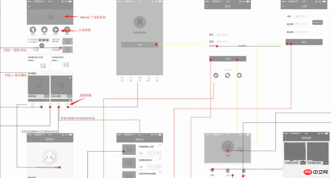
The first thing to do is to draw the page flow chart. The flow chart is mainly used to determine the interaction details of each functional module. After you have drawn all the interactive scenes, the pages required for the application number are basically completed. At this time, you need to work with the designer to design and beautify the UI for all pages. The final prototype of the Web App: including all page design and interaction processes. Now I would like to present my rough design page framework for the micro-mall to give you an idea.
After logging in to your account, select a blank template and build your own template. If you don’t have a UI yourself, if you want to save time, I think you can apply a template and generate the Web App you want faster.
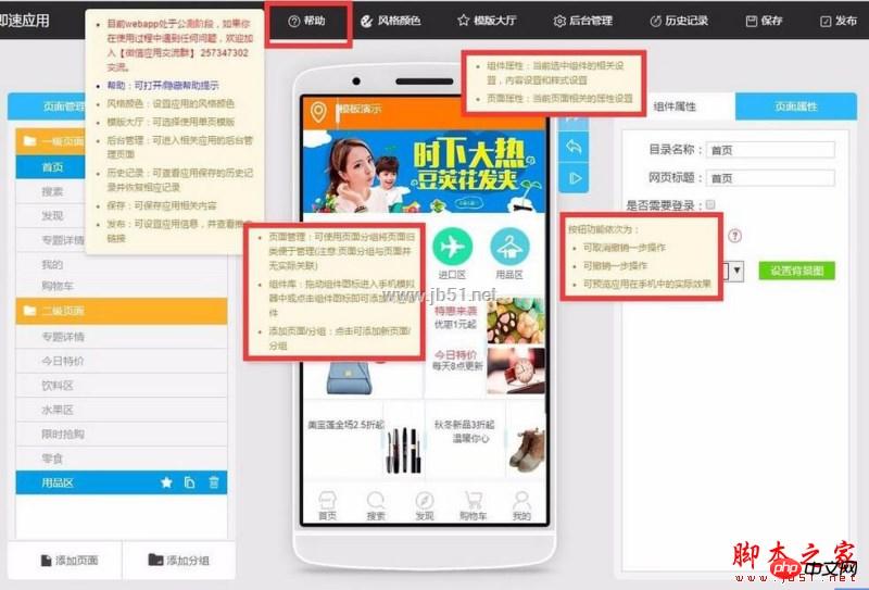
Let’s take a look at my rough home page layout!
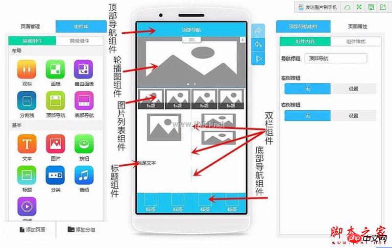
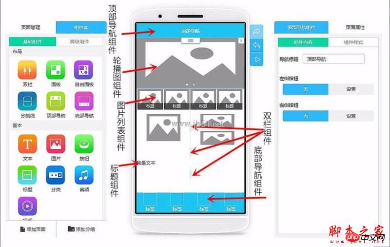
Can’t understand the component name or how to use the component? Check out Help! "Help" has already given a rough introduction to the general layout. At least you won't let yourself be vague about the function. If you are still unclear about a certain component, you can click the small question mark icon in the upper right corner of that component to get a detailed introduction.
First insert a top navigation component as the homepage. I suggest that the title of the top navigation be your company or mall name
Then create a carousel component as Banner, because I am building a micro-mall, and use carousel to play some of the product pictures I repaired. Then add corresponding page links to each carousel image one by one in the component content on the right.

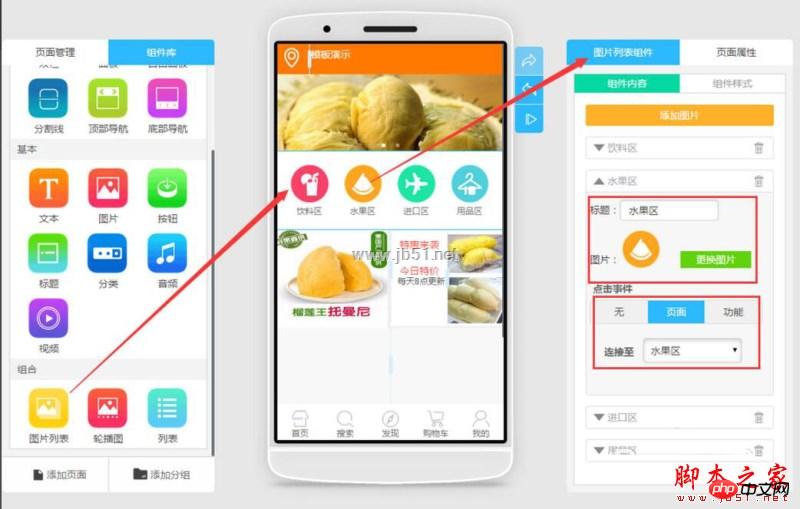
Then I created a picture list and set the rows and columns in the page properties to 4 columns and 1 row. I then modified the picture height directly. Set it to circular, and the system will automatically adjust the height of the image. Then I changed the image to a button image, and linked the page in the click event to the corresponding page. As shown in the picture
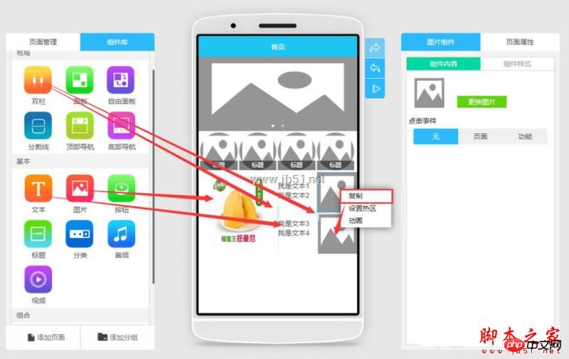
Because I want to separate the left and right sides of this line, and make it so that the left side is a large picture, and the right side is a small picture separated up and down with a title.
So I first inserted a double column component, and then inserted a double column in the right column, thus realizing the division of columns. Then insert a large image in the leftmost double column and adjust its width and height. Then insert a picture component into the rightmost double column, and right-click to copy a picture component below (little trick), as shown in the figure
Then drag in the text plug-in. Note here that after dragging into the third text box, you need First adjust its upper spacing, and then drag into the fourth text box, so that the upper and lower pictures can correspond to the title and content of the text. (Tips)
Insert the bottom navigation component. Any App has bottom navigation, and every page has it, so I need to remind you here. , after each page is edited, a bottom navigation needs to be inserted. I usually edit a page with pure bottom navigation first, and then when editing other pages, I first copy the page with pure bottom navigation and then edit it, which saves me a lot of time. (Tips)
Next is the product list component in the advanced component. After adding this component to your product page, you only need to edit the distribution and layout of this section in front-end App production. Because all product data and pictures are listed and prices adjusted in the backend, this is also convenient for data management in the backend.
But I want to complain. After the background data is sorted and the pictures are uploaded, the front-end production cannot see the pictures. You need to preview the App yourself to see them.
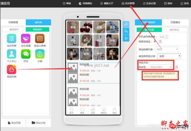
Enter the backend management and we will see the product management option. We first add categories to ensure that the items we put on the shelves will not be confusing and difficult to manage. After classification, just add products and fill in the product information in each corresponding category. As shown in the figure
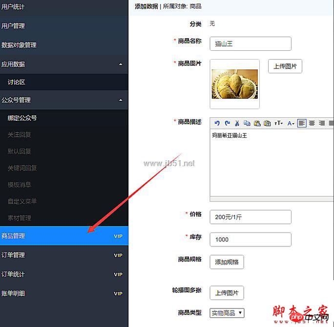
After uploading all the product data in the product management background, now you only need to return to the front-end App creation page, and give Just fill in the corresponding backend link for each product. Very convenient and fast.
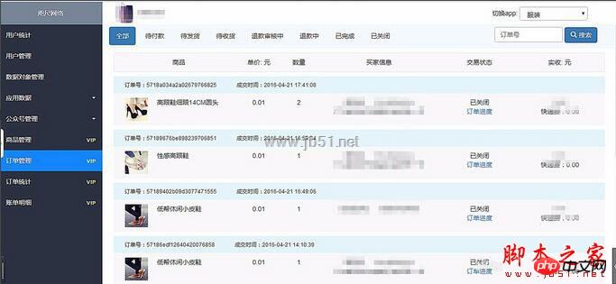
Now that the products are on the shelves and your products are on sale, you need to learn to manage the orders in the background and view the orders. The following is the order management page.
In fact, everyone is waiting to see the WeChat application account, but you can make a webapp first, and once the application account is online, we can directly put the link to the webapp Embed into application number.
For more related articles on how to develop WeChat mini programs and high-definition graphic tutorials on WeChat mini program development, please pay attention to the PHP Chinese website!


