


Foreword: Recently, many friends have talked about the issue of bootstrap icons in the group. For example, in the most common menu management, each menu definitely needs a corresponding menu icon. It would be great if there was a visual icon selection component. It is best to directly select the icon to get the corresponding class style. So various Baidu and Huangtian paid off, and finally found it by a blogger. I feel that the effect is pretty good, and it supports custom icons. I will share it today. It is absolutely useful!
1. Bootstrap icon picker component
This component was found when searching on github. At first glance, it looks really good and is based on bootstrap style, so it is more suitable for projects using bootstrap style layout. Since it is on github, there is no doubt that this is an open source component and the source code address. Okay, having said all that, let’s take a look at what it looks like.
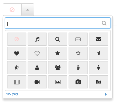
1. Component effect preview
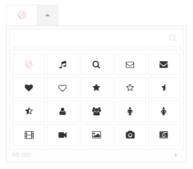
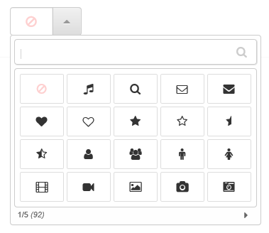
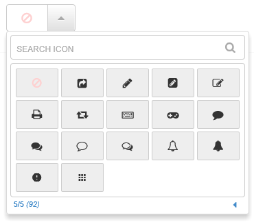
First initialization
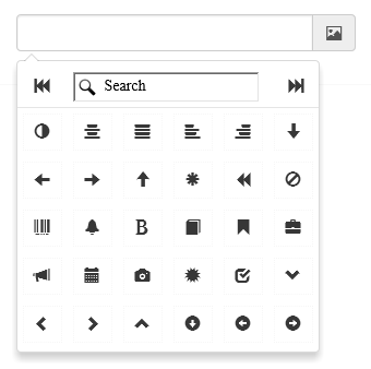
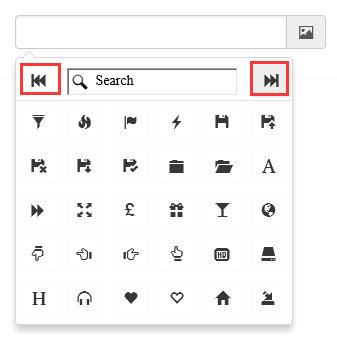
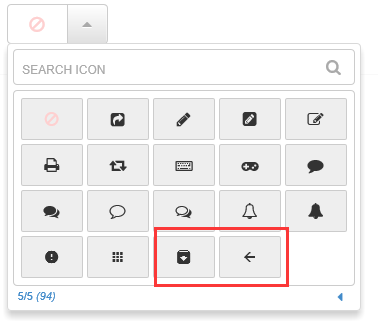
Supports "Previous Page" and "Next Page"
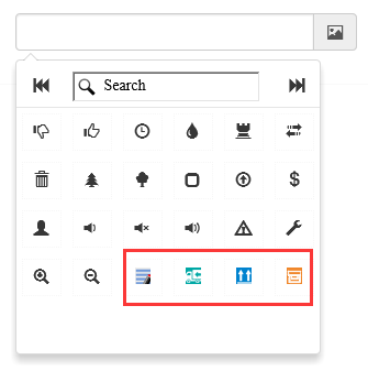
Supports the selection of custom icons
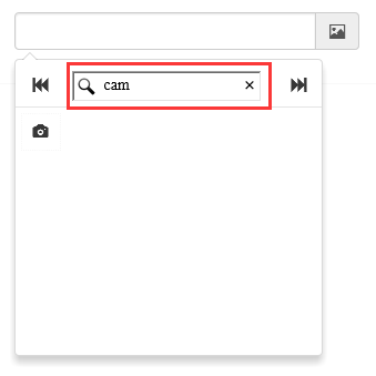
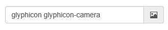
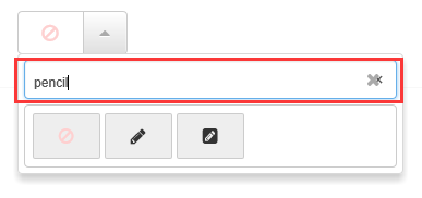
Support fuzzy search icons, for example, we search for camera
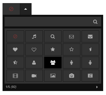
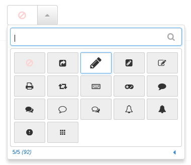
Select the icon and put the corresponding style into the text box
2. Component code example (1) Common usage
This component is based on bootstrap and jquery. The files that need to be referenced are as follows
 <link href="~/Content/bootstrap/css/bootstrap.css" rel="stylesheet" />
<link href="~/Content/Bootstrap-icon-picker-master/Bootstrap-icon-picker-master/css/icon-picker.css" rel="stylesheet" />
<script src="~/Scripts/jquery-1.9.1.js">
</script>
<script src="~/Content/Bootstrap-icon-picker-master/Bootstrap-icon-picker-master/js/iconPicker.js">
</script>
Place an ordinary input text box on the html page
<input type="text">
JS initialization
$(function () { //bootstrap icon初始化 $("#txt_boostrap_icon").iconPicker(); });After initialization, you can see the effect as shown above. Isn’t it very simple~~
Then we need to get the selected value, which is no different from the use of ordinary input text boxes var bootstrap_icon = $("#txt_boostrap_icon").val();
(2) Custom icon
We see that after initialization using the above method, the number of icons is fixed at dozens. What if we need to add some of our own icons to it? Or, we need to use a background image as an icon, what should we do? Don't worry, there is always a way! Let’s take a brief look at its js source code:
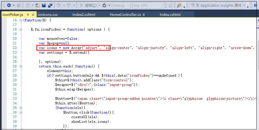
There are only more than a hundred lines of code in total, so it is not difficult to understand. Let's focus on the variable icons in the red line above. We observe that what is stored in this array is the collection of all our icons. Let's take a look at the generated html source code.
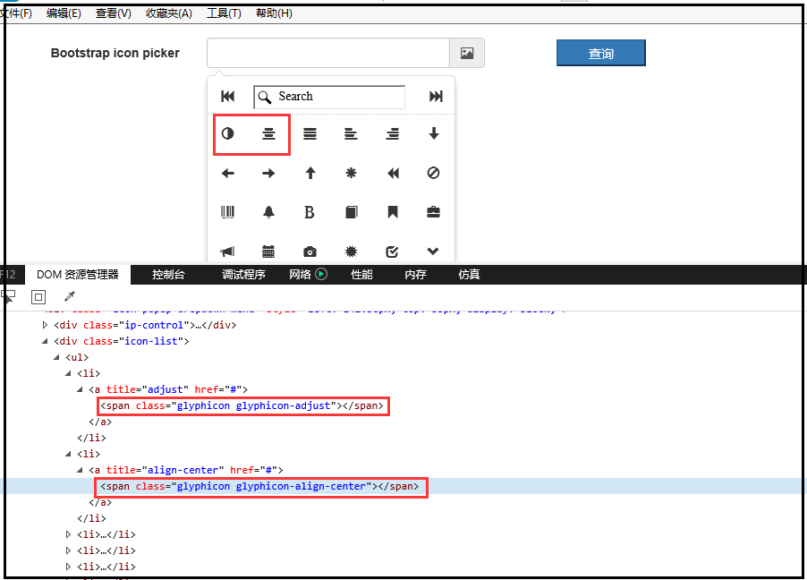
From this, we wonder if we can customize the style and name it glyphicon-such a style to customize the icon? With this idea in mind, we add two new styles in the css file
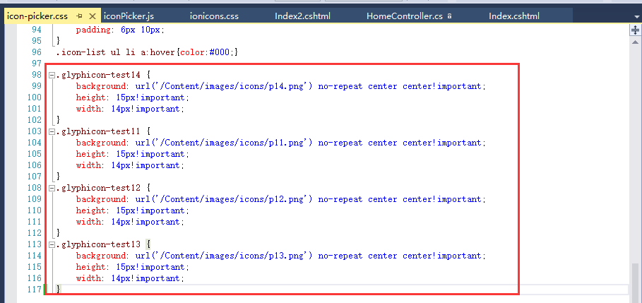
Then add four items test11, test12, test13, test14 to the icons variable
var icons = new Array("adjust", "align-center", "align-justify", "align-left", "align-right", "arrow-down", "arrow-left", "arrow-right", "arrow-up",......... "zoom-out","test11","test12","test13", "test14");好了,大功告成。接下来就是刷新页面看效果了。

所以这个组件最大的好处就是扩展自己的图标方便,不管是用content写还是使用背景图片都可以无缝对接。杠杠的!
二、jQuery fontIconPicker组件
jquery fonticonpicker是博主是找jquery插件的时候无意中发现的,不发现不要紧,仔细研究后发现这组件真心不错,尤其是界面效果很棒。并且开源,文档全,功能丰富。源码下载地址
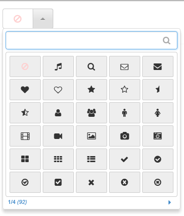
1、组件效果预览
初始化的时候有自定义了四种主题(博主更偏爱第一种bootstrap风格的)
支持分页
鼠标上上面效果
支持模糊搜索
支持自定义每页显示的图标个数
选择某个图标后的效果

2、组件代码示例
(1)普通用法
这个组件不需要bootstrap的支持,但是需要jquery的支持,不过我们测试的需要还是将bootstrap.css给引用进来。
<script src="~/Scripts/jquery-1.9.1.js"></script> <script src="~/Content/fontIconPicker-2.0.0/jquery.fonticonpicker.js">

</script> <link href="~/Content/bootstrap/css/bootstrap.css" rel="stylesheet" /> <link href="~/Content/fontIconPicker-2.0.0/css/jquery.fonticonpicker.css" rel="stylesheet" /> <link href="~/Content/fontIconPicker-2.0.0/themes/grey-theme/jquery.fonticonpicker.grey.css" rel="stylesheet" /> <link href="~/Content/fontIconPicker-2.0.0/themes/dark-grey-theme/jquery.fonticonpicker.darkgrey.css" rel="stylesheet" /> <link href="~/Content/fontIconPicker-2.0.0/themes/bootstrap-theme/jquery.fonticonpicker.bootstrap.css" rel="stylesheet" /> <link href="~/Content/fontIconPicker-2.0.0/themes/inverted-theme/jquery.fonticonpicker.inverted.css" rel="stylesheet" /> <link href="~/Content/fontIconPicker-2.0.0/fontIconPicker-2.0.0/demo/fontello-7275ca86/css/fontello.css" rel="stylesheet" />
效果炫,必然引用的文件就多了。
再来看看html准备
1)静态html
<select name="myselect"> <option value="">No icon</option> <option>icon-user</option> <option>icon-search</option> <option>icon-right-dir</option> <option>icon-star</option> <option>icon-cancel</option> <option>icon-help-circled</option> <option>icon-info-circled</option> <option>icon-eye</option> <option>icon-tag</option> <option>icon-bookmark</option> <option>icon-heart</option> <option>icon-thumbs-down-alt</option> <option>icon-upload-cloud</option> <option>icon-phone-squared</option> <option>icon-cog</option> <option>icon-wrench</option> <option>icon-volume-down</option> <option>icon-down-dir</option> <option>icon-up-dir</option> <option>icon-left-dir</option> <option>icon-thumbs-up-alt</option> </select>
2)如果是动态设置图标,这里只需要放一个空的select即可
<select name="myselect"></select>
JS初始化
1)静态初始化(针对select里面已经写好了option的情况)
$(function () { //jquery icon初始化 $('#myselect').fontIconPicker(); // Load with default options });2)动态初始化(针对空的select标签)
$(function () { //jquery icon初始化 $('#myselect').fontIconPicker({ theme: 'fip-bootstrap',//四种主题风格:fip-grey, fip-darkgrey, fip-bootstrap, fip-inverted source: ["icon-music", "icon-search", "icon-mail", "icon-mail-alt", "icon-heart", "icon-heart-empty", "icon-star", "icon-star-empty", "icon-star-half", "icon-star-half-alt", "icon-user", "icon-users", "icon-male", "icon-female", "icon-video", "icon-videocam", "icon-picture", "icon-camera", "icon-camera-alt", "icon-th-large", "icon-th", "icon-th-list", "icon-ok", "icon-ok-circled", "icon-ok-circled2", "icon-ok-squared", "icon-cancel", "icon-cancel-circled", "icon-cancel-circled2", "icon-plus", "icon-plus-circled", "icon-plus-squared", "icon-plus-squared-small", "icon-minus", "icon-minus-circled", "icon-minus-squared", "icon-minus-squared-alt", "icon-minus-squared-small", "icon-help", "icon-help-circled", "icon-info-circled", "icon-info", "icon-home", "icon-link", "icon-unlink", "icon-link-ext", "icon-link-ext-alt", "icon-attach", "icon-lock", "icon-lock-open", "icon-lock-open-alt", "icon-pin", "icon-eye", "icon-eye-off", "icon-tag", "icon-tags", "icon-bookmark", "icon-bookmark-empty", "icon-flag", "icon-flag-empty", "icon-flag-checkered", "icon-thumbs-up", "icon-thumbs-down", "icon-thumbs-up-alt", "icon-thumbs-down-alt", "icon-download", "icon-upload", "icon-download-cloud", "icon-upload-cloud", "icon-reply", "icon-reply-all", "icon-forward", "icon-quote-left", "icon-quote-right", "icon-code", "icon-export", "icon-export-alt", "icon-pencil", "icon-pencil-squared", "icon-edit", "icon-print", "icon-retweet", "icon-keyboard", "icon-gamepad", "icon-comment", "icon-chat", "icon-chat-empty", "icon-bell", "icon-bell-alt", "ion-android-alert", "ion-android-apps"], emptyIcon: true,//是否显示空 emptyIconValue: "none",//空值 iconsPerPage: 30, //每页显示图标的个数,默认20 hasSearch: true,//是否显示试试框,默认true }); });其实也很简单,就那么几个可以设置的参数,代码里面已经写了相应的注释,这里就不做过多讲解。
同样,获取选中的值,可以直接使用jquery的val()即可。
(2)自定义图标
看了上面bootstrap icon的自定义图标,你是否也在想,这个组件也能支持自定义就好了。呵呵,博主也是这样想得。行不行呢?我们先来试一试。
1)使用背景图片的图标尝试,结果失败
首先直接在页面上面定义一个使用背景图片的样式
<style type="text/css"> .glyphicon-test13

 { background: url('/Content/images/icons/p13.png') no-repeat center center!important; height: 15px!important; width: 14px!important;
}
</style>Then put "glyphicon-test13" at the end of the array corresponding to the initialization source, and it seems you're done. Let’s refresh the interface and take a look
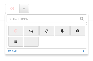
Contrary to expectations, the icon background image cannot be displayed properly. Why is this? The blogger’s curiosity is here again, let’s review the elements:
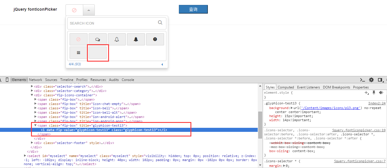
It turns out that this component generates an i tag, which is different from the span above. span can be used as a container, but can only be used as an italic tag. So this attempt failed. But the blogger is not convinced. You said that the i tag is not a container and has no actual placeholder, right? Can we write multiple spaces into i?
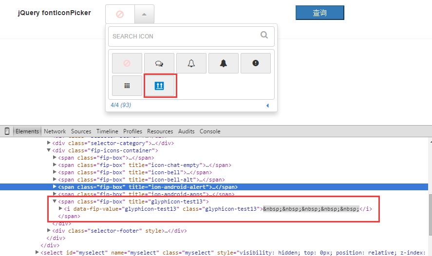
You can see that after adding spaces to the i tag, the image can indeed be displayed. It seems that the problem is perfectly solved! But, but, don't be too happy too early, it still won't work when you select it, because there is still an empty i tag in the selection. So in general, this method can be used as a reference idea. There will be time later to see if the source code can be appropriately modified to implement this function. At this stage, custom background images are not supported!
2) Try using icons written in css and the result is successful
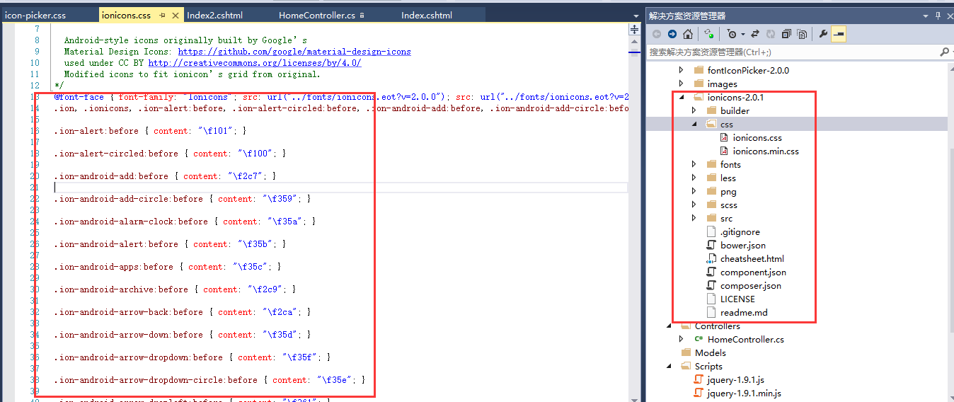
Since customizing background images does not work, what if we customize the icon, that is, if we write the icon in this way: before{content:""}, is it okay? The answer is yes. We found a website dedicated to icons, downloaded the icon package there, and referenced it to the page of our project.
We randomly select two "ion-android-archive" and "ion-android-arrow-back" and put them at the end of the array corresponding to the initialization source. Refresh the interface
After selection

3. Comparison
The above are examples of the use of two icon selection components. By comparison, this component actually has its own pros and cons.
1. From the perspective of interface effect, the second one (jqueryfontIconPicker) is better-looking than the first one (Bootstrap icon picker), with a more dazzling interface and a better user experience. This is not controversial.
2. From the perspective of lightweight components, the first type is better than the second type. Obviously, the second type references so much css, which will definitely lead to more or less failure of the component. Bloated.
3. From the perspective of convenience of use, the first one is simpler to use and easier to expand; the second API is more comprehensive, has more customizable items, and is flexible to use, but there are currently some custom background images question.
 Introduction to foreign free vps software
 What does the rm-rf command mean in linux?
 Book of a5 and b5
 What are the java file transfer methods?
 Mobile phone secondary card
 What are the Chinese programming languages?
 What are the css3 gradient properties?
 Reasons why computers often have blue screens


![[Web front-end] Node.js quick start](https://img.php.cn/upload/course/000/000/067/662b5d34ba7c0227.png)


