


Bootstrap sticky footer, to put it more specifically, "stick the fixed-height footer to the bottom of the page". Since the actual situation of the project is different from the template, so referring to the template, the editor cannot ensure that the "sticky footer" effect can be completed quickly, so I still want to share this tutorial with you. If it is not well written, please forgive me!
1. Page effect
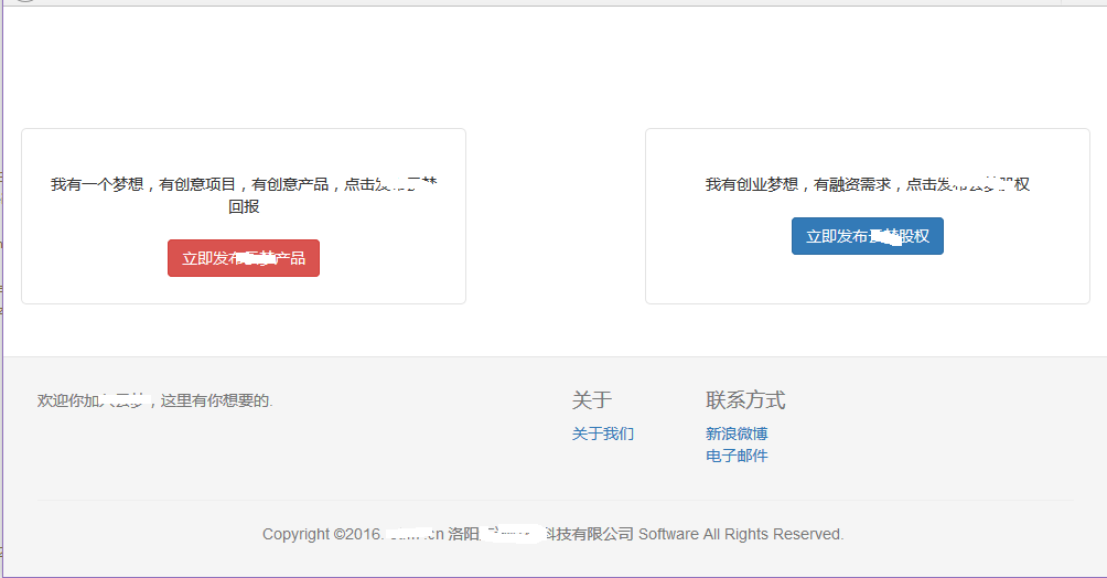
The page is very simple. Note that the bright line is the edge of Firefox, which can be clearly seen. The gray part of the footer is immersed in the bottom of the page.
2. Examples
①、Code
<!DOCTYPE html PUBLIC "-//W3C//DTD XHTML 1.0 Transitional//EN" "http://www.w3.org/TR/xhtml1/DTD/xhtml1-transitional.dtd">
<html xmlns="http://www.w3.org/1999/xhtml">
<link type="text/css" rel="stylesheet" href="/ymeng/components/bootstrap/css/bootstrap.css" />
<style type="text/css">
html,body {
height: 100%;
}
#wrap {
min-height: 100%;
height: auto !important;
margin: 0 auto -200px;
}
#push
height: 200px;
}
.footer {
border-top: 1px solid #e5e5e5;
color: #777;
padding: 19px 0;
background-color: #f5f5f5;
}
</style>
<head>
<title>发布项目</title>
</head>
<body>
<div id="wrap">
<div class=" container project_choose">
<div class="row">
<div class="col-md-5 project_general">
<span class="f14">我有一个梦想,有创意项目,有创意产品,点击发布回报</span>
<div class="blank20"></div>
<div>
<a type="button" class="btn btn-danger" href="/ymeng/deal/initDealCaluseConfirm">立即发布产品</a>
</div>
</div>
<div class="col-md-2"></div>
<div class="col-md-5 project_agency">
<span class="f14">我有创业梦想,有融资需求,点击发布股权</span>
<div class="blank20"></div>
<div>
<button type="button" class="btn btn-primary">立即发股权</button>
</div>
</div>
</div>
</div>
<div id="push"></div>
</div>
<div class="footer ">
<div class="container">
<div class="row footer-top">
<div class="col-sm-6 col-lg-6">
<h4></h4>
<p>欢迎你加入,这里有你想要的.</p>
</div>
<div class="col-sm-6 col-lg-5 col-lg-offset-1">
<div class="row about">
<div class="col-xs-3">
<h4>关于</h4>
<ul class="list-unstyled">
<li>
<a href="">关于我们</a>
</li>
</ul>
</div>
<div class="col-xs-3">
<h4>联系方式</h4>
<ul class="list-unstyled">
<li>
<a target="_blank" title="云梦网官方微博" href="">新浪微博</a>
</li>
<li>
<a href="">电子邮件</a>
</li>
</ul>
</div>
</div>
</div>
</div>
<hr>
<div class="row footer-bottom">
<ul class="list-inline text-center">
<li>Copyright ©2016. n 洛阳限公司 Software All Rights Reserved.</li>
</ul>
</div>
</div>
</div>
</body>
</html>②, page body layout
<body>
<div id="wrap">
<div class=" container">
</div>
<div id="push"></div>
</div>
<div class="footer ">
</div>
</body>
The first level element in body, two divs, wrap and footer
In the second level element, there are two divs, namely container and push (if you forget to push this div, ok, your page will be messed up when scaling)
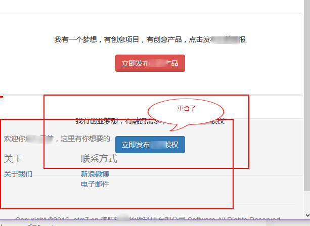
The elements listed above are essential for a naturally sticky footer.
③, css analysis
html,body {
height: 100%;
}
#wrap {
min-height: 100%;
height: auto !important;
margin: 0 auto -200px;
}
#push
height: 200px;
}
.footer {
border-top: 1px solid #e5e5e5;
color: #777;
padding: 19px 0;
background-color: #f5f5f5;
}The height of html and body must be 100%, which means it fills the height of the browser window
#wrap The min-height of the div must be 100%, and the height will automatically adapt.
The key point is margin, the top margin is 0, and the bottom margin is -200px.
Note that it is -200px, which is theoretically the negative number of the footer height (you can debug the optimal height through firebug). This is also critical! Why is it a negative number? Because the height of the warp is originally 100%, if it is a negative number, the full height can be left for the footer to display, otherwise the footer will appear at the bottom of the page scroll bar.
#push element. When the page is fully displayed, it seems that the function of the push element cannot be seen. However, when you zoom the page, if there is no push, the footer element will overlap with the elements in the container. This is also explained in the previous picture. So what is its specific function?
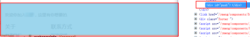
Through firebug, we select the push div and we can see that it contains the content of the footer element. This will prevent the footer and container elements from overlapping.
In this way, the above key points have been introduced. As long as you pay attention to the distribution of the following elements, you can easily achieve the sticky footer effect of bootstrap!
warp
push
That’s all the editor will tell you about the Bootstrap sticky footer effect introduced in this article. I hope it will be helpful to you!
 How to cancel Douyin account on Douyin
 Do you know if you cancel the other person immediately after following them on Douyin?
 How to learn C# from scratch
 What are the methods of executing Shell scripts?
 The difference between git and svn
 Ripple currency market trend
 socketpair usage
 U coin price today


![[Web front-end] Node.js quick start](https://img.php.cn/upload/course/000/000/067/662b5d34ba7c0227.png)


