Writing CSS media queries can be sometimes challenging fun, especially when there are too many things to be done. We often focus so much on building the layout and making other parts of our website responsive that it becomes stressful. But what if we could reduce that stress by making our text scalable, no matter the screen size, without needing to write a ton of media queries?
Let’s dive in and get started on how to achieve fluid typography using the CSS clamp() function.
The problem
Here’s a basic webpage with an H1 tag and a P tag:
<!DOCTYPE html>
<html lang="en">
<head>
    <meta charset="UTF-8">
    <meta name="viewport" content="width=device-width, initial-scale=1.0">
    <title>CSS Fluid Typography</title>
</head>
    <style>
        *{
            margin: 0;
            padding: 0;
            box-sizing: border-box;
        }

        body{
            font-family: Arial, sans-serif;
            background: #333;
            color: white;
            text-align: center;
        }

        h1{
            font-size: 5rem;
        }

        p{
            font-size: 3rem;
            color: red;
        }
    </style>
<body>
    <h1>CSS Fluid Typography</h1>
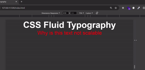
    <p>Why is this text not scalable</p>
</body>
</html>
Now let's take a look at how the text behaves on different screen sizes

A simple way to make the text above responsive is to use media queries, but in this article, we’ll make the text responsive using the CSS clamp() function.
But before that, let's first look at the vw (viewport width) unit. The vw unit allows you to set your font size relative to the width of the viewport, making your text responsive.
Let's update our existing code with the following changes:
<style>
  h1 {
    font-size: 10vw; /* H1 size is 10% of the viewport width */
  }
  p {
    font-size: 5vw;  /* p size is 5% of the viewport width */
    color: red;
  }
</style>
If the viewport width is 1000px:
The h1 font size will be 100px
The p font size will be 50px
The font sizes for H1 and p will continue to grow or shrink as the viewport width changes.
Let's see how it looks:

From the GIF above, we can see that using vw works for responsive text but lacks constraints. As the viewport width increases, the font size will keep growing without limit, and similarly, it will keep shrinking when the viewport width decreases.
This is where the clamp() function comes into play. clamp() allows you to set a minimum, preferred, and maximum font size, providing control over how the text scales within a defined range.
The Solution
Using the clamp() function
The clamp() function in CSS allows you to set a range for your font size.
The general format is :
clamp(minimum, preferred, maximum)
Let's use the example from above and modify the code with the following
h1{
  font-size: clamp(24px, 5vw, 48px); /* Font size scales between 24px and 48px */
}

p{
  font-size: clamp(16px, 3vw, 24px) /* Font size scales between 16px and 24px)
}
Let's see how it looks on the browser:

Now, the h1 and p elements will be responsive, as their sizes will stay within the defined range, ensuring they don't become too large or too small.
In this article, we have learnt how to achieve fluid typography using the CSS clamp() function. Thank you for reading to this point. I ask that you drop a like and share this article with your peers who will benefit from this.
What are your thoughts on this article? Feel free to share your thoughts in the comments section below.
P.S. I'm currently looking for frontend developer opportunities. If you have any leads or are hiring, feel free to check out my resume or connect with me on LinkedIn. I'd love to hear from you!
The above is the detailed content of CSS Fluid Typography: A Guide to Using clamp() for Scalable Text. For more information, please follow other related articles on the PHP Chinese website!


