


The Bootstrap pop-up box plug-in provides an extended view. The pop-up box (Popover) plug-in generates content and markup according to requirements. By default, the pop-up box (popover) is placed behind their triggering elements.
Popover is similar to Tooltip, providing an expanded view. To activate the popover, users simply hover over the element. The content of the popup box can be filled entirely using the Bootstrap Data API. This method relies on tooltips.
If you want to reference the functionality of this plugin separately, then you need to reference popover.js, which depends on the Tooltip plugin. Alternatively, as mentioned in the chapter Bootstrap Plugin Overview, you can reference bootstrap.js or a minified version of bootstrap.min.js.
1. Usage
Popover plug-in Generates content and markup according to requirements. By default, popovers are placed behind their triggering elements. You can add a popover in the following two ways:
Via data attribute: To add a popover, just add data-toggle="popover" to an anchor/button tag. The title of the anchor is the text of the popover. By default, the plugin places the popover at the top.
<a href="#" data-toggle="popover" title="Example popover">
 请悬停在我的上面
</a>
Via JavaScript: Enable popover via JavaScript:
$('#identifier').popover(options)
The Popover plug-in is not a pure CSS plug-in like the drop-down menu and other plug-ins discussed before. To use the plugin, you must activate it using jquery (read javascript). Use the following script to enable all popovers on the page:
$(function () { $("[data-toggle='popover']").popover(); });
2. Examples
The pop-up box means clicking an element to pop up a container containing title and content.
//基本用法

<button class="btn btn-lg btn-danger"
 type="button"
 data-toggle="popover"
 title="弹出框"
 data-content="这是一个弹出框插件">
 点击弹出/隐藏弹出框
</button>

//JavaScript 初始化

$('button').popover();
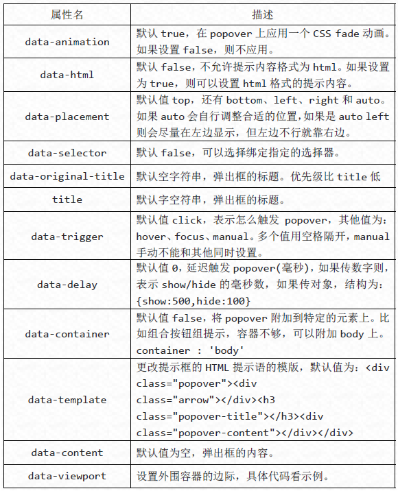
The pop-up box plug-in has many attributes to configure the display of prompts, as follows:
$('button').popover({
 container : 'body',
 viewport : {
 selector : '#view',
 padding : 10,
 }
}); There are four methods executed through JavaScript.
//显示
$('button').popover('show');
//隐藏
$('button').popover('hide');
//反转显示和隐藏
$('button').popover('toggle');
//隐藏并销毁
$('button').popover('destroy');
There are four types of events in the Popover plug-in:
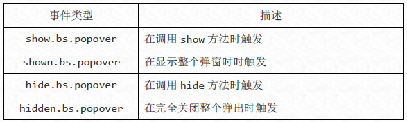
//事件,其他雷同

$('button').on('show.bs.tab', function() {
 alert('调用 show 方法时触发!');
});
The above is the entire content of this article. I hope it will be helpful for everyone to learn the Bootstrap pop-up box plug-in.


![[Web front-end] Node.js quick start](https://img.php.cn/upload/course/000/000/067/662b5d34ba7c0227.png)


