


css中设置三角形的方法:首先创建一个HTML示例文件;然后设置一个span元素为块级元素,并分别设置border的四边都为不同的颜色;最后通过设置上边框和左右边框宽度实现三角形即可。
本教程操作环境:windows7系统、HTML5&&CSS3版、Dell G3电脑。
使用css设置三角形
1.在开发中,有时候会用到一些小三角形来强调或者标记元素,这样以便区分不同的项目,然后把三角形绘制成一个比较明显的颜色,就达到效果了,那怎么才能画出三角形呢,之前我也不清楚,最近看到了有些网页在使用,在进行标记的时候,都是使用的是背景图片进行标记,这样在网页显示的时候,感觉有点生硬,毕竟图片的加载没有css加载那么顺畅
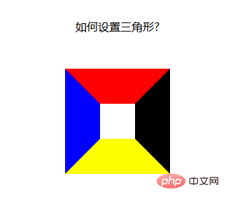
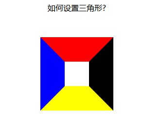
下面看一段代码:这里设置了一个span 元素为块级元素,分别设置border的四边都为不同的颜色:
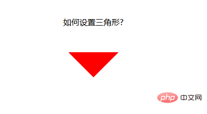
Document 如何设置三角形?
运行结果:发现四面的边框,居然是这种梯形的结构,如果把梯形上底变为0,不就是我们想要的三角形了么,而且这是使用html 和css做不来的,不存在使用静态页面就可以实行,不存在图片的不连续显示问题;
接下来就是把梯形的上底变为0 了【推荐:《css视频教程》】
上底变为0 很简单,只要把元素的高和宽设置为0就可以了
width:----->0 得到上下两种箭头
height:------->0 得到左右两种箭头
1.当我们想要上箭头的时候,就把元素的左右边框和下边框去掉
2.当我们想要下箭头的时候,就把元素的左右边框和上边框去掉
3.当我们想要左箭头的时候,就把上下边框和右边框去掉
4.当我们想要右箭头的时候,就把上下边框和左边框去掉
想法是好的,试了一下,想要上加箭头:设置css如下:
span { position: relative; margin: 0 auto; display: block; width: 0px; height: 0px; border-style: solid; border-width: 50px; /* 设置上边框和左右边框宽度为0 开始*/ border-top-width: 0; border-left-width: 0; border-right-width: 0; /* 设置上边框和左右边框宽度为0 开始*/ border-top-color: red; border-left-color: blue; border-bottom-color: yellow; border-right-color: black; }
运行结果:发现不行啊,什么都没有
那我们换个方法:既然设置宽度不行,那我们就设置颜色吧,只要把上,左,右边框的颜色设置为透明的,不就可以了么,css 中,刚好有一个设置颜色为透明的值
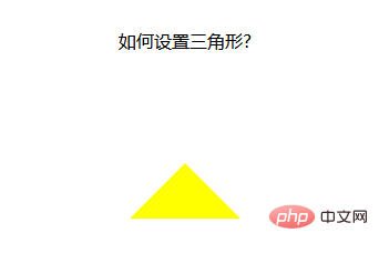
span { position: relative; margin: 0 auto; display: block; width: 0px; height: 0px; border-style: solid; border-width: 50px; /* 设置上边框和左右边框宽度为0 开始*/ border-top-color: transparent; border-left-color: transparent; border-right-color: transparent; /* 设置上边框和左右边框宽度为0 开始*/ /* border-top-color: red; border-left-color: blue; */ border-bottom-color: yellow; /* border-right-color: black; */ }
运行结果:OK,大功告成!!!
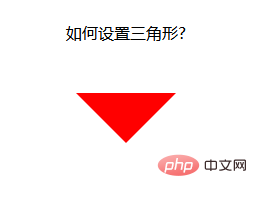
设置下箭头:
span { position: relative; margin: 0 auto; display: block; width: 0px; height: 0px; border-style: solid; border-width: 50px; /* 设置上边框和左右边框宽度为0 开始*/ border-bottom-color: transparent; border-left-color: transparent; border-right-color: transparent; /* 设置上边框和左右边框宽度为0 开始*/ border-top-color: red; /* border-left-color: blue; border-bottom-color: yellow; border-right-color: black; */ }
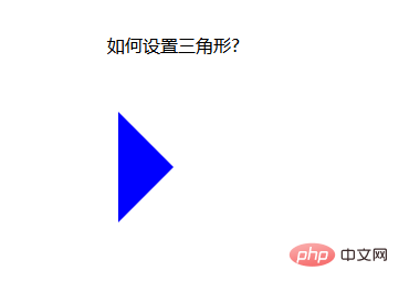
设置左箭头:
span { position: relative; margin: 0 auto; display: block; width: 0px; height: 0px; border-style: solid; border-width: 50px; /* 设置上边框和左右边框宽度为0 开始*/ border-top-color: transparent; border-bottom-color: transparent; /* border-left-color: transparent; */ border-right-color: transparent; /* 设置上边框和左右边框宽度为0 开始*/ /* border-top-color: red; */ border-left-color: blue; /* border-bottom-color: yellow; border-right-color: black; */ }
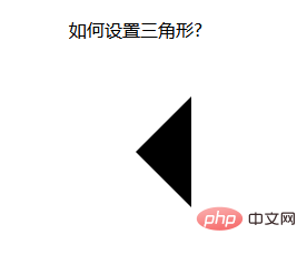
设置右箭头:
span { position: relative; margin: 0 auto; display: block; width: 0px; height: 0px; border-style: solid; border-width: 50px; border-top-color: transparent; border-bottom-color: transparent; border-left-color: transparent; /* border-right-color: transparent; */ /* border-top-color: red; border-left-color: blue; border-bottom-color: yellow; */ border-right-color: black; }
当然,css 还可写在一起,这样看起来要简单一些:
span { position: relative; margin: 0 auto; display: block; width: 0px; height: 0px; /* 先后设置上右下左的border-color属性都是一样的,需要哪个箭头,再设置哪个方向的颜色属性,这样,最后设置的属性覆盖了前面的属性,就变成箭头了 */ border: 50px solid transparent; border-top-color: red; }
以上,是使用html和css两项综合起来设置的箭头,可以不可以再设置简单一点呢?
下面,我采用class 属性来设置箭头,当需要箭头的时候,直接加上这个class 属性就可以,当不想要箭头的时候,去除调这个类就好了
下面来看一个例子:
Document 请选择你喜欢的电影
运行结果:
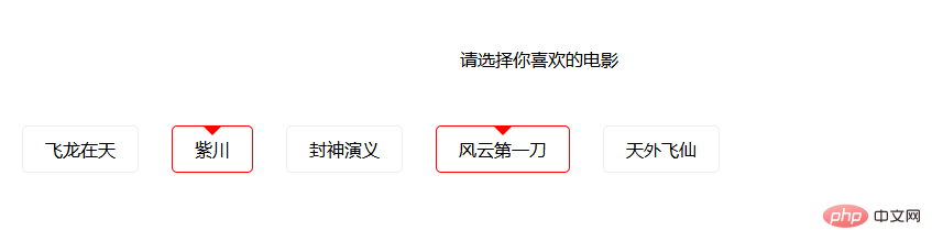
这样,就实现了使用class 属性控制箭头的方式,当需要选中时,给li 元素加上一个active class 属性即可,当不需要时,就去除active class 属性。
Das obige ist der detaillierte Inhalt voncss中怎么设置三角形. Für weitere Informationen folgen Sie bitte anderen verwandten Artikeln auf der PHP chinesischen Website!


