


Hover on the image
It uses a combination of all the rotate operators


Geschrieben von Oscar Jite-Orimiono✏️
Als Frontend-Entwickler haben Sie höchstwahrscheinlich schon einmal die Hausanalogie gehört, die zur Beschreibung von HTML, CSS und JavaScript verwendet wird. HTML ist die Struktur (Wände, Räume, Türen usw.), CSS ist der Dekorateur (Gemälde, Layout und Möbel), während JavaScript Funktionalität für Strom und Sanitär bereitstellt.
Schauen wir uns CSS separat an, erstens weil es erstaunlich ist, aber zweitens ist CSS an sich schon leistungsstark und kann ein gewisses Maß an Funktionalität bieten, wo JavaScript in manchen Fällen nicht benötigt wird. Bei CSS sind Ihrer Fantasie keine Grenzen gesetzt, aber lassen Sie ihr am besten nicht freien Lauf, denn Sie müssen ein hohes Maß an Funktionalität aufrechterhalten.
In diesem Beitrag erfahren Sie, wie Sie mit CSS 3D-Effekte erstellen, indem Sie relevante Eigenschaften und Operationen verwenden, die Elemente in einem virtuellen 3D-Raum steuern. Außerdem behandeln wir visuelle Illusionen mit Schatten und Licht.
Objekte im 3D-Raum haben drei Dimensionen: Länge, Breite – technisch gesehen dasselbe wie „Länge“, wird aber allgemein als die kürzere Seite angesehen, und Höhe (oder Tiefe). Beim Betrachten eines Bildschirms sehen Sie nur in 2D, daher benötigen Sie eine CSS-Eigenschaft wie „transform“, um 3D-Effekte zu erzeugen.
Die Transformationseigenschaft verfügt über mehrere Operationen, die die 3D-Abmessungen und die Position eines Elements steuern. Sie steuern die horizontale Position mit TranslateX(), die vertikale Position mit TranslateY() und Höhe und Tiefe mit TranslateZ().
Betrachten Sie diese Illustration. Wir haben zwei rechteckige Elemente – eines klein und das andere groß. Das kleine Element ist das untergeordnete Element und ist im größeren übergeordneten Element verschachtelt: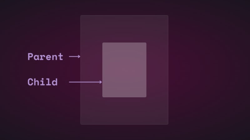
Wenn Sie die Position des untergeordneten Elements mithilfe von Übersetzen vertikal und horizontal ändern, werden Sie sehen, wie es sich bewegt: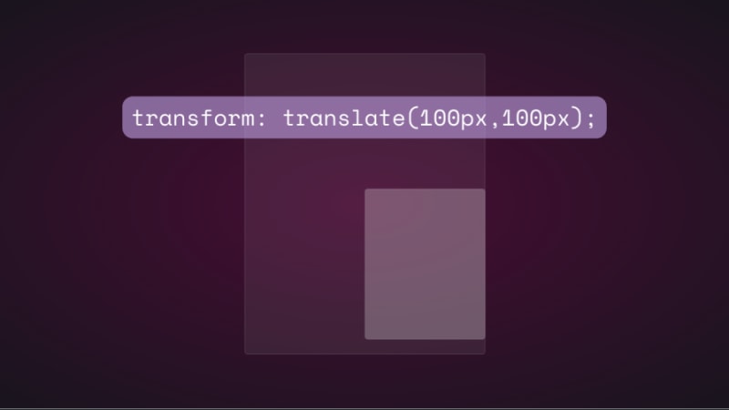
Wenn Sie versuchen, die Position des untergeordneten Elements auf der Z-Achse durch Hinzufügen von translatorZ() zu ändern, passiert nichts. Die Z-Achse verläuft senkrecht zum Ansichtsfenster, daher sollte das untergeordnete Element kleiner erscheinen, wenn es sich vom Bildschirm entfernt, und größer, wenn es näher kommt, oder? So funktioniert es auch in der realen Welt, wenn man ein Objekt von oben betrachtet. Allerdings funktionieren die Dinge virtuell nicht gleich, weil es keine Perspektive gibt.
In CSS sind die Eigenschaft „Perspektive“ und der Operator „Perspektive()“ wirklich wichtig für die Funktionsweise von 3D-Transformationen. Die Perspektive ist Ihr Standpunkt und erzeugt die Illusion von Tiefe und Höhe.
Die perspektivische Eigenschaft gilt für das übergeordnete Element, während perspective() mit der transform-Eigenschaft für das untergeordnete Element arbeitet. Sie machen das Gleiche – meistens.
Sehen wir uns an, wie sich die perspektivische Eigenschaft auf translatorZ() auswirkt. Zur Veranschaulichung verwenden wir eine einfache Animation.
Hier sind der HTML- und CSS-Code für die übergeordneten und untergeordneten Elemente:
.parent { display: flex; justify-content: center; align-items: center; background: rgba(255, 255, 255, 0.07); width: 400px; height: 500px; border: 0.5px solid rgba(255, 255, 255, 0.15); border-radius: 5px; z-index: 0; } .child { background: rgba(255, 255, 255, 0.25); width: 200px; height: 250px; border: 1px solid rgba(255, 255, 255, 0.15); border-radius: 5px; z-index: 1; }
Fügen Sie zunächst dem übergeordneten Element eine Perspektive hinzu und fügen Sie dann die Transformationsanimation dem untergeordneten Element hinzu:
.parent{ perspective: 1000px; } .child{ animation: transform 5s infinite ease-in-out alternate-reverse; } @keyframes transform{ 0%{ transform: translateZ(-200px) } 100%{ transform: translateZ(200px) } }
Und hier ist das Ergebnis: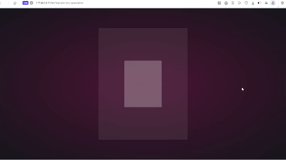
Sie erhalten das gleiche Ergebnis, wenn Sie den Operator perspective() verwenden. Anders verhält es sich jedoch, wenn es mit rotation() verwendet wird.
Lassen Sie uns das Kind entlang der x-Achse drehen und sehen, was passiert:
.child{ transform: perspective(10px) rotateX(2deg); }
Hier ist ein Screenshot: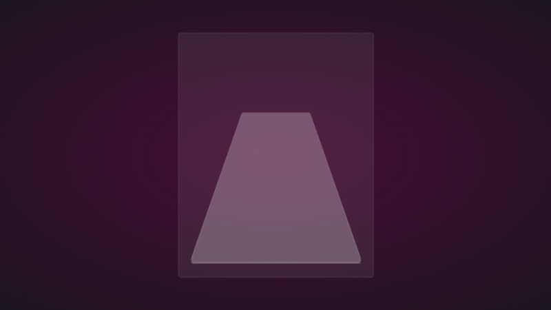
Wenn wir eine kleine Verschiebung auf der Z-Achse hinzufügen, erhalten Sie Folgendes: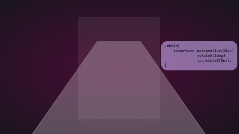
Zum Spaß, hier erfahren Sie, wie weit es geht:
Es ist, als befände man sich auf der Oberfläche des Elements. Es wäre großartig, wenn Sie dies über ein VR-Headset betrachten könnten.
Wir können auch die alleinstehende Immobilie nutzen:
.parent { perspective: 10px; } .child { transform: rotateX(2deg) translateZ(5px); }
Das Ergebnis ist dasselbe, aber es läuft nicht über das Ansichtsfenster hinaus. Beide haben ihre Anwendungsfälle, und wir werden sie und den Rest der Transformationsvorgänge im weiteren Verlauf bei der Arbeit sehen.
Beachten Sie, dass der im obigen Beispiel verwendete kleine Perspektivwert dazu diente, den 3D-Effekt zu übertreiben, damit Sie sehen können, wie er funktioniert. Meistens möchten Sie das Element von oben betrachten, daher reicht ein viel größerer Wert bis zu 1000 Pixel aus. Kleine Perspektivenwerte lassen Elemente dreidimensionaler erscheinen.
Hier ist ein CodePen mit einer 3D-Transformationsanimation.
Es ist Zeit, zum spaßigen Teil zu kommen und einige 3D-Effekte mit CSS zu erstellen!
How objects interact with light is another way to tell they’re in 3D space. We can use the perspective() operator to create reflections and shadows in CSS to generate the illusion that an element is floating in 3D space.
This example will feature text, but you can use other HTML elements:
Text in space
We’re creating a reflection, so we need light. You’ll need the text-shadow property to create this light effect:
.content h1 { position: relative; font-size: 5rem; font-weight: 600; color: #fff; margin: 3px; text-shadow: 0px 0px 10px #b393d350, 0px 0px 20px #b393d350; text-transform: uppercase; }
You should have glowing text at this point: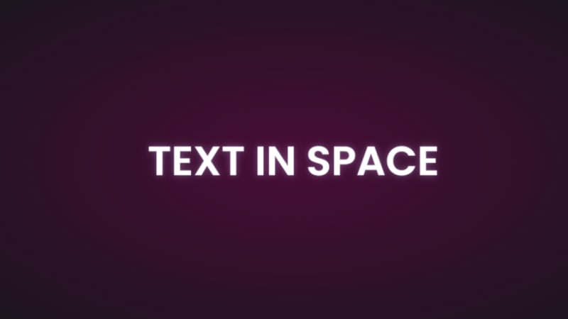
It’s time to add the reflection using a pseudo-element:
.content h1::before { content: ""; position: absolute; top: 80%; left: 0; height: 100%; width: 100%; background: #b393d3; transform: perspective(10px) rotateX(10deg) scale(1,0.2); filter: blur(1em); opacity: 0.5; }
First, we give the pseudo-element the same dimensions as the text. Then we add a background with the same color as the text-shadow. Next, we add the transform property with three operations.
We’ve already seen how the first two work, so let’s talk about scale(). Remember how the child element stretches beyond the viewport? This prevents that by resizing the element along the x and y directions.
In this example, the reflection we created with the pseudo-element keeps its original size on the x-axis but is reduced to less than half on the y-axis. The opacity and filter make it look like the light fades the further it moves from the text: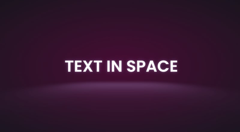
The text looks like it’s floating and reflecting light off the floor.
We can also create shadows using a similar method to the light. Let’s work with an image this time.
Here’s the image we’ll work with for this example: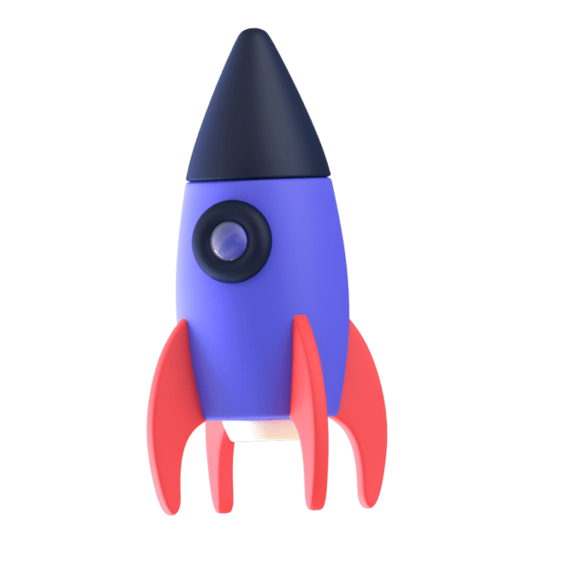
It’s nice to have the shadow match the shape and size of the element. In this case, we have a rocket, and this means our shadow should be round. Consequently, there’s no need for the perspective() operator.
Here’s the HTML:
In CSS, go ahead and give the image any dimensions you want, then add a pseudo-element below it:
.rocket::before { content: ""; position: absolute; bottom: -10%; left: 0; height: 50px; width: 100%; border-radius: 50%; background: radial-gradient(rgba(0, 0, 0, 0.8), transparent, transparent); transition: 0.5s; }
The border-radius of 50 percent gives it an oval shape. You can add more height or a more specific width if you'd like. Shadows are black most of the time, so the background is a blurry radial-gradient fading from black to transparent.
Here’s a screenshot of how it should look at this point: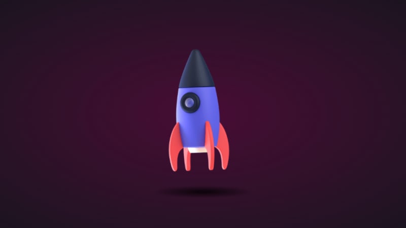
Finally, let’s add some animation:
.rocket:hover img{ transform: translateY(-40px); } .rocket:hover::before { opacity: 0.8; transform: scale(0.8); }
This will move the rocket up and down, and the shadow will change as it moves. Hover on the rocket in the CodePen to see this 3D effect.
You can create 3D text with the CSS box-shadow property. You’ll need multiple shadow layers to create this effect.
Here’s the HTML:
3D text in 3D space
Next, we need CSS to turn it into 3D text. We’ll use perspective and transform to tilt the text at an angle:
.content { position: relative; transform: translate(-50%, -50%); display: flex; align-items: center; justify-content: center; text-align: center; perspective: 1500px; transform-style: preserve-3d; } .content h1 { font-size: 5rem; font-weight: 600; color: #b393d3; text-shadow: 1px 4px 1px #480d35, 1px 5px 1px #480d35, 1px 6px 1px #480d35,/* to create the sides*/ 1px 10px 5px rgba(16, 16, 16, 0.5), 1px 15px 10px rgba(16, 16, 16, 0.4), 1px 20px 30px rgba(16, 16, 16, 0.3); /* real shadow */ margin: 3px; transform: rotateX(15deg) rotateY(-20deg) rotateZ(10deg); text-transform: uppercase;
Here’s how the text should look at this point: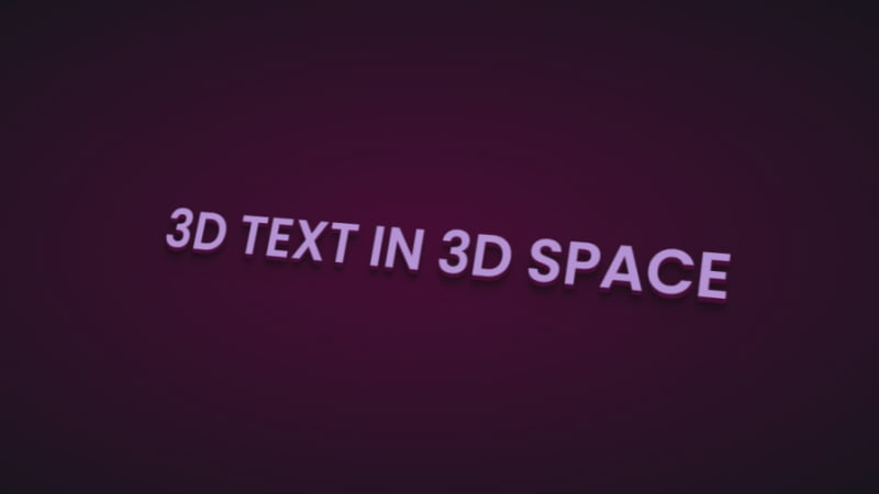
Now let’s add some animation:
.content:hover h1{ transform: rotateX(2deg) rotateY(0deg) rotateZ(0deg); font-size: 4rem; transition: 500ms ease-in-out; }
Here’s the 3D text plus tilt on hover effect on CodePen.
Let’s work with an image this time, and we’ll use the one below:
Here’s the HTML:
Hover on the image
It uses a combination of all the rotate operators
You could use a background image, but what’s important is that there’s a clear parent and child element.
In the CSS, use the transform property tilt the image at an angle, then reset it on hover:
.tilt-img { width: 600px; height: auto; margin-top: 20px; perspective: 1000px; } .tilt-img img { width: 100%; height: 100%; object-fit: contain; border-radius: 10px; transform: rotateX(15deg) rotateY(-5deg) rotateZ(1deg); box-shadow: 5px 5px 2px rgba(0, 0, 0, 0.5); transition: 2s; } .tilt-img:hover img{ transform: none; box-shadow: 0px 2px 3px rgba(0, 0, 0, 0.5); }
You can reverse it and add the tilt on hover, or change the transform values:
See the 3D image tilt with CSS on CodePen.
Here, we’re going to make an element tilt and follow the movement of the mouse when you hover over it. We’re going to work with vanilla-tilt.js, a JavaScript library.
Here’s what we’re aiming for: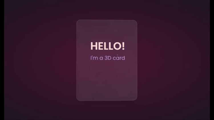
We’ll start with HTML, creating a card and some text:
Hello!
I'm a 3D card
Next, we’ll style with CSS:
.box { position: relative; border-radius: 20px; transform-style: preserve-3d; } .box .card { position: relative; background: rgba(255, 255, 255, 0.07); width: 300px; min-height: 400px; backdrop-filter: blur(10px); border: 0.5px solid rgba(255, 255, 255, 0.15); border-radius: 20px; box-shadow: 0 25px 45px rgba(0,0,0,0.05); } .elements{ position: absolute; top: 100px; left: 50px; width: 200px; height: auto; text-align: center; background: transparent; transform: translateZ(80px); } .elements h2{ font-size: 3rem; font-weight: 600; color: #f6d8d5; text-transform: uppercase; } .elements p{ font-size: 1.5rem; color: #b393d3; }
The two CSS properties directly responsible for creating the 3D effect on the card are transform and transform-style.
First, we have the transform-style, set to preserve-3d, applied to the box. This means the card and any nested element are now in a 3D space. The transform property is applied to the text’s parent element, with the class name .elements. Here, translateZ(80px) moves the text toward the viewer.
These two properties combined create the illusion of depth, and the text will appear to be floating above the card.
Head to cdnjs.com to grab the Vanilla-tilt CDN and link it to your HTML document. Next, go to the main site and copy the VanillaTilt.init JavaScript function that controls the tilt. Add it just before the closing body tag:
Now all you have to do is replace .your-element with the class name of your element getting the 3D tilt effect, and you’re in business.
By default, the maximum tilt rotation and transition speed are defined by max and speed respectively. You can also add a glare, easing, or tilt direction and angle.
Here’s how to get the exact effect shown in the “HELLO” example above:
More functions and effects are listed on the main site.
Here’s a CodePen showing the 3D tilt effect.
Just to show that the library isn’t doing all the work and how important the transform and transform-style properties are for this 3D effect, here’s what it would look like if they weren’t included: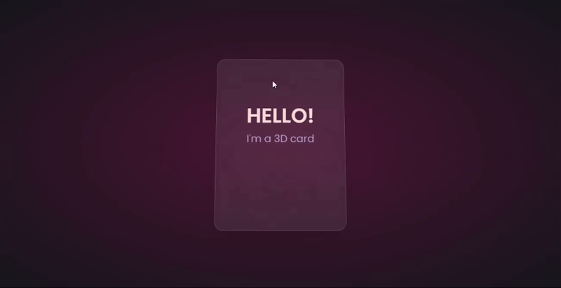
The text appears flush against the card and you’re left with only the tilting, which is nice, but not as nice as the 3D effect created when those properties are included.
Let’s explore another practical use case of this 3D effect.
Using the same card, we’ll add a background image and caption that’ll appear on hover:
.box .card { position: relative; background: url(/Captions/8.jpg) center; background-size: cover; background-repeat: no-repeat; width: 300px; min-height: 400px; border: 1px solid rgba(255, 255, 255, 0.15); border-radius: 10px; box-shadow: 0 25px 45px rgba(0,0,0,0.05); z-index: 0; } .elements{ position: absolute; top: 60%; left: 30%; width: 250px; height: auto; padding: 10px; border-radius: 5px; text-align: center; background: rgba(255, 255, 255, 0.25); transform: translateZ(80px); z-index: 2; opacity: 0; transition: opacity 500ms; } .box:hover .elements{ opacity: 1; }
Here’s a CodePen with the result of the 3D image card with caption appearing on hover.
Buttons are common web components with many shapes, sizes, and purposes. No matter the button type, they all have one thing in common: you have to click on them to work. But how many times have you seen them actually “click”?
This will be a little micro-interaction that helps the user know they’ve done something. The main CSS property we’ll use for this 3D effect is the transform property.
Here’s how it should look: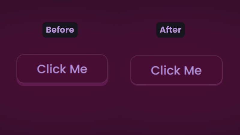
There are two distinct parts of this 3D button — the top with the "Click Me” text and the bottom and sides with a lighter color.
You’ll start with the HTML for the button:
In CSS, we’ll start with the bottom. That’s the button with the class name btn:
.btn { position: relative; background: #17151d; border-radius: 15px; border: none; cursor: pointer; }
Next, we have the top of the button:
.text { display: block; padding: 10px 40px; border-radius: 15px; border: 1px solid rgba(255, 255, 255, 0.15); background: #480d35; font-size: 1.5rem; font-weight: 500; color: #b393d3; transform: translateY(-6px); transition: transform ease 0.1s; }
The transform property is what creates the 3D effect of the button clicking. All that’s left is to reverse the transformation by a few pixels when you click on it:
.btn:active .text{ transform: translateY(-2px); }
And that’s how to create a 3D click button. Here’s a CodePen you can interact with.
The transform property and its operators have excellent support across all the major browsers — unless you still use Internet Explorer. You can check it out yourself on CanIuse: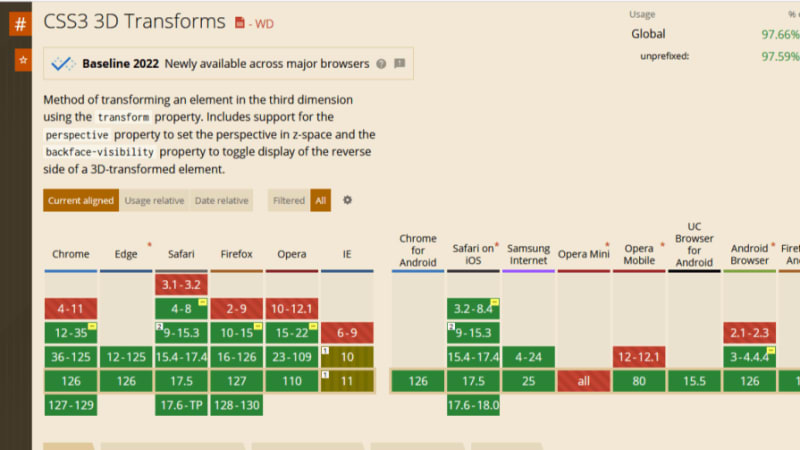
Unfortunately, the borders of the cards do not appear straight during animation on Firefox browsers, but it’s not clear why. Apart from that, the animation runs smoothly. Compare performance across browsers, and try different border thickness.
The web is your canvas, and CSS is your paintbrush. In this post, you’ve learned how to create 3D effects with the transform property. What other effects can you think of?
As web frontends get increasingly complex, resource-greedy features demand more and more from the browser. If you’re interested in monitoring and tracking client-side CPU usage, memory usage, and more for all of your users in production, try LogRocket.
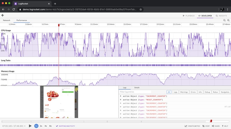
LogRocket is like a DVR for web and mobile apps, recording everything that happens in your web app, mobile app, or website. Instead of guessing why problems happen, you can aggregate and report on key frontend performance metrics, replay user sessions along with application state, log network requests, and automatically surface all errors.
Modernize how you debug web and mobile apps — start monitoring for free.
Das obige ist der detaillierte Inhalt vonEffekte in CSS erstellen. Für weitere Informationen folgen Sie bitte anderen verwandten Artikeln auf der PHP chinesischen Website!


