Analysis of percentage problems in CSS
This article mainly introduces a brief discussion of percentages in CSS. The length unit "%" is often used when defining CSS styles, but who is this percentage relative to?
This article introduces a brief discussion of percentages in CSS and shares them with everyone. The details are as follows:
Conclusion:
Elements in the standard flow, see Are there any inheritance properties? For width and margin-left, it is inheritable, and it will refer to the parent element or ancestor element (actually the containing block); for height, it has no inheritance, and the parent element or ancestor element will adapt to the height of all its child elements. and (this needs to be noted).
Absolute positioning refers to the nearest parent element or ancestor element. If there is no parent element or ancestor element, then it refers to the initial containing block (different browsers may be different , because W3C does not specify how browsers implement it). But in fact, most browsers treat the viewable area as an absolutely positioned containing block.
Fixed positioning reference visual area
width is set to percentage
Generally, child elements usually inherit the calculated value of the parent element as a reference for percentage. For non-inheritable attributes and root elements, use the initial value as a reference.
For example, .box does not have a width set, but the default It inherits the calculated value of body, and because .box is the parent element of .item, .item inherits the calculated value of .box. When a block-level element does not set a width, its width defaults to full screen because it inherits the width of the containing block.
height is set to a percentage
Conclusion
When the height is set to a percentage, the height does not inherit the parent element like the width. Or ancestor elements. On the contrary, the parent element or ancestor element will adapt itself according to the actual height (height calculation value) of the child element, which is generally the sum of the heights of the contents of all child elements. The child element will set a specific height value based on the text line height (in the case where the height of the child element is not set to a specific value). For an element with absolute positioning, when its height is a percentage, it will refer to the height of the parent element or ancestor element. Absolute positioning will refer to the parent element or ancestor element closest to it. If there is no parent element or ancestor element, then it will refer to the initial element. Containing block (different browsers may be different, because W3C does not specify how browsers should implement it). But in fact, most browsers treat the viewable area as an absolutely positioned containing block.
We generally like to set the width as a percentage, but be careful when setting the height as a percentage.
 <style>
        body,p{
            margin:0;
            padding:0;
        }
        .box{
            width:100px;
            height:100%;
            background-color: #58d3e2;
        }
    </style>
<p class="box">height 100%</p>
html Why does height equal to 21? Is this 21 inherited from the ancestor element? When we set the height of the body to 100% the result is still the same. In fact, the height here is the height of the line height. That is to say, when the height is 0 or no height is set, the height is the line height of the text. When we add line-height:20px; to .box, the box , the height of body and html will become 20px; when we set the .box height to a specific value:
 <style>
        body,p{
            margin:0;
            padding:0;
        }
        .box{
            width:100px;
            height:100px;
            background-color: #58d3e2;
        }
    </style>
<p class="box">height 100%</p>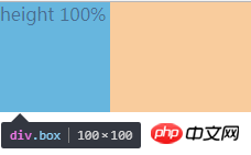
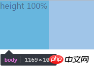
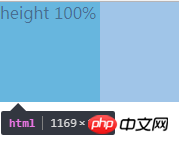
It can be found that the height of body and html is the same as .box, which is 100px. Therefore, it can be concluded that the parent element is adaptive to the height of the child element when the height is not set (when the height is not set) Below, the height of html and body is the combined height of all content). If the parent element sets the height, it is another situation:
 <style>
        body,p{
            margin:0;
            padding:0;
        }

        .d{
            height: 100px;
            width: 200px;
            background-color: #9d9d9d;
        }
        .box{
            width:100px;
            height:100px;
            background-color: #58d3e2;
        }
    </style>
<p class="d">
<p class="box">height</p>
</p>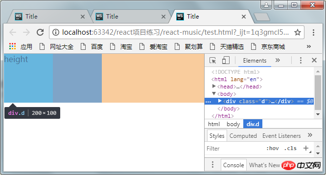
You can find d The height of body and html has become 100px (it should be 200px), which means that the parent element or ancestor element passively adapts the height of the child element, and their height value will not be inherited from the element.
When there is absolute positioning
#1. Absolutely positioned ancestor elements without positioning
At this time, absolute positioning refers to the height of a viewport. Pay attention to the concept of viewport.
 <style>
        body,p{
            margin:0;
            padding:0;
        }
        .box{
            position:absolute;
            width:100px;
            height:100%;//改变百分比为50%
            background-color: #58d3e2;
        }
    </style>
<p class="box">height 100%</p>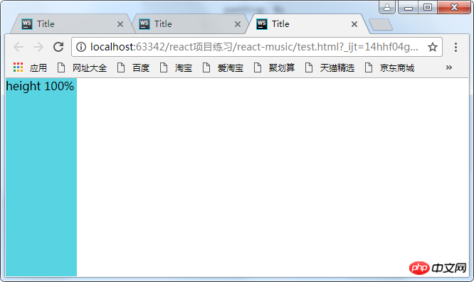
改变height分别为100%和50%,可以发现html的高度为0,并没有自适应p的高度,因为p已经彻底脱离标准流了,我们说过,如果绝对定位没有定位的祖先元素,则包含块为初始包含块,这里的初始包含块即为可视区,所以这里的百分比是参照可视区的大小来计算的。所以为50%时占视口的一半。注意这只是一个视口的高度,把滚动条往下拉拉就知道了。
2.绝对定位的元素在另外一个定位元素里面(除static外)
这时百分比参照的是父元素生成的包含块计算出来的值
所以想让定位元素的高度占满整个屏幕,可以:
body{
  position:relative;
}margin-left设置成百分比
  <style>
        body,p{
            margin:0;
            padding:0;
        }
        .box{
            position:absolute;
            width:100px;
            height:100px;
            margin-left: 100%;
            background-color: #58d3e2;
        }
    </style>
<p class="box">margin-left</p>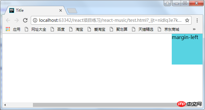
这时出现了滚动条,这是因为将p的margin-left设置成了100%,而百分比是参照其包含块body的宽度,body又是参照的html(某些浏览器将它当作初始包含块)。而html的初始包含块是可视区,所以可视区的宽度再加上元素的100%,自然就超出了屏幕了。
解决方法:
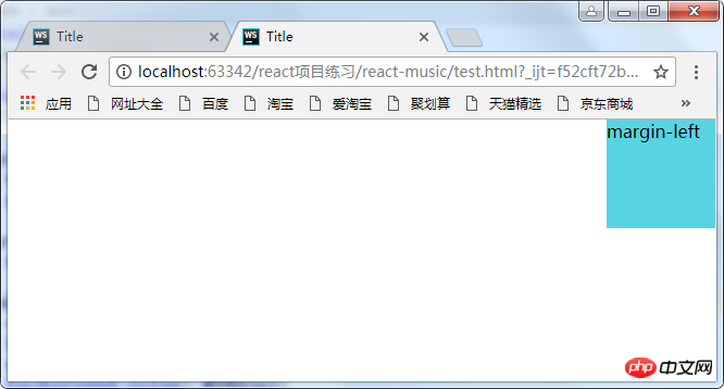
(1)利用calc函数
<style>
        body,p{
            margin:0;
            padding:0;
        }
        .box{
            position:absolute;
            width:100px;
            height:100px;
            margin-left: calc(100%-100px);
            background-color: #58d3e2;
        }
    </style>
<p class="box">margin-left</p>(2)让body的宽度减去100px,因为p的百分比是参照其父元素的宽度计算的,因此这里将它的父元素的宽度减小,那么它的margin-left的100%自然就小了
<style>
        body,p{
            margin:0;
            padding:0;
        }
         body{
             margin-right;100px;
        }
        .box{
            position:absolute;
            width:100px;
            height:100px;
            margin-left: 100%;
            background-color: #58d3e2;
        }
    </style>
<p class="box">margin-left</p>以上就是本文的全部内容,希望对大家的学习有所帮助,更多相关内容请关注PHP中文网!
相关推荐:
The above is the detailed content of Analysis of percentage problems in CSS. For more information, please follow other related articles on the PHP Chinese website!

Hot AI Tools

Undresser.AI Undress
AI-powered app for creating realistic nude photos

AI Clothes Remover
Online AI tool for removing clothes from photos.

Undress AI Tool
Undress images for free

Clothoff.io
AI clothes remover

AI Hentai Generator
Generate AI Hentai for free.

Hot Article

Hot Tools

Notepad++7.3.1
Easy-to-use and free code editor

SublimeText3 Chinese version
Chinese version, very easy to use

Zend Studio 13.0.1
Powerful PHP integrated development environment

Dreamweaver CS6
Visual web development tools

SublimeText3 Mac version
God-level code editing software (SublimeText3)

Hot Topics
 1378
1378
 52
52
 How to resize bootstrap
Apr 07, 2025 pm 03:18 PM
To adjust the size of elements in Bootstrap, you can use the dimension class, which includes: adjusting width: .col-, .w-, .mw-adjust height: .h-, .min-h-, .max-h-
 How to insert pictures on bootstrap
Apr 07, 2025 pm 03:30 PM
There are several ways to insert images in Bootstrap: insert images directly, using the HTML img tag. With the Bootstrap image component, you can provide responsive images and more styles. Set the image size, use the img-fluid class to make the image adaptable. Set the border, using the img-bordered class. Set the rounded corners and use the img-rounded class. Set the shadow, use the shadow class. Resize and position the image, using CSS style. Using the background image, use the background-image CSS property.
 How to set up the framework for bootstrap
Apr 07, 2025 pm 03:27 PM
To set up the Bootstrap framework, you need to follow these steps: 1. Reference the Bootstrap file via CDN; 2. Download and host the file on your own server; 3. Include the Bootstrap file in HTML; 4. Compile Sass/Less as needed; 5. Import a custom file (optional). Once setup is complete, you can use Bootstrap's grid systems, components, and styles to create responsive websites and applications.
 The Roles of HTML, CSS, and JavaScript: Core Responsibilities
Apr 08, 2025 pm 07:05 PM
HTML defines the web structure, CSS is responsible for style and layout, and JavaScript gives dynamic interaction. The three perform their duties in web development and jointly build a colorful website.
 How to use bootstrap button
Apr 07, 2025 pm 03:09 PM
How to use the Bootstrap button? Introduce Bootstrap CSS to create button elements and add Bootstrap button class to add button text
 How to write split lines on bootstrap
Apr 07, 2025 pm 03:12 PM
There are two ways to create a Bootstrap split line: using the tag, which creates a horizontal split line. Use the CSS border property to create custom style split lines.
 How to view the date of bootstrap
Apr 07, 2025 pm 03:03 PM
Answer: You can use the date picker component of Bootstrap to view dates in the page. Steps: Introduce the Bootstrap framework. Create a date selector input box in HTML. Bootstrap will automatically add styles to the selector. Use JavaScript to get the selected date.
 How to use bootstrap in vue
Apr 07, 2025 pm 11:33 PM
Using Bootstrap in Vue.js is divided into five steps: Install Bootstrap. Import Bootstrap in main.js. Use the Bootstrap component directly in the template. Optional: Custom style. Optional: Use plug-ins.


